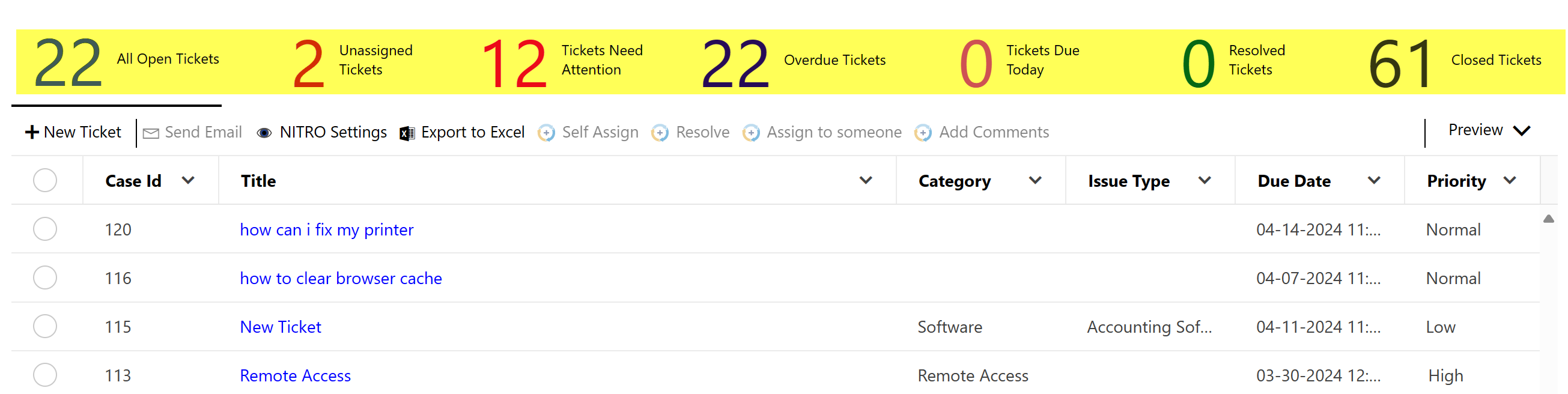
List Views are typically used on either dashboard pages or home pages to present list data in the site or across multiple sites. This works well in conjunction with Dials, NITRO Reports, and Tiles for a look at the underlying data.
To configure a new List View to add to a Modern/Classic UI page, go to NITRO Studio and click on "List View". This will then show all NITRO List Views configured for the site for the Modern/Classic UI. If you are using the Modern UI, please see the Add View to Modern UI section first, and then come back here to go through the configuration options.
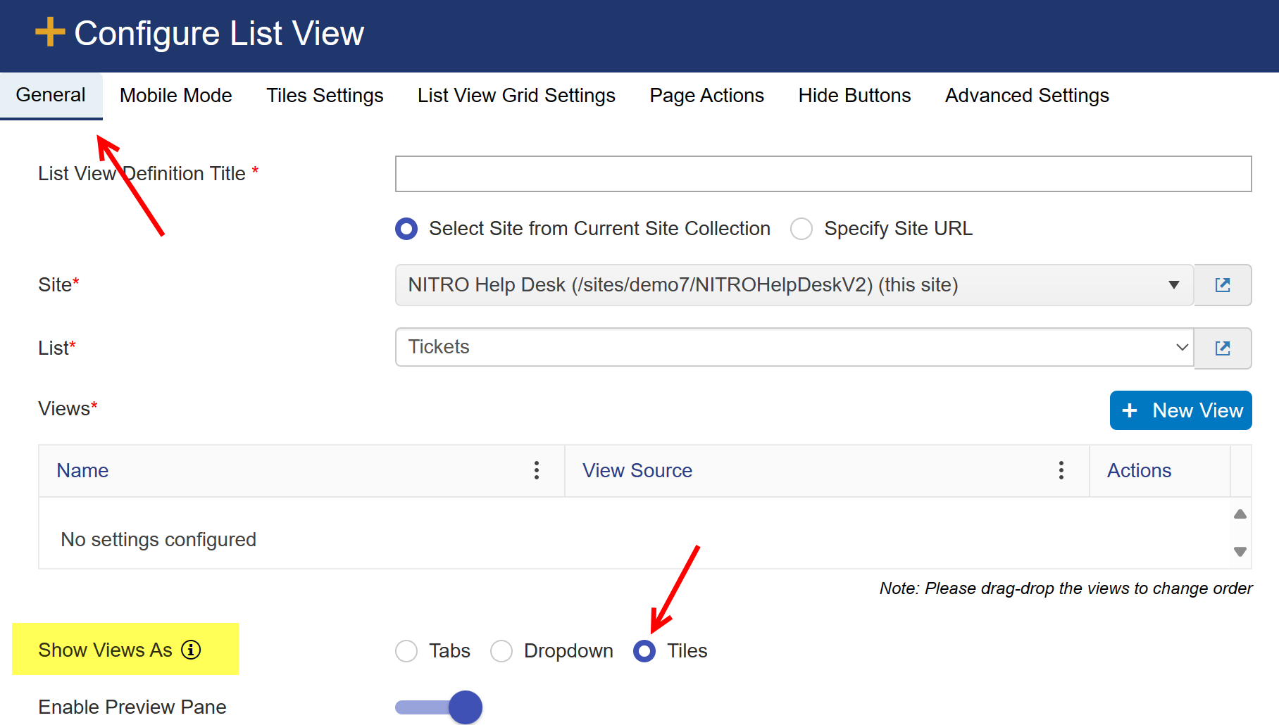
Either edit an existing List View or click on New List View...
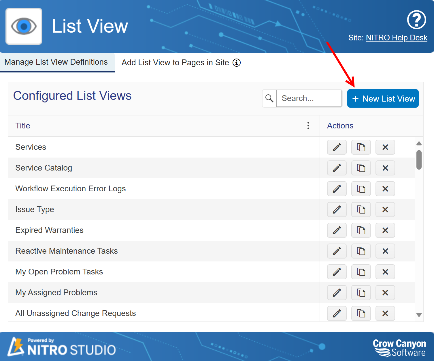
...which brings you to this screen:
General tab:
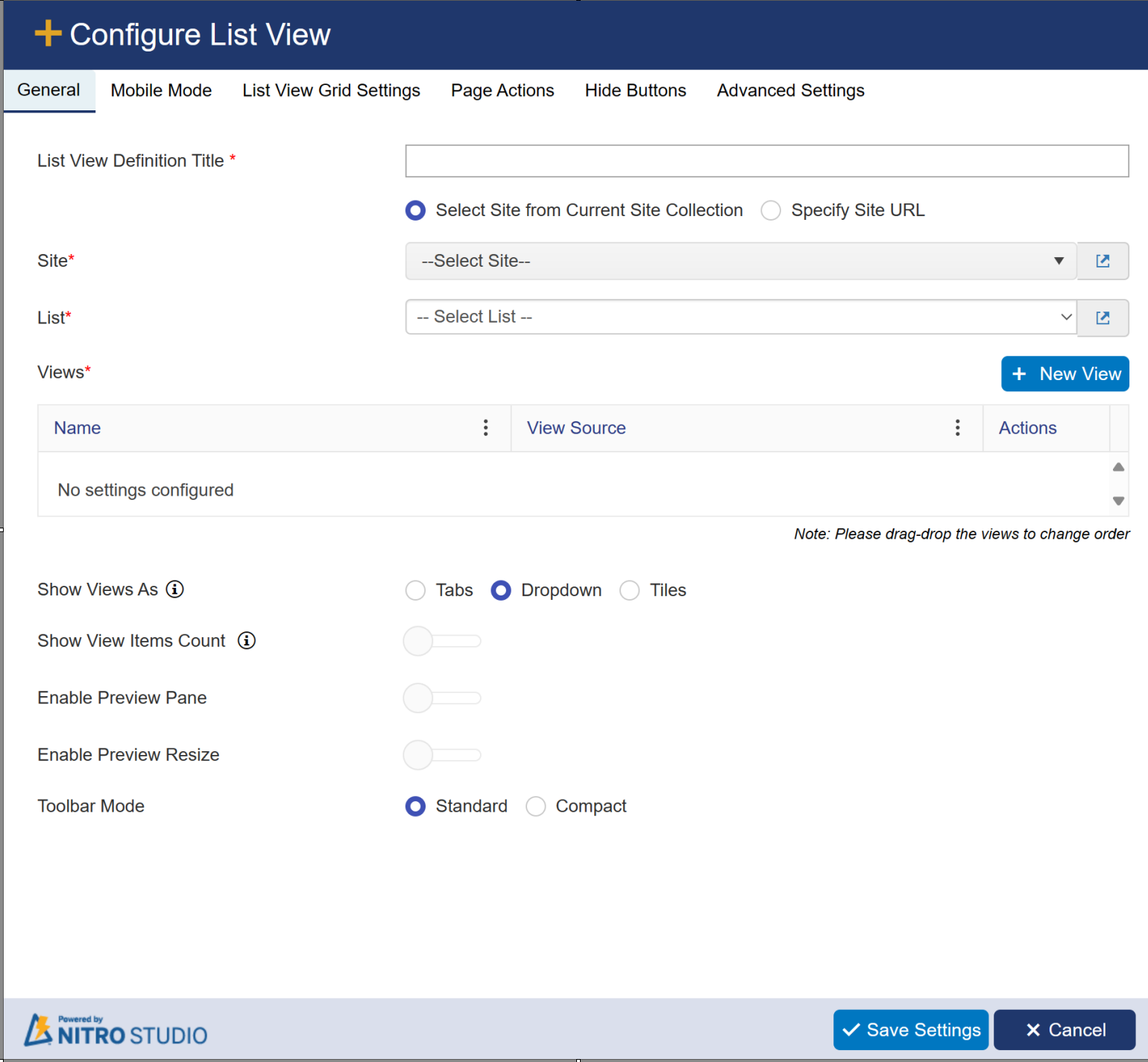
List View Definition Title: Provide unique name for List View Title.
Site: Required. You can pull data from a list within the current Site, Site Collection, or Tenant/Web Application.
Select Site from Current Site Collection: Shows a drop down of all sites, including the root site, within the current Site collection
Specify Site Url: Allows you to add your own URL to access a site in another Site Collection within the Tenant/Web Application.
Note: the current logged in user will need at least read permissions on the selected site to set up this list view.
List: Required. Shows all Lists within the selected site. This will be the list used for the list view.
Views: Required. Shows all views for the selected list. You must select at least one view for the web part. If you select more than one view, the List View
web part will allow your users to change views by using the Tabs/Dropdown feature.
New View: Allows you to create a new view on the list while in the List View utility
New View Settings:
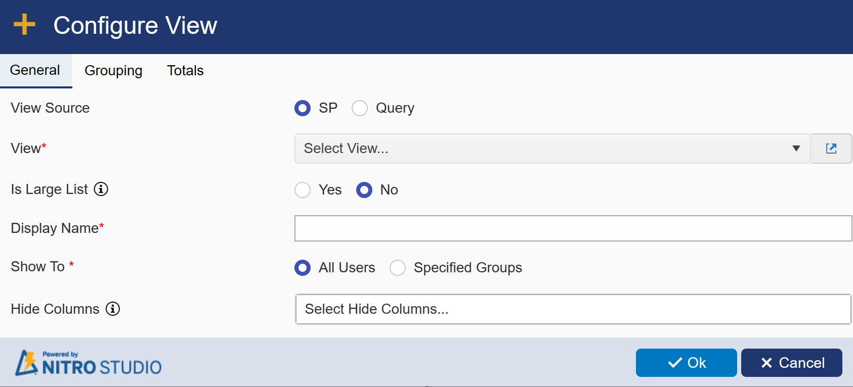
General Tab:
Settings common in SP and Query View Source
Is Large List: Use this option if list has large number of items and list view doesn't work due to threshold error.
Display Name: Provide display name for selected view.
Show To: It has two options
All Users: If you want to show the selected view to all users then select this option.
Specified Groups: If you want to show this option to specific group users then select this option and specify the group name.

Hide Columns: Selected columns will not be shown in the list view. Data for these columns will be loaded if specified
in the view columns.
see below settings if View Source is selected as 'SP'
View: Allows you to choose an existing SharePoint view configured for the list.
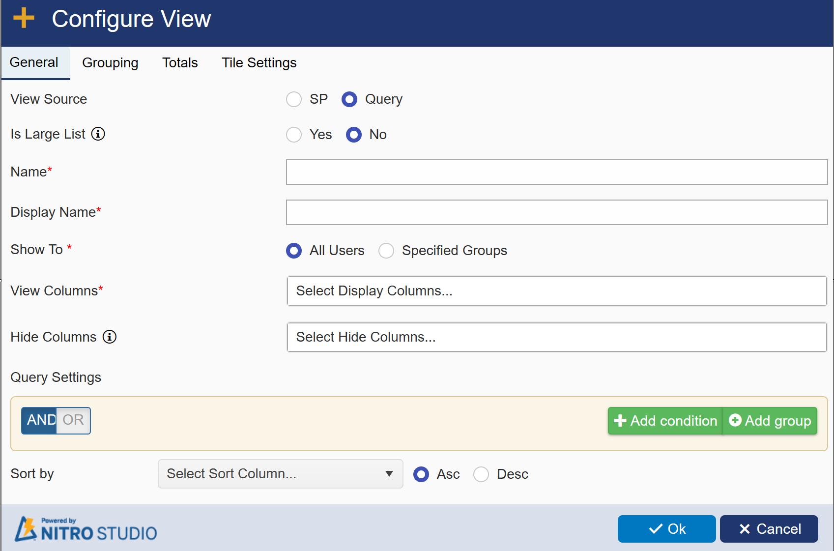
see below settings if View Source is selected as 'Query'
Query: Allows you to query for specific items from the list based on one or more conditions.
Name: Provide unique name.
View Columns: Allows you to choose which columns to display on the List View.
Query Settings: Query for list items based on one or more conditions.
Sort by: Sort the view in ascending or decending order based on selected column here.
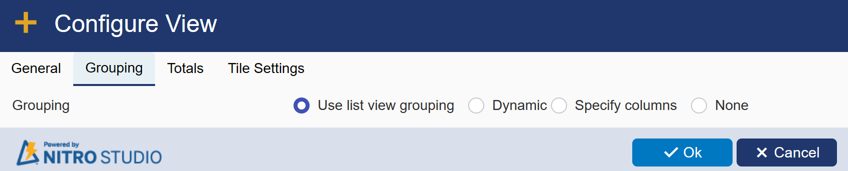
Grouping Tab:
Gives you various grouping options.
Use list view grouping: Allows you to use the grouping configuration already set in the SharePoint view configured for the List View.
Note: In order for this setting to function properly, be sure to add the column you are grouping by into "View Columns".
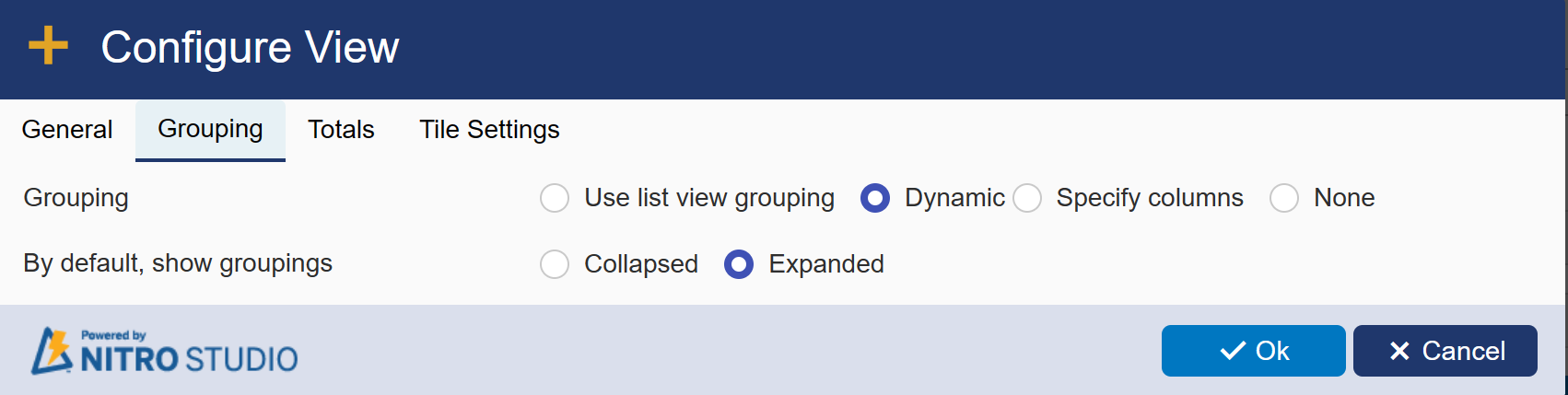
| Dynamic: Allows you to decide in real-time which column to group by on the display page for your List View. Just select and |
| drag the column you wish to group by to the blue bar at the top of the List View. It provides two options to select: Collapsed and Expended. |
 |
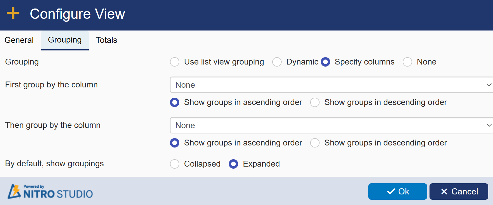
| Specify columns: Allows you to choose which column to group by. First group by the column and Then group by the column allow you to select multiple columns to group by and whether they are grouped in ascending or descending order. |
| It provides two options to show view: Collapsed and Expended. |
 |
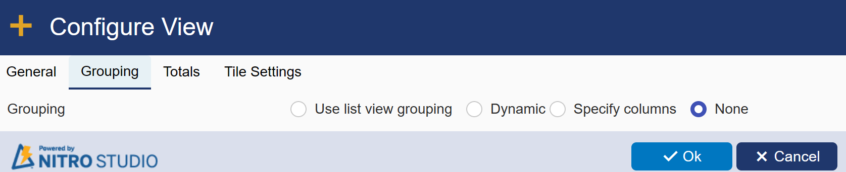
| None: If you don't want to provide any grouping then select this option. |
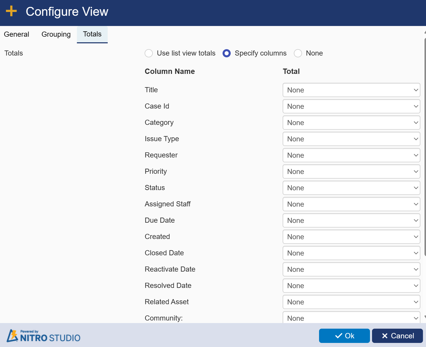
Totals: Allows you to count the number of items in one or more columns and display that number at the bottom of the List View.
It provide three options
Use list view totals: Allows you to use the totals configuration already set in the SharePoint view configured for the List View.
Specify columns: Allows you to choose which column to show totals count.
None: If you don't want to show totals then select this option.
Tiles Tab: This tab will be visible if you select Tiles in 'Show View As' of List View General tab
Tiles tab will be visible in Configure View as shown below. Enter settings in tiles tab as per requirement.
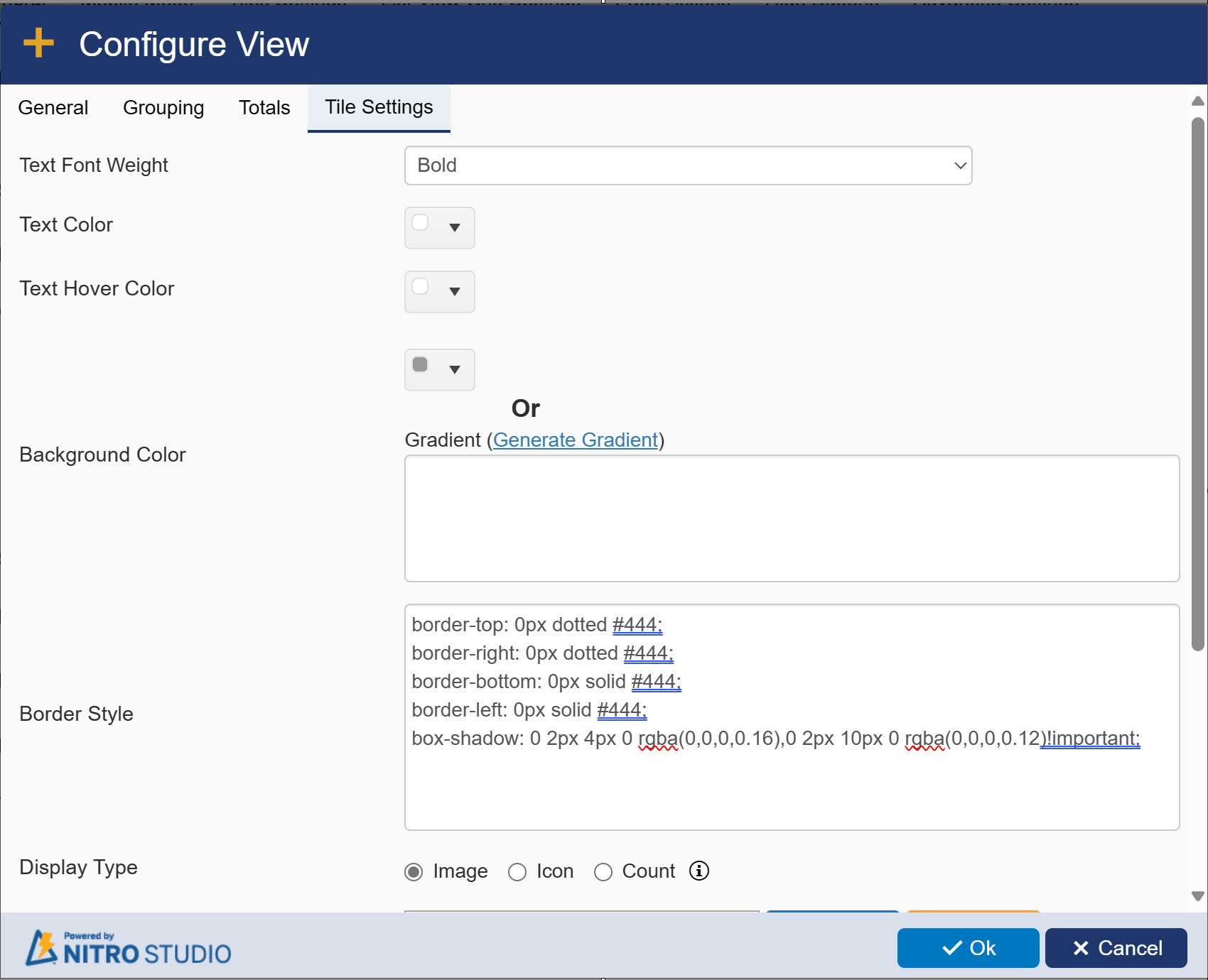
Text Font Weight: select font weight from drop-down.
Text Color: select font weight from drop-down.
Text Hover Color: select font weight from drop-down.
Background Color: select font weight from drop-down.
Border Style: Select border style as dotted or solid or both
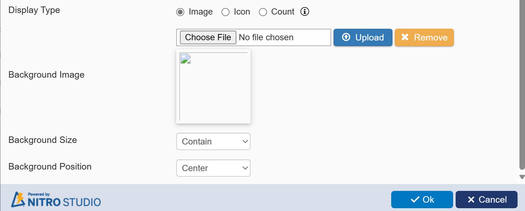
Display Type: it has three options
Image: it will display the selected image on tile. To select an image click 'Choose File' button and
then select the file and click Upload button
Background Image: it will show the above selected image here.
Background Size: it provide three options : Contain, Auto and Cover. select the option as per requirement.
Background Position: it will provide options to select the position of image on tile. Available options are: Bottom, Top, Center, Left and Right.
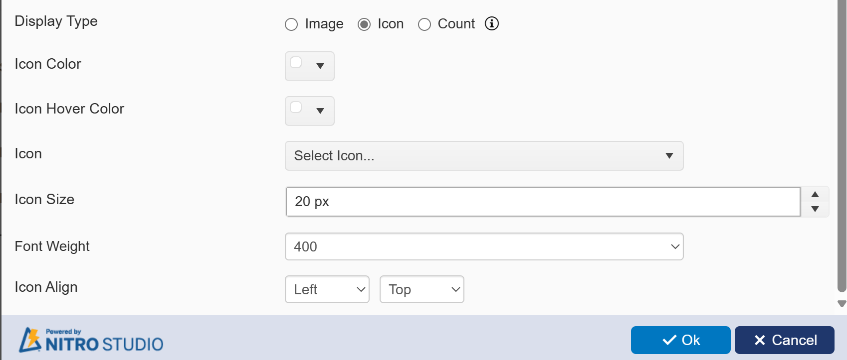
Icon: It will display the selected icon on tile. Selecting this opting makes 'Icon Color', 'Icon Hover Color', 'Icon', 'Icon Size', 'Font Weight' and
'Icon Align' fields visible. select values for these fields as per requirement.
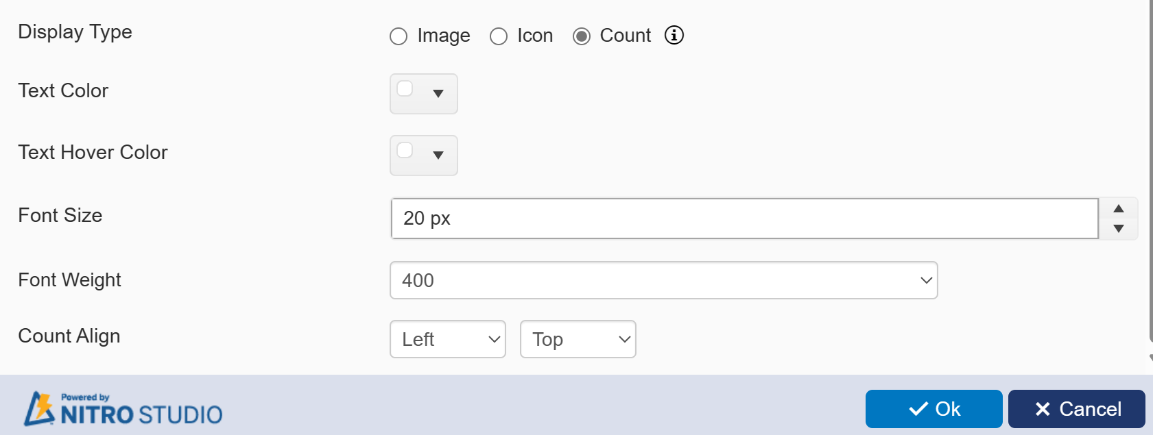
Count: it will display the count of items in selected view on tile. Selecting this opting makes ' Display Type', 'Text Color', 'Text Hover Color', 'Font Size', 'Font Weight' and 'Count Align' fields visible. select values for these fields as per requirement.
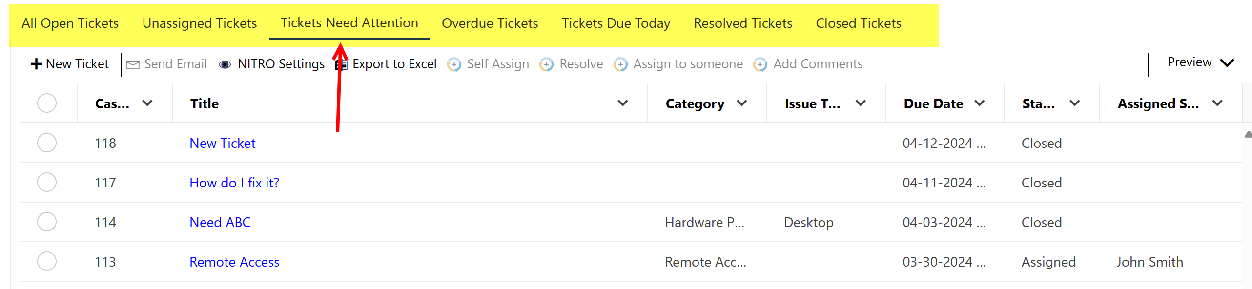
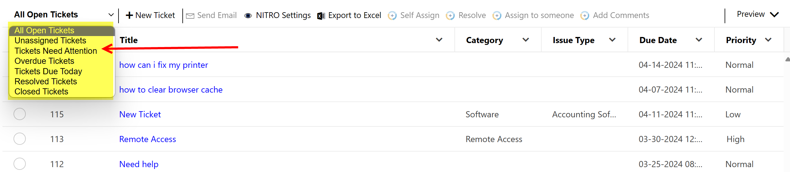
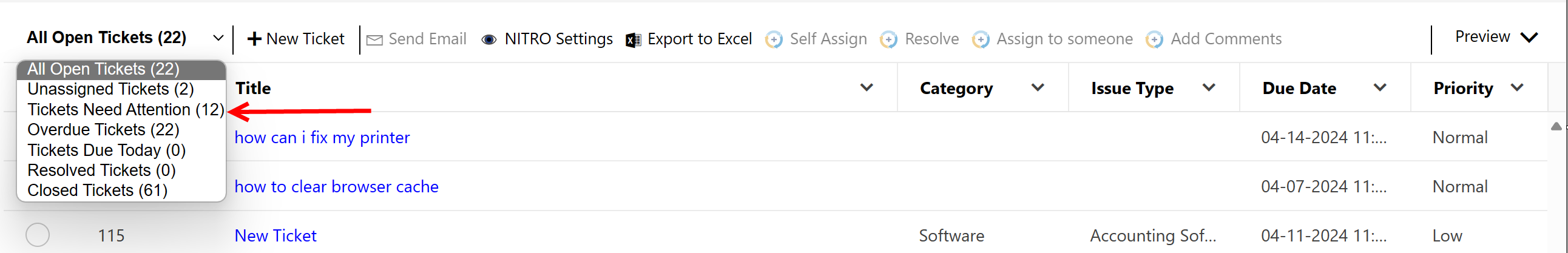
Show Views As: When selecting multiple Views, you can show the additional views using the Tabs, Dropdown or Tiles feature:
Tabs: The active tab has a Black underline.
Dropdown:
Tiles:
Show View Items Count: Shows the number of items in the selected view. This is useful for when you have multiple views configured.
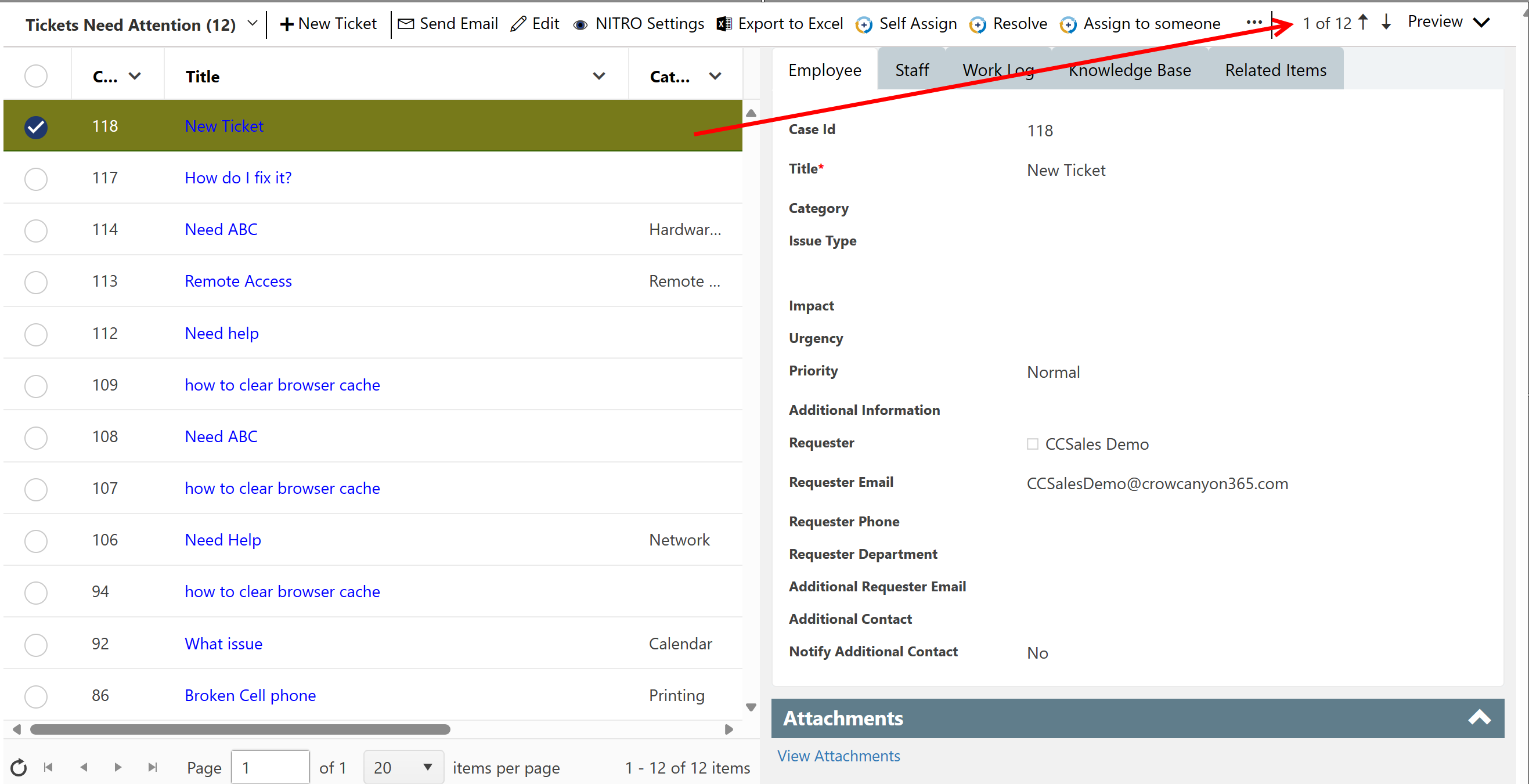
Enable Preview Pane: Allows for showing a preview of the selected item. A "Preview" option will appear on the right of the web part:
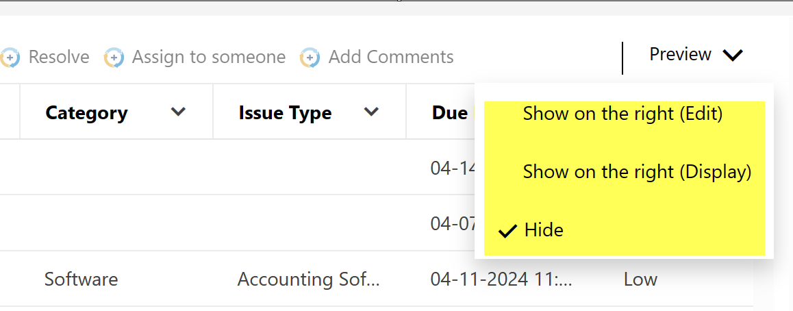
The options here will show the preview of the item in either Edit mode (i.e. the item will be editable) or Display mode (i.e. read-only) on the right of the web part. This selection is on a per user basis, so each user can select their own option.
Example:
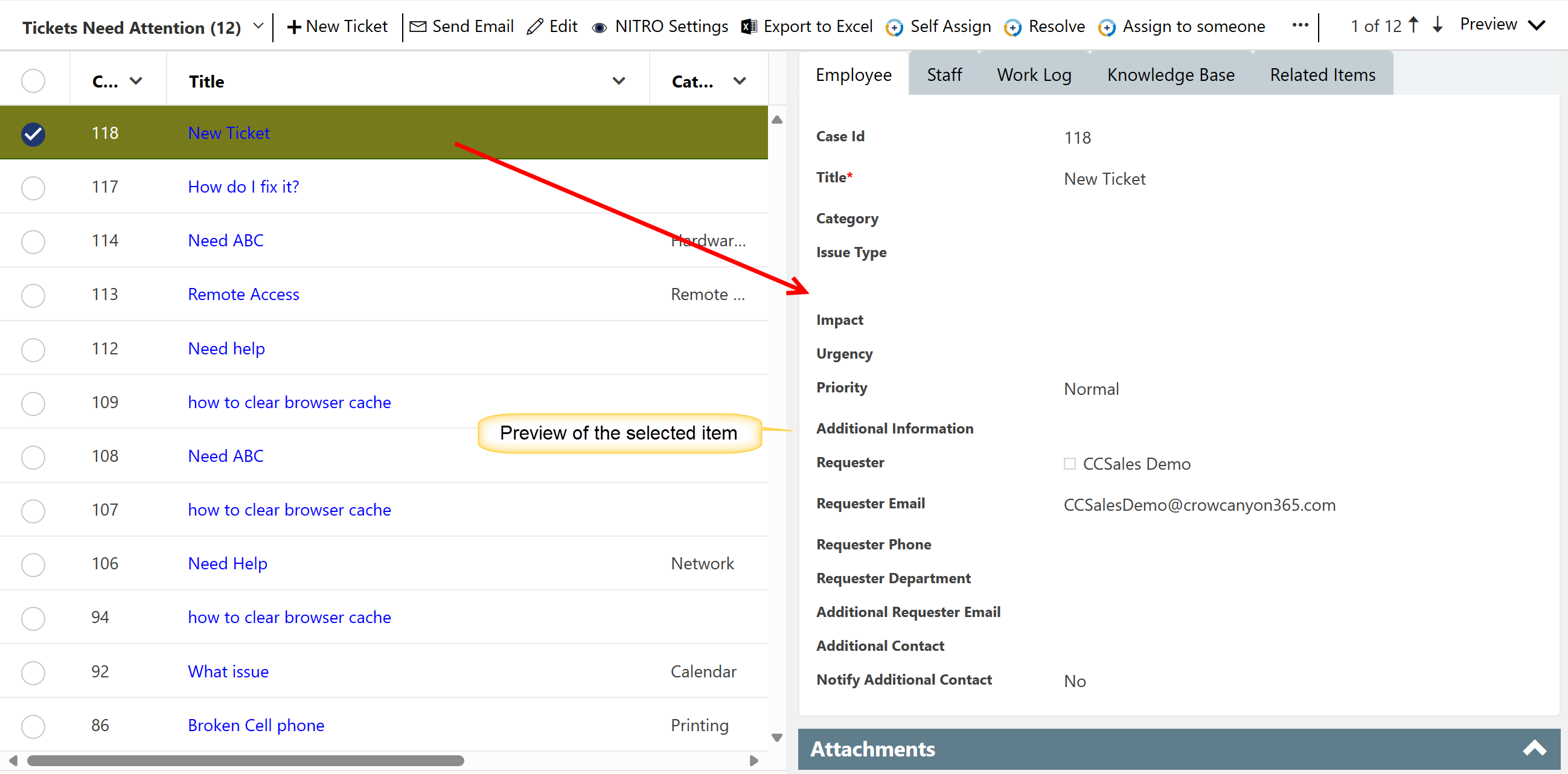
Also note that there is a way to move to the previous and next items in the list view from the preview pane. This allows for updating multiple items in sequence without needing to open item, edit, save, refresh, open next item, etc. Simply click the arrow up or down to get to the next item.
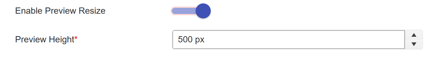
Enable Preview Resize: Allows resizing of a preview. A "Preview Height " option will appear by enabling this option.
Toolbar mode: Has two options, Standard and Compact. Will explain this with advanced settings.
Mobile Mode Tab:
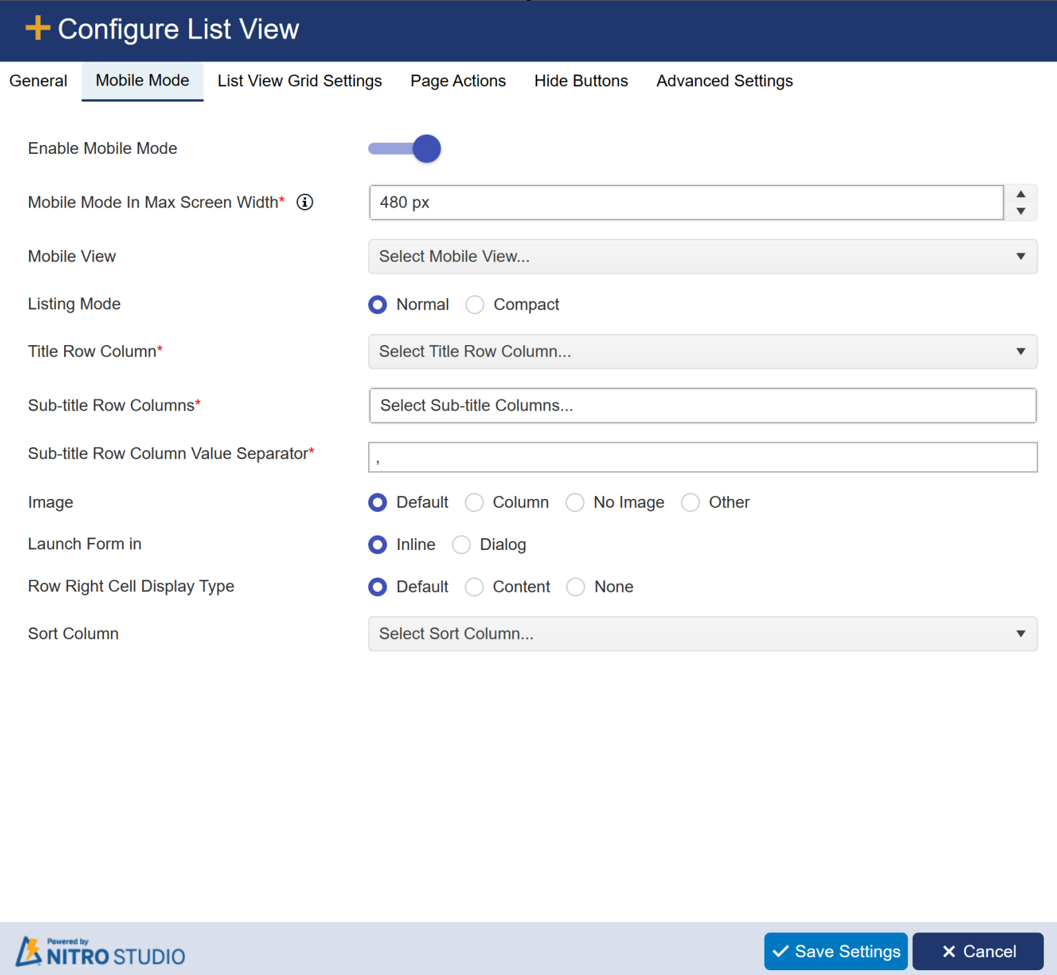
Refer Mobile Mode for more detail.
List View Grid Settings Tab
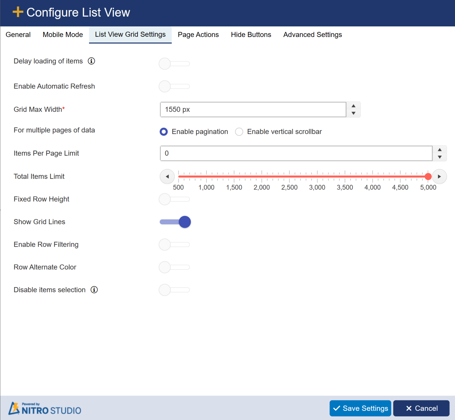
| Delay loading of items: Allows for delaying the load of the web part to speed up the overall loading of the workspace page where this list view is added |
Enable Automatic Refresh: Allows for the data to be refreshed periodically.
Grid Max Width: Max width of the list view on the web page. Default value is 1550px.
For multiple pages of data: it has two optons: 1) Enable pagination 2) Enable verticle scrollbar
Items Per Page Limit: Determines how many items to show on a page before there is pagination.
Total Items Limit: Total items to return in the view. Max is 5000 as per Microsoft standards.
Fixed Row Height: Sets the row height to be consistent.
Show Grid Lines: Shows lines in between the items when there are multiple items in the view.
Enable Row Filtering: Allows you to filter items quickly by the value in a given column.
Row Alternate Color: Alternates between white and light blue for list views with multiple items.
Disable items selection: hide checkboxes column to disallow selection of multiple items.
Page Actions Tab:
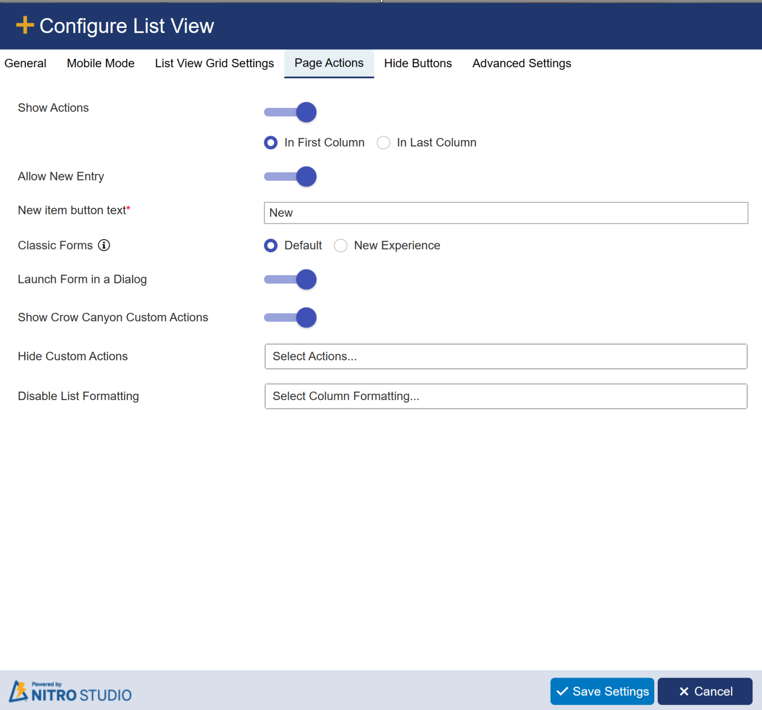
Show Actions: here you can select an option to show actions either in first column or last column
Allow New Entry: Allows you to toggle the ability to add new items to the list on and off
Classic Forms: The "New Experience" will show the modern responsive tool bar when viewing a list item. "Default" will show the Classic UI ribbon.
Launch Form in Dialog: Let's you launch the form in a dialog box over the main web page. Otherwise the list item will open on a new browser tab.
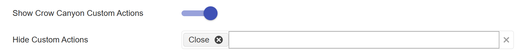
| Show Crow Canyon Custom Actions: If there are any Custom Actions configured for the list, they can appear in the ribbon with this option turned on. When this is enabled, the "Hide Custom Actions" box will appear. You can also choose to hide one or more Custom Actions from the list view. |
Disable List (Conditional) Formatting: You can choose one or more List (Conditional) Formatting settings to be disabled for this list view.
Hide Buttons Tab:
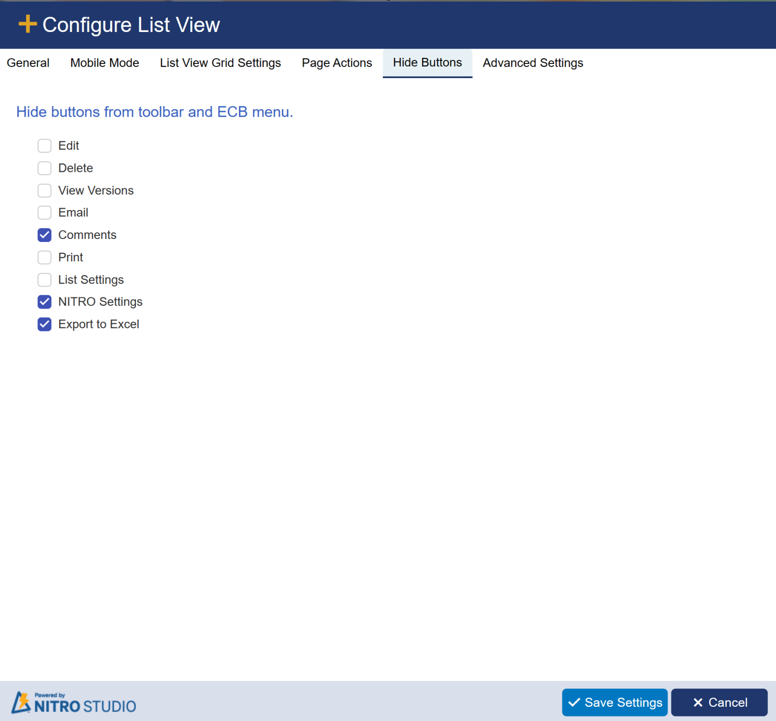
Hide Edit Button: Hides the item Edit button from the list view ribbon.
Hide Delete Button: Hides the delete button from the list view ribbon.
Hide View Versions Button: Hides the item view versions button from the list view ribbon.
Hide Email Button: Hides the Crow Canyon Email button from the list view ribbon.
Hide Comments Button: Hides the comments button from the list view ribbon.
Hide Print Button: Hides the Crow Canyon Print button from the list view ribbon.
Hide List Settings Button: Hides the button that will take the user to the List Settings page of the list.
Hide NITRO Settings Button: Hides the button that will take the user to the NITRO list view settings page of the list.
Hide Export to Excel Button: Hides the button that allows the user to export the list view data to Excel.
| Advanced Settings Tab: |
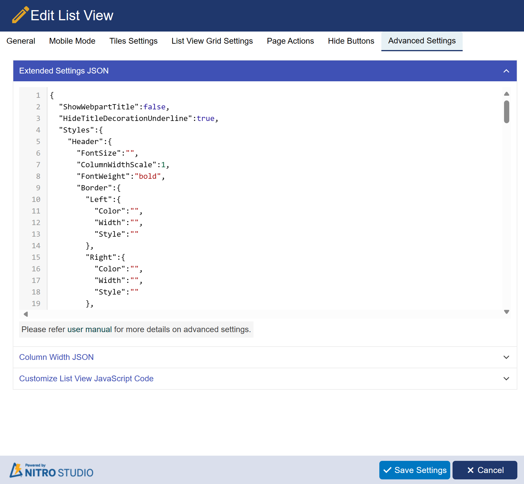 |
| Show Webpart Title |
We can show or hide the webpart title using ‘ShowWebpartTitle’ property in ‘Extended Settings’.
Set “ShowWebpartTitle” property value as ‘true’ to show the webpart title.
HideTitleDecorationUnderline: set this setting to 'true' to hide title decoration underline.
Header border, text overflow, font size, font weight, vertical padding, background color, text color, text align
We can set the header border, text overflow, background color, font size, font weight, font color, vertical padding using ‘Extended Settings’.
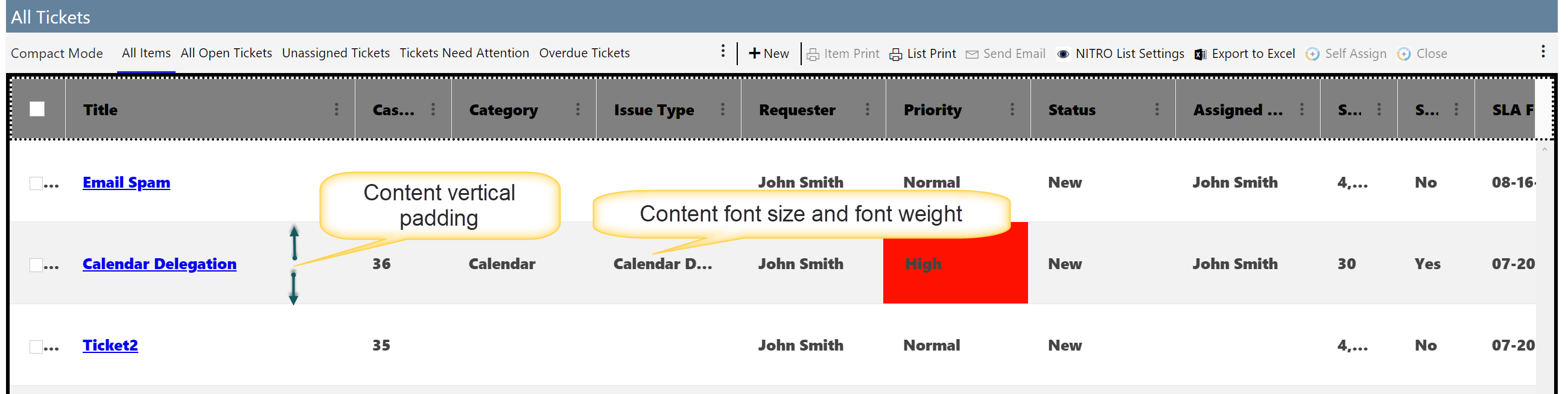
Content font size, font weight, vertical padding
We can set the content font size, font weight, vertical padding using ‘Extended Settings’.
Sample output for content extended settings
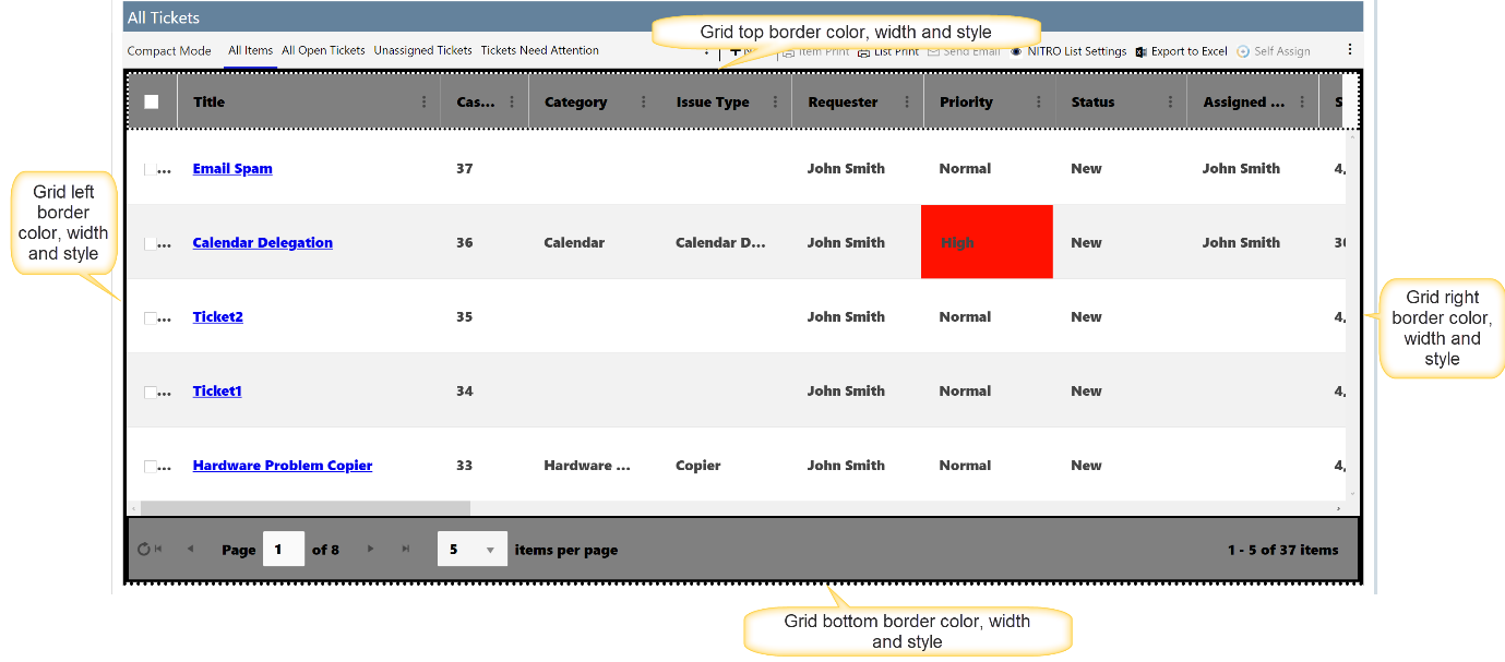
Grid border extended settings
We can set the grid border color, width and style using ‘Extended Settings’.
Sample output for Grid border
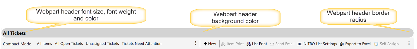
Webpart Header font size, font weight, border radius, background color and font color
We can set the webpart header font size, font weight, border radius, background color and font color using ‘Extended Settings’ .
Sample output for Webpart Header
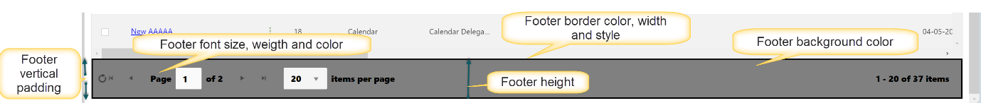
Footer border, font size, font weight, vertical padding, background color, text color
We can set the footer border, height, background color, font size, font weight, font color, vertical padding using ‘Extended Settings’.
Sample output for footer extended settings
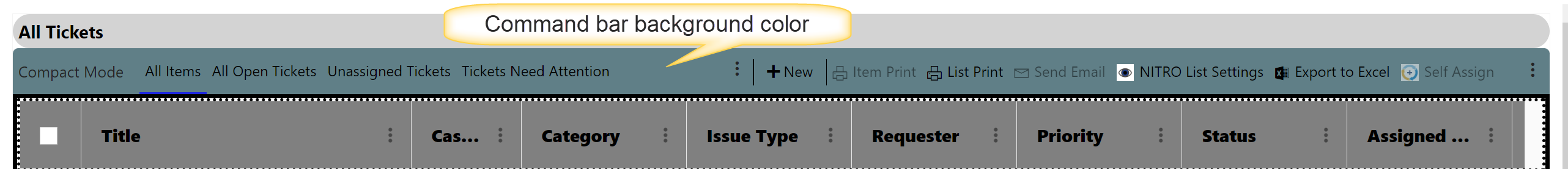
Command Bar Background color
Specify command bar background color :
Sample output for Command bar background color
HideNavigationArrowsInItemForm: to hide navigation arrow in item form, set this property value to 'true'.
HideRefreshButton: to hide refresh button in crow canyon list view, set this property value to 'true'.
DisableLookupHyperLink: to disable lookup columns hyperlink in crow canyon list view, set this property value to 'true'.
| LoadColorKPISettings: Set 'true' to load list formatting settings on crow canyon list view items. |
| LoadAssociatedItemsSettings: Set 'true' to load Associated items settings on crow canyon list view items that have associated items. |
| LoadNITROFormSettings: To apply NITRO Form settings on crow canyon list view items, set this setting value to 'true' |
| ColumnsFilterable: provide columns name here to make columns filterable in crow canyon list view. for example: |
| "ColumnsFilterable":[ |
| "Category1", |
| "RequestStatus", |
| "IssueType", |
| "Priority1"], |
MultiValuesInSeparateLines: If there are columns in list that have multiple values, then set 'true' in this setting to show multiple values in separate lines.
Toolbar Compact Mode Prefix Text
In compact mode, list view tabs and command bar are merged in one line to save vertical space.
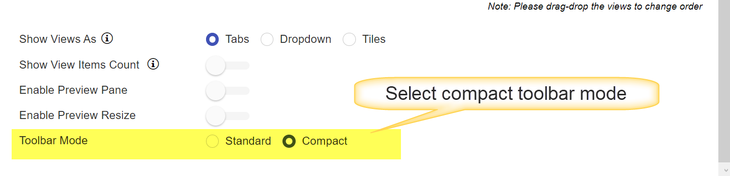
If Toolbar mode is selected as ‘Compact’ then a text can be added before the view tabs using extended setting ‘ToolbarCompactModePrefixText’.
To select ‘Compact’ mode in toolbar, go to the site -> Site Settings -> Crow Canyon List View -> Create/Edit existing list view definition and select the ‘Compact’ mode as shown below:
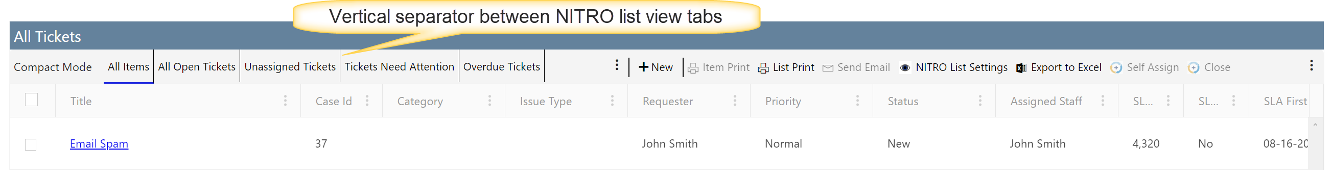
Vertical separator between tabs
In NITRO list views, we can show the configured list views as ‘Tabs’ or in a ‘Dropdown’.
This setting is applied only when we select ‘Tabs’ option in ‘Show Views As’.
Output With vertical separator between Tabs:
ItemSelectionControl: here you can set the property value to 'Radio' or 'Checkbox' as per requirement.
HeaderColumnMenuIcon: here set the value to 'Arrow' if you want to shown header column menu icon as arrow else it will show three dots.
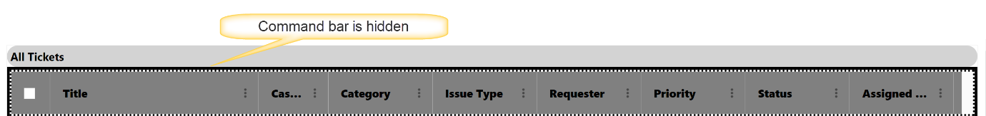
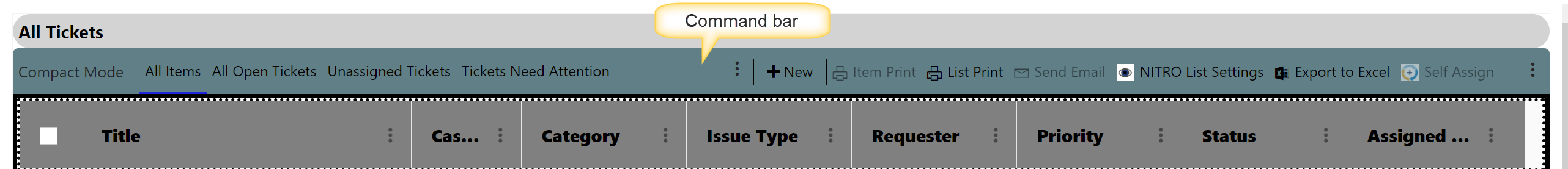
Hide Command Bar
By default, command bar is visible. To hide command bar, set hide to ‘true’ in extended settings.
Sample output for hidden command bar
Sample output when command bar is visible
HideWebpartWhenNoItems: set this property to 'true' to hide webpart when crow canyon list view has no item.
DisableTitleUnderline: set this property to 'true' to disable title underline.
TitleColor: set color value for Title here.
SelectedTabStyles: set this prperty value as per requirement.
HideSearchButton: set this property value to 'true' to hide search button in crow canyon list view.
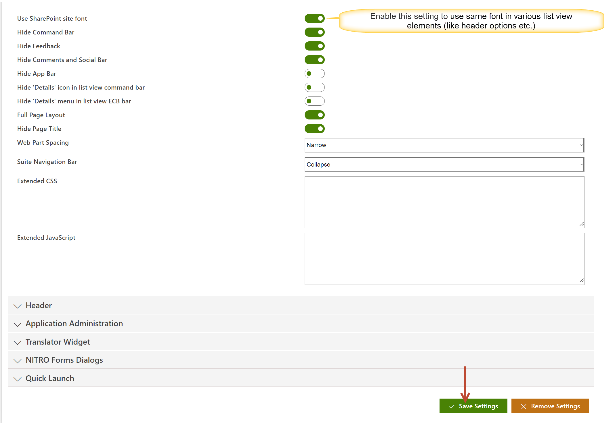
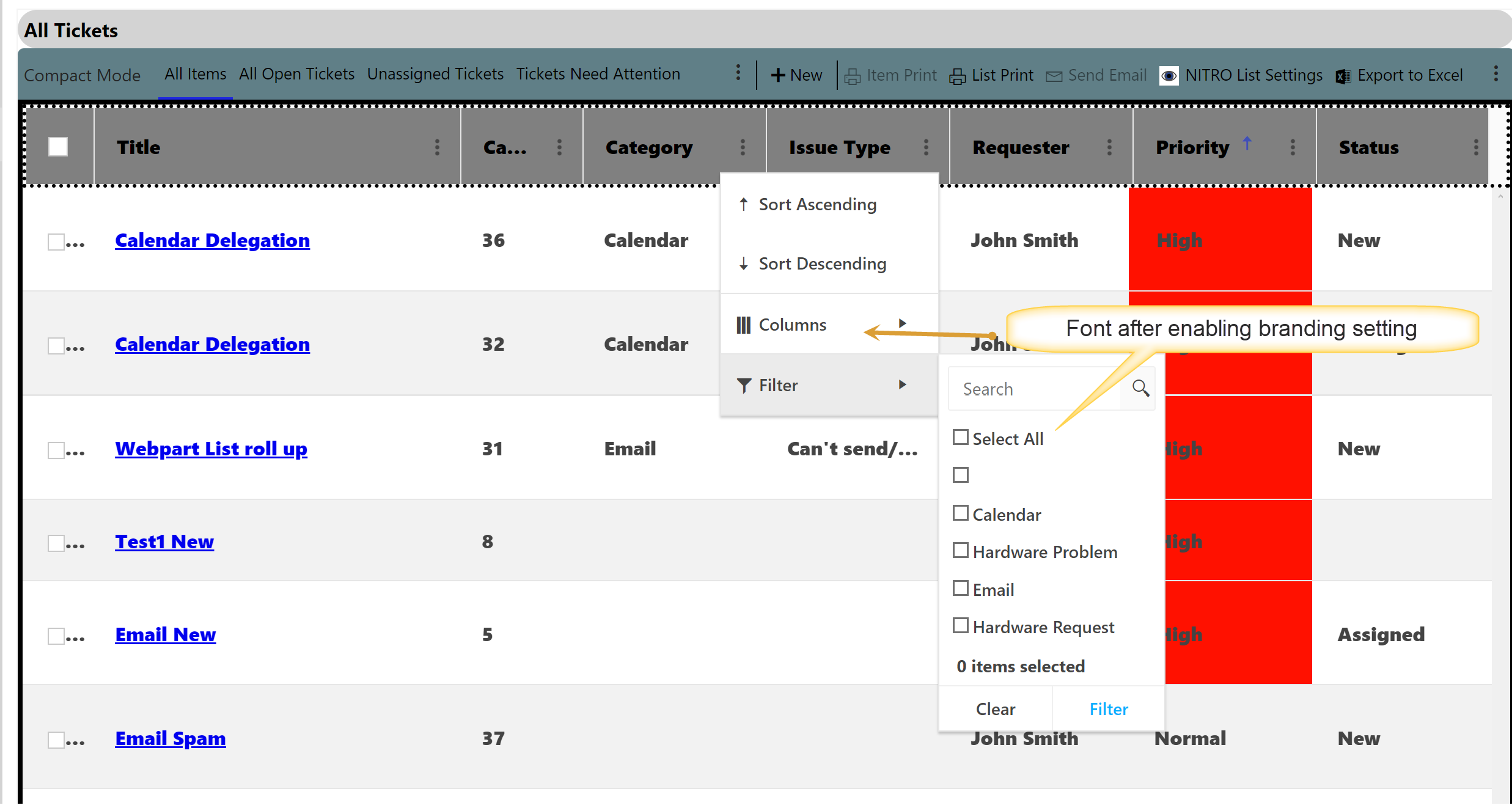
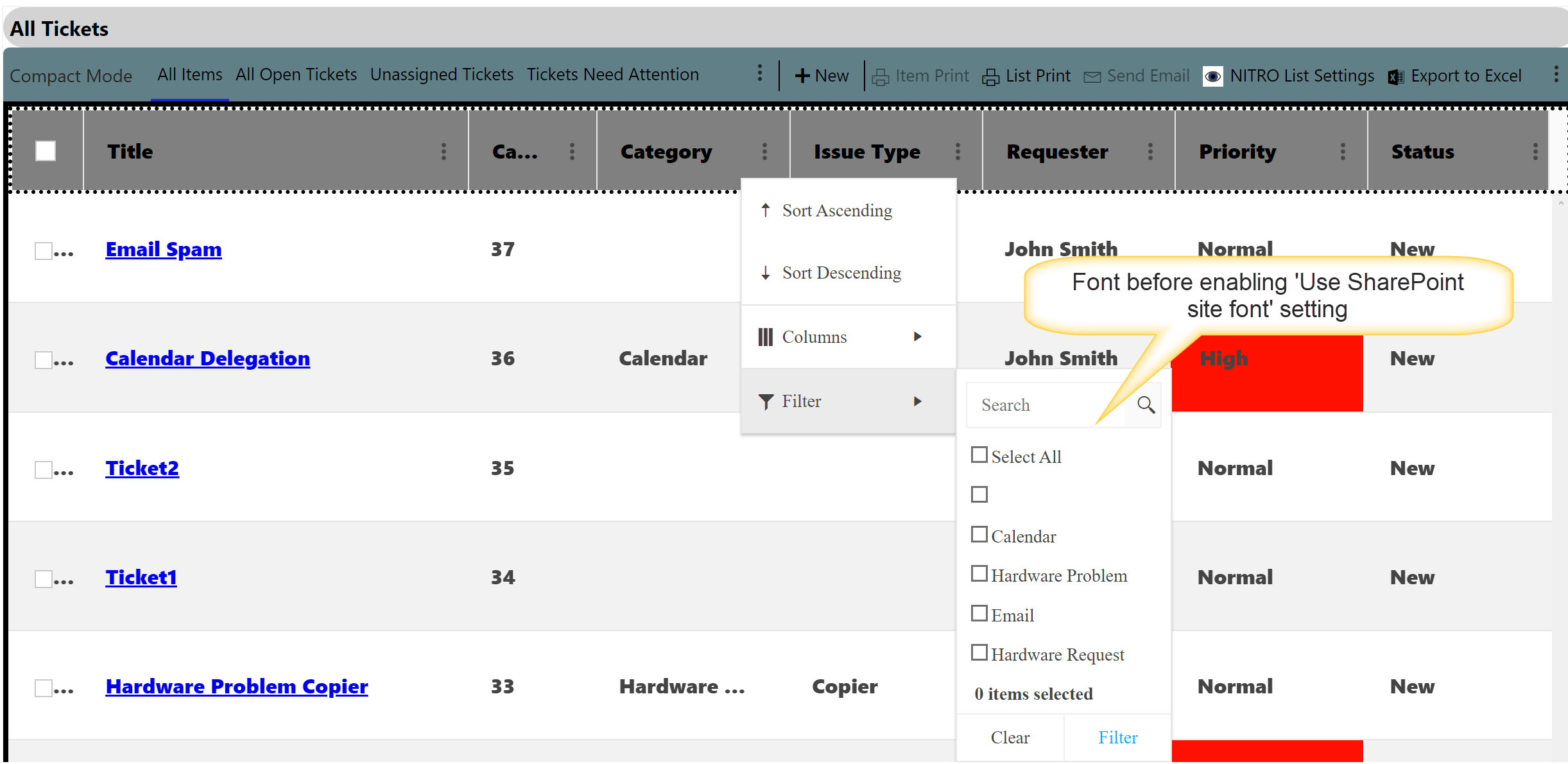
Consistent Font in List view
To use same font in various list view elements (like header options etc.), enable ‘Use SharePoint site font’ setting in the NITRO Modern UI Branding settings.
Go to SharePoint Site -> Site settings -> Crow Canyon NITRO Apps -> Modern Branding
Sample output after enabling ‘Use SharePoint site font’ setting in branding
Sample output before enabling ‘Use SharePoint site font’ setting in branding
| Refer Crow Canyon List View Advanced Settings for more detail. |
| Column Width JSON: Allows you to define the width of each column in the view using pixels. |
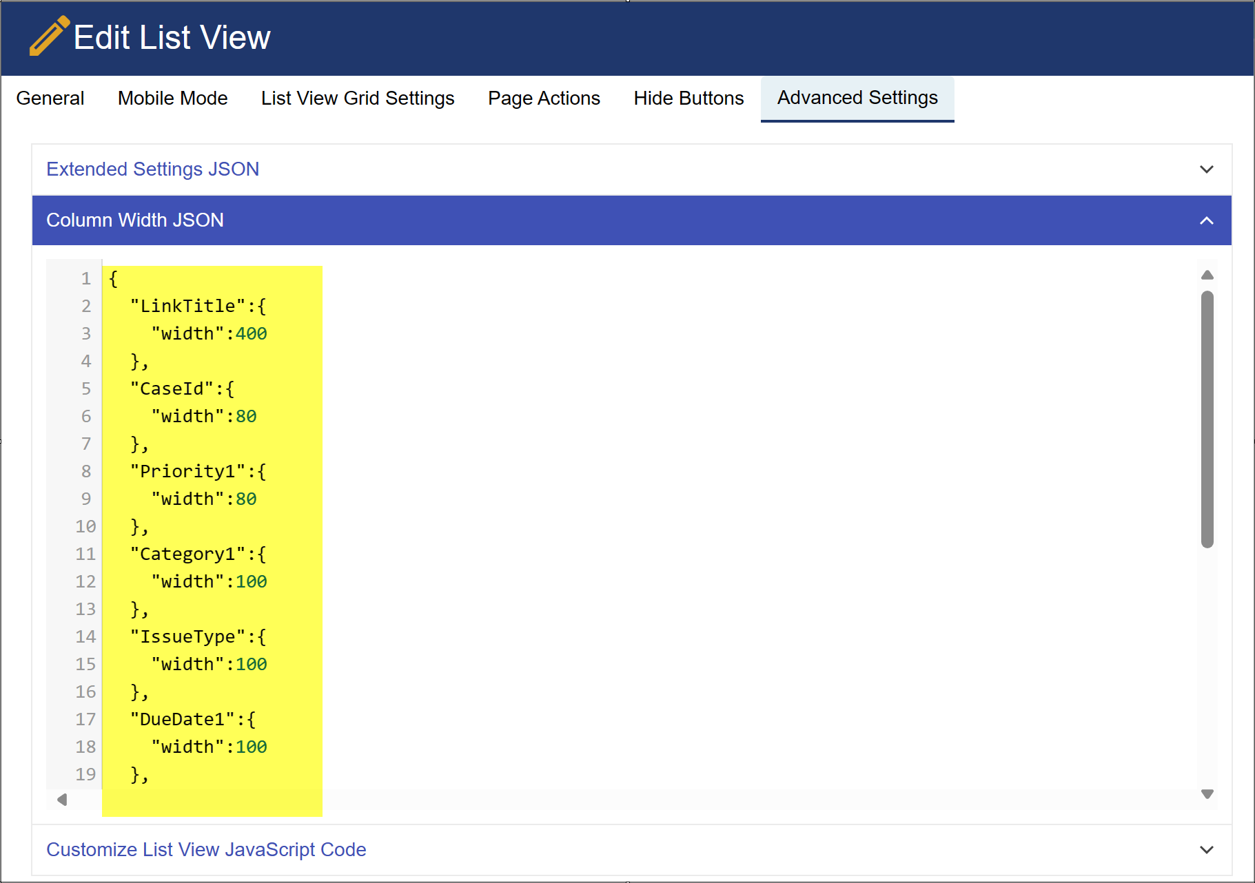 |
| Refer Column Width And Text Overflow In Crow Canyon List Views Article for more detail. |
Customize List View JavaScript Code: Allows you to add additional custom JavaScript to the list view when it's rendered on the page.
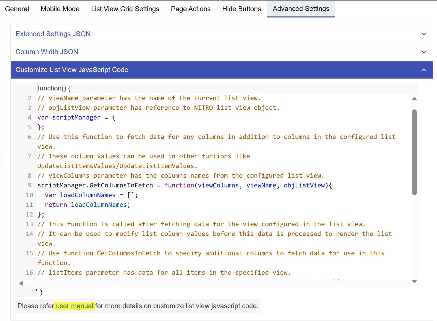
Refer Customize Crow Canyon List View Using JavaScript Code Article for more detail
Refer Configure Gantt Chart In Crow Canyon List Views for more detail.
| Refer Troubleshooting Crow Canyon List View/List Rollup for more detail. |
| Refer Configuring Permissions For List Views In Crow Canyon for more detail. |
| Refer How To Add A List View Web Part To A Workspace (Web Part Page)? for more detail |