Tiles are typically used on either dashboard pages or home pages to present some quick info about list data in the site or across multiple sites. This works well in conjunction with Dials, NITRO Reports, and List Views for a snapshot of the underlying list data.
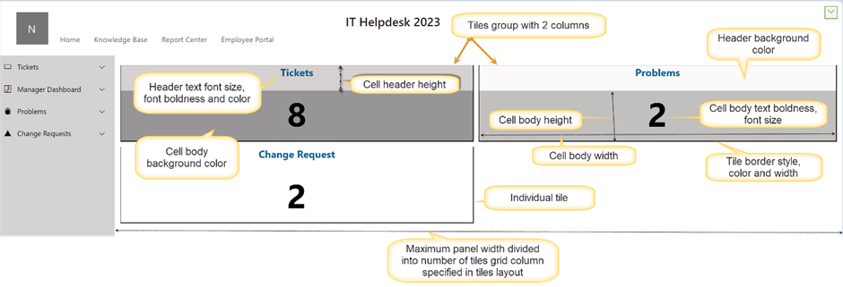
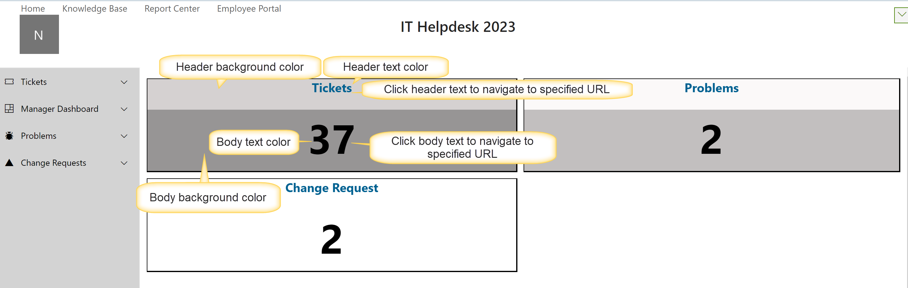
Each tile represents a list view, with the number corresponding to the number of SharePoint list items in that view. Tiles are typically grouped together with any number of them in one row. Here is how you configure a tiles group:
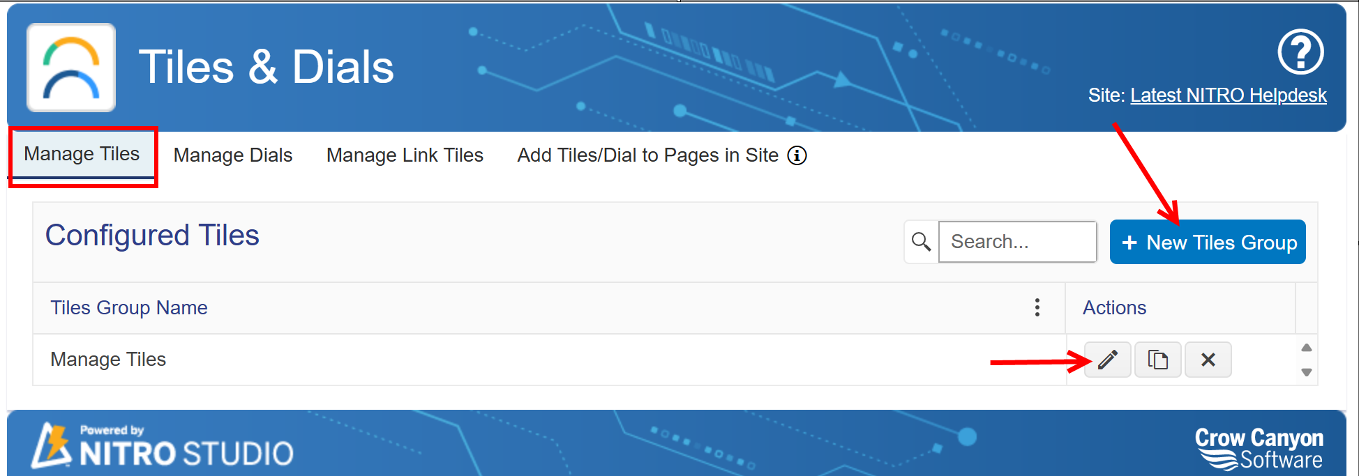
Either edit an existing tiles group or click on New Tiles Group...
...which brings you to this screen:
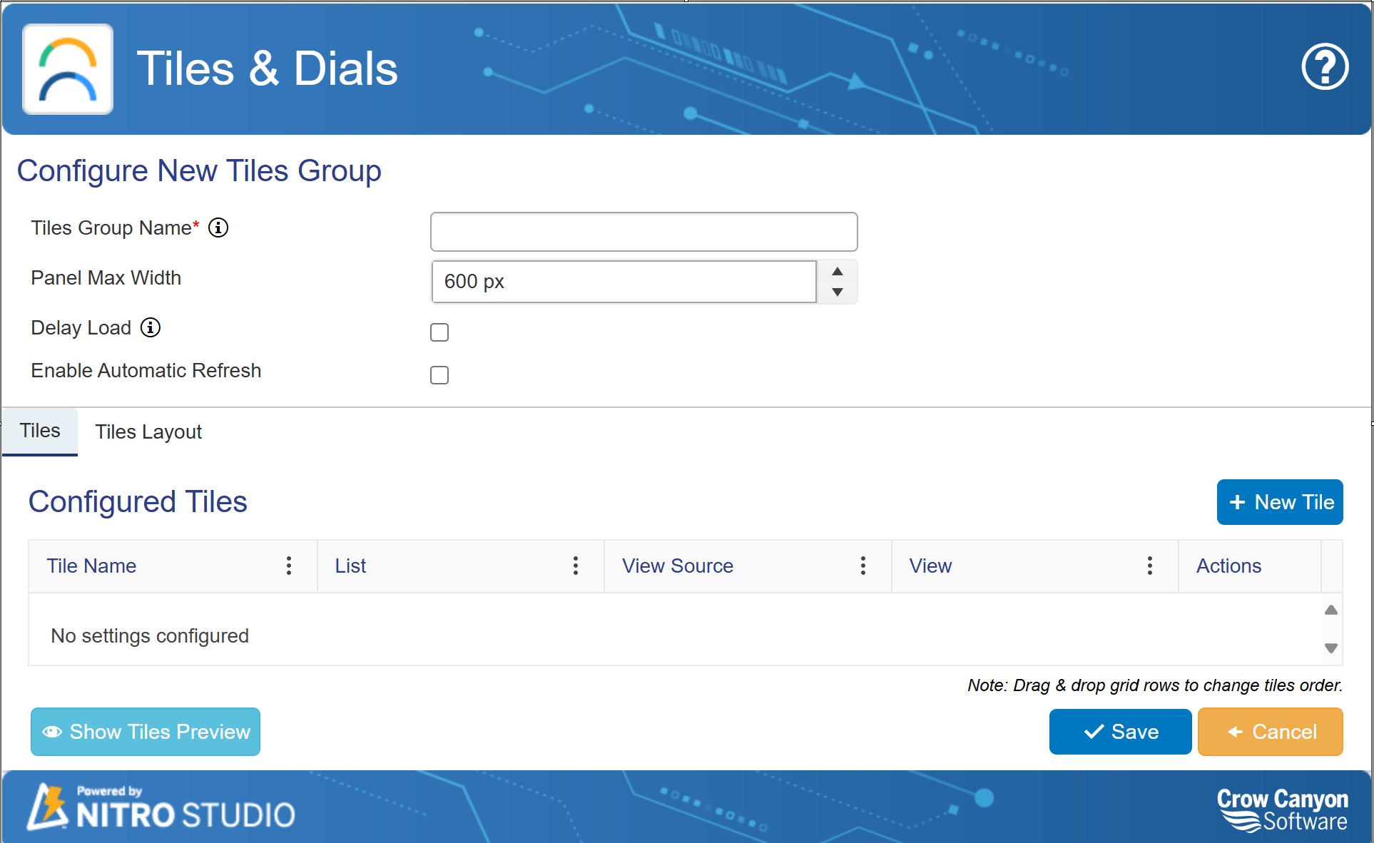
Tiles Group Name: Required. You can refer to this group name when adding the group to a workspace page
Panel Max Width: Required. Default is 600px. Sets the maximum value for pixels across on the screen. If the number of tiles extends beyond the pixels, you will get a horizontal scroll bar.
Delay Load: Allows for delaying the load of the web part to speed up the overall loading of the workspace page where this tiles group is added
Enable Automatic Refresh: Will refresh the data of the tiles group periodically
Configured Tiles: Shows currently configured tiles with the corresponding list and corresponding view associated with each tile. You can edit or delete tiles under the "Actions" column
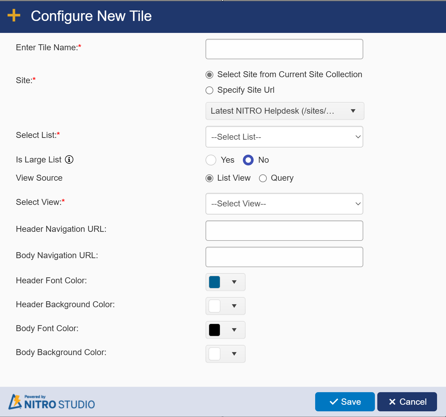
New/Edit Tile Screen
Sample Configuration:
Sample output:
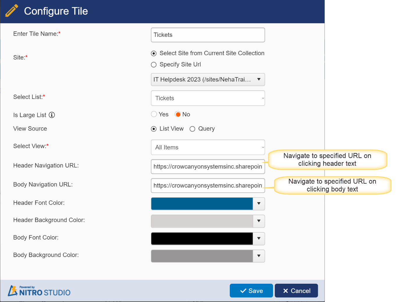
Enter Tile Name: Required. This will be the name shown on the Configure New Tiles Group screen and in the Header Text of the tile.
Site: Required. You can pull data from a list within the current Site, Site Collection, or Tenant/Web Application.
Select Site from Current Site Collection: Shows a dropdown of all sites, including the root site, within the current Site collection
Specify Site Url: Allows you to add your own URL to access a site in another Site Collection within the Tenant/Web Application. Note: the current logged in user will need at least read permissions on the selected site to set up this tile.
Select List: Required. Shows all Lists within the selected site. This will be the list used for the tile.
Is Large List: Use this option if list has large number of items and tiles does not work due to list view threshold error.
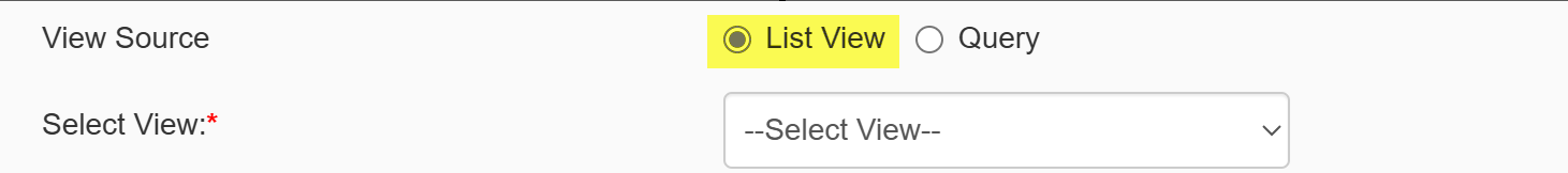
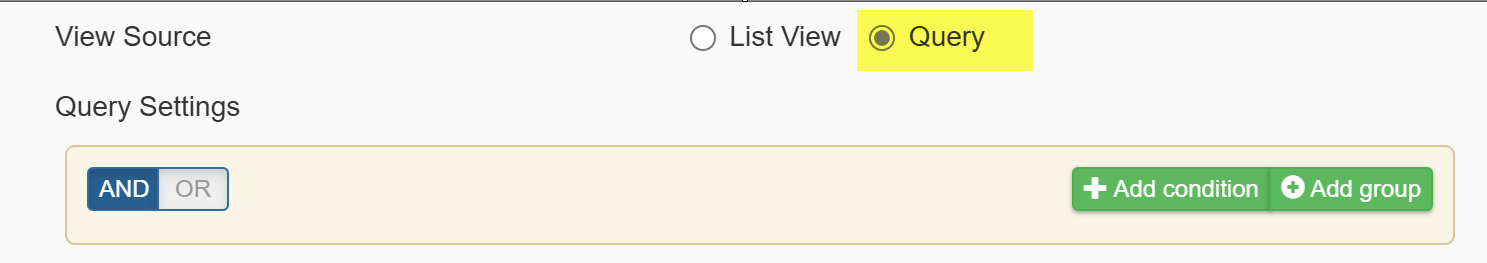
View Source: It provides two options
1. List View: if this option is selected, below column will be visible.
Select View: Required field. Shows all views for the selected list. This will be the view used to filter the data, and the tile will return the count of all items in that view. For example, if you want your tile to show all overdue tasks, make sure you have a view already created that will show all overdue tasks (e.g. with the filter of Due Date is less than [Today]).
2. Query: use this option to fetch items from the list based on specified conditions
Header Navigation URL: Optional. This will allow users to click the header section of the tile. In practice, this is usually a link to the specific view selected in the "Select View" option.
Body Navigation URL: Optional. Typically the same URL as the Header Navigation URL.
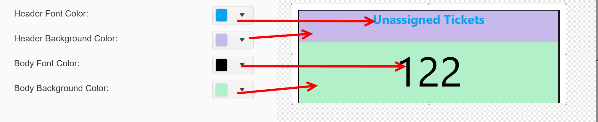
For the next four, please see the example below as well.
Header Font Color: The color of the header text on the tile (the text specified in the "Enter Tile Name" section), in RGBA format. Default value is rgba(0, 97, 145, 1).
Header Background Color: Can be used to create contrast with the Header Font and/or Body Background Color.
Body Font Color: The color of the number displayed on the tile in RGBA format. Default value is rgba(0, 0, 0, 1).
Body Background Color: Can be used to create contrast with the Body Font and/or Header Background Color.
Tiles Layout
This determines the overall layout of the Tiles Group. Each Tiles Group can have a different layout.
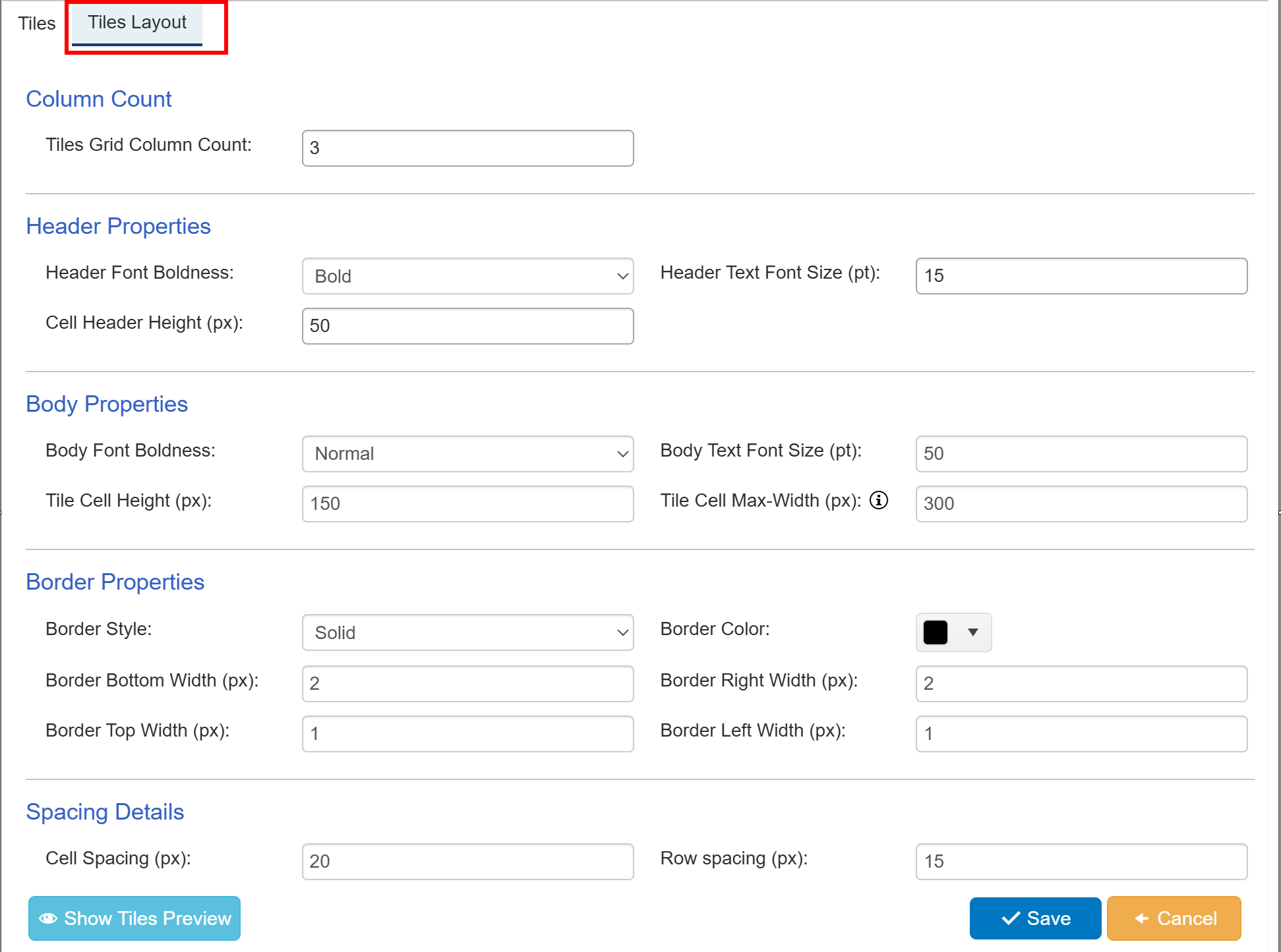
Column Count
Tiles Grid Column Count: The number of tiles that will show horizontally across the screen before wrapping to a new line.
Header Properties
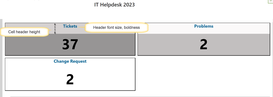
Header Font Boldness: Choose whether to show the header text as Bold or Normal. Default is Bold.
Header Text Font Size (pt): Font size for the header text. Default is 15.
Cell Header Height (px): Vertical height of the header in pixels. Default is 50.
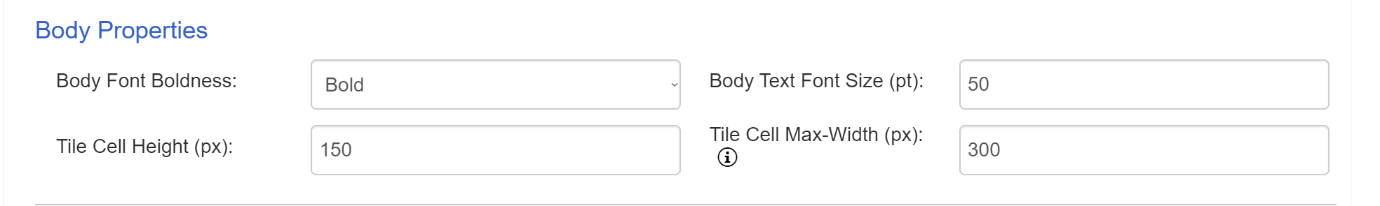
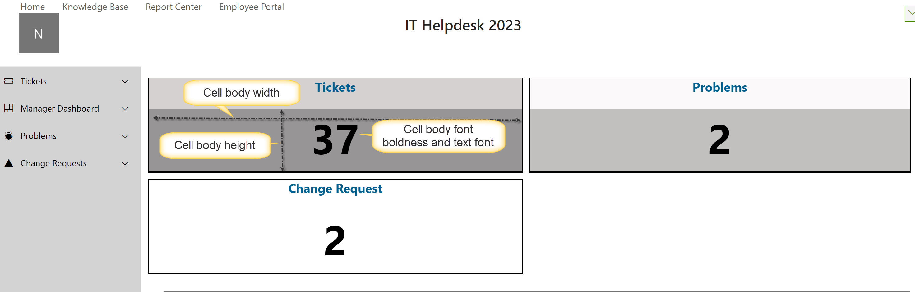
Body Properties
Body Font Boldness: Choose whether to show the body (number) as Bold or Normal. Default is Normal.
Body Text Font Size (pt): Font size for the body (number). Default is 50.
Tile Cell Height (px): Vertical height of the body section in pixels. Default is 150.
Tile Cell Max-width (px): Sets the width of the cell if Panel Max Width is not specified. Default is 300.
Sample output of tiles layout
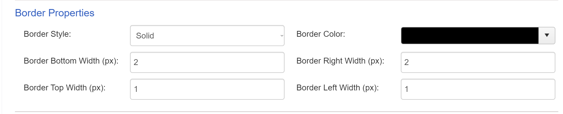
Border Properties
Border Style: Sets the border of each tile to be Solid or Dashed. Default is Solid.
Border Color: Sets the color of the border around each tile. Default value is rgba(0, 0, 0, 1).
Border Bottom Width (px): Sets the pixel size of the bottom border of each tile. Default is 2.
Border Right Width (px): Sets the pixel size of the right border of each tile. Default is 2.
Border Top Width (px): Sets the pixel size of the top border of each tile. Default is 1.
Border Left Width (px): Sets the pixel size of the left border of each tile. Default is 1.
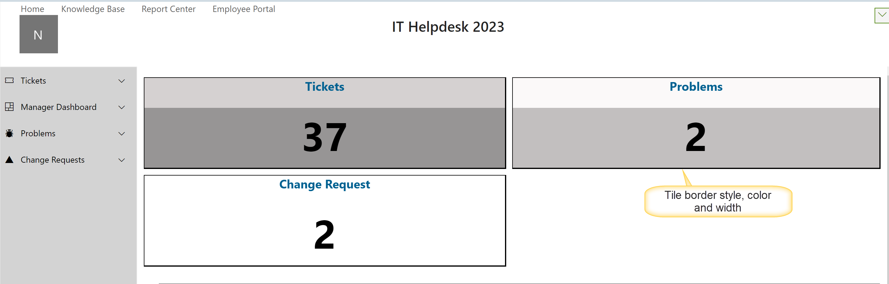
The above defaults create a slight shadow-box effect for the tiles creating some depth to the page. You can play around with the pixel sizes to enhance or decrease this effect.
Configure border properties as below
Sample output of border properties
Spacing Details
Cell Spacing (px): The amount of space in pixels between each tile. Default is 20.
Row Spacing (px): The amount of space in pixels between each row in the tile group (applies when the number of tiles exceeds the "Tiles Grid Column Count"). Default is 15.
When done configuring tiles, you can add the tiles group to either a Classic UI page (SharePoint 2013 and above, and some M365 customers) or to a Modern UI Page (M365).