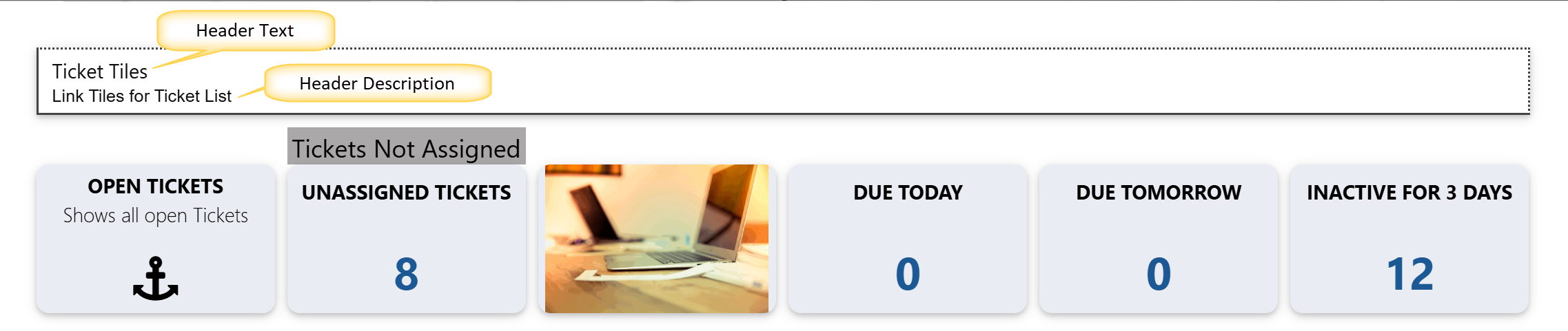
Link tiles are used to display an array of links in a stylized way. One prime example from our NITRO Portal page is the array of Quick Ticket links on the home page:
Each tile can be configured to do different things. You can have a hyperlink to a form, a hyperlink to a webpage, or display custom content. In addition, with any of the above options you can add your own custom JavaScript to a tile. Each tile is intended to "do" something when clicked, whether that is linking to another page or site or running custom code. While you can configure a link tile to look the same as one of our tiles from the Tiles section, you should also have a link or some content behind it as well.
Either edit an existing Link Tiles Group or click on a New Link Tiles Group...
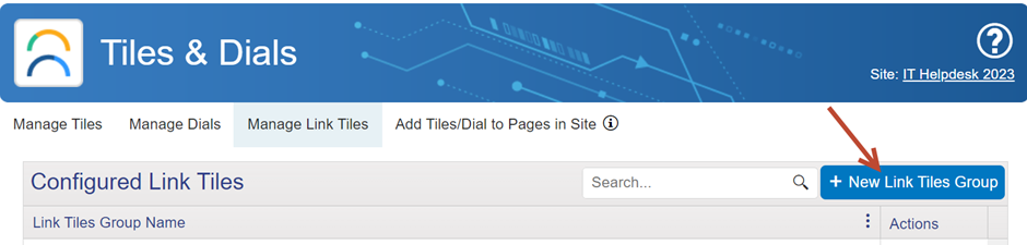
...which brings you to this page:
Sample Configuration:
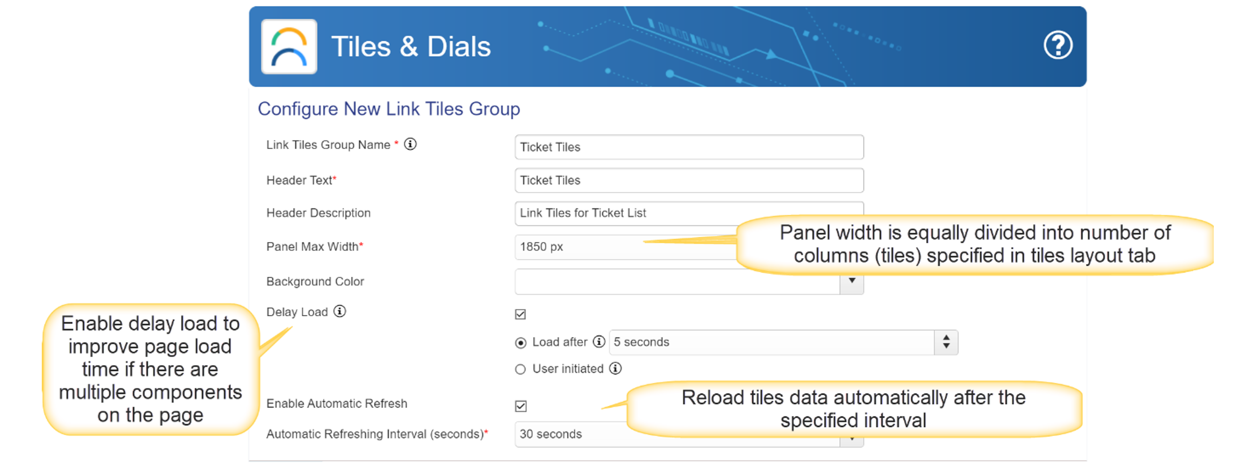
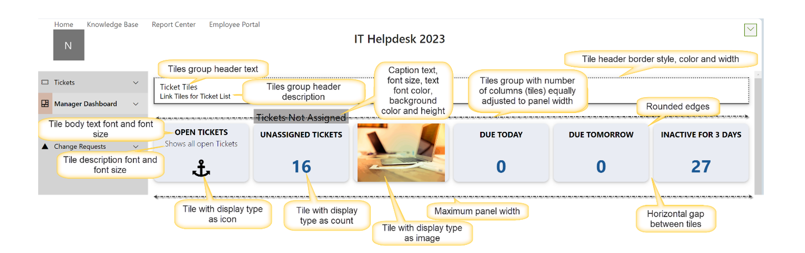
Link Tiles Group Name: Required. You can refer to this group name when adding the group to a workspace page.
Header Text: Text that displays in the header of the group
Header Description: Text that displays below the header above the link Tiles
Panel Max Width (px): Panel width is equally divided into number of columns (tiles) specified in tiles layout tab. Default is 600.
Background Color: The color that will appear behind the web part. Can be used to contrast this web part with other web parts on the page, or to match existing branding standards. Default is white (rgba(255, 255, 255, 1)).
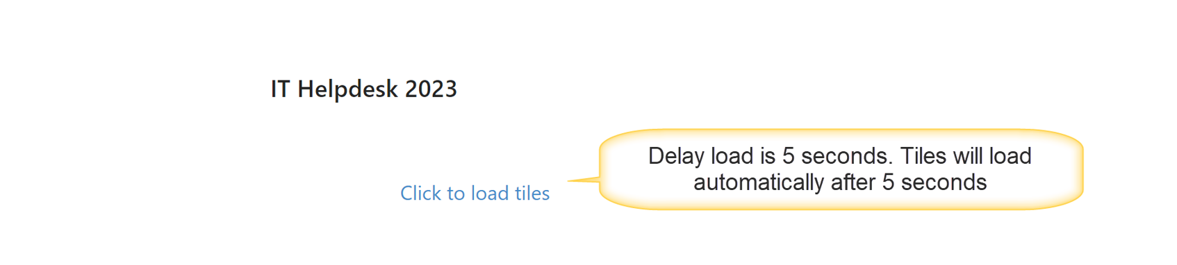
Delay Load: Allows for delaying the load of the web part to speed up the overall loading of the workspace page where this link tiles group is added.
Enable Automatic Refresh: Will refresh the links periodically.
Configured Link Tiles: Shows currently configured tiles with the Tile Type for each tile. You can edit or delete tiles under the "Actions" column.
New/Edit Link Tile Screen
General Tab:
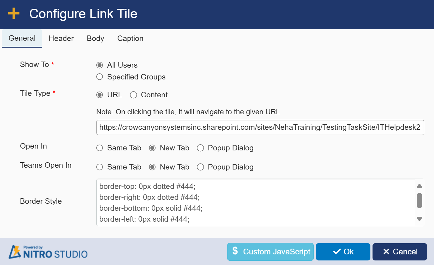
Show to: Link Tiles can be security-trimmed based on the users SharePoint Group membership. This allows you to hide or show tiles to groups of users.
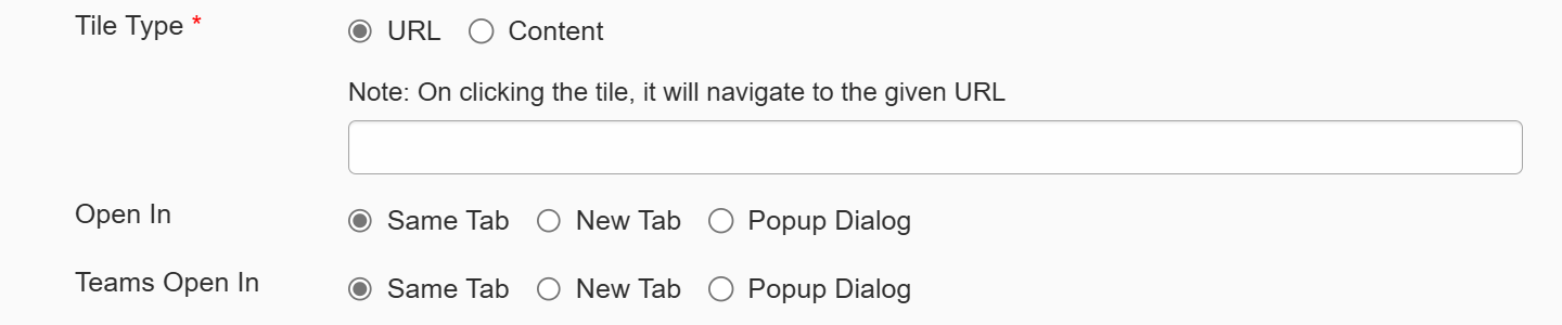
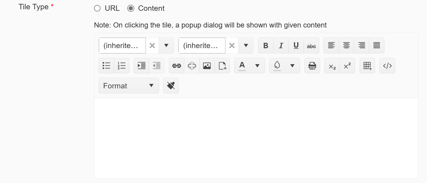
Tile Type: URL or Content
URL: The tile becomes a hyperlink to the URL specified here. You can choose to open this in the Same [browser] Tab, New [browser] Tab, or in a Popup Dialog. You can choose to open this in teams in the Same Tab, New Tab, or in a Popup Dialog.
Content: The tile can display content based on what is entered into the Rich Text Editor
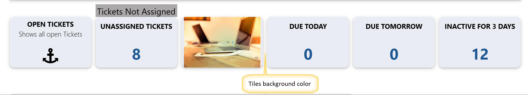
Border Style: Sets the size, in pixels, for the border on the top, bottom, right, and left of the tile. You can also configure a shadow for the tile to give it more depth. The default values are shown here:
border-top: 0px dotted #444;
border-right: 0px dotted #444;
border-bottom: 0px solid #444;
border-left: 0px solid #444;
box-shadow: 0 2px 4px 0 rgba(0,0,0,0.16),0 2px 10px 0 rgba(0,0,0,0.12)!important;
Header Tab:
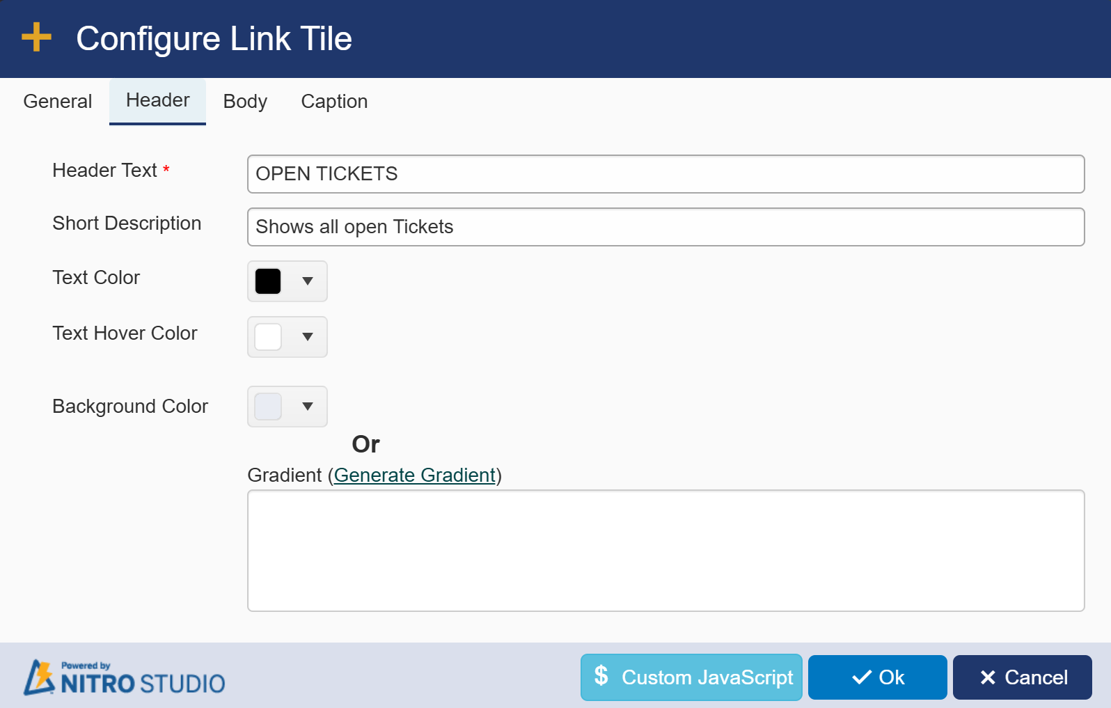
Header Text: This will be the header on the tile itself.
Short Description: Text that will appear below the header on the tile. One note of caution; if you use this feature AND the image or icon feature, your text may obscure the image or icon.
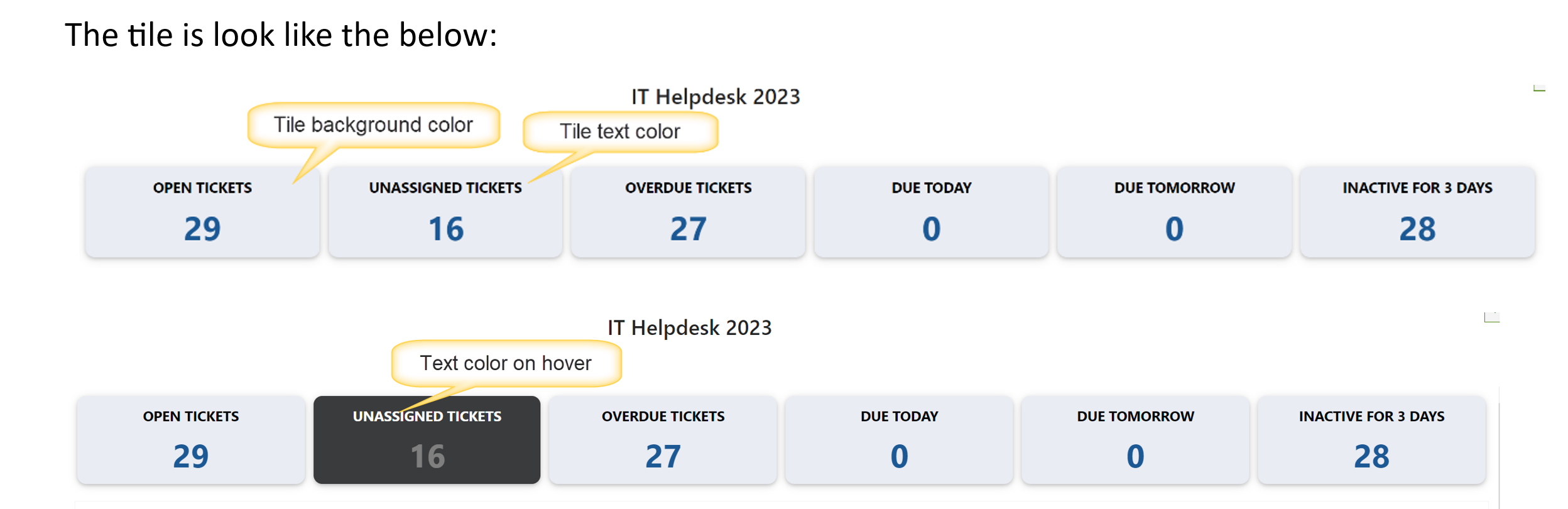
Text Color: The color of the Header Text and the Short Description that appears on the tile. Default is white (#ffffffff).
Text Hover Color: Select link tile header text hover color from dropdown. Default is white (#ffffffff).
Background Color: The underlying color of the tile. Make sure your Text Color and Background Color have enough contrast to be visible (e.g. white or light colored Text Colors work well on black or dark Background Colors). Default is gray (#999999ff).
| Generate Gradient: Instead of a solid color, you can choose to generate a gradient from the standard gradient generator at https://www.colorzilla.com/gradient-editor/. Once you create your gradient, copy and paste the code from the Colorzilla website back into the Generate Gradient box. |
| Sample Output: |
 |
Body Tab:
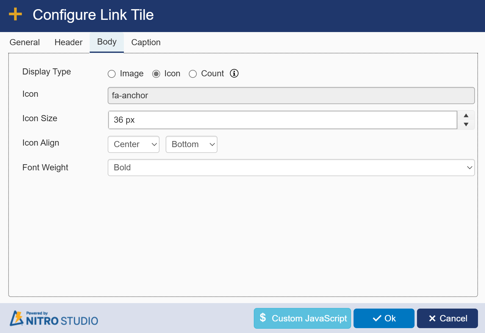
Display Type: You can choose to show an Image, an Icon (the stock icons loaded with NITRO are from Font Awesome: https://fontawesome.com/), or a count.
Image: Allows you to upload an image from your local machine.
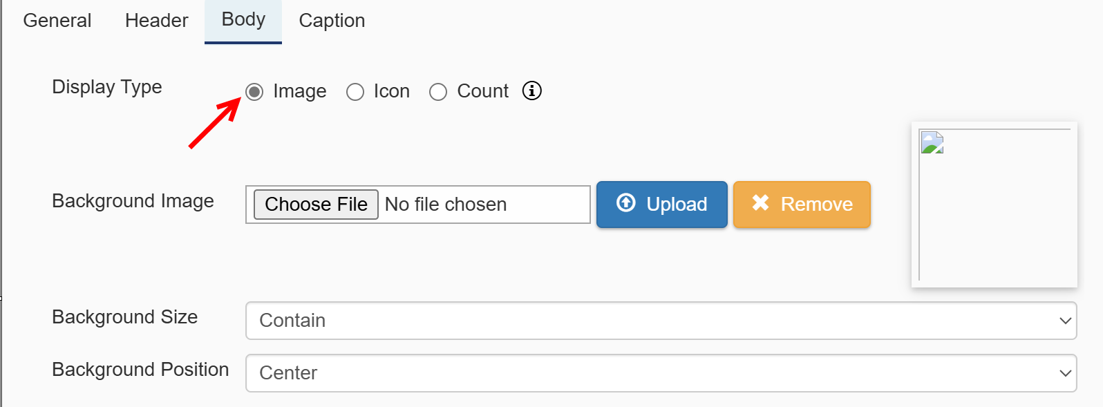
Background Image: You can select file, click upload, or remove a file for this tile.
Background Size: Auto, Contain, or Cover
Background Position: Aligns the image to the Bottom, Top, Center, Left, or Right on the tile
Icon: Allows you to use one of the pre-loaded Font Awesome icons
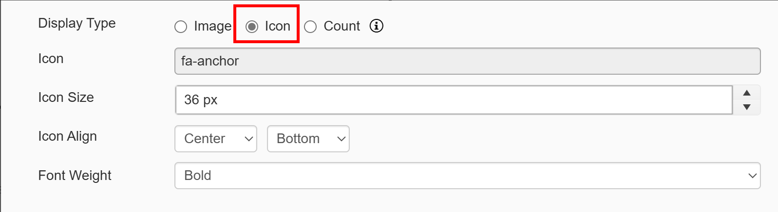
Icon: Select one icon from the options. There is a search option if you are looking for a particular icon.
Icon Size: Determines how large the icon will be on the tile. Default value is 20 pixels.
Icon Align: Aligns the icon horizontally (first drop-down) and vertically (second drop-down).
Font Weight: select font weight from dropdown.
| Count: The Count option is the same as the Tiles option, where it will show a count of items in a particular list view. This can be used to mix and match tile types within the same web part. |
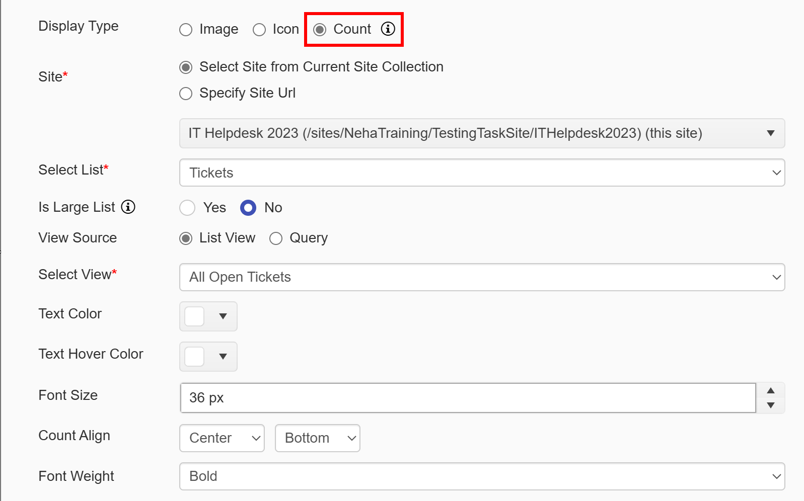
Site: Required. You can pull data from a list within the current Site, Site Collection, or Tenant/Web Application.
Select Site from Current Site Collection: Shows a dropdown of all sites, including the root site, within the current Site collection
| Specify Site Url: Allows you to add your own URL to access a site in another Site Collection within the Tenant/Web Application. Note: the current logged in user will need at least read permissions on the selected site to set up this tile. |
Select List: Required. Shows all Lists within the selected site. This will be the list used for the tile.
Is Large List: Use this option if list has large number of items and link tiles does not work due to list view threshold error.
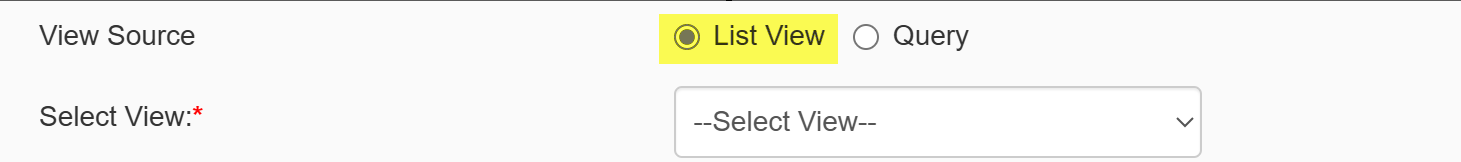
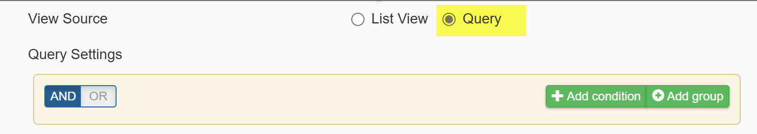
View Source: It provides two options
1. List View: if this option is selected, below column will be visible.
Select View: Required. Shows all views for the selected list. This will be the view used to filter the data, and the tile will return the count of all items in that view. For example, if you want your tile to show all overdue tasks, make sure you have a view already created that will show all overdue tasks (e.g. with the filter of Due Date is less than [Today]).
2. Query: use this option to fetch items from the list based on specified conditions
Text Color: Allows you to choose a color for the number that is displayed on the tile.
Text Hover Color: Select count text color on hover from dropdown.
Font Size: Sets the size of the number that is displayed on the tile. Default value is 20 pixels.
Count Align: Aligns the number horizontally (first drop-down) and vertically (second drop-down).
Font Weight: select font weight from dropdown.
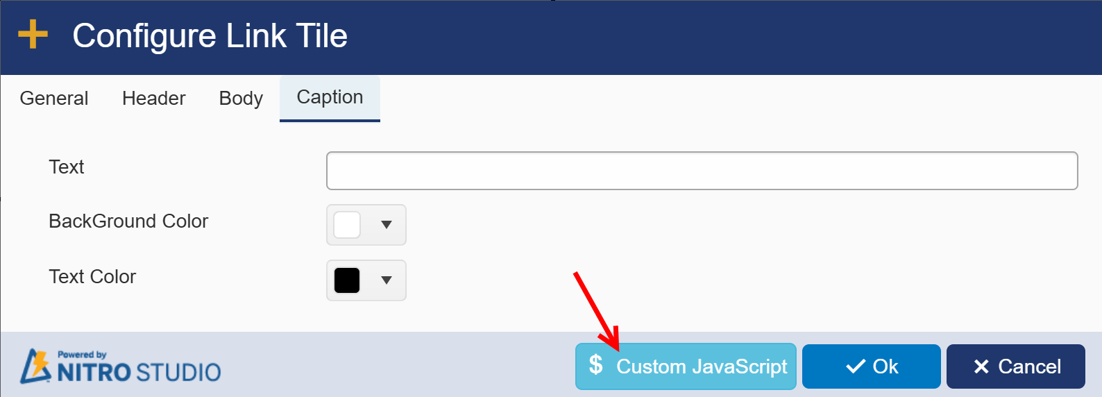
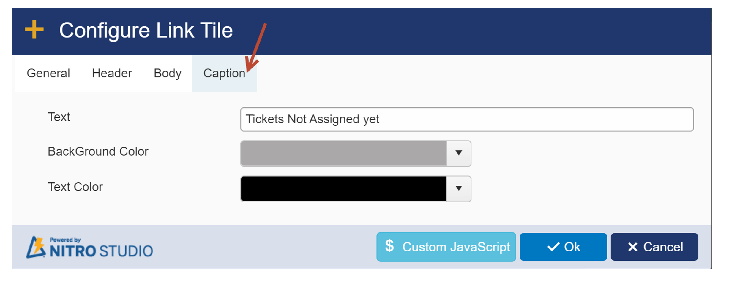
Caption Tab:
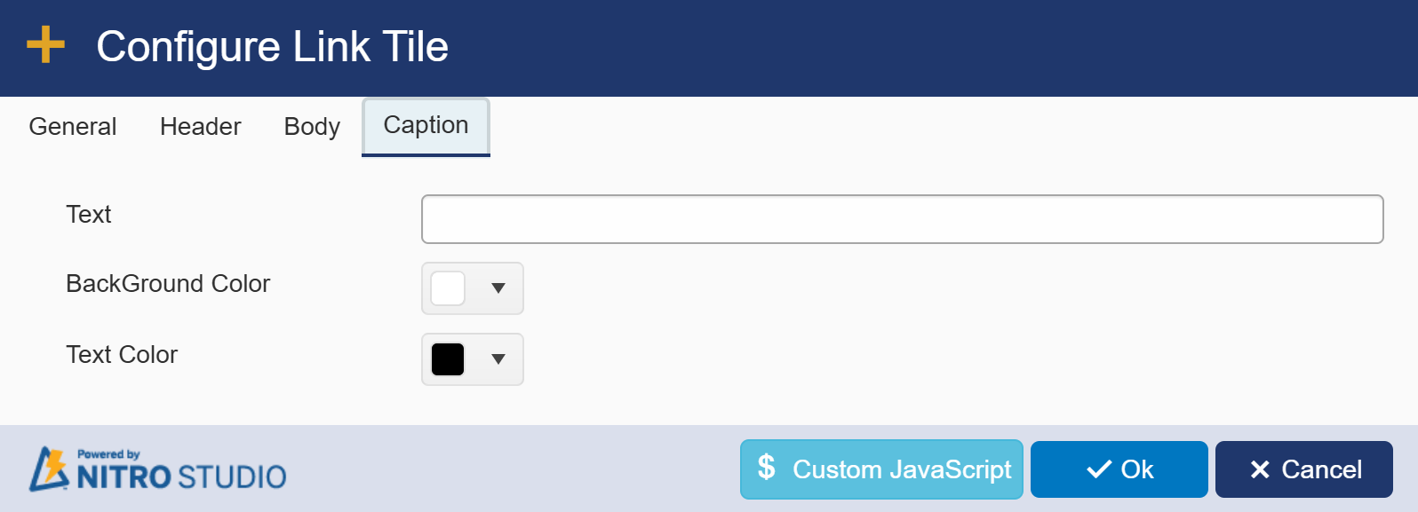
Text: provide text for caption
Bacground Color: Allows you to choose background color for caption.
Text Color: Allows you to choose a color for the caption.
Sample Output of Display Type and Caption:
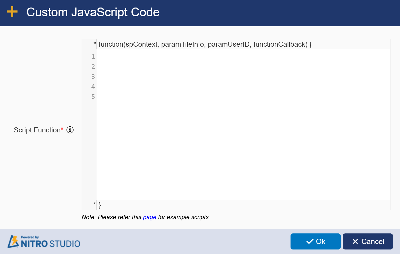
Custom JavaScript
There is an option to add your own custom JavaScript for when the tile is clicked. Simply write your JavaScript and paste it into the box. This can be used in conjunction with the other Tile Types (URL or Content).
Tiles/Header Layout
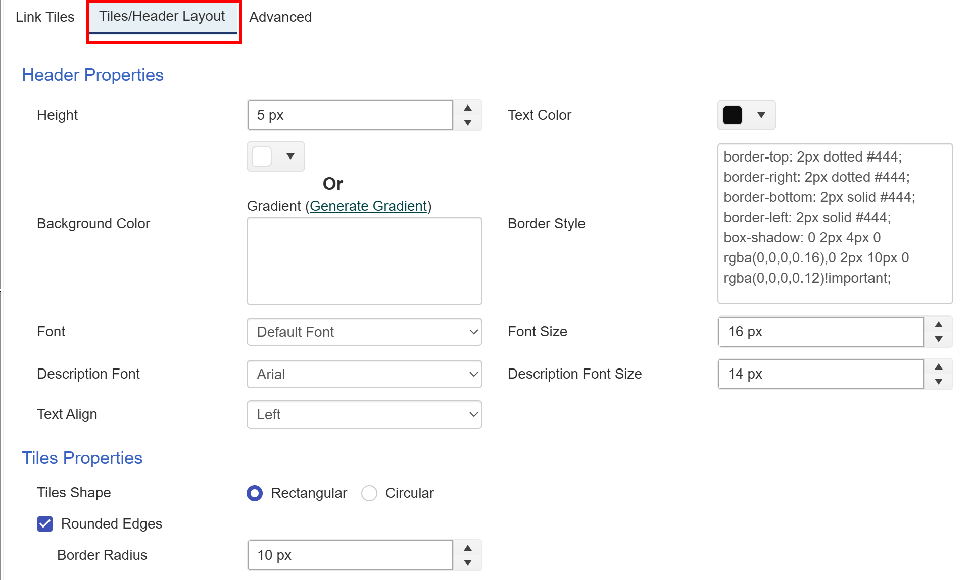
Header Properties
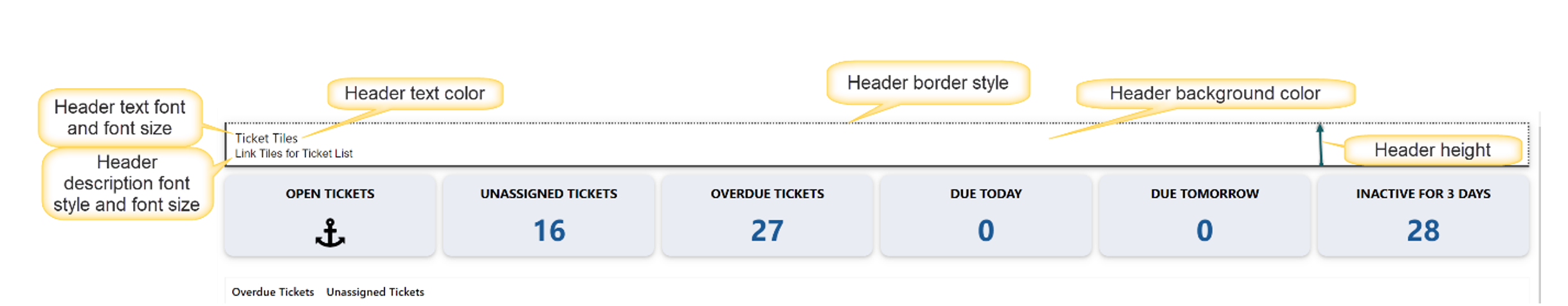
Height: Height of the header in pixels. Default is 35 px.
Text Color: Color of the text in the header, both the Header Text and the Header Description
| Background Color: The underlying color of the header section. Make sure your Text Color and Background Color have enough contrast to be visible (e.g. white or light colored Text Colors work well on black or dark Background Colors). Default is gray (rgba(153, 153, 153, 1)). |
| Generate Gradient: Instead of a solid color, you can choose to generate a gradient from the standard gradient generator at https://www.colorzilla.com/gradient-editor/. Once you create your gradient, copy and paste the code from the Colorzilla website back into the Generate Gradient box. |
| Border Style: Sets the size, in pixels, for the border on the top, bottom, right, and left of the header. You can also configure a shadow for the header to give it more depth. The default values are shown here: |
| border-top: 0px dotted #444; |
| border-right: 0px dotted #444; |
| border-bottom: 0px solid #444; |
| border-left: 0px solid #444; |
| box-shadow: 0 2px 4px 0 rgba(0,0,0,0.16),0 2px 10px 0 rgba(0,0,0,0.12)!important; |
| Font: Font style for the Header Text. The Default Font option takes input from the section of the SharePoint page where this web part is added. |
| Font Size: Size of the Header Text font in pixels. Default value is 16 px. |
| Description Font: Font style for the Header Description. |
| Description Font Size: Size of the Header Description font in pixels. Default value is 14 px. |
| Text Align: Aligns the text to the left, center, or right of the header text box. Applies to both the Header Text and the Header Description. |
 |
Tiles Properties
| Tile shape: Select tile shape as rectangular or circular. In sample image, tile shape is rectangular with rounded edges |
| Border Radius: Provide border radius if ‘Rounded Edges’ is enabled. |
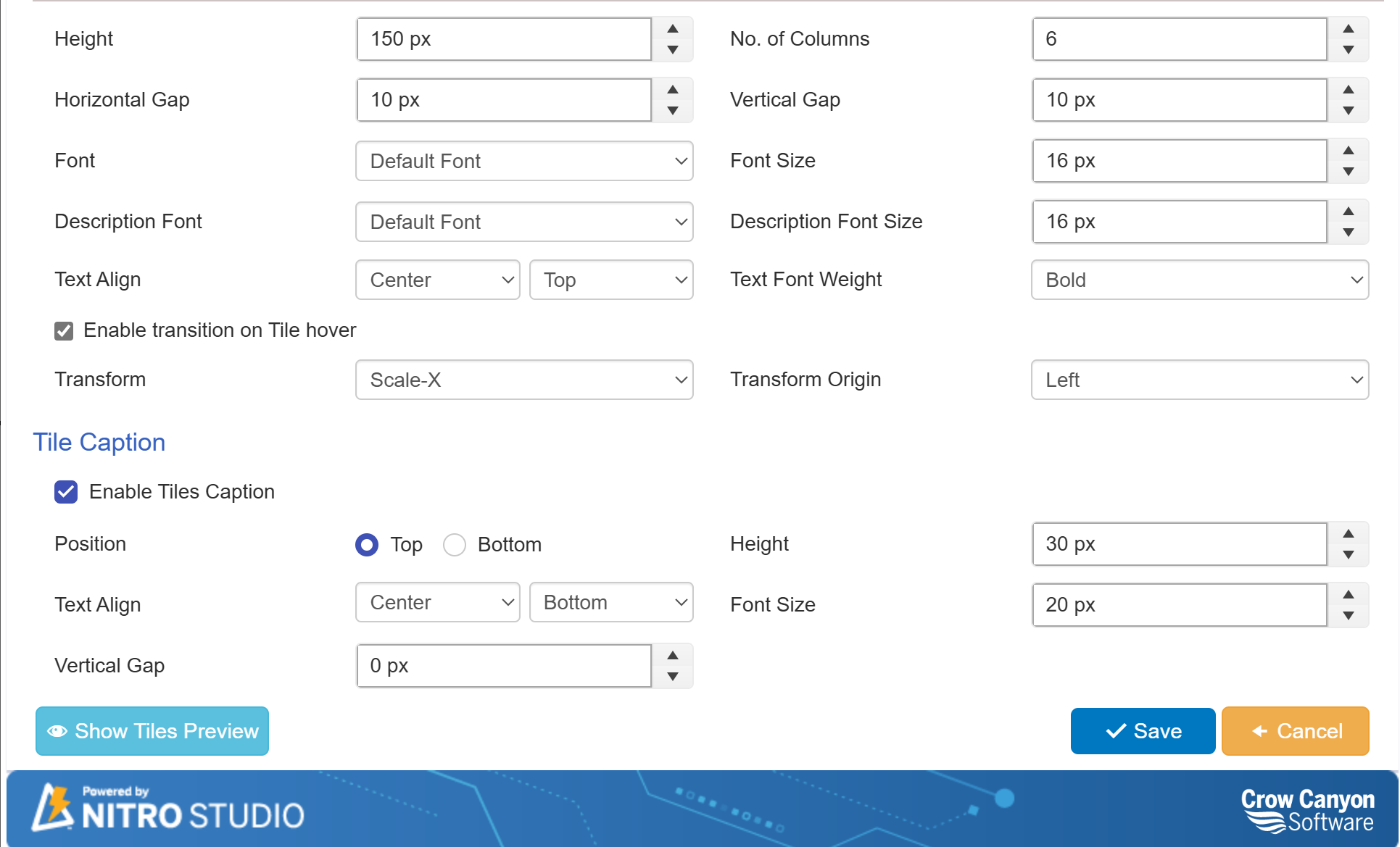
| Height: Sets the height of each tile in the Link Tiles Group, in pixels. Default value is 275 px. |
| No. of Columns: The number of tiles that will show horizontally across the screen before wrapping to a new line. Default value is 3. |
| Horizontal Gap: The amount of space between each tile in the same row, in pixels. Default value is 10px. |
| Vertical Gap: The amount of space between rows of tiles, in pixels. Applies when the number of tiles in the group exceeds the value in "No. of Columns". Default value is 10 px. |
| Font: Font style for the header text on the tile. |
| Font Size: Font size for the header text on the tile, in pixels. Default value is 16 px. |
| Description Font: Font for the "Short Description" on each tile. The Default Font option takes input from the section of the SharePoint page where this web part is added. |
| Description Font Size: Font size for the "Short Description" on each tile, in pixels. Default value is 14 px. |
| Text Align: Aligns the text to the left, center, or right within the tile. Applies to both the header text and short description on the tile. |
| Text Font Weight: Allows you to select text font weight form dropdown. |
| Enable transition on Tile hover: If you want to change how the tile looks when someone hovers over it, you can check this box. There are two settings for this: |
| Transform: Determines which way the transition "wipes" over the tile. Scale-X for horizontal and Scale Y for vertical. |
| Transform Origin: Determines which side the transition "wipes" from. For Scale-X the options are Left, Center, and Right. For Scale-Y the options are Top, Middle, and Bottom. |
 |
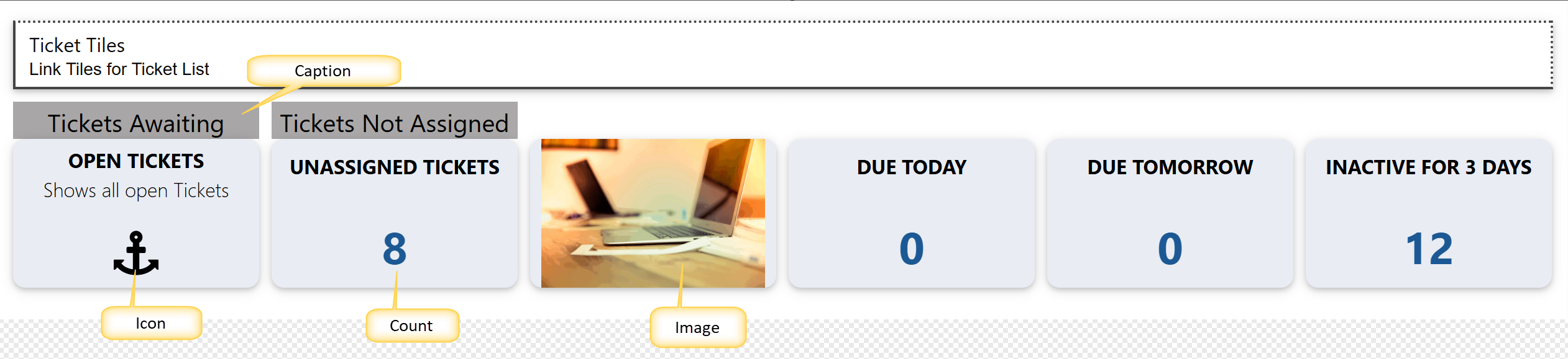
| Tile Caption |
| Tile caption is a text that can be positioned in between the header and tile or at the bottom of the tile. Tiles caption property can be enabled by clicking |
| ‘Enable Tiles Caption’ in tiles/header layout. This property will be same for all tiles configured in tiles group. After enabling tiles caption, text and colors can be specified for individual tile by clicking ‘Caption’ tab in link tile. |
Configure tile caption as shown below:
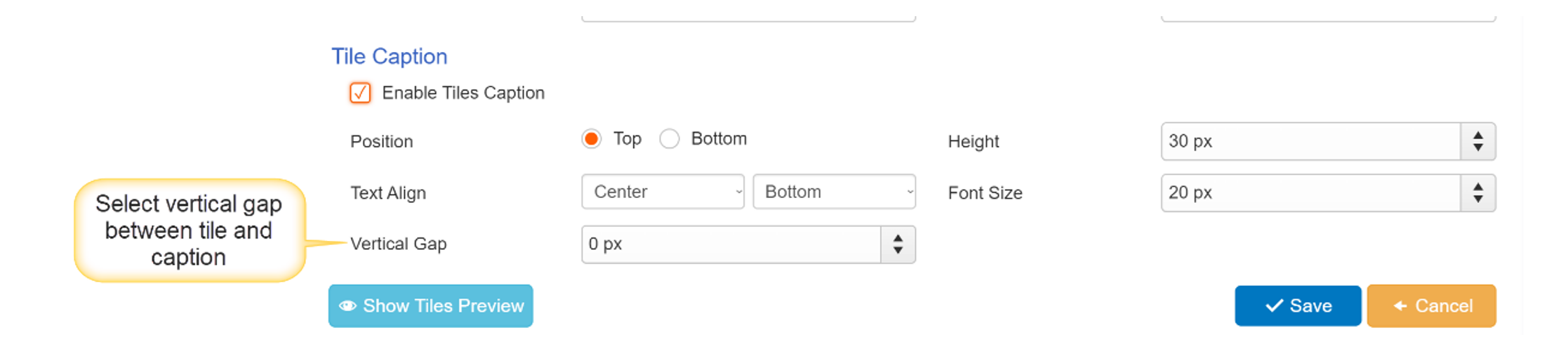
Vertical Gap: 0 px
means there will be no gap between tile and caption.
Increasing the value of vertical gap will increase the gap between tile and caption.
If tile caption is enabled. ‘Caption’ tab appears in link tile window as shown below:
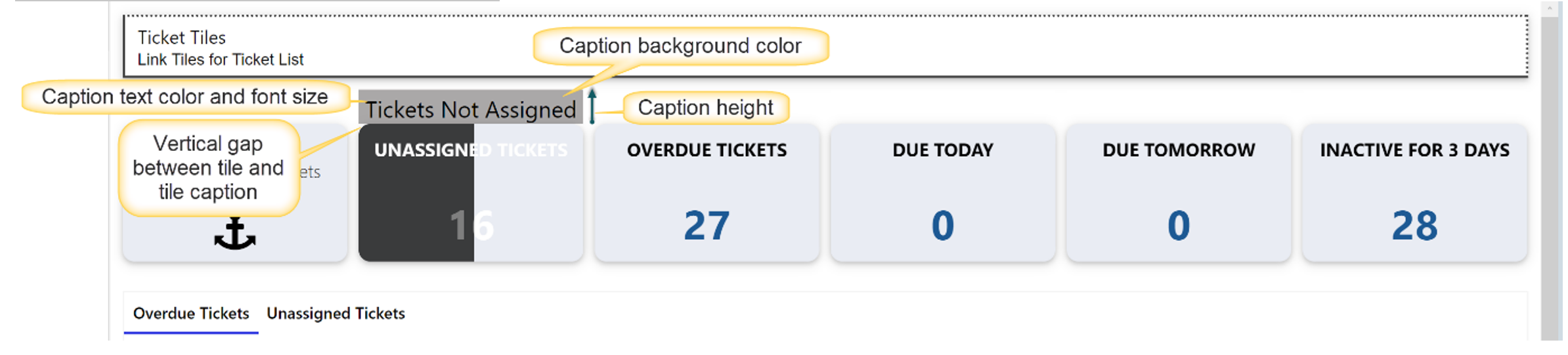
Sample output of Tile caption
When done configuring the Link Tiles Group, you can add it to either a Classic UI page (SharePoint 2013 and above, and some M365 customers) or to a Modern UI Page (M365).