This action requires Crow Canyon's "Self-service Bot" to be configured. If you haven't already, please contact sales@crowcanyon.com to subscribe to Crow Canyon's bot service.
You'll also need to configure the Self-service Bot once you have a subscription: https://www.crowcanyon.help/article/398/
More than just a notification, the adaptive card allows for user input directly from the Teams interface. For example, if you have an approval process, and need input from the approver, you can send an adaptive card to the designated approver and take their decision through Teams. No email, no signing into SharePoint required.
If you have not already, you'll need to follow the steps in this article to enable the Teams API for NITRO in order to use this action.
Post an Adaptive Card action in designer custom action
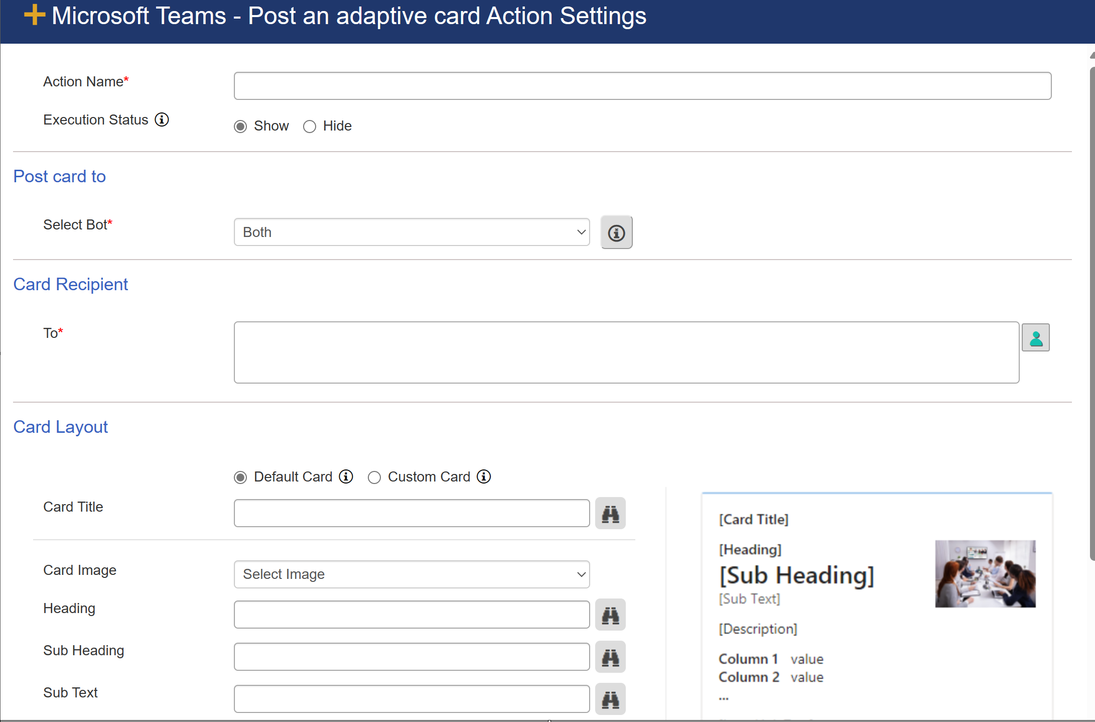
Action Name: Provide unique name for action
Execution Status: select this option to show or hide this custom action from user during execution.
Post card to: Select where you want to post the card in below column
Select Bot: it provide 3 options in dropdown
Both: select this option if you want to post the card in NITRO Engage and Self-Service bot.
NITRO Engage: select this option if you want to post the card in NITRO Engage.
Self-Service Bot: select this option if you want to post the card in Self-Service Bot.
Card Recipient
To: To whom to send the adaptive card. This can be an individual, multiple users, or a SharePoint group.
Card Layout
The options here are to either send the Default card or a Custom Card. The Custom Card requires JSON. More info about Teams adaptive cards can be found here: https://docs.microsoft.com/en-us/microsoftteams/platform/task-modules-and-cards/cards/cards-reference#adaptive-card
Shown below is the Default Card Layout; each placeholder in this screen can use placeholders from the referenced SharePoint item by clicking on the binocular icon to the right of the field.
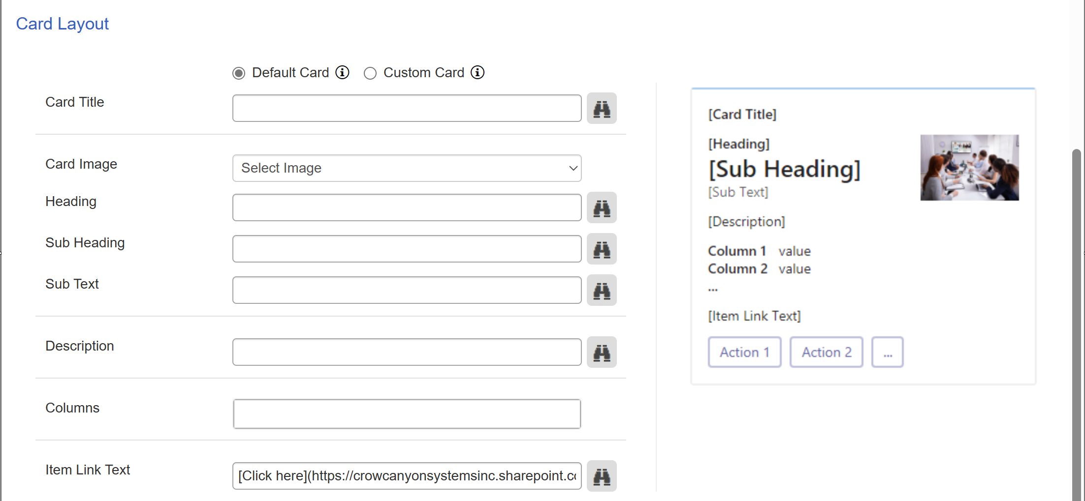
The default card has the following options:
Card Title: This will appear at the top of the card.
Card image: This provide two option in dropdown.
• User
• Other
User: This will be a generic image and is not specific to any user. It looks like this:

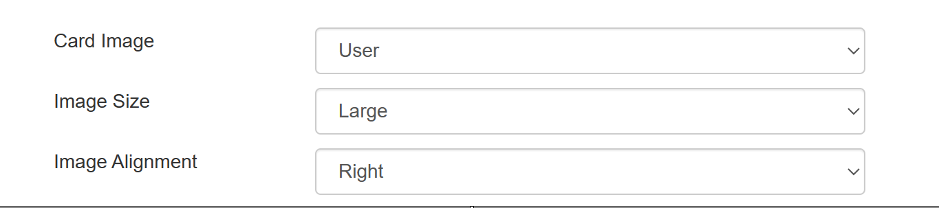
Other: If you want to add a different picture than the above, specify a URL for an image to show on the card
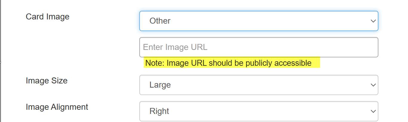
'Image size' and 'Image alignment' column will be available when 'Card Image' column value is selected.
Image size: Relative size of the image with options of Large, Medium and Small
| Image alignment: Shows the image to the left or the right of the text on the card |
Heading: Appears between Card Title and Sub Heading
Sub Heading: Appears between the Heading and the Sub Text
Sub Text: Appears between the Sub Heading and Description
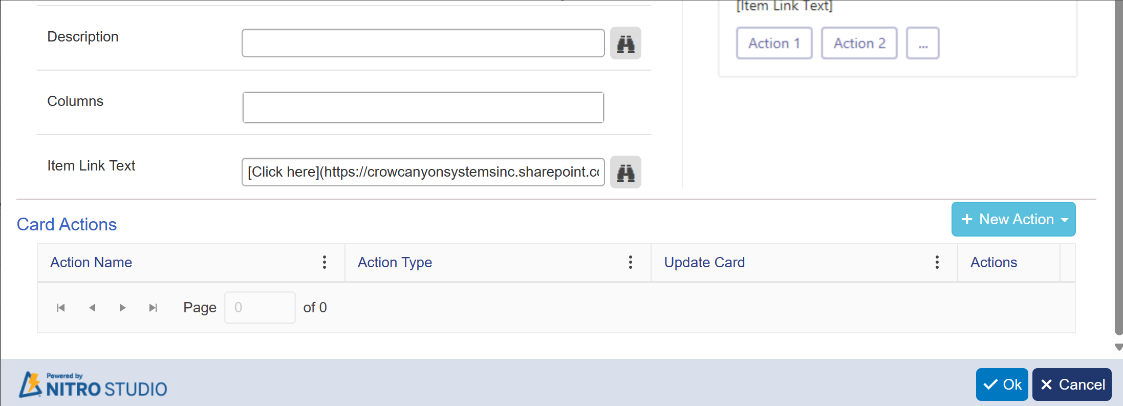
Description: Appears between the Sub Text and any columns you want to show on the card
| Columns: Column values from the SharePoint item that you want to show on the card. These appear between the Description and the Item Link Text and to the right of the corresponding column label from the SharePoint list |
Item Link Text: The hyperlink text shown on the card. It is clickable so that the user can navigate to the URL provided in this setting. Appears between the columns and any actions added to the card.
Card Actions
The user can take the following actions from the adaptive card. These will appear as buttons on the card. NOTE: The user will need to click twice to run an action. First on the Action Button itself. Second on the "Submit Button" to confirm they want to take the desired action.
1. Create List Item
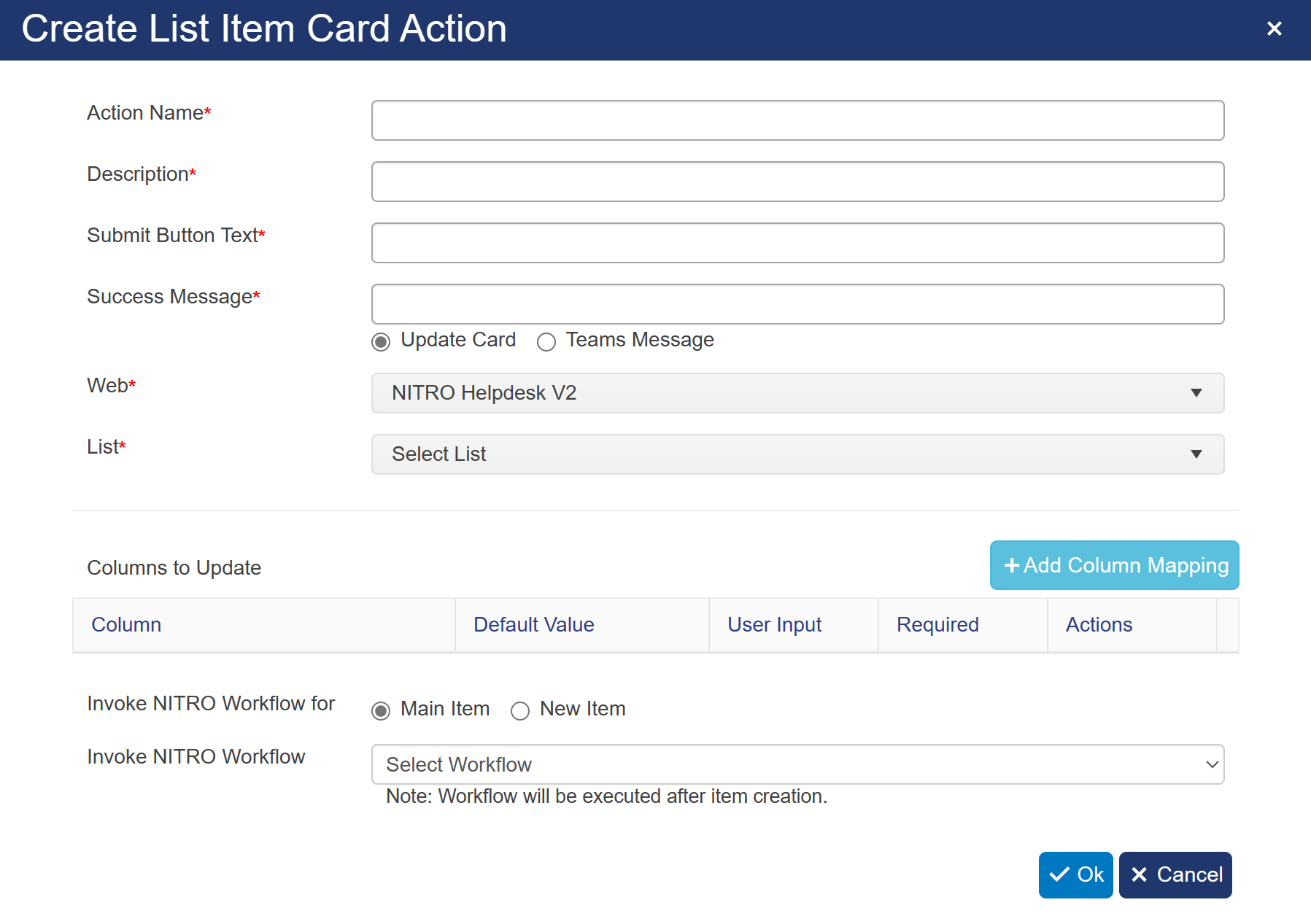
This will take input from the user to create a new list item.
Action Name: Appears on the action button below the Item Link Text
Description: When clicked, the description will appear in a dialog below the Action button
Submit Button Text: This text will appear on the confirmation button (e.g. "Are you sure?")
Success Message: Appears as a message in Teams when the action is successfully executed.
Web: This is the site where you want to create the new item. Note: only sites within the same Site Collection are available
List: This is the list within the above site where you want to create the new item
| Columns to Update: Define which columns to update as part of the card action. This can take User Input or set default and calculated values. See image and description below |
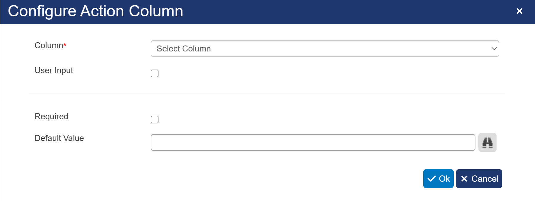
Column: Select which column to update
User Input: Decide whether to have the user input the value or to use a Default Value
Required: Indicates if this particular field is required; applicable when accepting User Input
| Default Value: Sets the value of the specified column; can use placeholders and functions from the SharePoint list column values when using the binoculars icon. Use this when "User Input" is turned off |
| Invoke Workflow: Start a NITRO Workflow after the items have been updated |
2. Update List Item
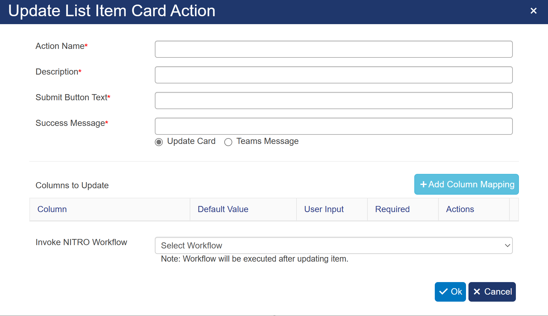
This will take input from the user to update the list item.
Action Name: Appears on the action button below the Item Link Text
Description: When clicked, the description will appear in a dialog below the Action button
Submit Button Text: This text will appear on the confirmation button (e.g. "Are you sure?")
Success Message: Appears as a message in Teams when the action is successfully executed.
| Columns to Update: Define which columns to update as part of the card action. This can take User Input or set default and calculated values. See image and description below. |
Invoke Workflow: Start a NITRO Workflow after the items have been updated.
Column: Select which column to update
User Input: Decide whether to have the user input the value or to use a Default Value
Required: Indicates if this particular field is required; applicable when accepting User Input
| Default Value: Sets the value of the specified column; can use placeholders and functions from the SharePoint list column values when using the binoculars icon. Use this when "User Input" is turned off |
3. Invoke Workflow
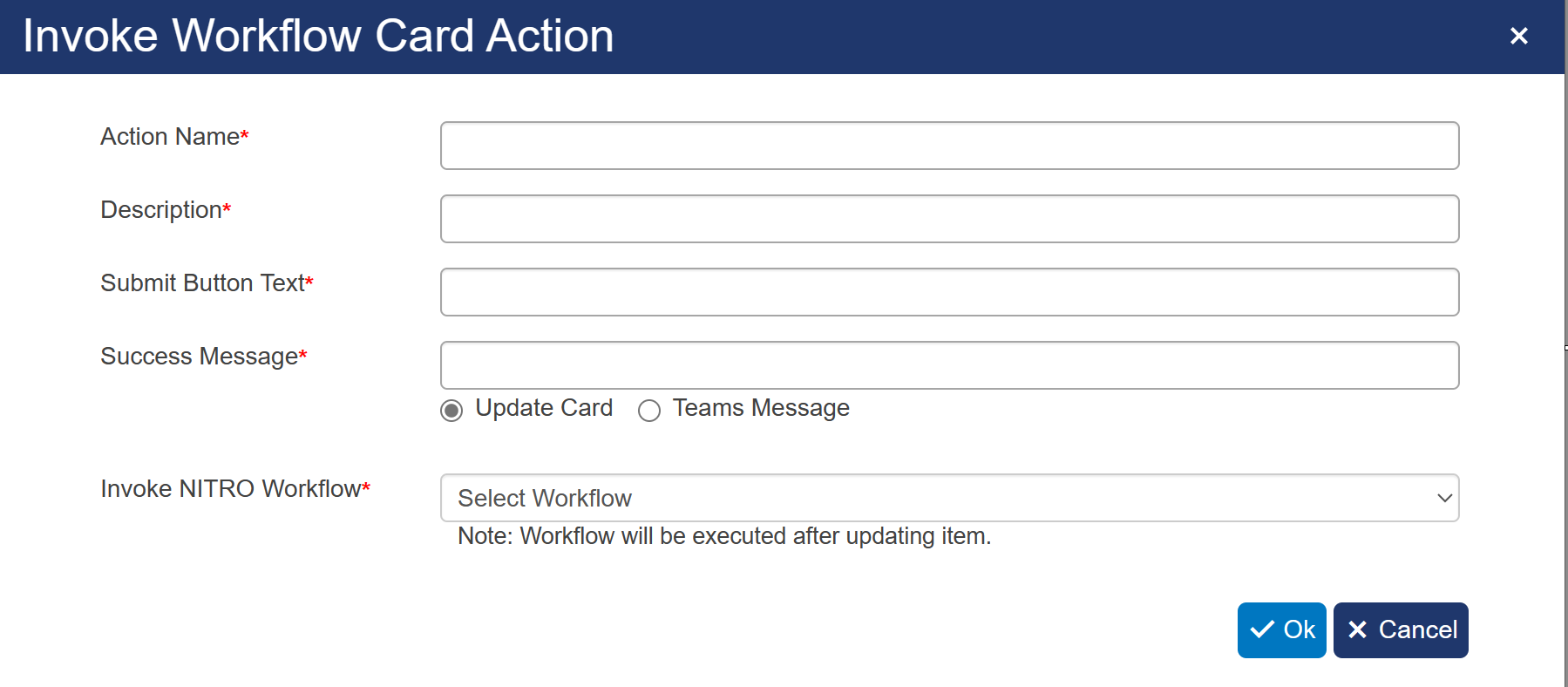
Action Name: This is shown in the action button in the card
Description: When clicked, the description will appear in a dialog below the Action button
Submit Button Text: This text will appear on the confirmation button (e.g. "Are you sure?")
Success Message: Appears as a message in Teams when the action is successfully executed.
Invoke Workflow: Select which NITRO workflow to invoke as part of this action
4. Launch URL
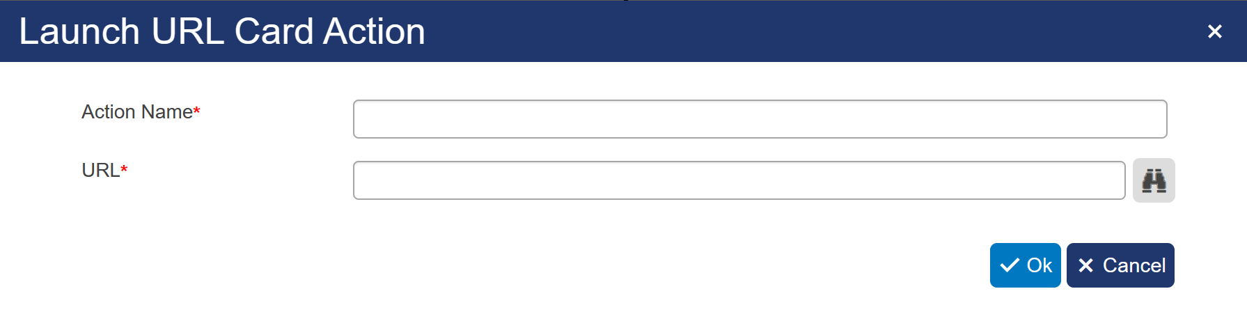
Action Name: This is shown in the action button in the card
URL: The URL to where the user is redirected in their default browser. Using the binoculars icon to use placeholders in the URL