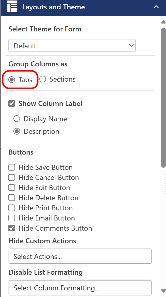
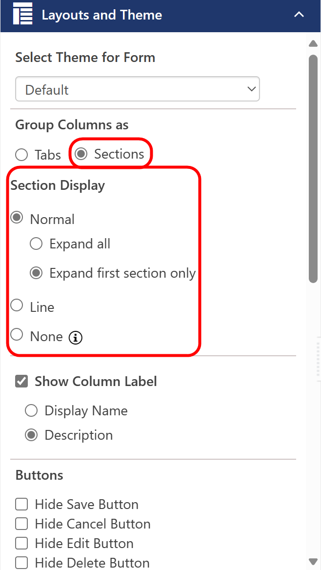
Layouts and Theme is where you set the overall layout of the form -- theme, tabs or sections, labels, buttons, etc. The options change when changing "Group Columns as" from Tabs to Sections.
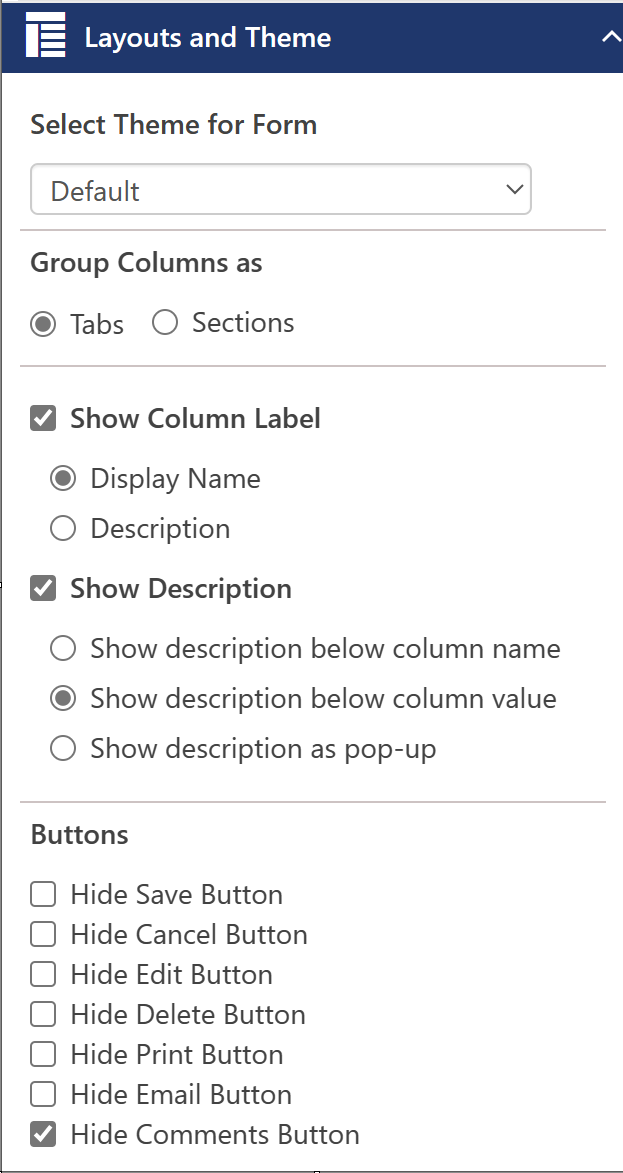
Select Theme for Form - you can select a Theme for the form in this section. NITRO Forms Designer comes with eight pre-set themes.
The Themes section of this manual explains how to create and use Themes.
Group Columns as -- select Tabs or Sections. If Sections is selected, a "Section Display" area appears, where you can set how the Sections headers are displayed (Normal, Line, None) and how the Sections are expanded by default (all or only the first section).
Show Column Label -- Allows you to hide or show the name of the column (as stored in the SharePoint list), the description of the column (as stored in the column settings for that column), neither, or both.
Under "Show Column Label" you can select either Display Name or Description. You can also uncheck the box to show neither.
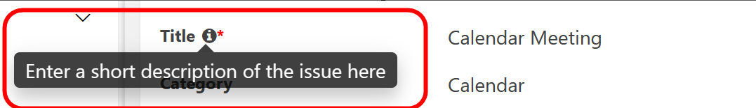
if you select "Show Description". select column and ob the right side panel of column, you can select where to show the Description: Below the column name, below the column value, or as a pop-up. You can also uncheck the box to hide the description. When using pop-up, there will be an information icon ( ) that appears next to the column name. When a user hovers over the icon on form, they'll see the description:
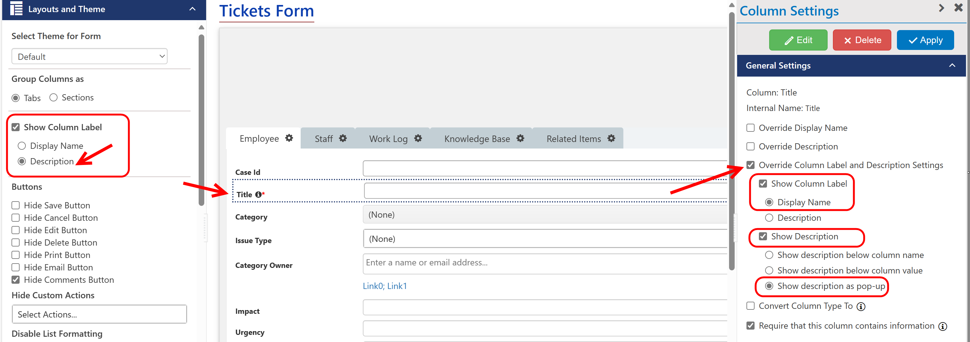
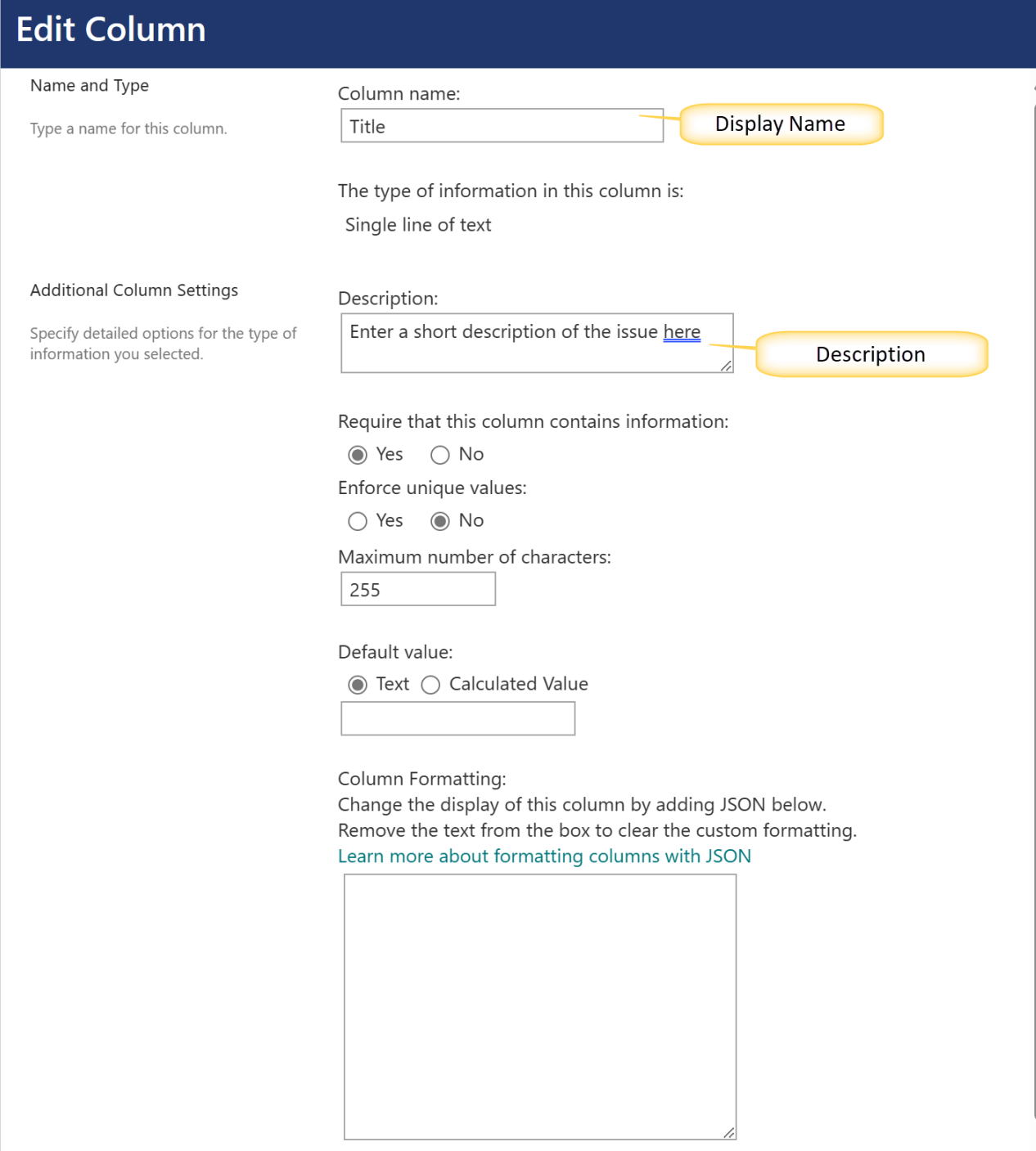
These settings impact the whole form, and you can override these settings on a column-by-column basis when editing the column. See General Settings - columns for more information about overriding column labels.
Buttons - the default buttons, "Save" and"Cancel", can be hidden. You would want to do this if you want to override the standard SharePoint Save and Cancel functions. These buttons would be replaced by buttons that run scripts or custom actions. See the Actions section of this manual for a detailed explanation. You can also hide the standard SharePoint "Edit" button. This can come in handy if you want to make sure the user only interacts with the "Custom Actions" you have added to the list or form (See Actions and Custom Actions for more information). Additionally, you can hide the"Print" and "Email" buttons from the ribbon in the form (both of these buttons are added by NITRO).
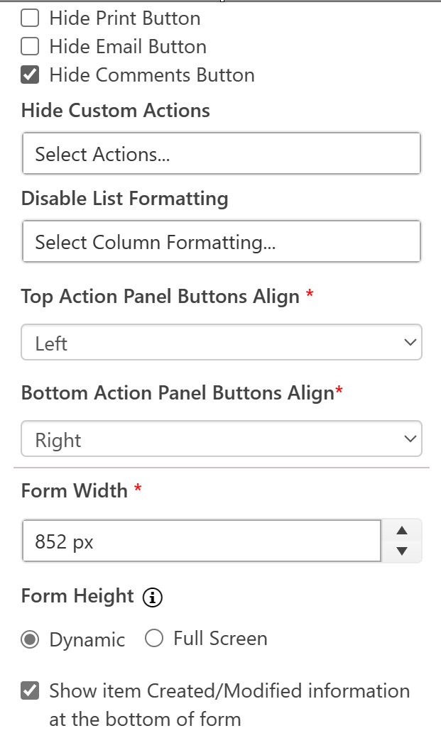
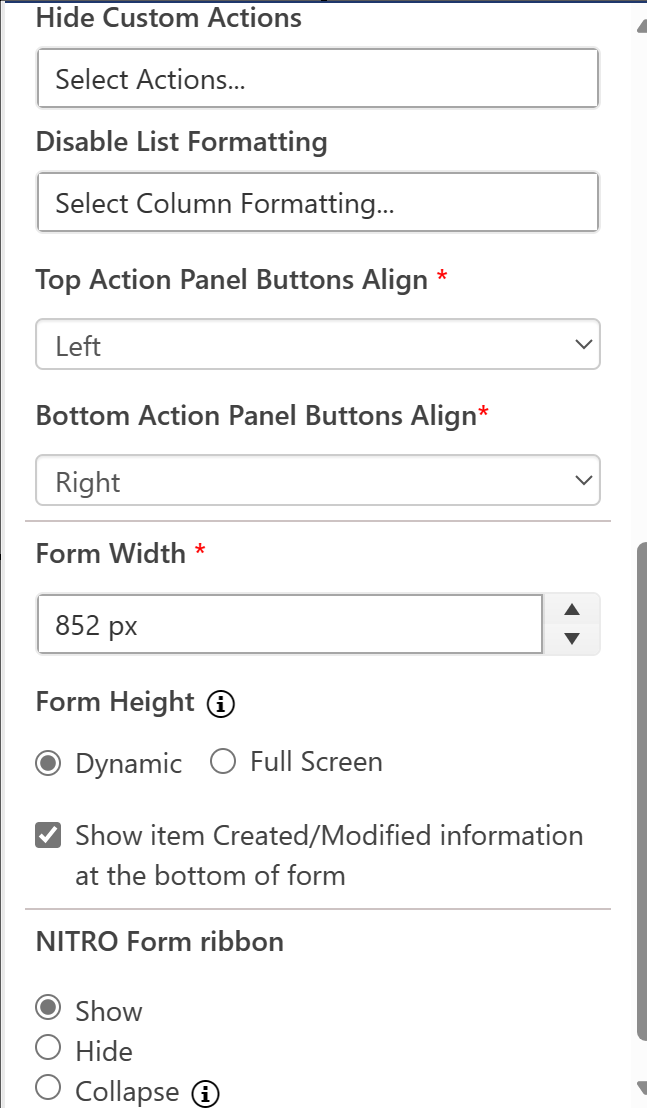
Hide Custom Actions - you can hide specific Custom Action buttons from a form. This is useful for when you have multiple forms on a list, and you want one form to use a Custom Action, but not the others.
Disable List Formatting -
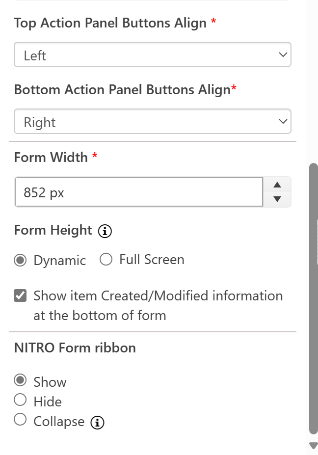
Top Action Panel Buttons Align and Bottom Action Panel Buttons Align -- these determine how the buttons on the form -- whether the default buttons or custom ones added in Forms Designer -- are positioned. See the Actions section of this manual for a detailed explanation.
Form Width - sets the width of the form in dialog. In full window, it will limit the form rendering to this width. Min is 850 px and max is 2000 px.
Form Height - allows you to determine how the form appears when using the modal dialog option in the SharePoint Classic UI. "Dynamic" will adjust to screen size. "Full screen" will show the normal dialog window without regard to the screen size.
Show item Created/Modified information at the bottom of the form - the NITRO Form by default hides the Created, Created by, Modified, and Modified by fields. You can add these directly to the form using the Form Controls settings or you can add them back to the bottom of the form as you would normally see it in SharePoint.
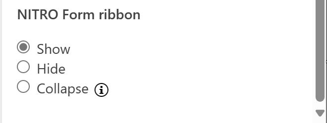
NITRO Form ribbon - this hides/collapses the item ribbon control at the top of the form. This allows the creation of forms with no item ribbon showing at the top.
|
|