The Tables control gives tremendous capabilities to design the form according to exacting specifications.
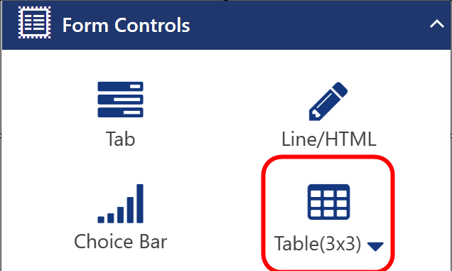
A Table can have any number of cells from 1x1 to 10x10. The Table size is set by using the down arrow in the Table control and choosing the proper grid size.
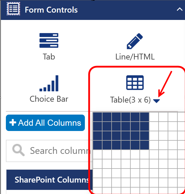
Once the size is chosen, the Table can be dragged to the form.
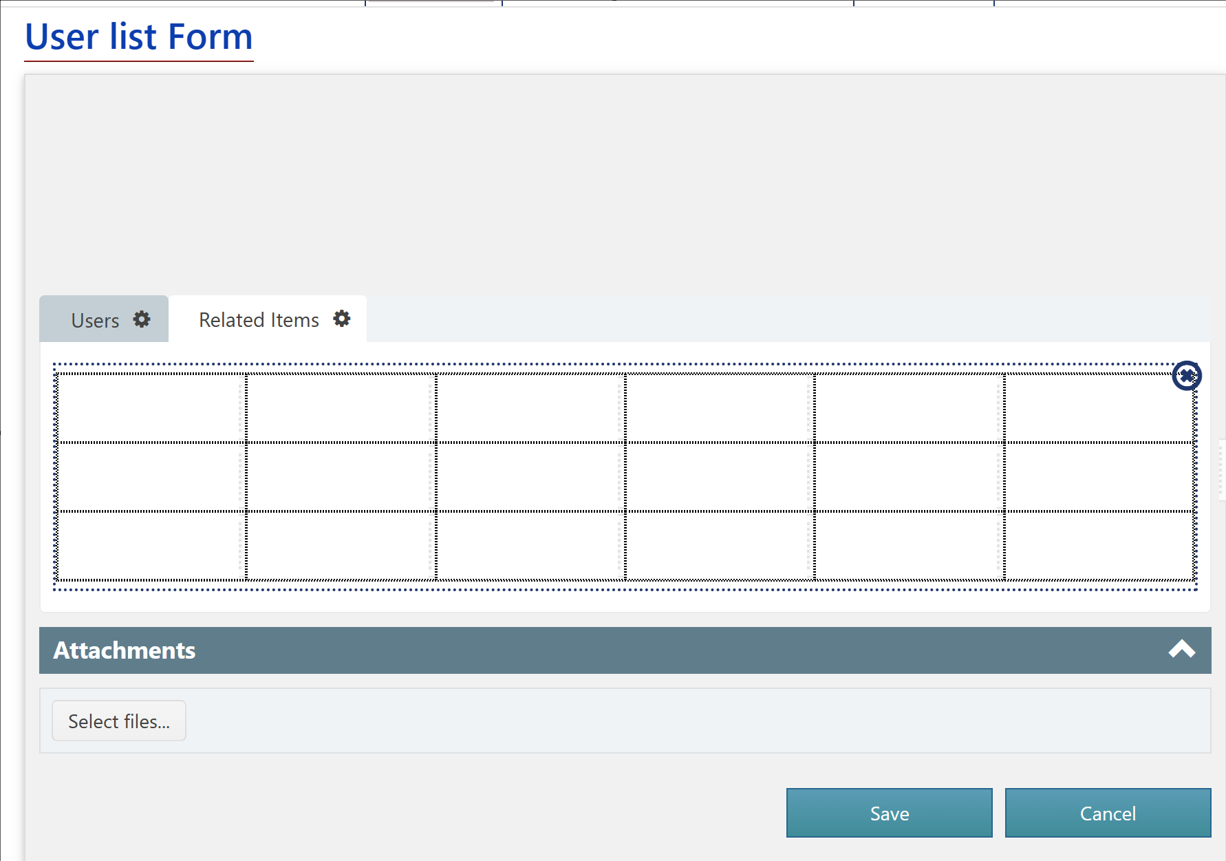
Columns can be added to cells by dragging them into the cell. One way to use tables is that a column can be set to not show the label. That column can be placed in a cell. Then, a Line/HTML control can be added to the cell immediately to the left of the cell that holds the column. The text in the Line/HTML control can be used to set the label or instructions for the column.
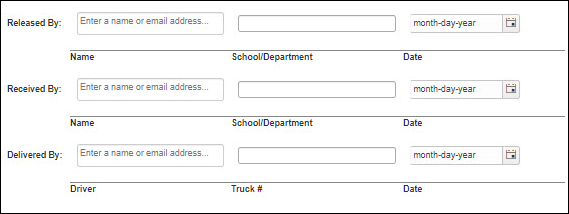
Example using Table control:
CONFIGURING THE TABLE
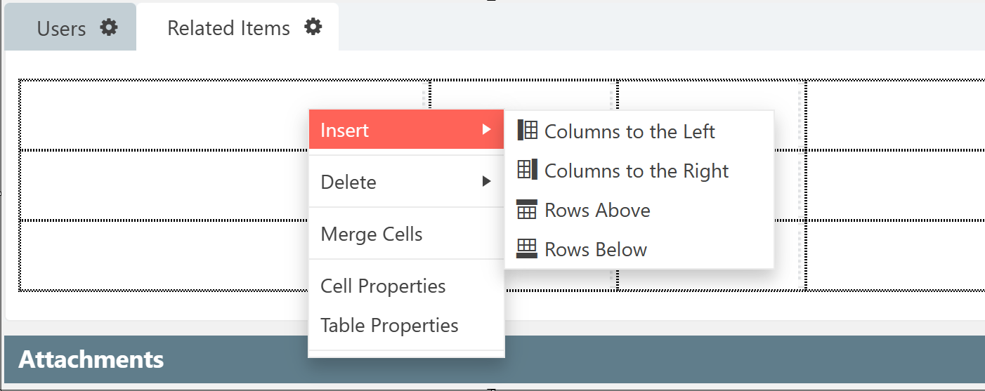
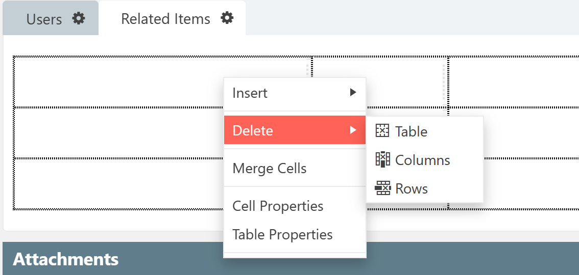
Each cell can be right-clicked, and a set of options appears. These are used to create the specific layout desired. Many of these functions are similar to tables in other programs, such as Excel.
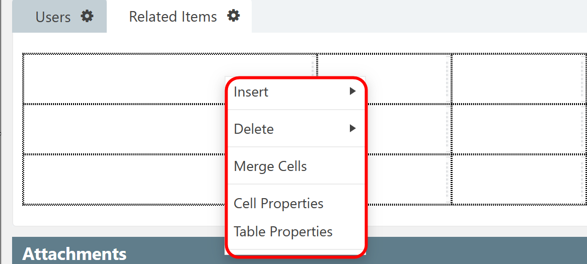
Insert
Delete
Merge Cells
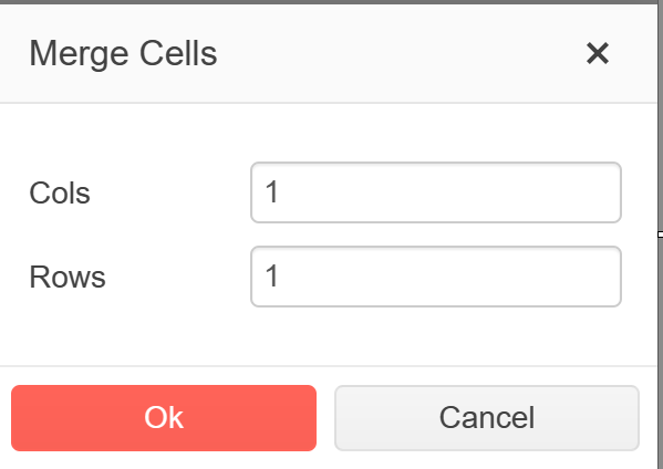
Note: The Merge Cells property is relative to the cell in which you right-clicked and is always the uppermost and leftmost cell of the merged cells. The number of Cols (columns) is the number of columns to the right of the cell you clicked in that you want to merge. The number 2 will merge the cell you clicked in and the cell immediately to the right of the cell you clicked in. Rows is the number of rows below the column you clicked in that you want to merge. The number 2 will merge the cell you clicked in and the cell immediately below the cell you clicked in. For example, if you want to merge a block of four cells, right-click in the cell that will be the upper left of the merged cell then enter 2 for Cols and 2 for Rows.
Cell Properties
Cell Properities - Table Tab
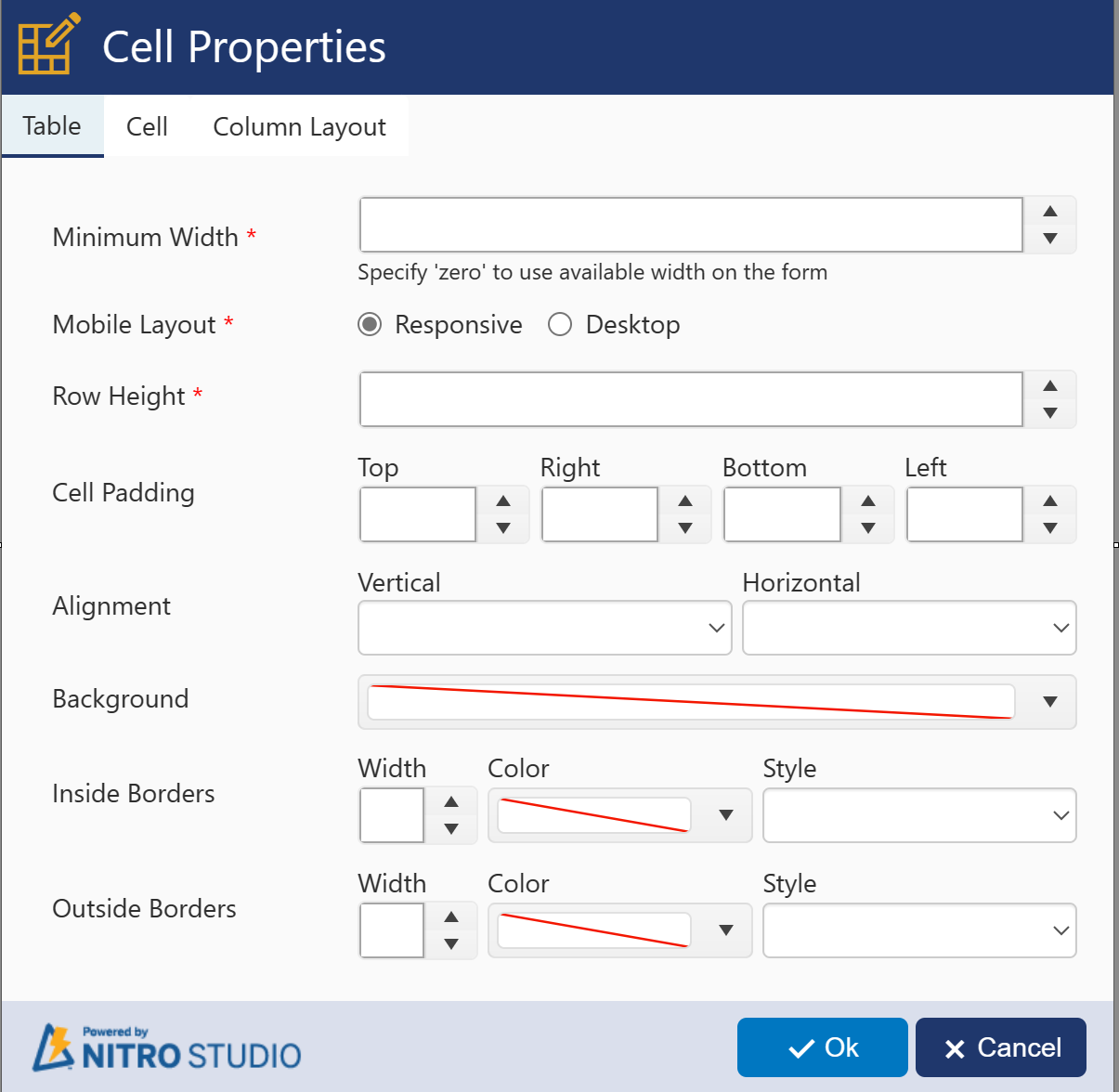
Minimum Width - The smallest the table will be shown on the screen in pixels before creating a horizontal scroll bar on the form.
Mobile Layout - Determines whether you want the table to be static in its display (Desktop) or to respond to the size of the screen (Responsive).
Row Height - The height of each row of the table in pixels
Cell Padding - Adds spacing in pixels around the cell to the Top, Right, Bottom, and/or Left of each cell
Alignment - The justification of the content of the cell. Vertical: Top, Middle, Bottom of the cell. Horizontal: Left, Center, Right of the cell.
Background - Fills the background of the table with the selected color
Inside Border - The style of the inside border of each cell
Width - Width of the board in pixels
Color - Selected color of the border
Style - Style can be solid, dashes, dots, etc.
Outside Border - The style of the outside border of each cell
Width - Width of the board in pixels
Color - Selected color of the border
Style - Style can be solid, dashes, dots, etc.
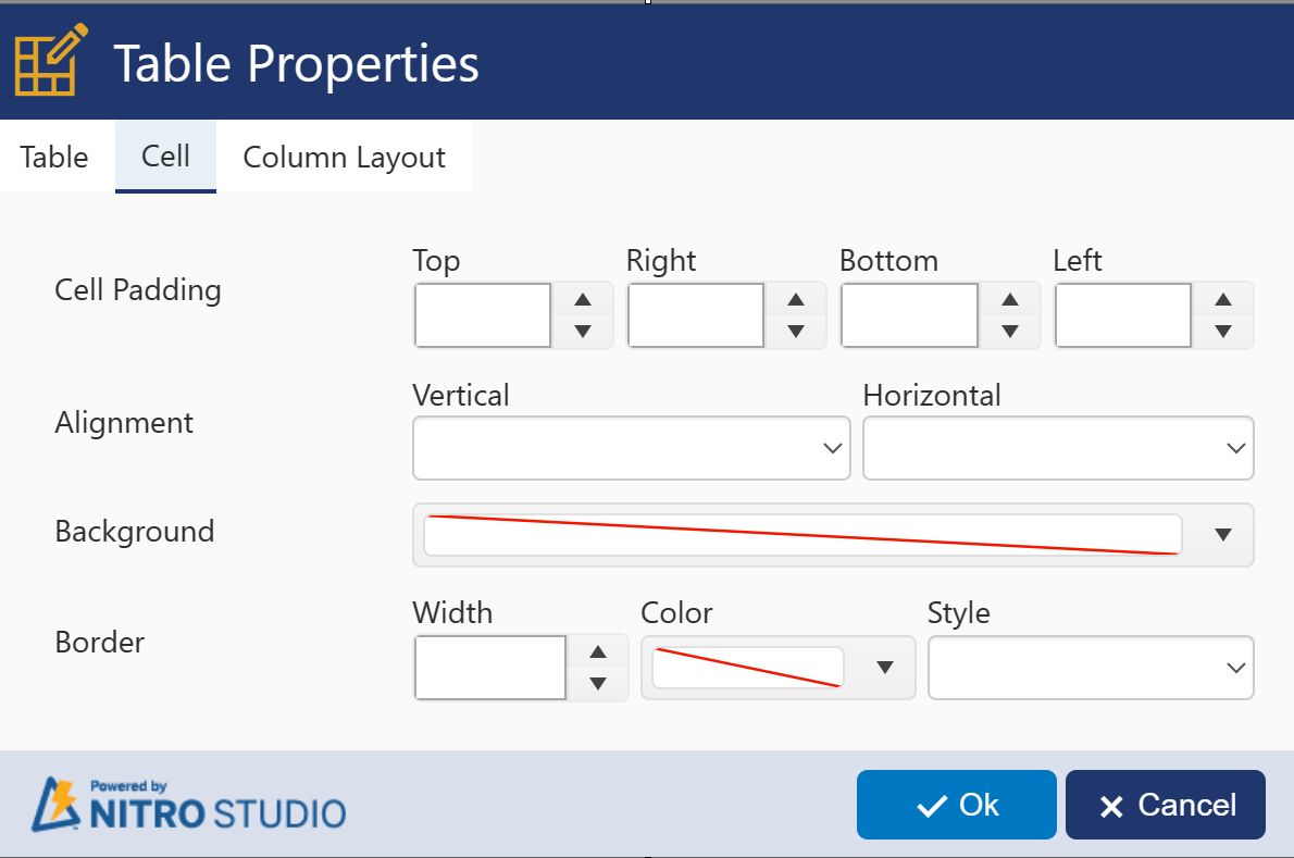
Cell Properities - Cell Tab
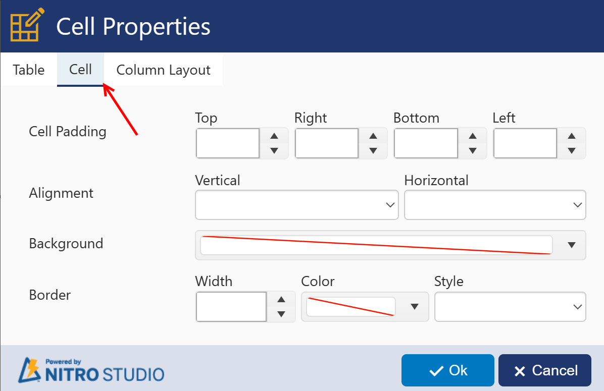
Note: Cell Properties always override Table Properties. If you configure a property for the table and you want it to apply to all cells, if any cell has custom properties, you'll need to configure the cell the same as the table.
Cell Padding - How many pixels between the border of the selected cell and the cells to the Top, Right, Bottom, and Left of the cell
Alignment - Alignment (justification) of the text in the cell
Background - Fills in the background of the cell with the selected color
Border - Width is in pixels. Color will be the color of the border. Style can be solid, dashes, dots, etc.
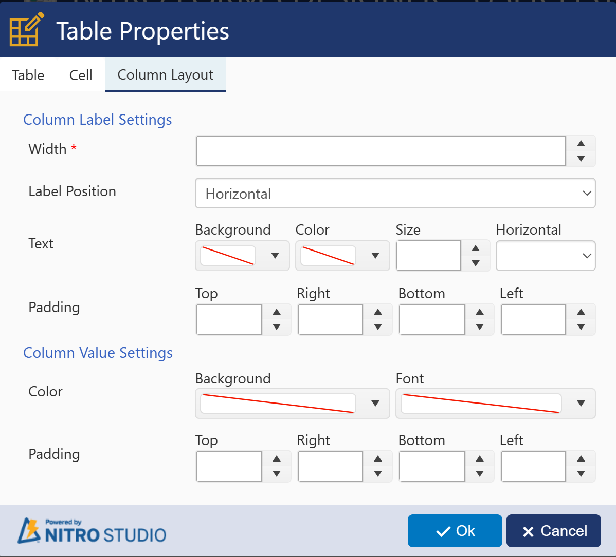
Cell Properities - Column Layout Tab
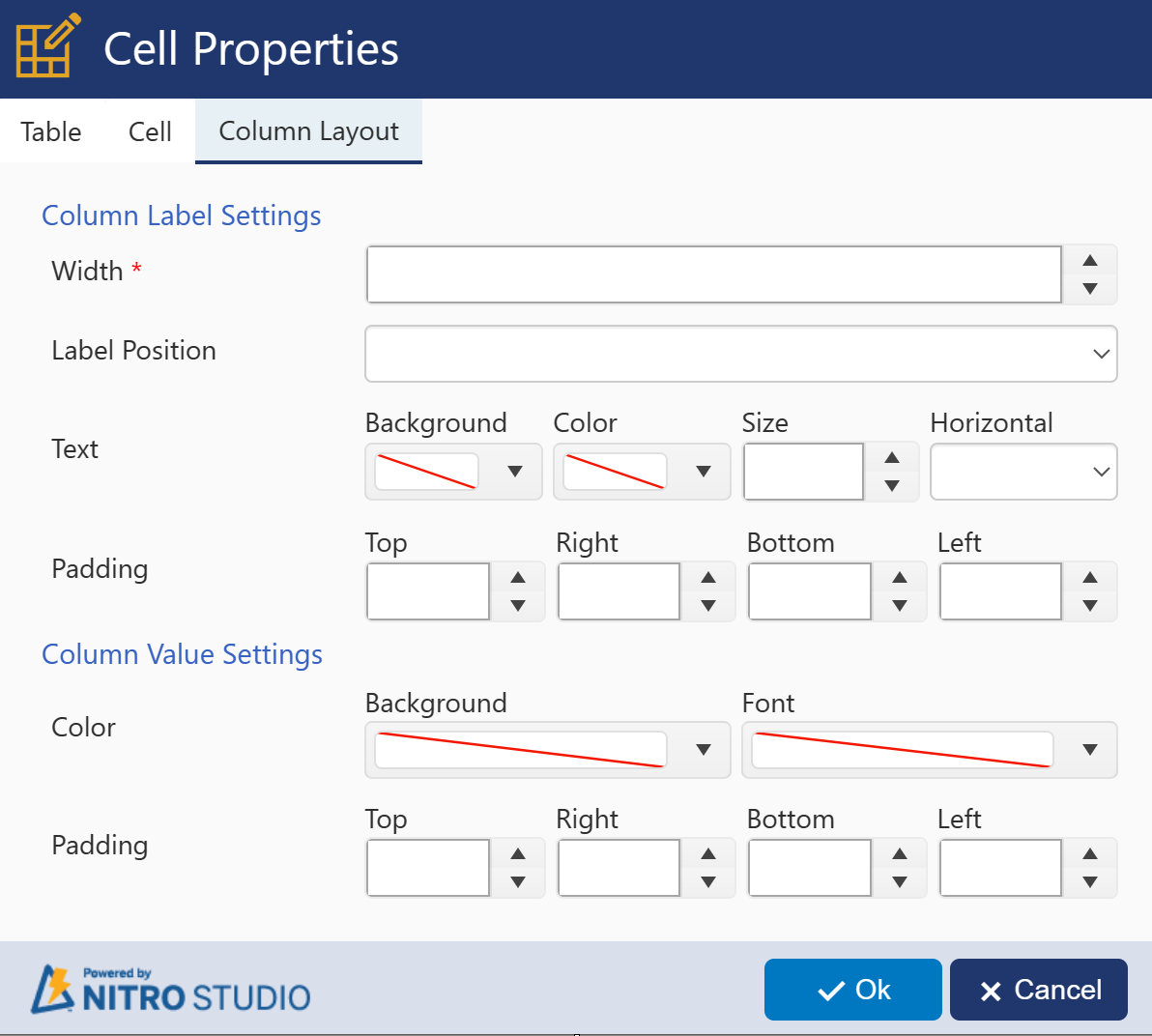
When using a column in your cell, you have some options with how the Column Label and Column Value apply. These settings don't affect any Line/HTML controls that you have added.
Column Label Settings:
Width - % of the cell width that the Column Label should occupy. If blank, SharePoint will auto-select the width.
Label Position - Whether to show the label immediately to the left (Horizontal) or directly above (Vertical) the Column Value
Text - Styles for the Column Label text
Background - Highlights the Column Label text with the selected color
Color - Changes the color of the text of the Column Label
Size - Size of the Column Label in pixels; SharePoint will auto-select the size if nothing is configured here
Horizontal - Changes the justification of the label: Left, Middle, or Right
Padding - Adds spacing in pixels around the Column Label
Column Value Settings:
Color - Settings for showing color around the Column Value
Background - Highlights the Column Value field with the selected color
Font - Shows the text of entries in the column as the selected color
Padding - Adds spacing in pixels around the Column Value
Table Properties
Table Properities - Table Tab
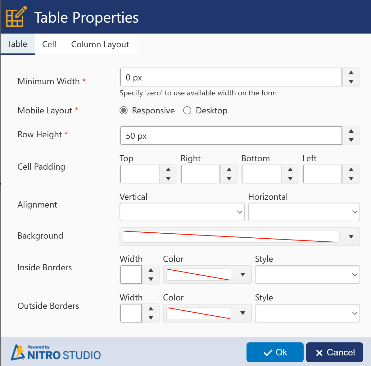
Note: Cell Properties always override Table Properties. If you configure a property for the table and you want it to apply to all cells, if any cell has custom properties, you'll need to configure the cell to apply the same property as the table.
Minimum Width - The smallest the table will be shown on the screen in pixels before creating a horizontal scroll bar on the form.
Mobile Layout - Determines whether you want the table to be static in its display (Desktop) or to respond to the size of the screen (Responsive).
Row Height - The height of each row of the table in pixels
Cell Padding - Adds spacing in pixels around the cell to the Top, Right, Bottom, and/or Left of each cell
Alignment - The justification of the content of the cell. Vertical: Top, Middle, Bottom of the cell. Horizontal: Left, Center, Right of the cell.
Background - Fills the background of the table with the selected color
Inside Border - The style of the inside border of each cell
Width - Width of the board in pixels
Color - Selected color of the border
Style - Style can be solid, dashes, dots, etc.
Outside Border - The style of the outside border of each cell
Width - Width of the board in pixels
Color - Selected color of the border
Style - Style can be solid, dashes, dots, etc.
Table Properities - Cell Tab
Cell Padding - How many pixels between the border of the selected cell and the cells to the Top, Right, Bottom, and Left of the cell
Alignment - Alignment (justification) of the text in the cell
Background - Fills in the background of the cell with the selected color
Border - Width is in pixels. Color will be the color of the border. Style can be solid, dashes, dots, etc.
Table Properties - Column Layout Tab
All of the options here are the same as the Column Layout properties above under Cell Properties.
Note: Cell Properties always override Table Properties. If you configure a property for the table and you want it to apply to all cells, if any cell has custom properties, you'll need to configure the cell to apply the same property as the table.
Column Label Settings:
Width - % of the cell width that the Column Label should occupy. If blank, SharePoint will auto-select the width.
Label Position - Whether to show the label immediately to the left (Horizontal) or directly above (Vertical) the Column Value
Text - Styles for the Column Label text
Background - Highlights the Column Label text with the selected color
Color - Changes the color of the text of the Column Label
Size - Size of the Column Label in pixels; SharePoint will auto-select the size if nothing is configured here
Horizontal - Changes the justification of the label: Left, Middle, or Right
Padding - Adds spacing in pixels around the Column Label
Column Value Settings:
Color - Settings for showing color around the Column Value
Background - Highlights the Column Value field with the selected color
Font - Shows the text of entries in the column as the selected color
Padding - Adds spacing in pixels around the Column Value