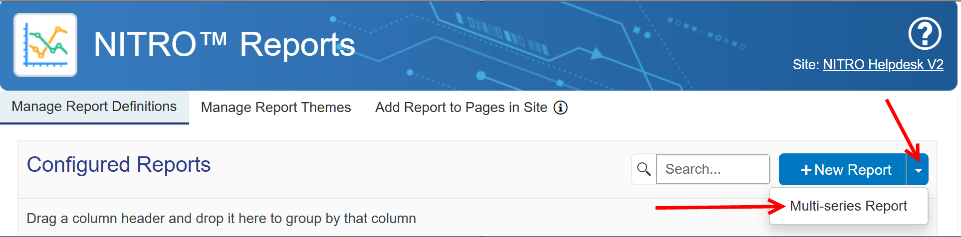
A multi-series report is a report that depicts a one-to-many relationship of list items to their respective data. With this style of report, two or more different columns of the same data type (Text, Date, and Number) can display their data for each item in the list, on the same chart. To create a Multi-series report, select the down arrow icon in NITRO reports as shown below and select Multi-series report.
The first two sections 'Configure New Report' and 'List Details' of the report are to be configured as you would a standard report, by including the Report Title and List Details.
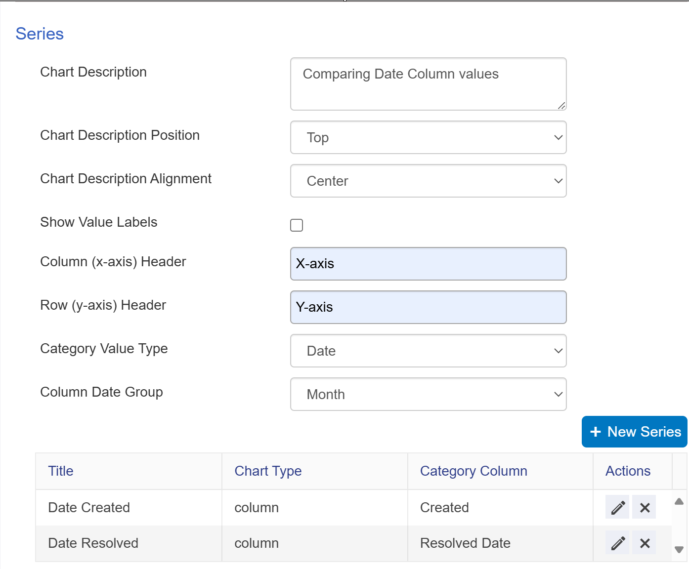
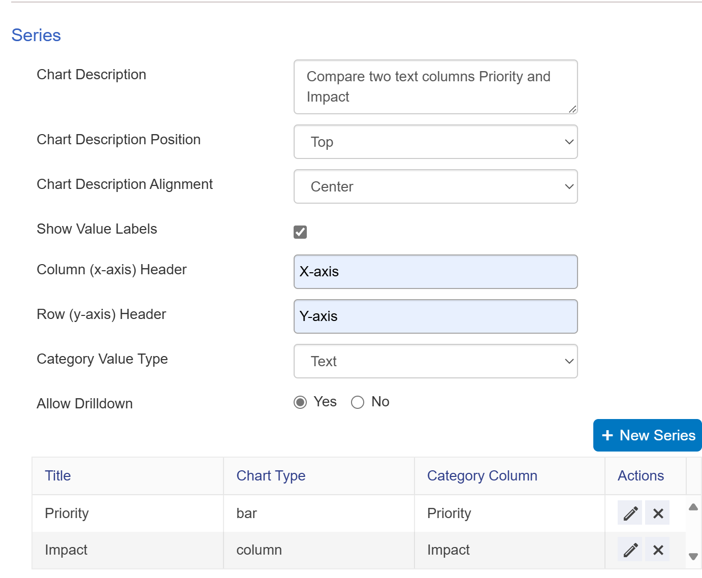
Series: In the Series settings,
Provide Chart Description and set the position and alignment of chart description.
Show Value Labels if this setting is enabled, it will showthe value column data. If this setting is disabled, it will not show value column data.
Provide Column (x-axis) and Row (y-axis) header
Category Value Type should be set to Text, Date, or Number depending on what types of columns data will be included on the report. Each of the columns to be included as a series must be of that same Category Value Type.
Allow Drilldown setting if enabled will create a feature of the report, that when each section of the chart is selected, will open the list view with the filter of only those items that fall within that section, in the SharePoint list view.
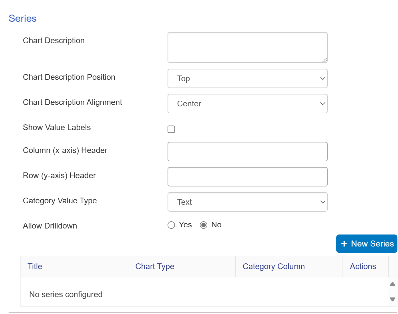
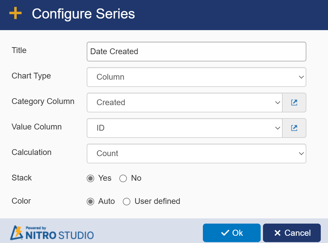
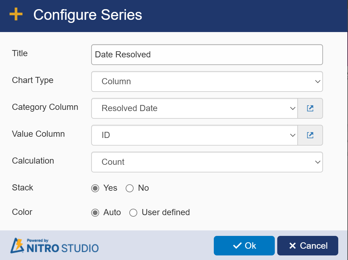
To create a New Series, select the + New Series button.
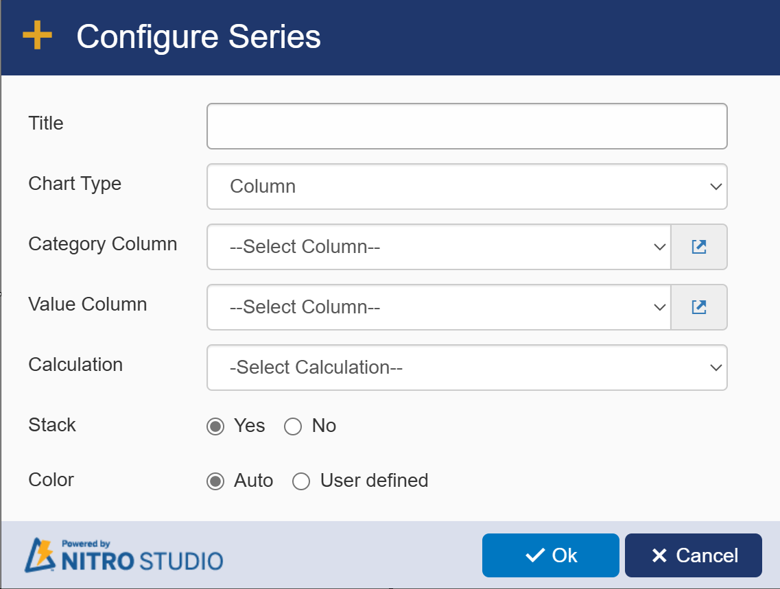
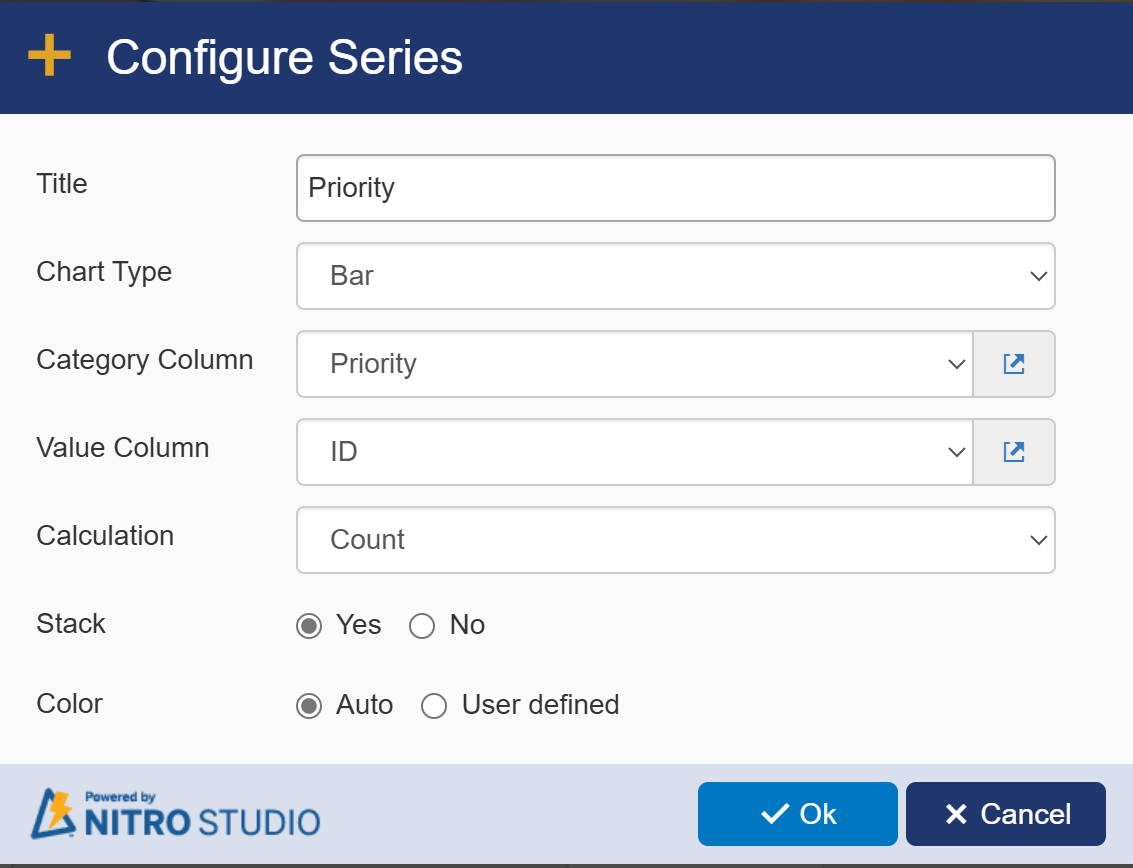
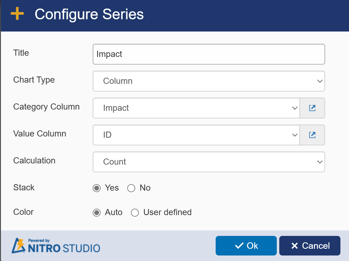
The Category Column is the column that you wish to display the data of.
The Value Column can be set to the ID column, or any other field that will have a set value in every item, as the value column acts to count the number of items in the dataset.
The Calculation field must be set to Count.
The Stack feature can be enabled if you want one series data to be stacked on the other series’ data. Otherwise, the series will be displayed beside one another.
The Color feature allows you to set a user-defined color scheme. The "Select Theme" feature can also be used to set the colors of the chart. Otherwise, the colors will be automatically regenerated every time the report is reloaded.
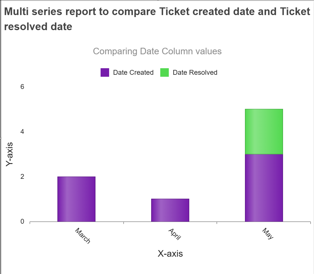
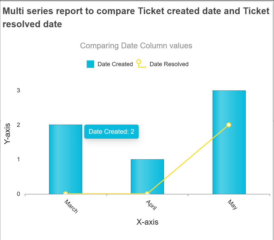
Example 1: Using a Multi-series report to compare two date columns.
Here is a Multi-series report configuration for comparing Date Created to Date Resolved for the same list.
Here are each of the series configurations:
Date Created Series:
Date Resolved Series:
Report Generated:
You can also choose a different type of chart for each series:
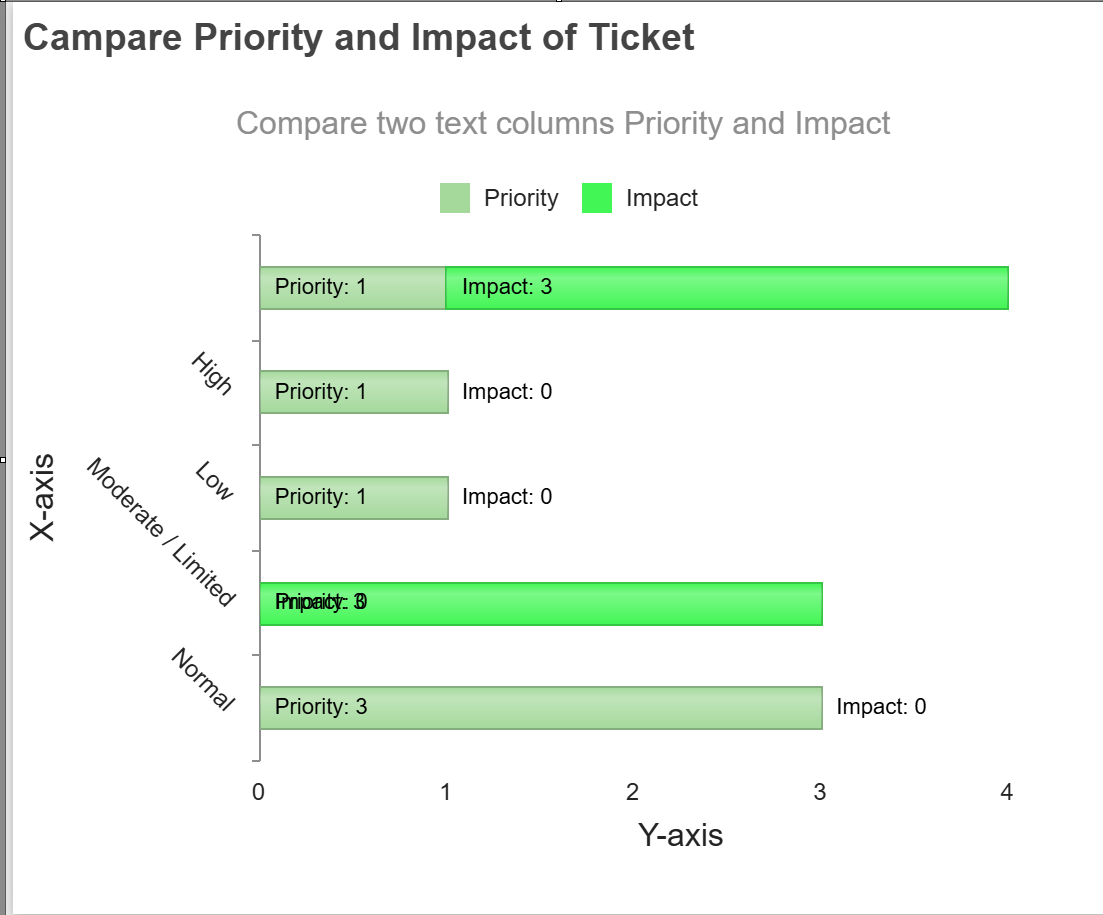
Example 2: Using a Multi-series report to compare two Text columns
Here is a Multi-series report configuration for comparing Priority to Impact for the same list.
Priority Series:
Impact Series:
Report Generated: