Create New Theme in Report Manager
NITRO Reports allows you to create custom themes to provide borders, padding and spacing to tables and also to define custom colors for charts.
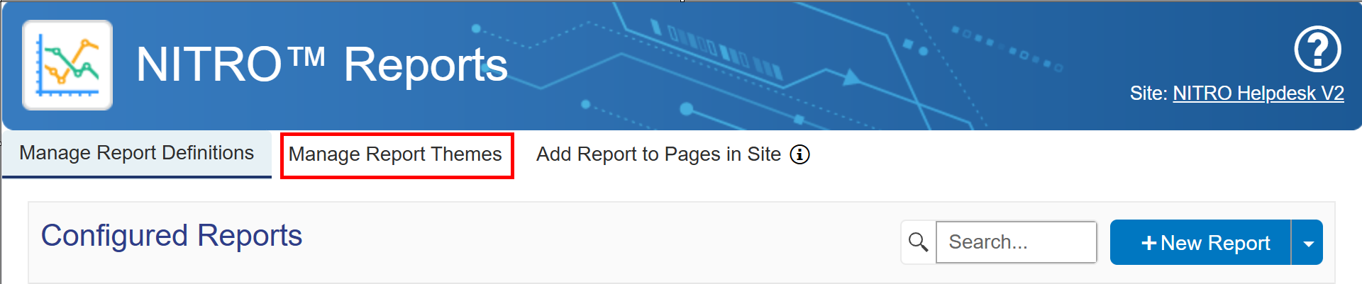
Go to the "Manage Report Themes" tab in Report Manager.
Themes can be added, edited, or deleted on this tab.
Choose "New Theme" to create a theme.
Theme Name: give the theme a name
Table Appearance & Chart Appearance: options differ for table themes versus chart themes
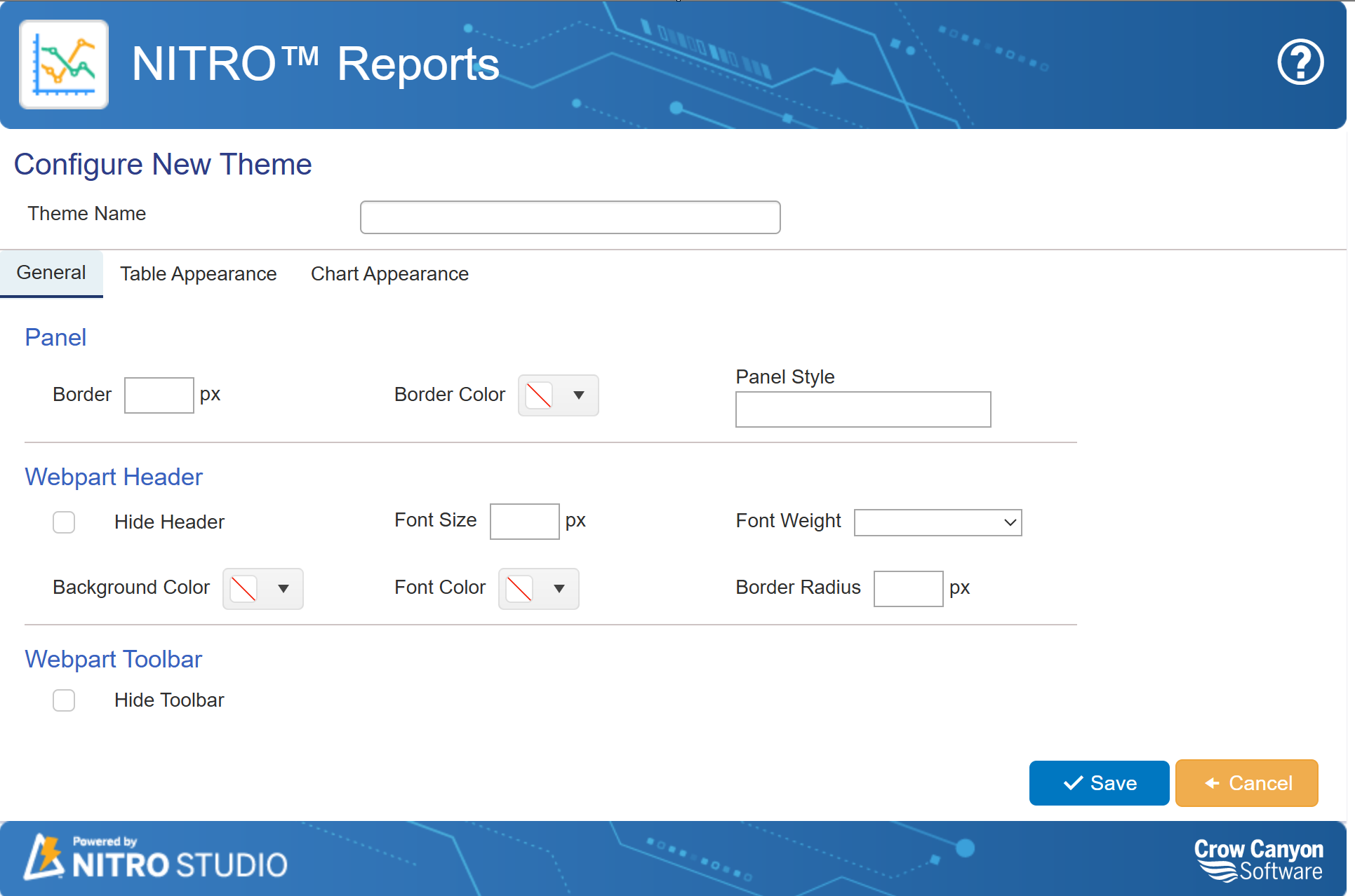
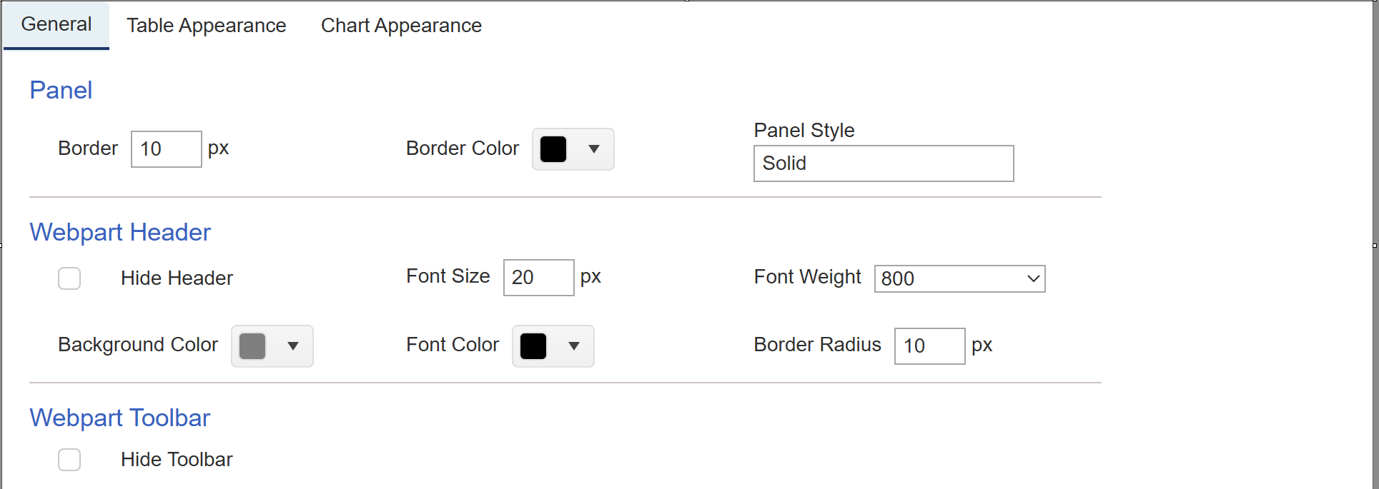
General Tab
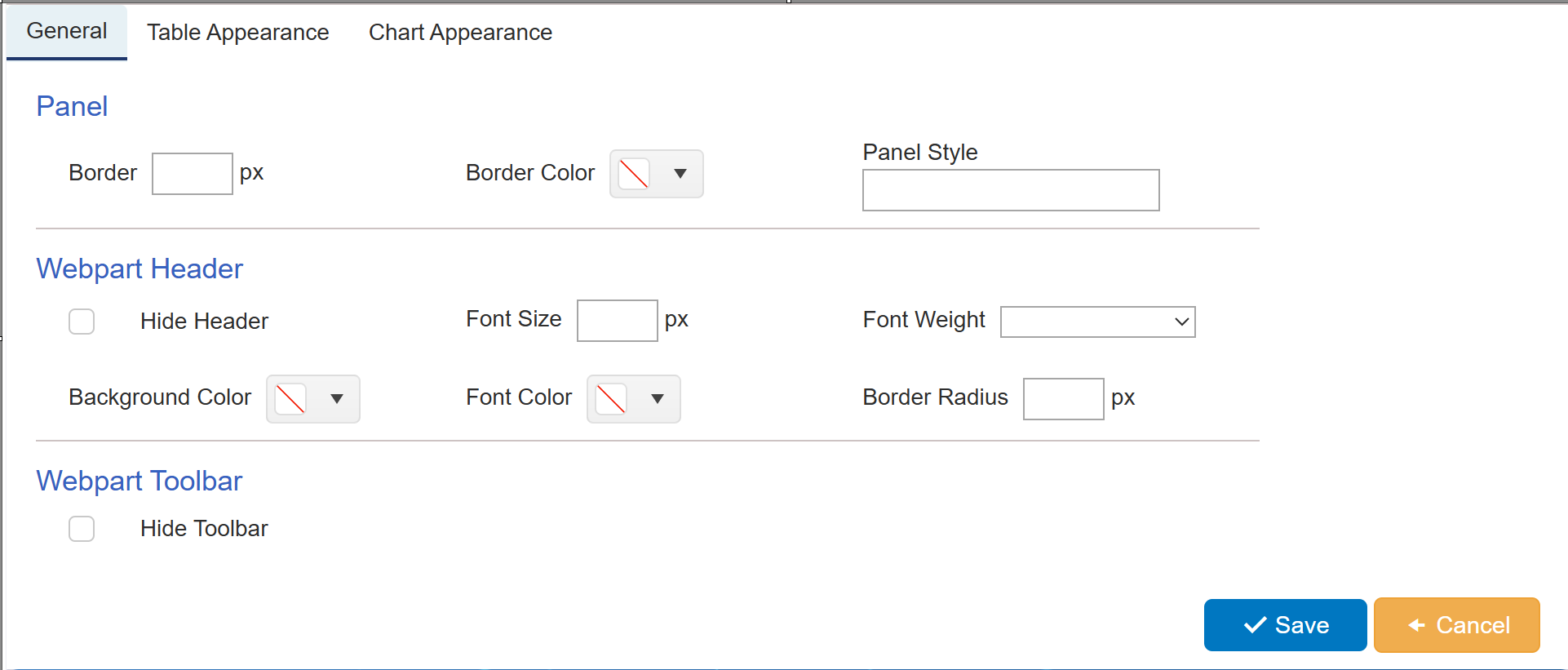
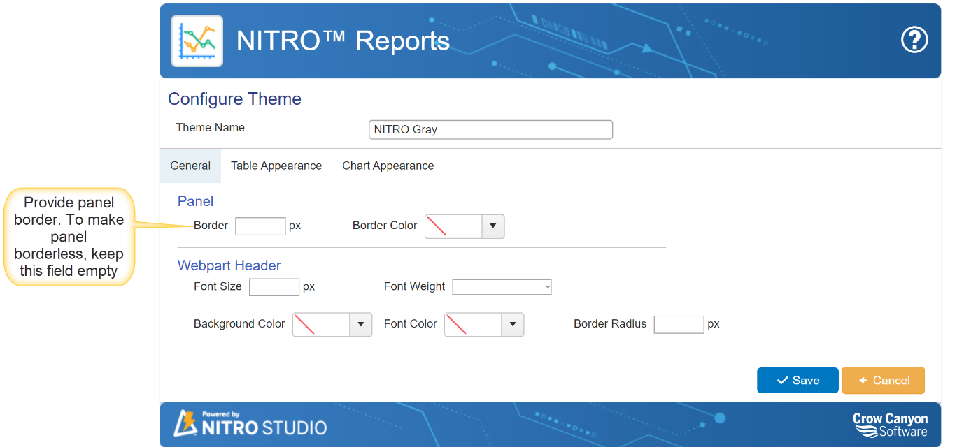
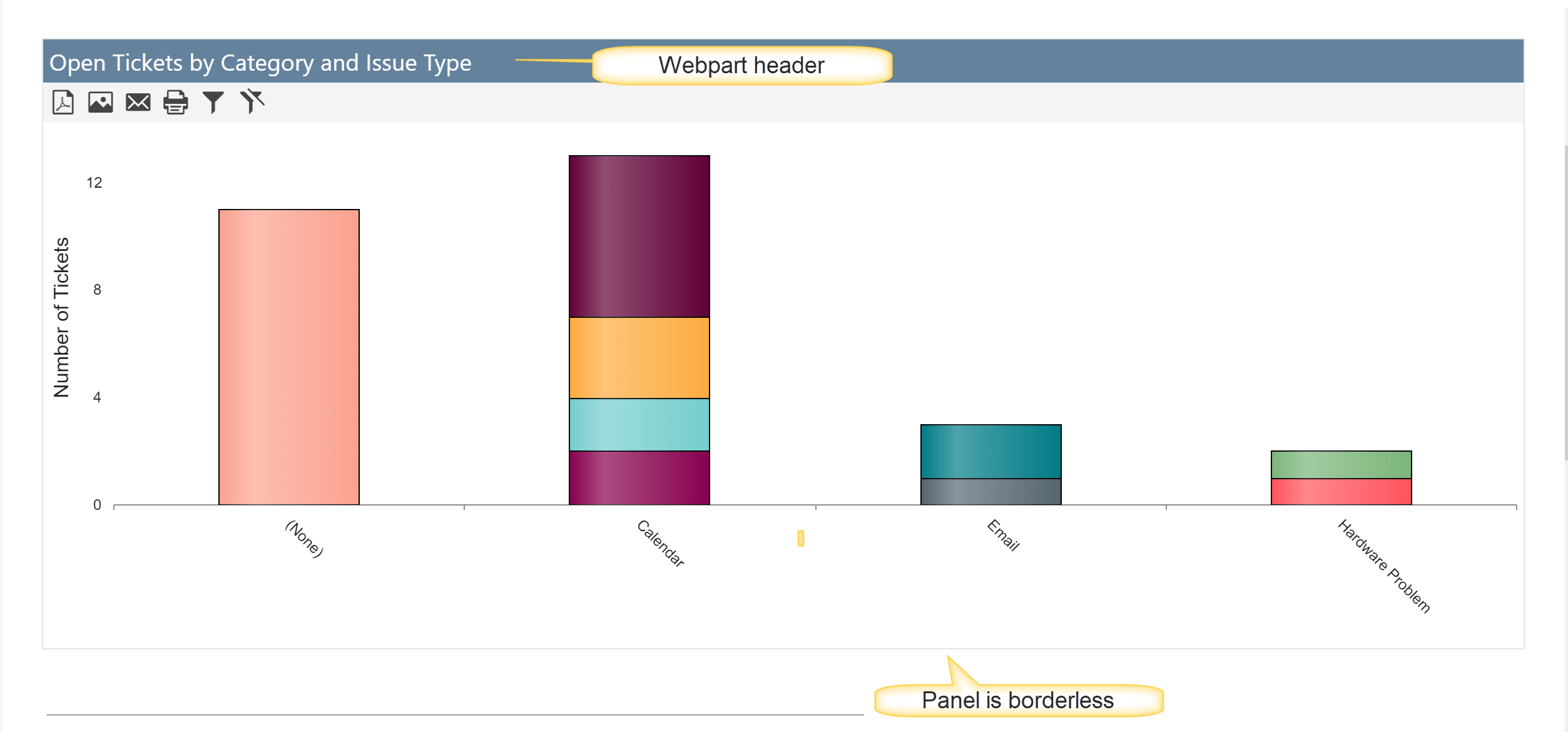
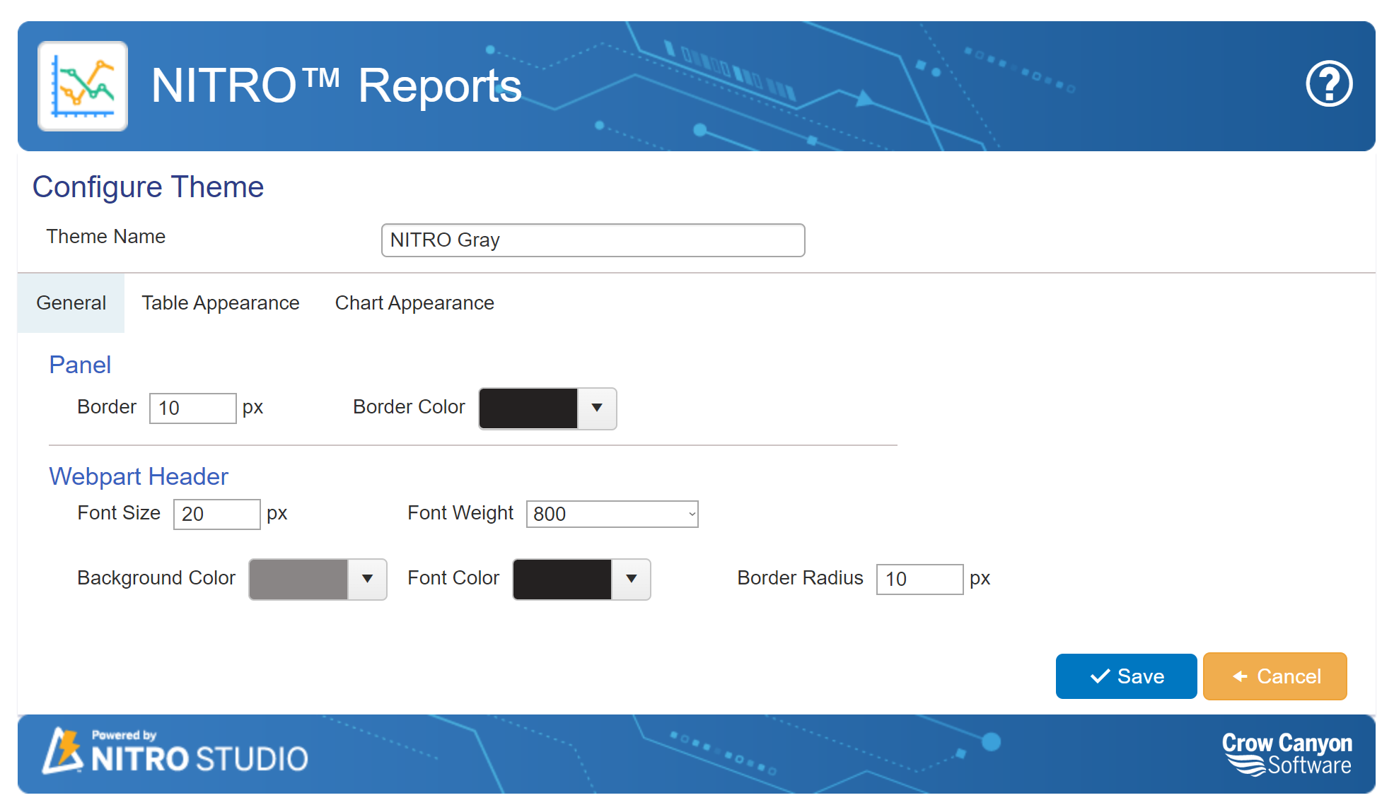
Panel: Provide border size , border color and panel style (Like dotted/Solid). To keep panel border less, keep these fields empty.
Webpart Header: To hide webpart header, select 'Hide Header' option. Provide webpart header font size, font weight, font color and background color. Proder webpart header border radius size.
Webpart Toolbar: Enable this option to hide webpart toolbar. id this option is disabled, toolbar will be visible.
Sample Settings of General tab
Sample output of General tab
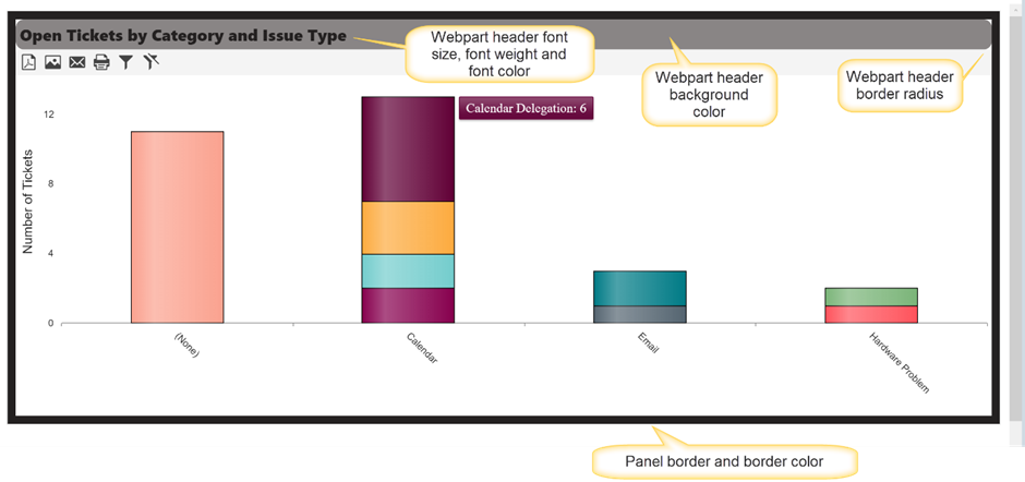
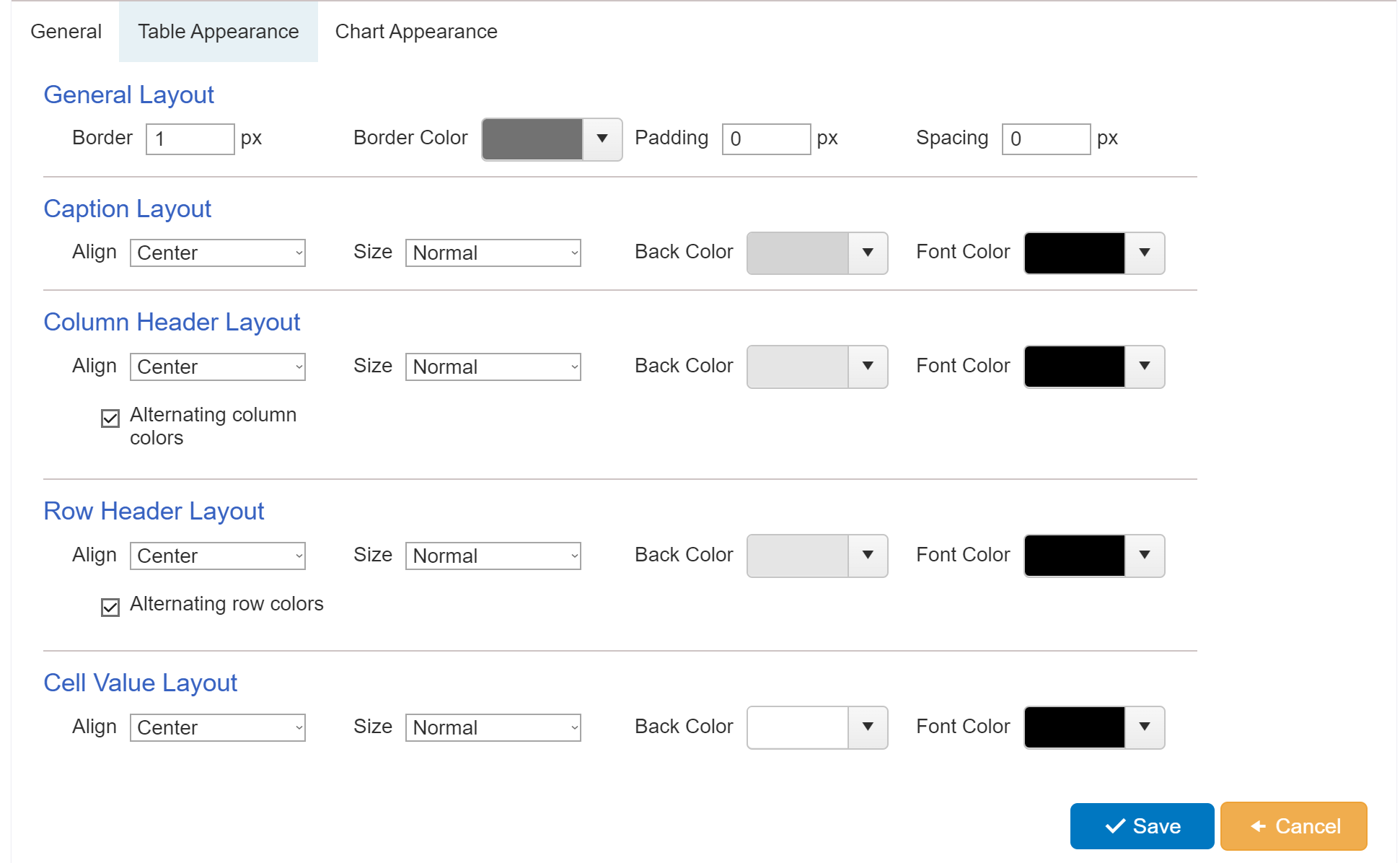
Table Appearance:
Table appearance can be configured in Reports by providing a border and padding, along with header font colors in the ‘Table Appearance’ section as shown below.
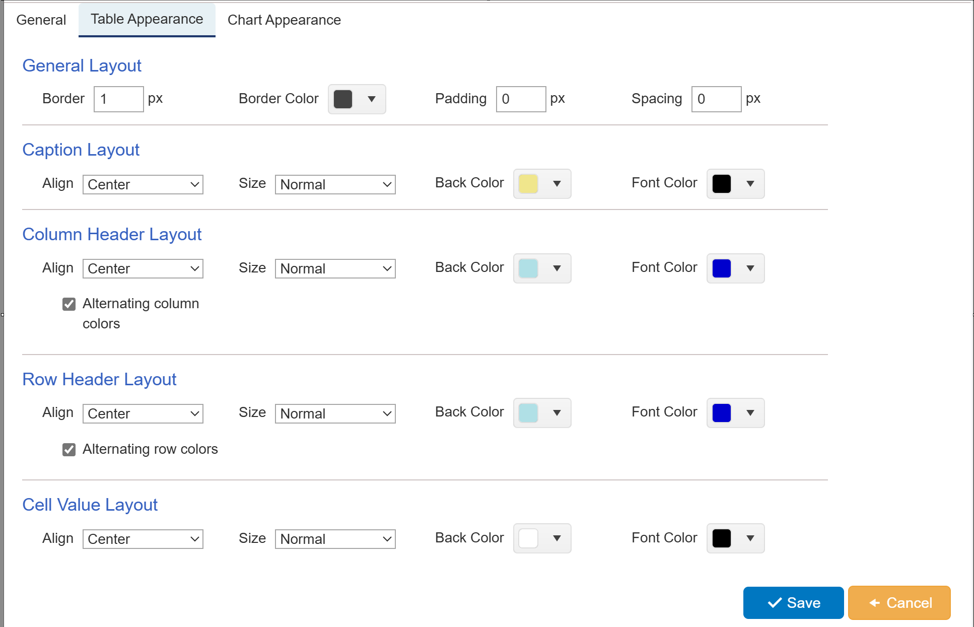
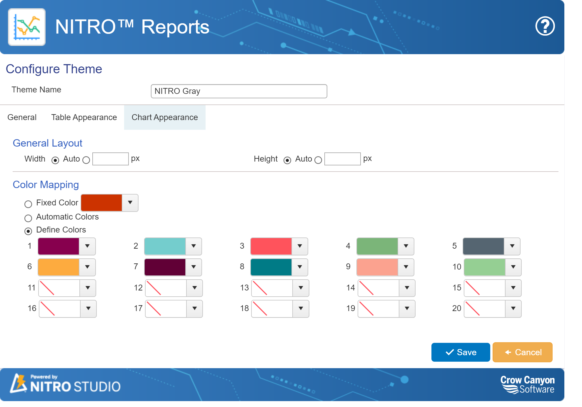
Chart Appearance
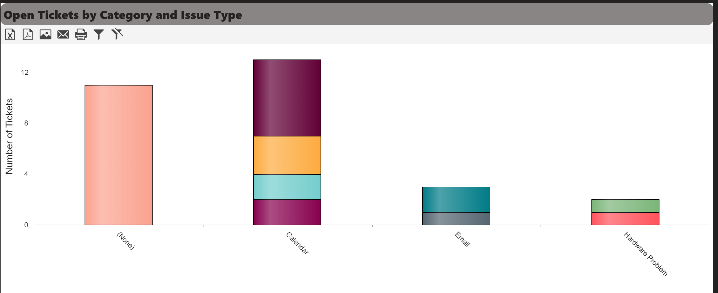
Chart appearance is designed in the ‘Chart Appearance’ section shown below.
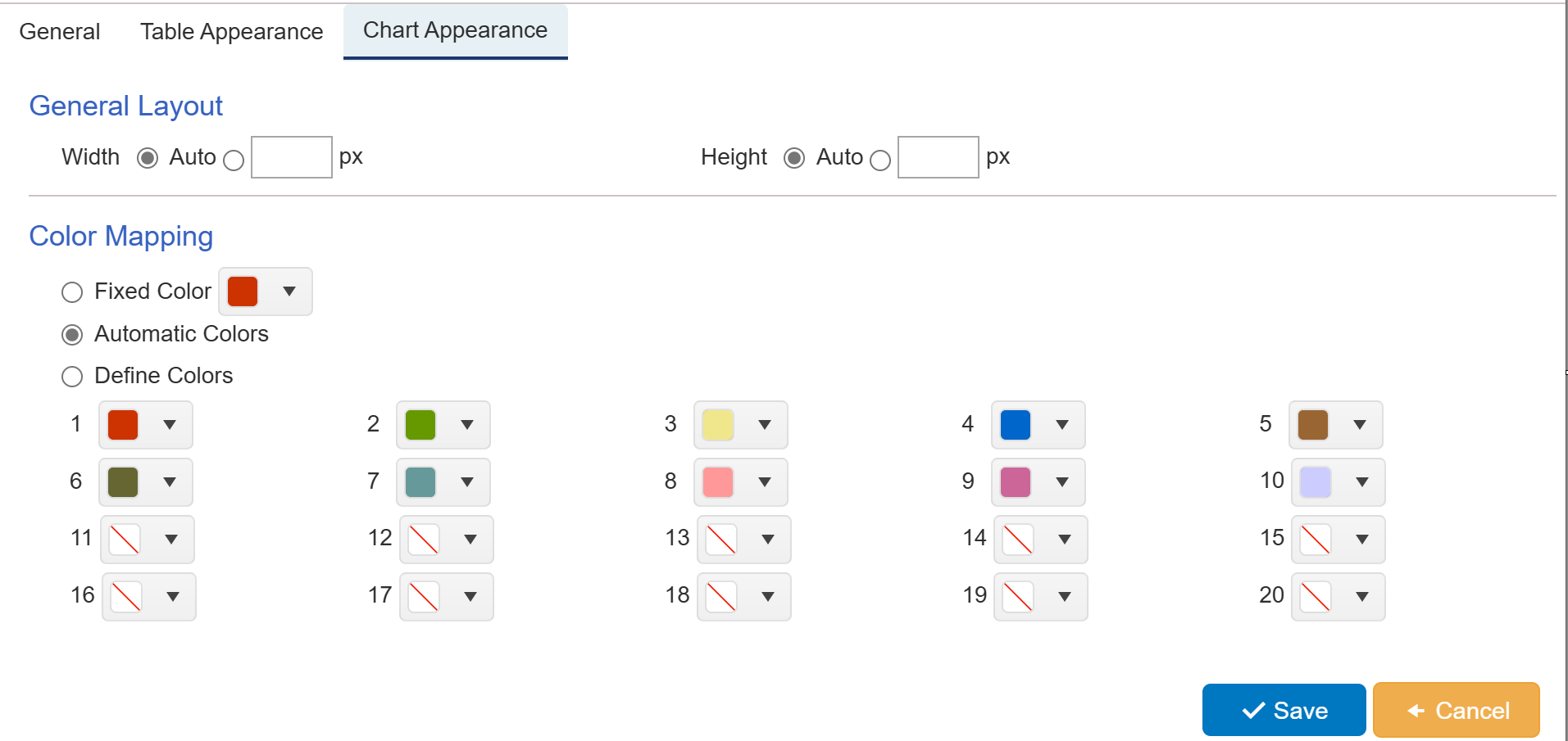
Below is the detail of each part of chart appearance
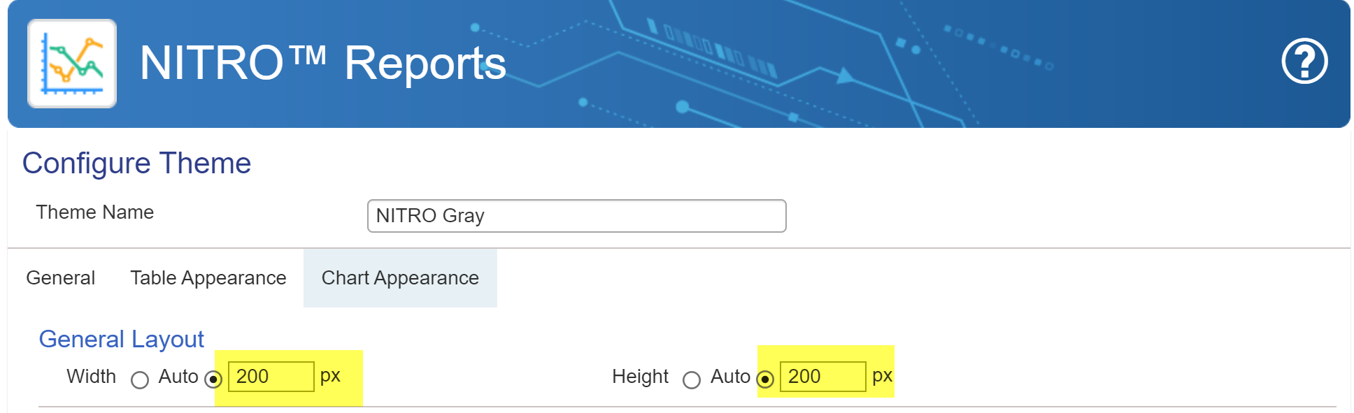
General Layout with ‘Auto’ width and height
General Layout with ‘custom’ width and height
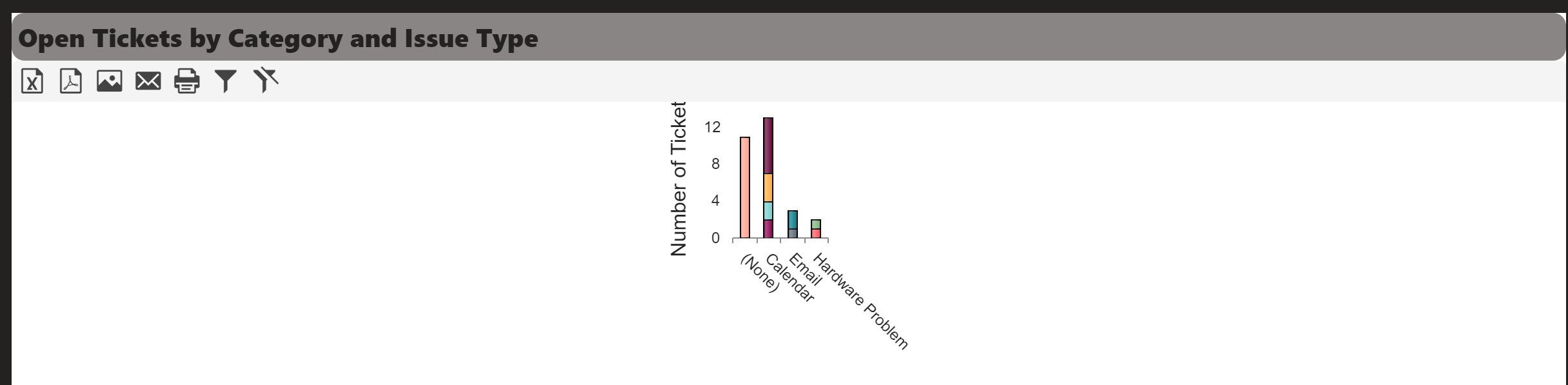
Sample output of customised width and height
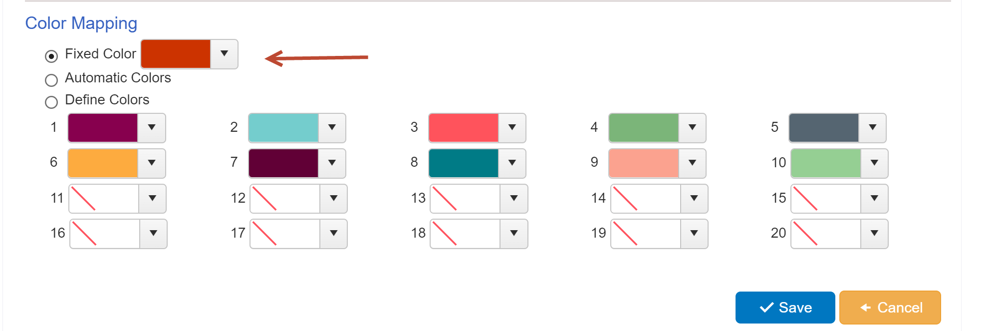
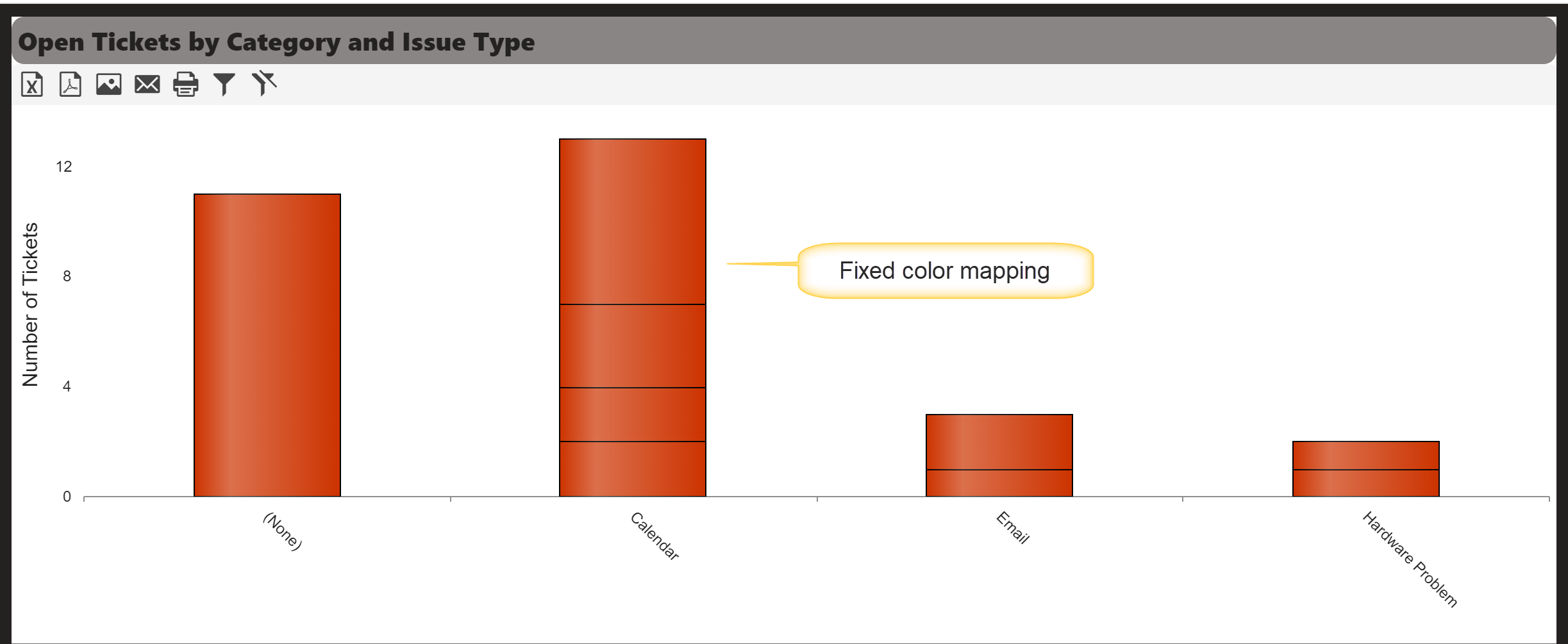
Fixed Color mapping in Chart Appearance
Sample Output of fixed color mapping in chart appearance
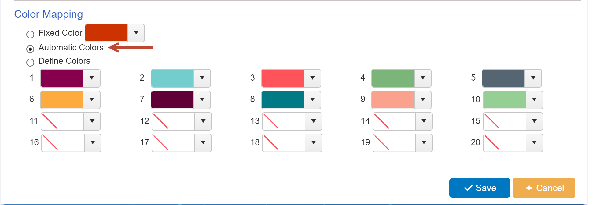
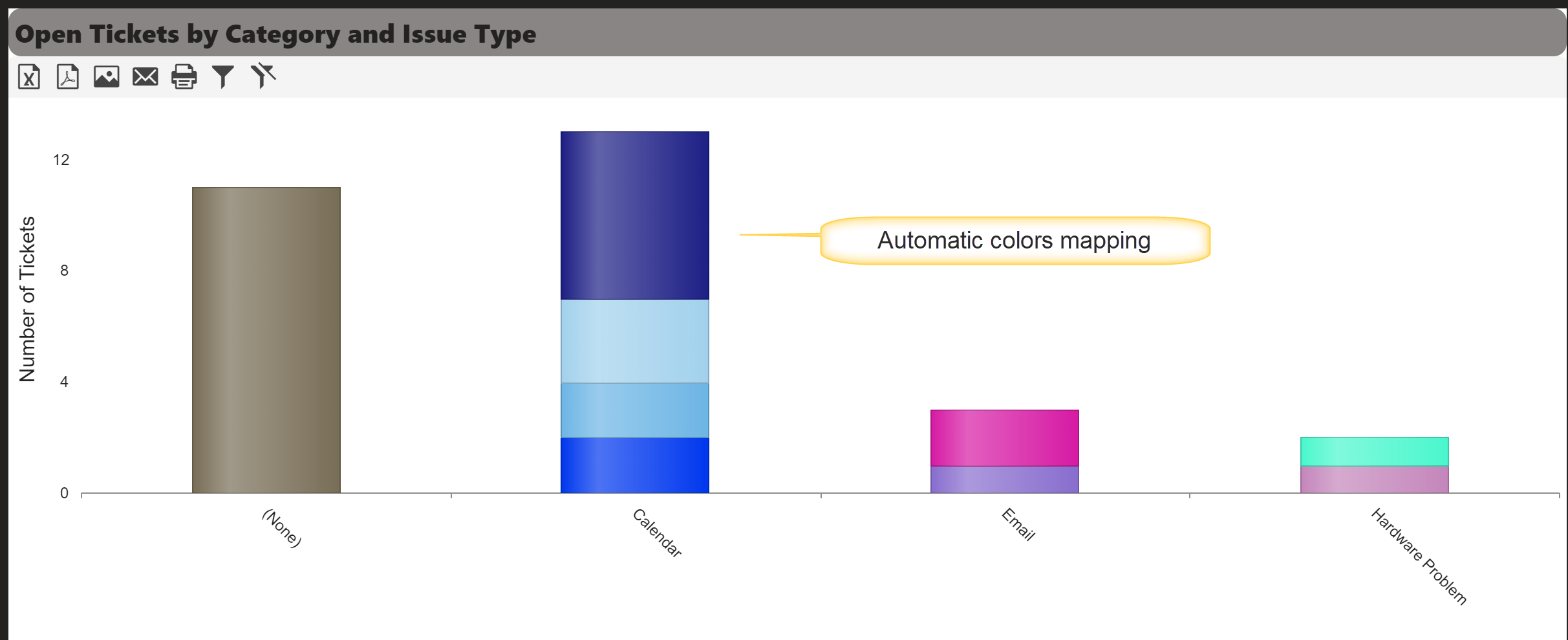
Automatic colors mapping in chart appearance
Sample output of automatic colors mapping in chart appearance
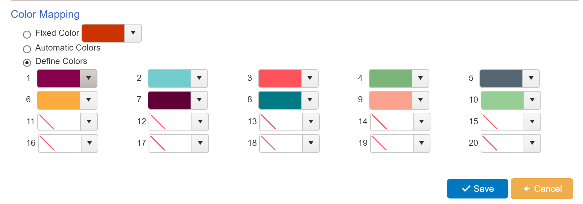
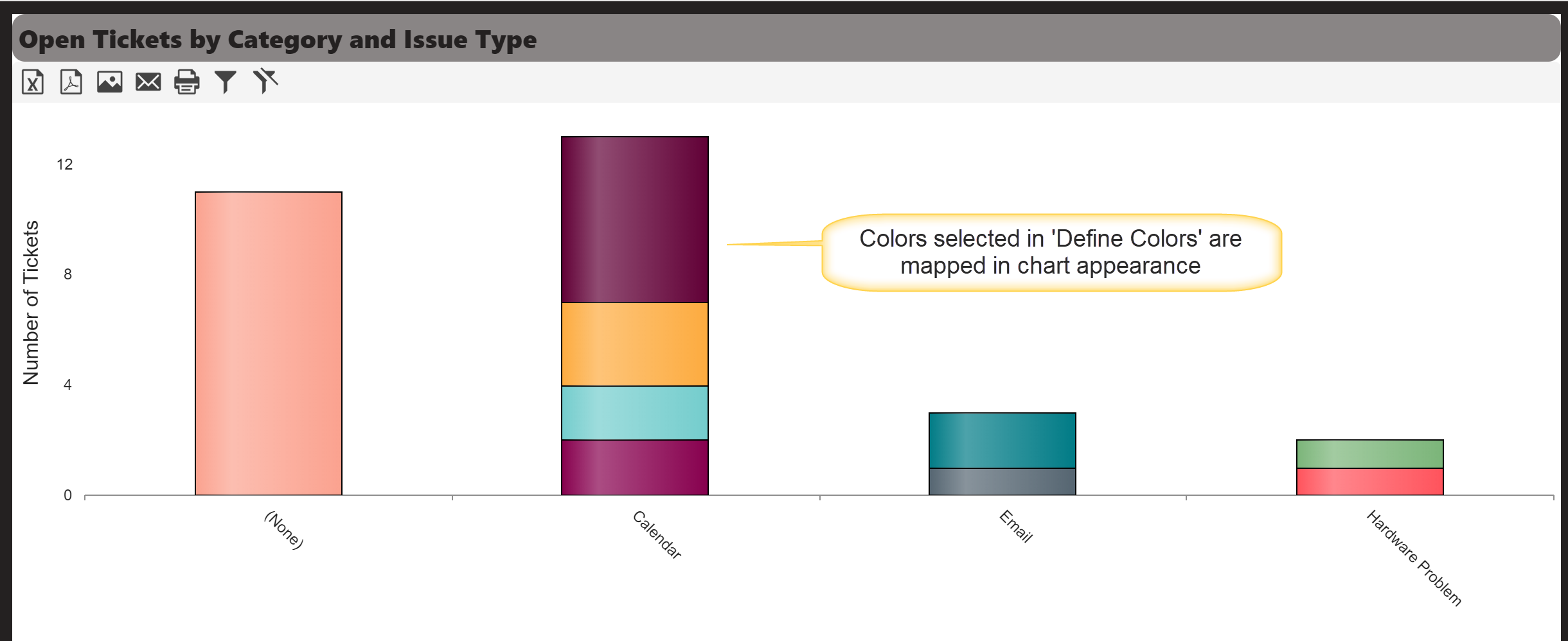
Define colors mapping in chart appearance
Sample output of define colors mapping in chart appearance
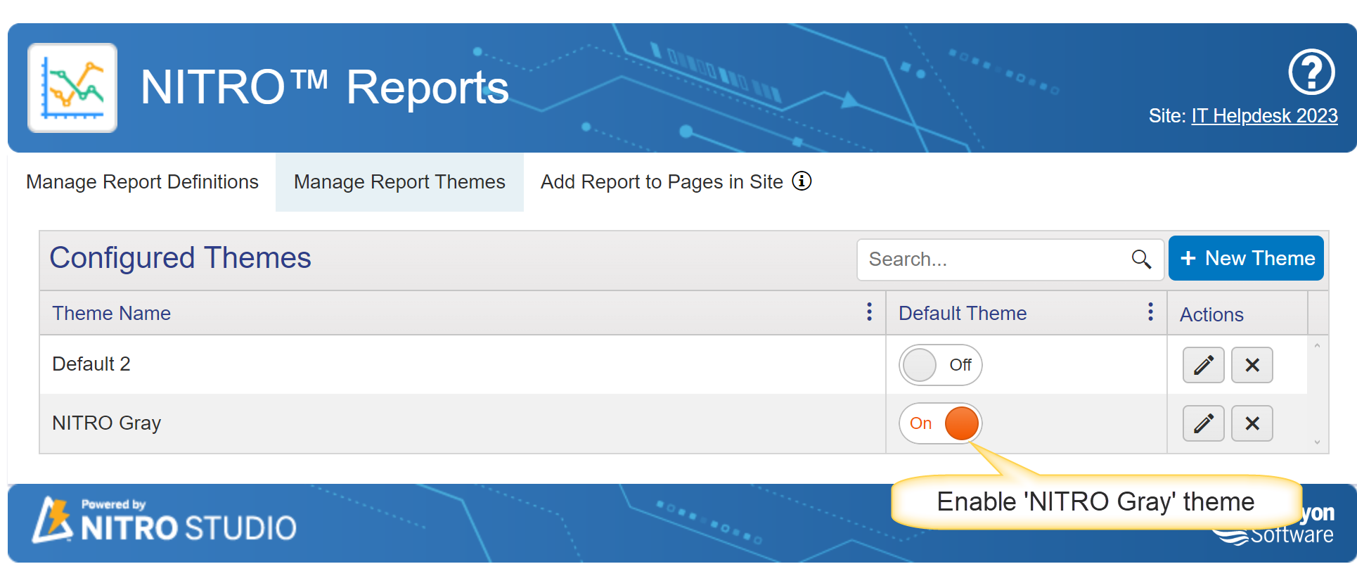
Gray Theme
NITRO Gray theme is available in NITRO Reports. Enable this theme to apply on NITRO Reports.
Edit the theme to view settings.
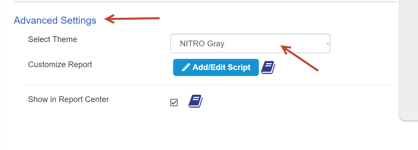
In NITRO reports advanced settings, Select NITRO Gray theme to apply the settings.
General Tab
Sample output of General tab
General Tab with Panel and Webpart header settings
Output of General Tab after applying panel and Webpart header settings
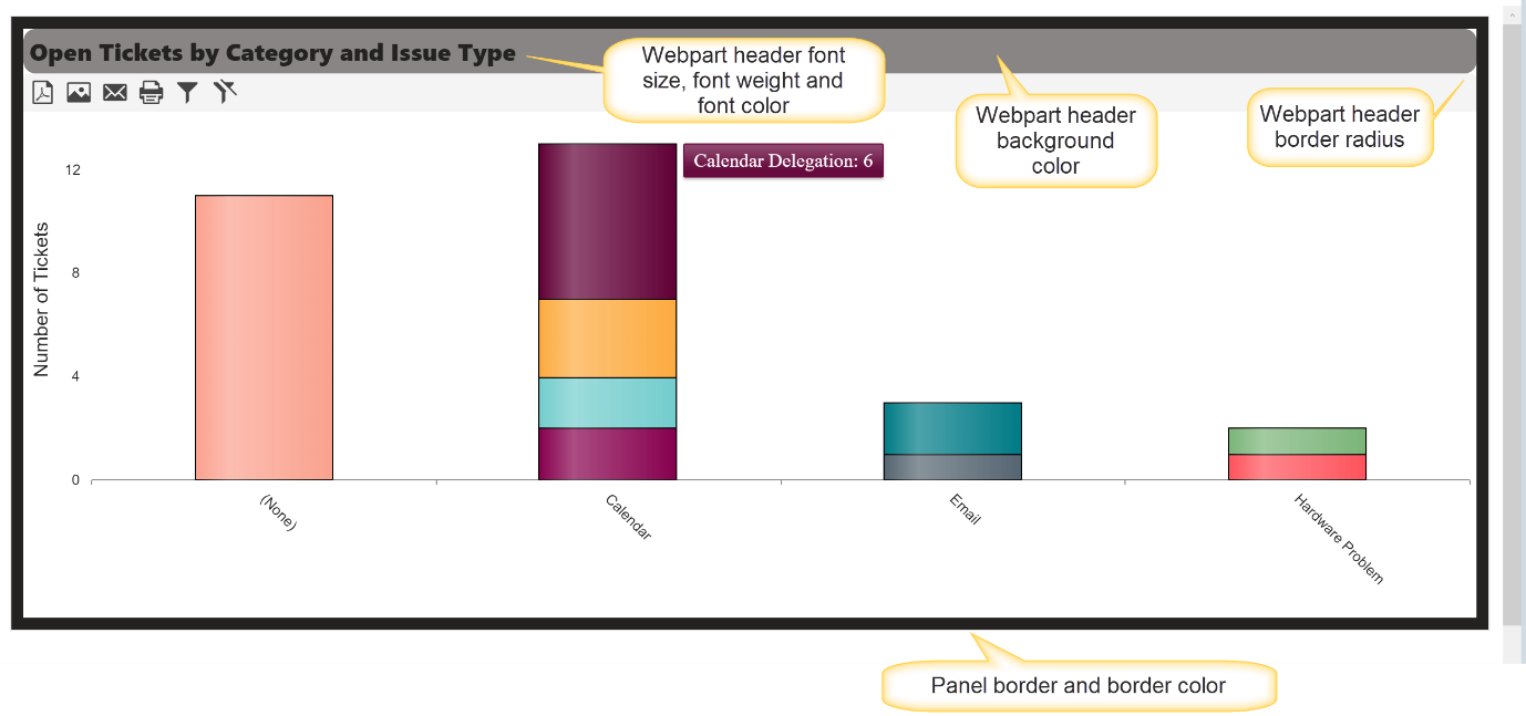
Table Appearance Setting for Grey Theme
Configure
User can change these settings according to their requirement.
Sample Output of Table with Grey theme
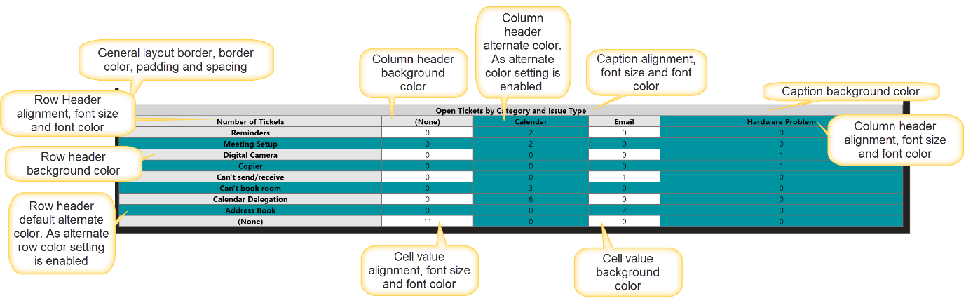
Chart Appearance
Configure chart appearance as shown below: