Custom CSS Sample Code
Overview: Custom CSS is used to change the look and feel of the NITRO Forms. You can use this if the Themes in NITRO Forms Designer are not sufficient for your branding needs.
In below example of custom CSS, following changes are demonstrated:
1.Use a gradient color for form background
2.Tab border style changes
3.Showing an icon in tabs
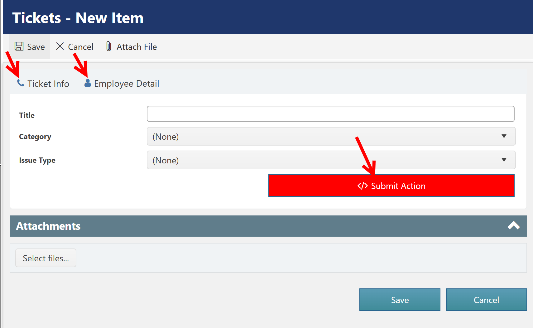
To specify the custom CSS, go to NITRO/Portal Form settings, in the left pane expand "Advanced" section and click "Custom CSS".
Custom CSS used for above changes:
/*Script Action Button Color*/
button.ccs_btn_ScriptAction {
background: #253cc6;
}
/*Script Action Button Color on hover*/
button.ccs_btn_ScriptAction:hover {
background: #0620ba;
}
/*Submit Action Button Color*/
button.ccs_btn_SubmitAction {
background: red;
}
/*Submit Action Button Color on hover*/
button.ccs_btn_SubmitAction:hover {
background: #0d7e0d;
}
/*Custom Action Button Color*/
button.ccs_btn_SubmitAction {
background: green;
}
/*Custom Action Button Color on hover*/
button.ccs_btn_SubmitAction:hover {
background: #0d7e0d;
}
/*Applying Form background color as Gradient in Tab*/
p.k-content#panleFormControls {
/* Permalink - use to edit and share this gradient: http://colorzilla.com/gradient-editor/#1e5799+0,7db9e8+100&1+0,0+100 */
background: -moz-linear-gradient(left, rgba(30,87,153,1) 0%, rgba(125,185,232,0) 100%); /* FF3.6-15 */
background: -webkit-linear-gradient(left, rgba(30,87,153,1) 0%,rgba(125,185,232,0) 100%); /* Chrome10-25,Safari5.1-6 */
background: linear-gradient(to right, rgba(30,87,153,1) 0%,rgba(125,185,232,0) 100%); /* W3C, IE10+, FF16+, Chrome26+, Opera12+, Safari7+ */
filter: progid:DXImageTransform.Microsoft.gradient( startColorstr='#1e5799', endColorstr='#007db9e8',GradientType=1 ); /* IE6-9 */
color:white;
}
/*Applying Tab icon before Tab title*/
/*Applying Icon to first Tab*/
ul#panelCCSTabs > li:nth-child(1) > .k-link:before {
font-family: FontAwesome;
content: "\f095";
padding-right: 5px;
color: #4575aa;
}
/*Applying Icon to second Tab*/
ul#panelCCSTabs > li:nth-child(2) > .k-link:before {
font-family: FontAwesome;
content: "\f007";
padding-right: 5px;
color: #4575aa;
}
/*Applying Tab CSS*/
#tabStripForm{
border:none;
}
#panelCCSTabs > li.k-item{
border:none;
min-height: 40px;
padding-top: 5px;
background: rgba(0,0,0,0);
}
#panelCCSTabs .k-loading{
border-top:0px;
}
#panelCCSTabs li.k-item:after {
position: absolute;
top: 0;
left: 0;
z-index: -1;
width: 100%;
height: 100%;
background-color: #f0f0f0;
content: '';
-webkit-transition: -webkit-transform 0.3s, background-color 0.3s;
transition: transform 0.3s, background-color 0.3s;
-webkit-transform: perspective(900px) rotate3d(1,0,0,90deg);
transform: perspective(900px) rotate3d(1,0,0,90deg);
-webkit-transform-origin: 50% 100%;
transform-origin: 50% 100%;
-webkit-perspective-origin: 50% 100%;
perspective-origin: 50% 100%;
}
#panelCCSTabs > .k-state-active:after {
background-color: #fff;
-webkit-transform: perspective(900px) rotate3d(1,0,0,0deg);
transform: perspective(900px) rotate3d(1,0,0,0deg);
}