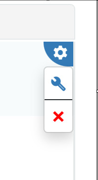
To configure the List Search box, go to the blue gear in the upper right corner once a List Search box has been placed on a page:
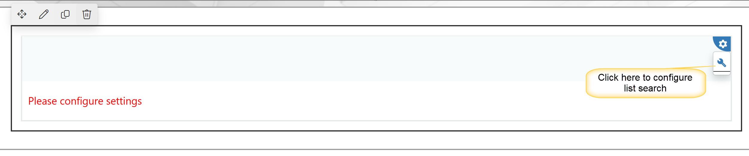
Choose the blue wrench there.
This opens the List Search Settings for this particular List Search box. List Search Settings contains multiple tabs, each described below.
General Tab:
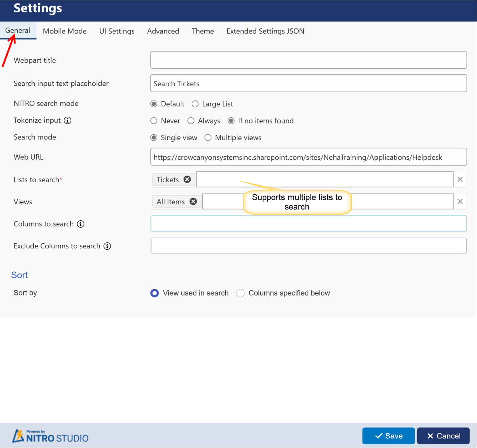
General Tab
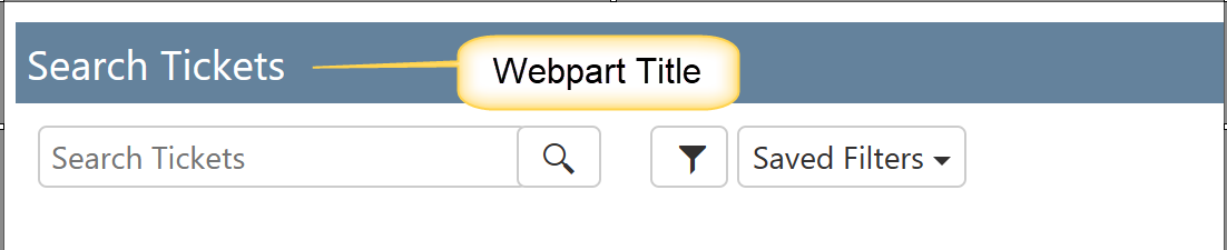
WebPart Title: the "List Search Header Text" that shows as the title of the List Search box. If you don't want to add Webpart Title, then leave it blank.
List Search With WebPart Header:
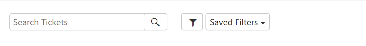
List Search Without WebPart Header:
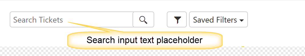
Search Input Text Placeholder: this is what is shown in the "Enter Search Text" box prior to the person entering in any text. By default, it says "Search Text" inside the Enter Search Text box. This option allows you to change that.
NITRO Search Mode: It has two options: Default and Large List. default option is selected by deafault. If list contains large number of items that exceeds SharePoint Threshold, then select Large List option. 'Tokenize Input' option is not available for large list.
Tokenize Input: NITRO search Supports Tokenize feature. In tokenize search, it splits multi word input and run query for each word. Tokenize search works with “And” operator.
For example:
Search String: “Email Working”
NITRO search will fetch all the items that contains words “Email” and “Working”
‘Tokenize’ feature supports 3 settings
•Never: This search will fetch the items matching with the exact substring of the text provided in the Search Box.
•Always: This Search will fetch all the items containing all the substring provided in the “Search Box” with ‘And’ operator. If exact match is not found, it will split the multi-word and run query for each word. Thereafter the result of each word is combined to find the match with the ‘multi-word’ provided in the search box.
•If no items found: This first searches for the exact substring of the text provided in the search box. If exact match is not found, it will split the multi-word and run query for each word. Thereafter the result of each word is combined to find the ‘exact’ match with the ‘multi-word’ provided in the search box.
Example of ‘Never’, ‘Always’ and ‘If no items found’
Item 1 text - "if email not working then"
Item 2 text - "if email working not then"
search string - "email not working"
Never – will return “if email not working then”
Always - will return both items "if email not working then","if email working not then"
If no items Found - will return "if email not working then" as exact match found
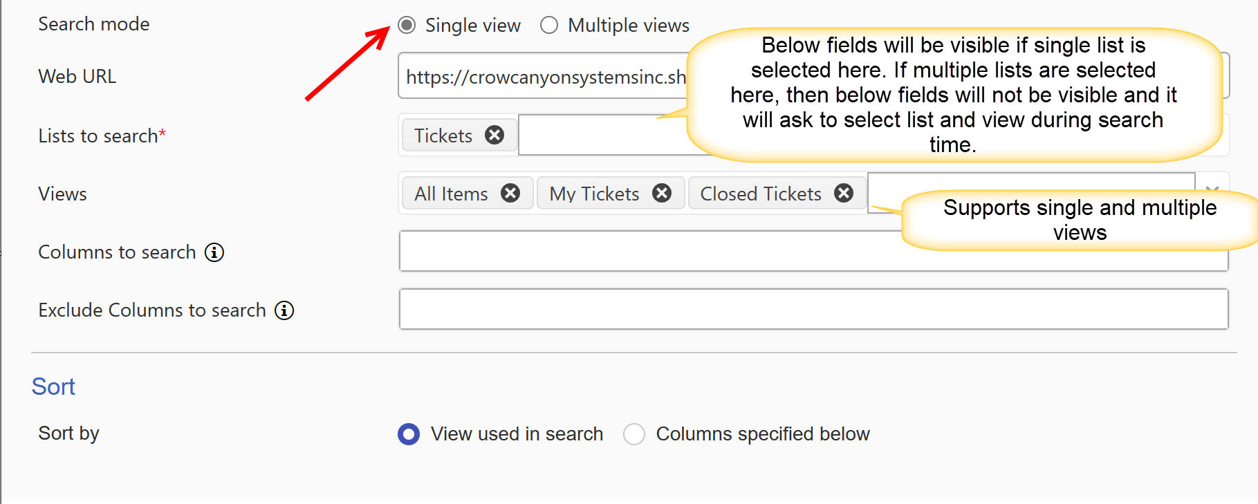
Search Mode:
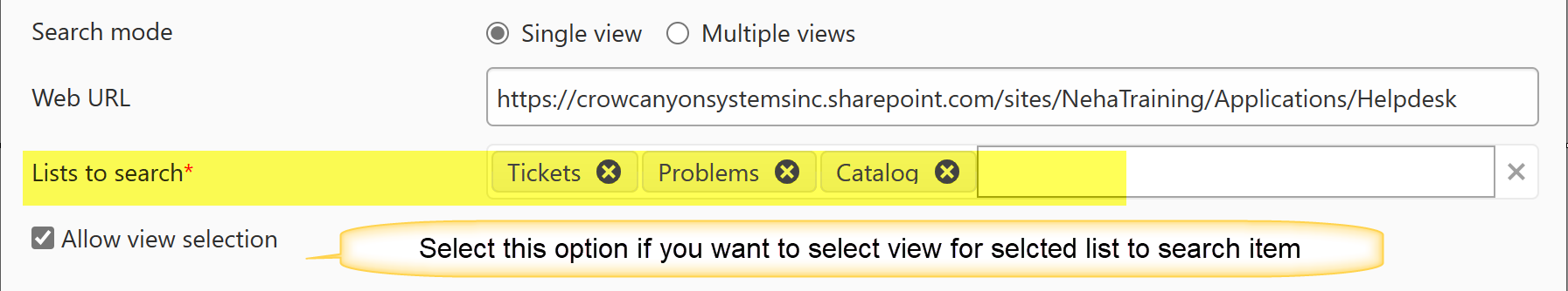
Single View: here you can configure search on single or multiple lists in current site, cross site and cross site collection. But here Web URL is provided once and only the lists of provided URL will be shown.
Web URL: Input URL of the page the List Search is being utilized on.
Lists to search: select single or multiple lists from dropdown. Dropdown will show all lists of above specified URL.
below fields will be visible only if single list is selected in 'Lists to search' field.
Views: Select one or more views from the list(s) to search for the webpart. This dropdown will show all views configured on list selected in 'Lists to search' field.
Columns to search: Select which columns you would like to search from the selected list(s) and view(s). For simple mode, entered text will be searched in specified columns. If list has large number of items, specified the indexed columns.Leave blank to search all columns.
Exclude Columns to search: for simple mode, entered text will not be searched in specified columns. Leave blank to search all columns.
Sort by: it provides two sorting options
View used in search: sort the columns according to view selected in list search
Columns Specified below: selecting this option makes 'First sort by column' and 'Then sort by column' fields visible. here you can select column by which you want to sort your search result. Also, you can show search result items in 'ascending' or 'descending' order.
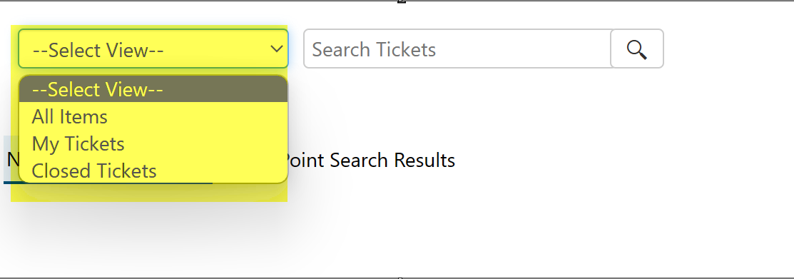
Output of single view with single list and multiple views: It will ask to select the view during execution of list search. If view is not selected then it will show message 'Please Select View'.
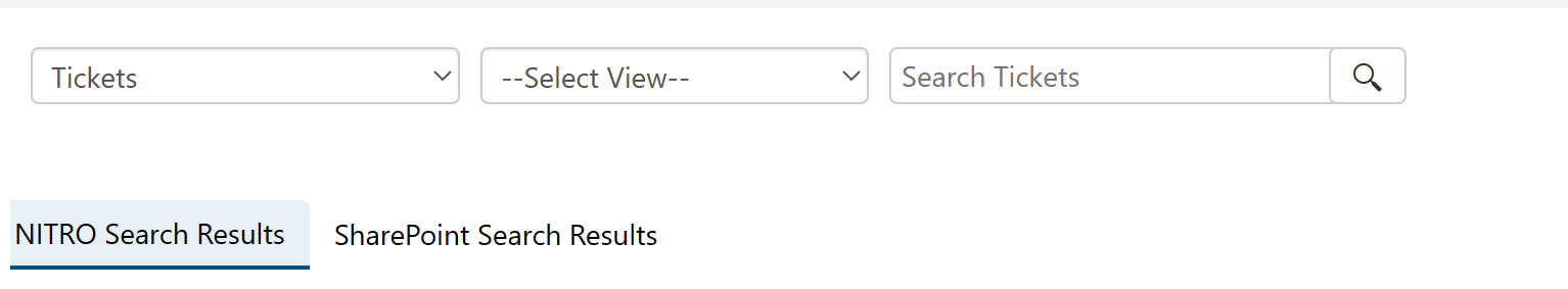
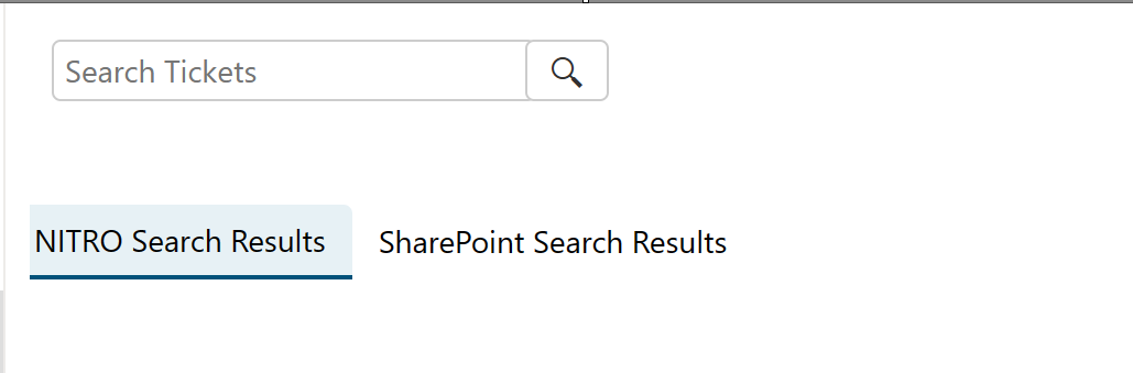
Single view with multiple lists:
Output of Single view with multiple lists:
Single view with single list and single view:
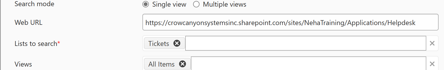
Output of Single view with single list and single view:
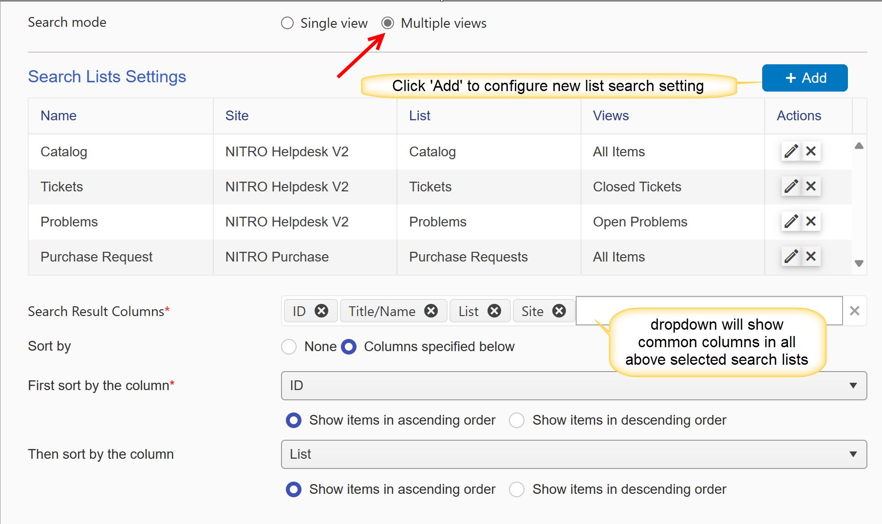
Multiple Views: here you can configure search on multiple lists in current site, cross site and cross site collection.
Search List Settings: click 'Add' button to configure list search on multiple lists.
Search Result Columns: here select the columns that you want to show in search result. multiple columns can be selected here. for multiple views, it will show the common columns of selected search lists.
Sort By: It provides two options
None: if you don't want to sort the search output items then select this option
Columns Specified below: selecting this option makes 'First sort by column' and 'Then sort by column' fields visible. here you can select column by which you want to sort your search result. Also, you can show search result items in 'ascending' or 'descending' order.
below form will pop up by clicking 'Add' button
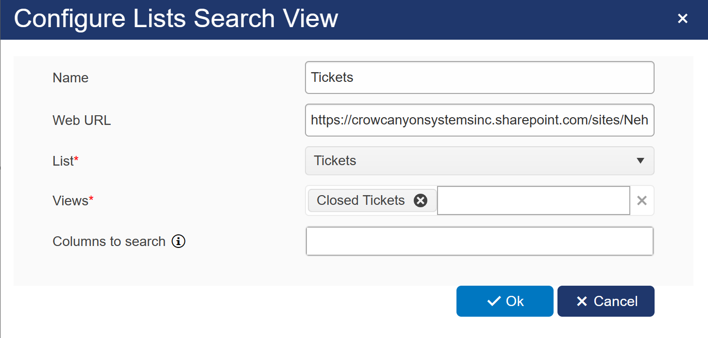
Name: Provide name for List search view
Web URL: Input URL of the page the List Search is being utilized on.
List: here dropdown will show all lists of above selected site. select list to search data.
Views: here dropdown will show all views configured on above selected list. Select one or more views from the list(s) to search for the webpart.
Columns to search: Select which columns you would like to search from the selected list(s) and view(s). For simple mode, enetered text will be searched in specified columns. If list has large number of items, specified the indexed columns.Leave blank to search all columns.
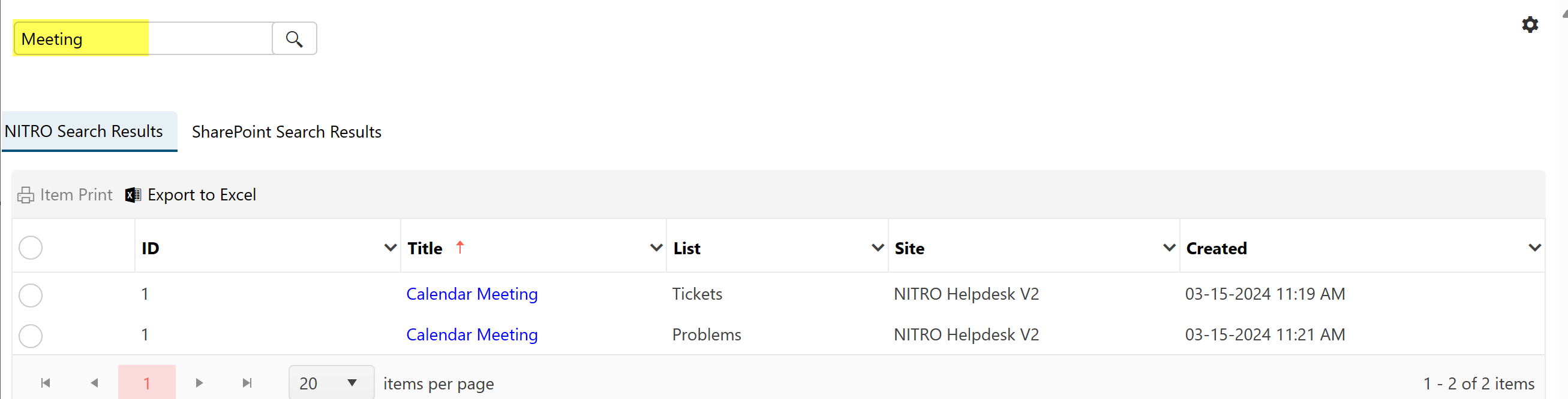
Output with Multiple views:
Mobile Mode tab:
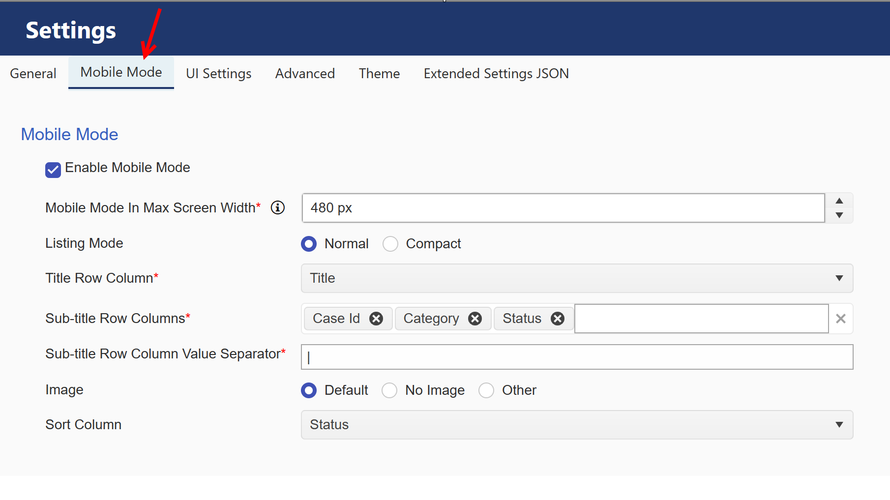
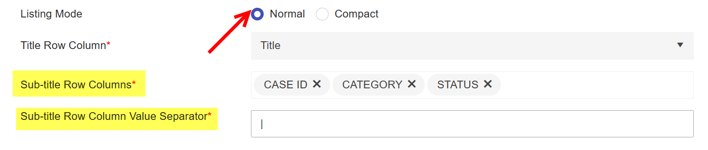
Listing Mode: We can show the items in list search as ‘Normal’ and ‘Compact’ listing mode.
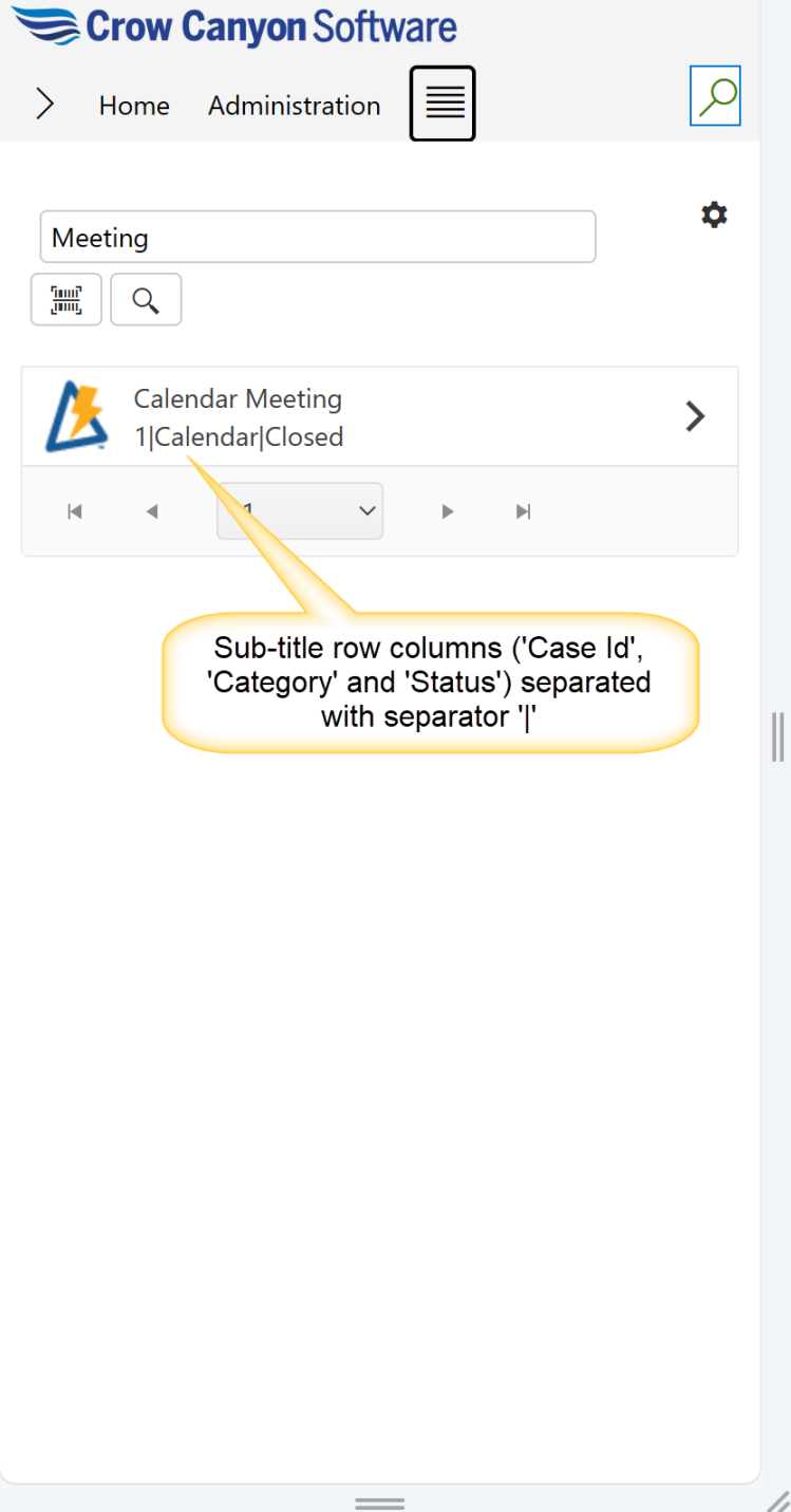
•Normal: When normal mode is selected, ‘Sub-title Row Columns’ and ‘Sub-title Row Column Value Separator’ columns will be visible.
Sample output of normal mode:
•Compact:
When ‘Compact’ mode is selected, then ‘Sub-title Row Columns’ and ‘Sub-title Row Column Value Separator’ options are hidden, and the search result items show only the title of item.
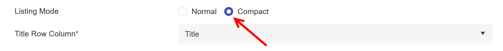
Sample output of compact mode:
Title Row Column: Select the column from dropdown to show the ‘Title’ for search result item in mobile experience.
Sub-title Row Columns: Select the columns to show the other columns information on the search result item.
Sub-title Row Column Value Separator: Specify separator to be shown between above selected sub-title row columns. Separator can be specified as comma, semicolon, pipe etc.
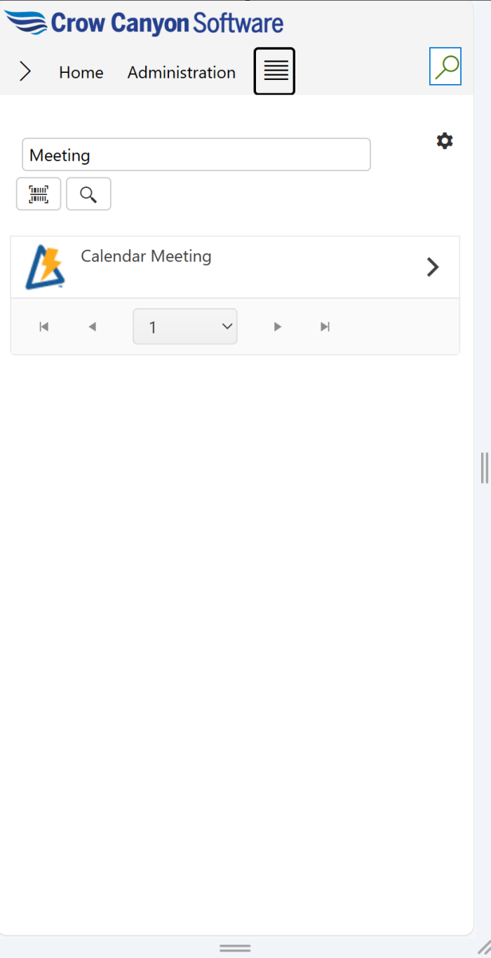
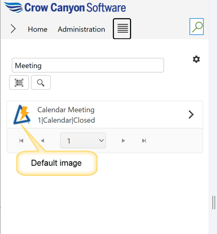
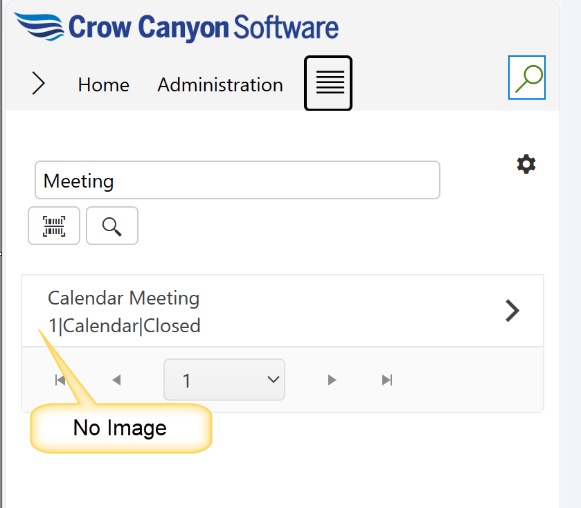
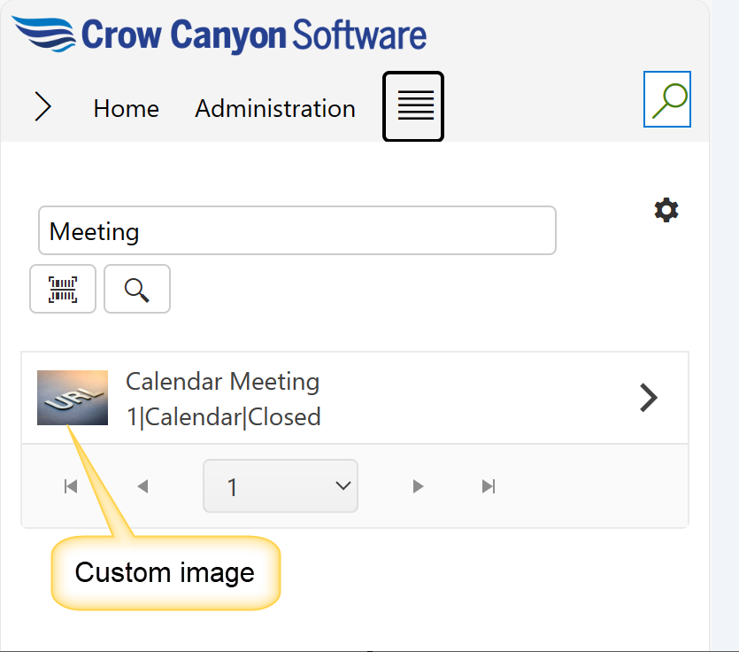
Image: Image will be shown on the search result item in mobile experience. Supporting below options in Image configurations:
The options present under this are ‘Default’, ‘No Image’ and ‘Other’.
Default: This is the default option. Selecting this option, will show NITRO image on the search result item in List Search.
No Image: When ‘No Image’ option is selected, then search result items will not show any image adjacent to the displayed list items as shown below:
Other: Select this option to specify the URL for custom image. This can be done by uploading an image to the ‘Site Assets’ folder and then using the path of the image to be specified in the ‘Enter Image URL’. Specified image will be shown on the item.
Sample Output of custom image:
Sort Column:
This option can be used to sort the search result items displayed in List Search in mobile experience.
In this example, we have selected ‘Status’ as the sorting column.

UI Settings Tab:
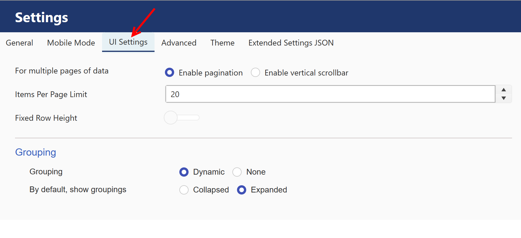
For multiple pages of data: it has two optons:
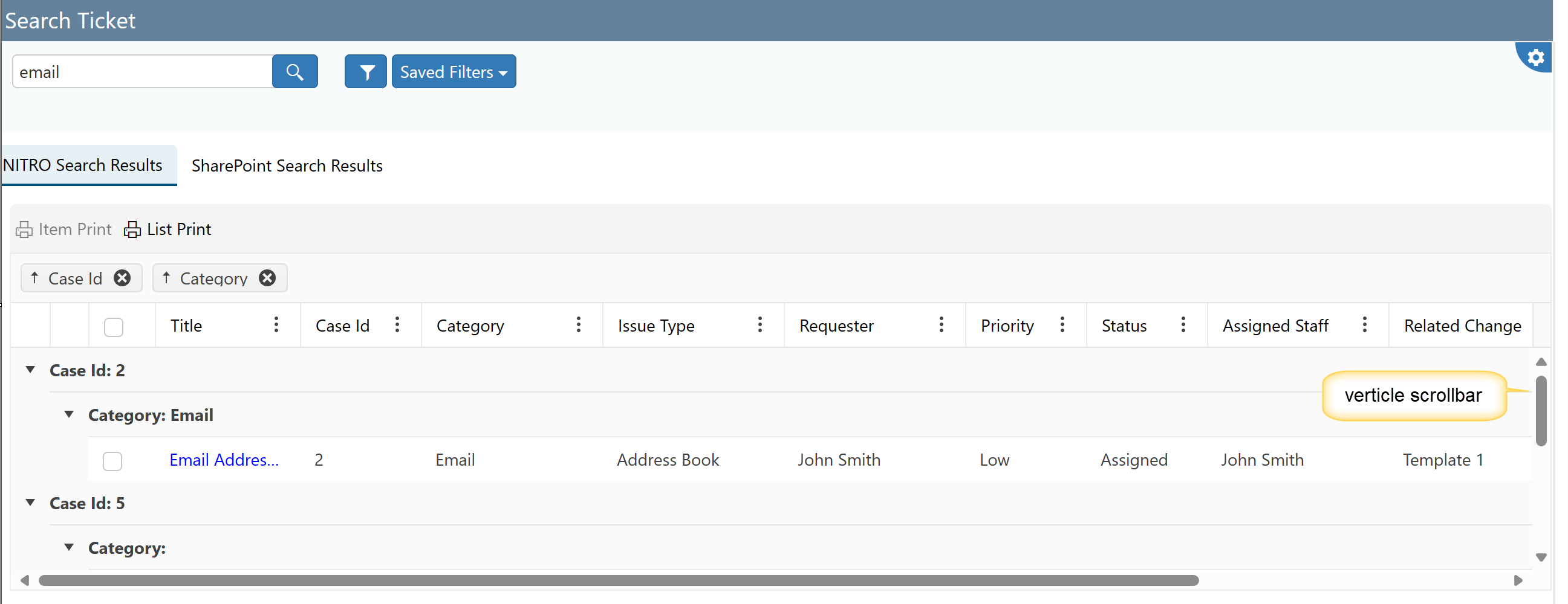
1) Enable pagination
2) Enable vertical Scrollbar : if this option is selected, below shown fields will be visible.
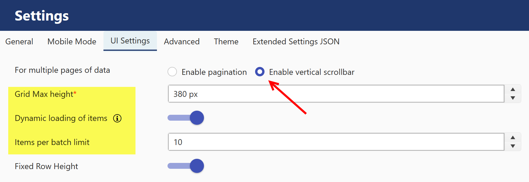
Grid Max Height: select grid height here.
Dynamic loading of items : load items as user scroll through data
Items per batch limit: select how many items can be shown in one batch of vertical scrollbar.
Sample output:
Items Per Page Limit: Determines how many items to show on a page before there is pagination.
Fixed Row Height: Sets the row height to be consistent.
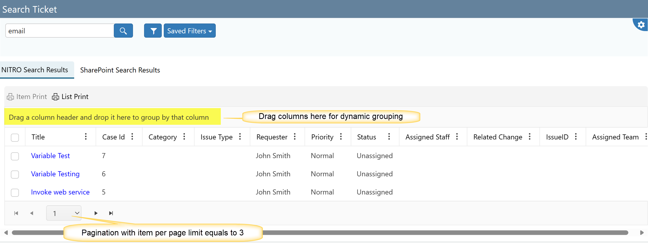
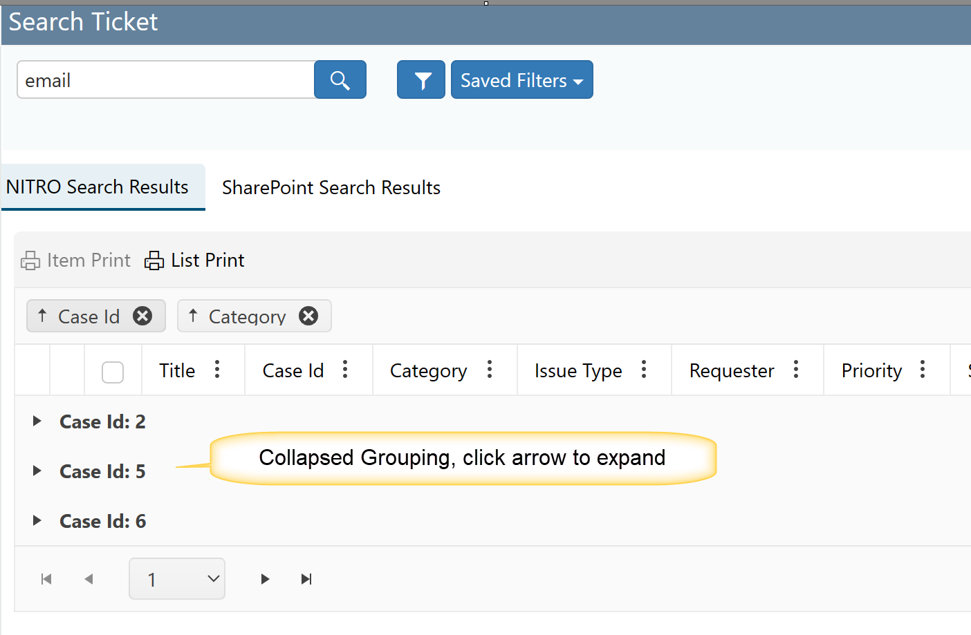
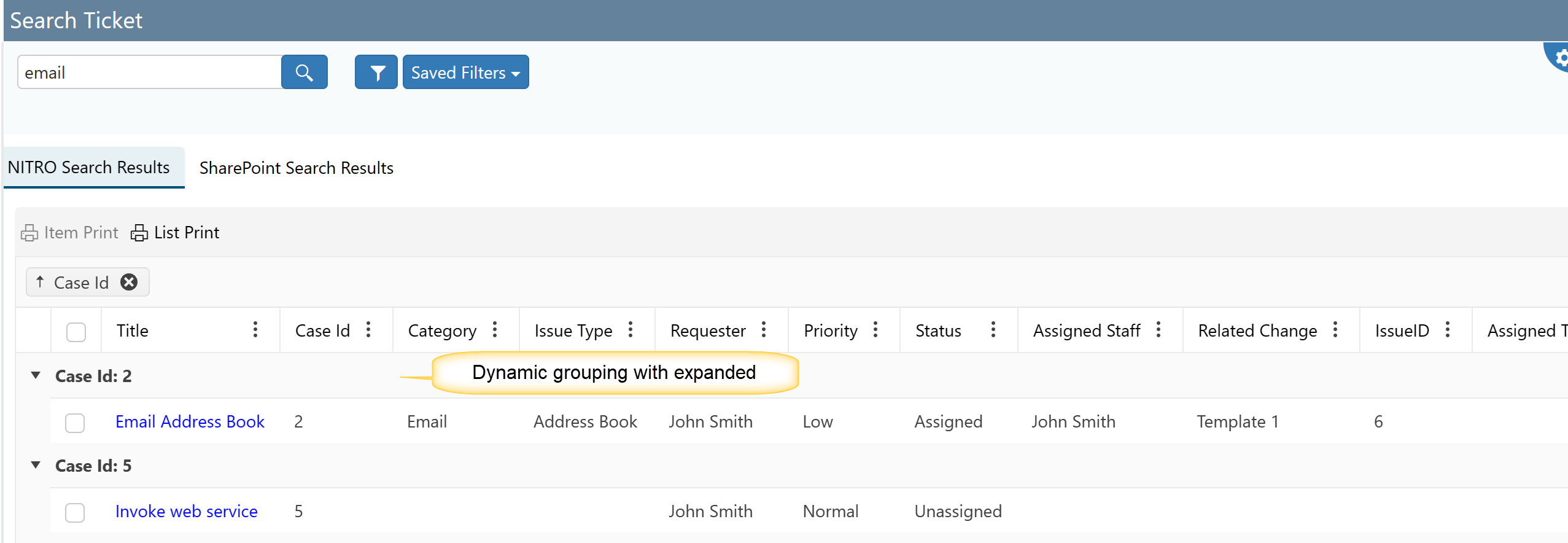
Grouping: It provides two options
Dynamic: Allows you to decide in real-time which column to group by on the display page for your List Search result items. Just select and
drag the column you wish to group by to the blue bar at the top of the List search. It provides two options to select: Collapsed and Expended.
Collapsed Dynamic grouping example:
Expended Dynamic grouping example:
None: If you don't want to provide any grouping then select this option.
Advanced Tab
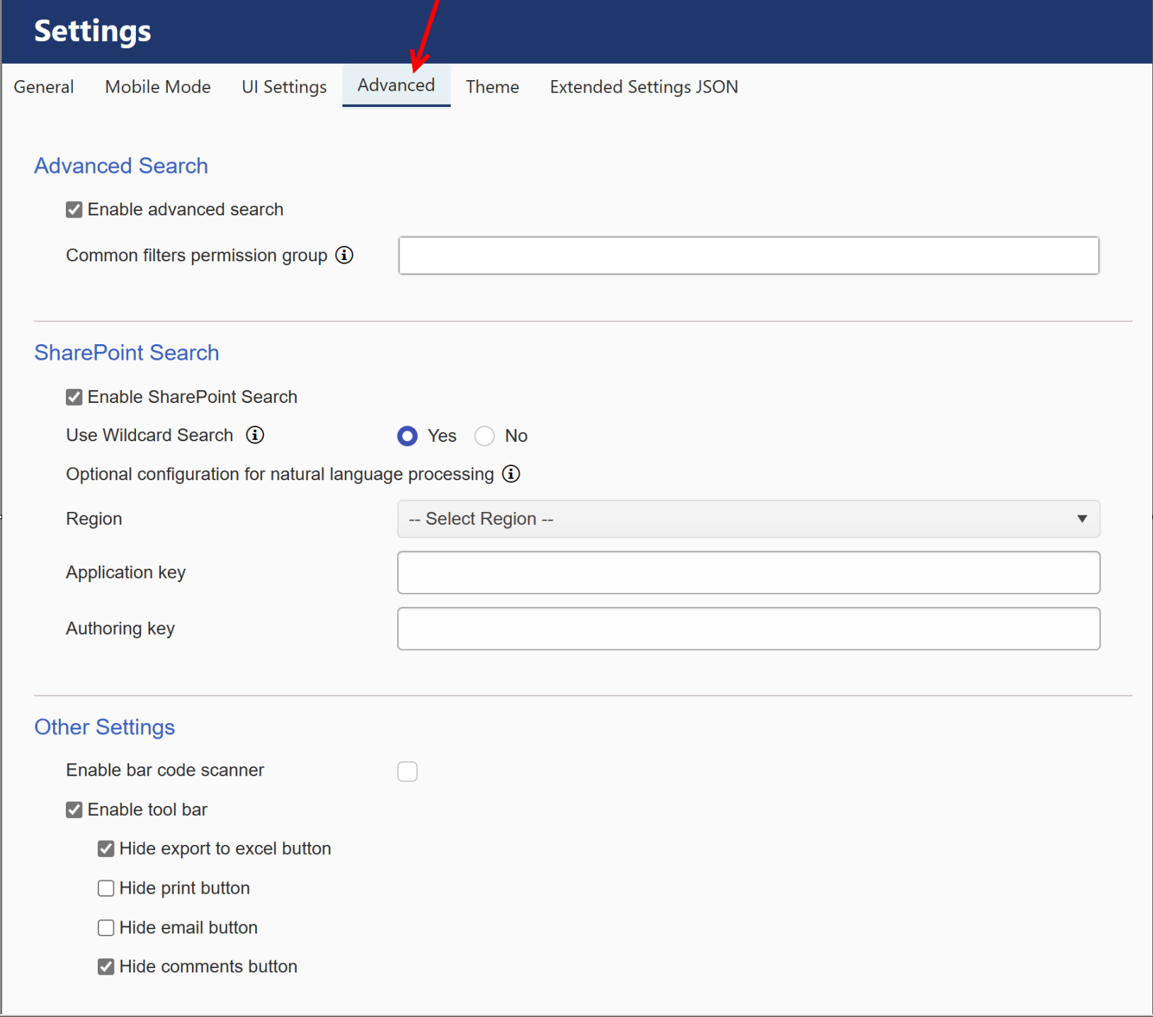 |
Enable Advanced Search: checking this causes the Advanced Filter option to show up.
| Common filters permission group: Users having permission to create filters visible to all users and edit/delete those filters. Users having manage web permissions are always allowed to do these operations. |
SharePoint Search: check this option to enable SharePoint search. Below fields will be visible by enabling this feature.
Use Wildcard Search: Add wildcard at the end of each word to enable partial work matching.
Optional Configuration for natural language processing: using natural language processing extract the key phrases from the input search text. Search for matching items for any of the key phrase (Or operator)
Refer How To Configure NLP Based List Search In Crow Canyon Search Web Part? article for more detail on NLP.
Enable bar code scanner - You can enable a bar code scanner for scanning in your assets with either type code_128_reader, ean_8_reader, code_39_reader, or upc_e_reader.
Enable tool bar - Enabling this option will show Export to Excel, Print, Email, and Comments button in the List Search after the search engine has run for the items being searched for. You can also hide any combination of these buttons by enabling the Hide settings for each button.
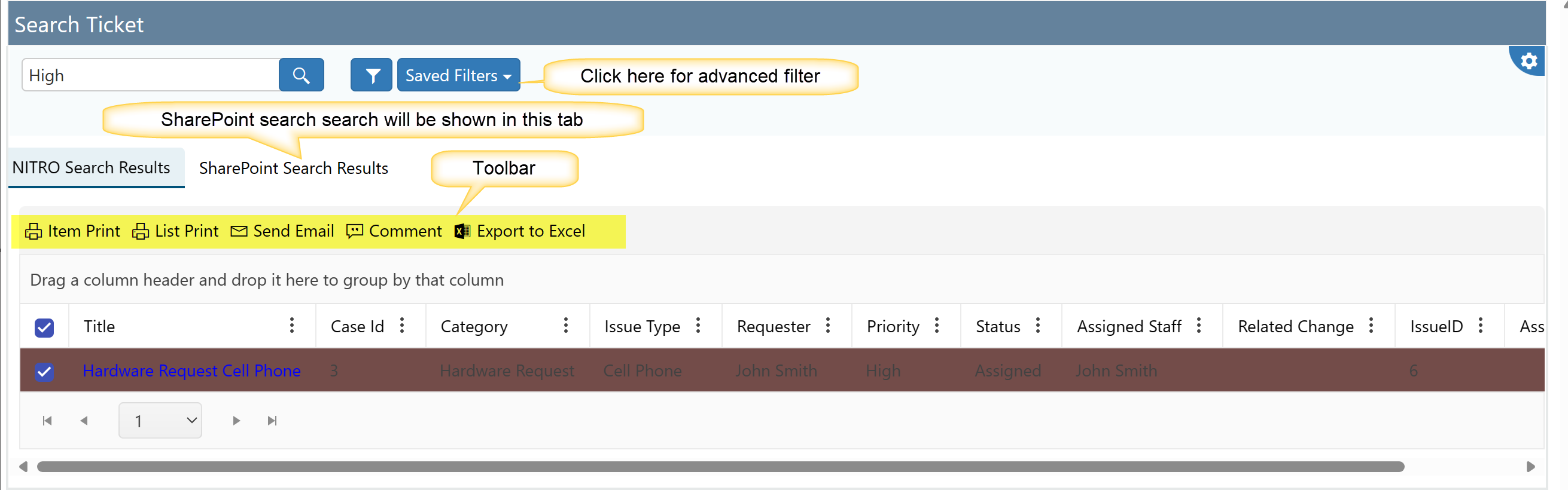
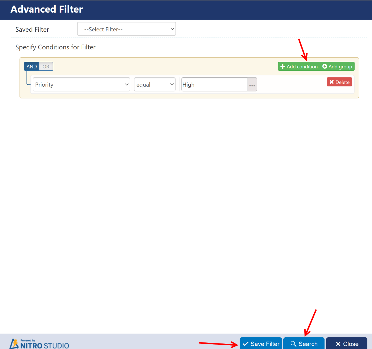
Upon clicking "Advanced Filter", conditions (such as the value of one or more columns) can be set to filter the search. The search can be run with the Search button on this form. Also, Advanced Filters can be saved and re-used. Use "Save Filter" button to save a particular set of conditions, and later, use "Saved Filter" to recall that search criteria.
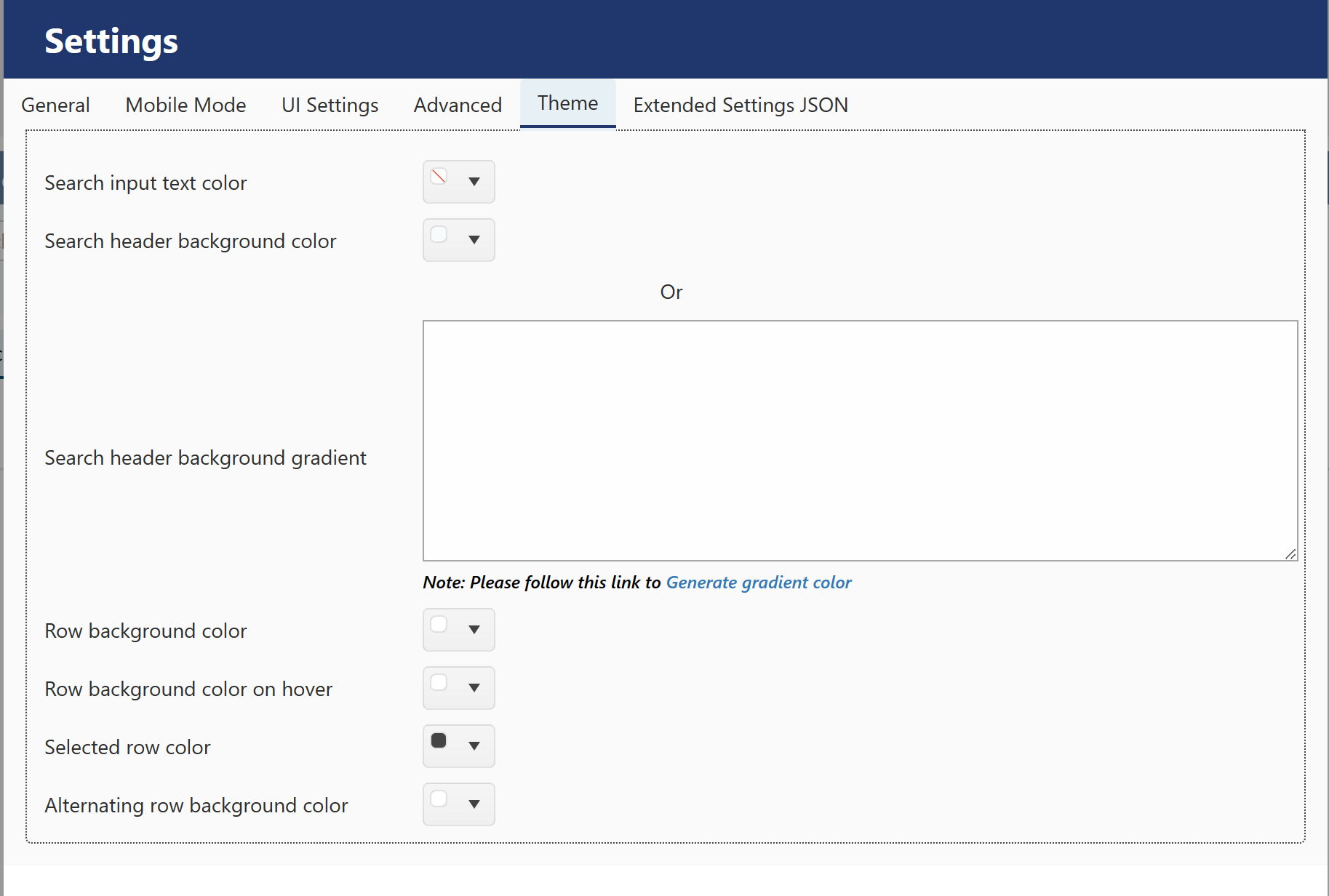
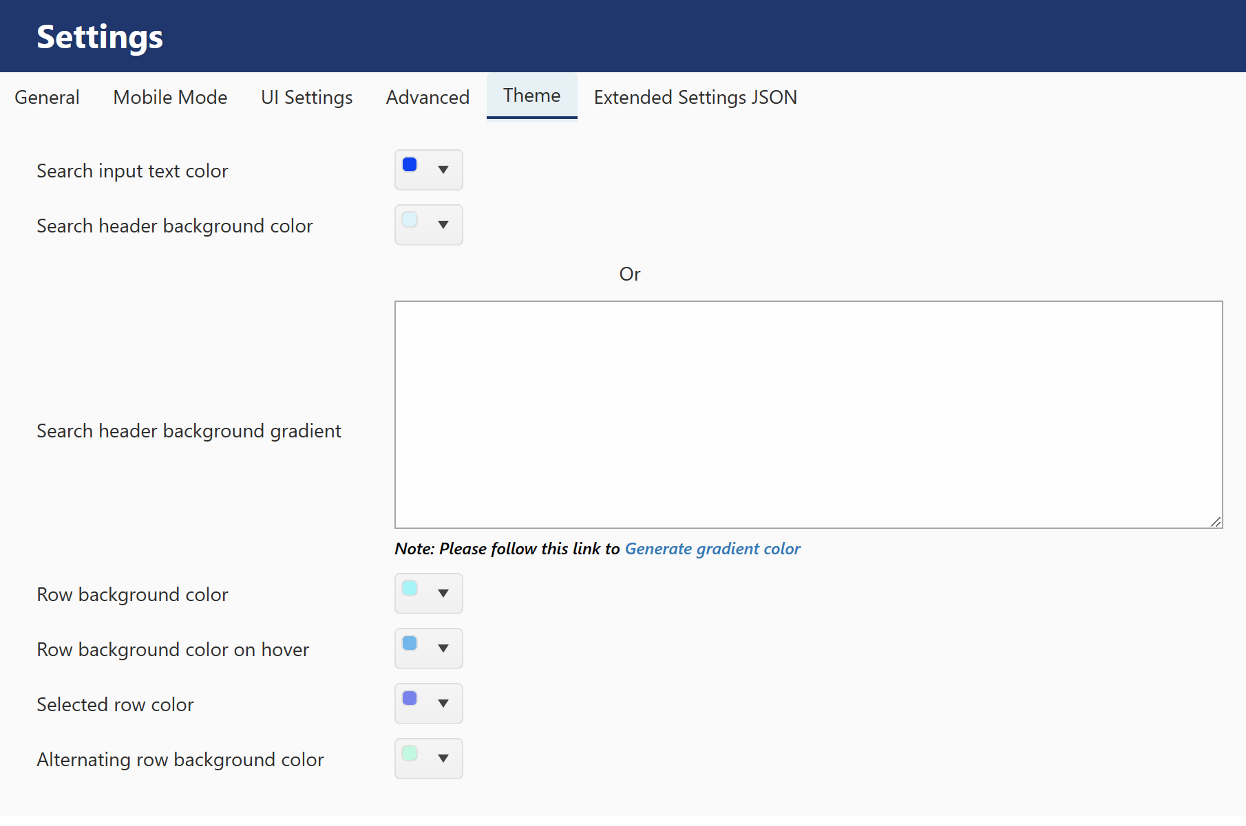
THEME Tab
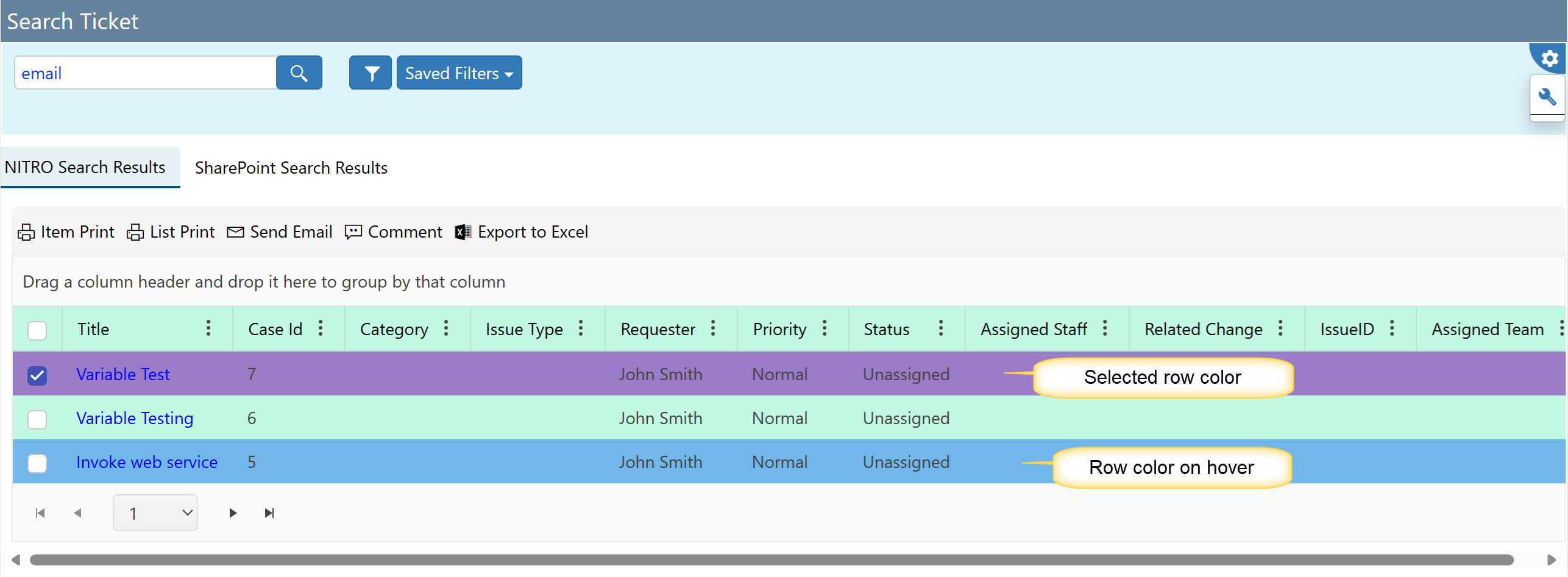
The Theme tab gives options as to what the List Search box will look like and how the results will be shown.
 |
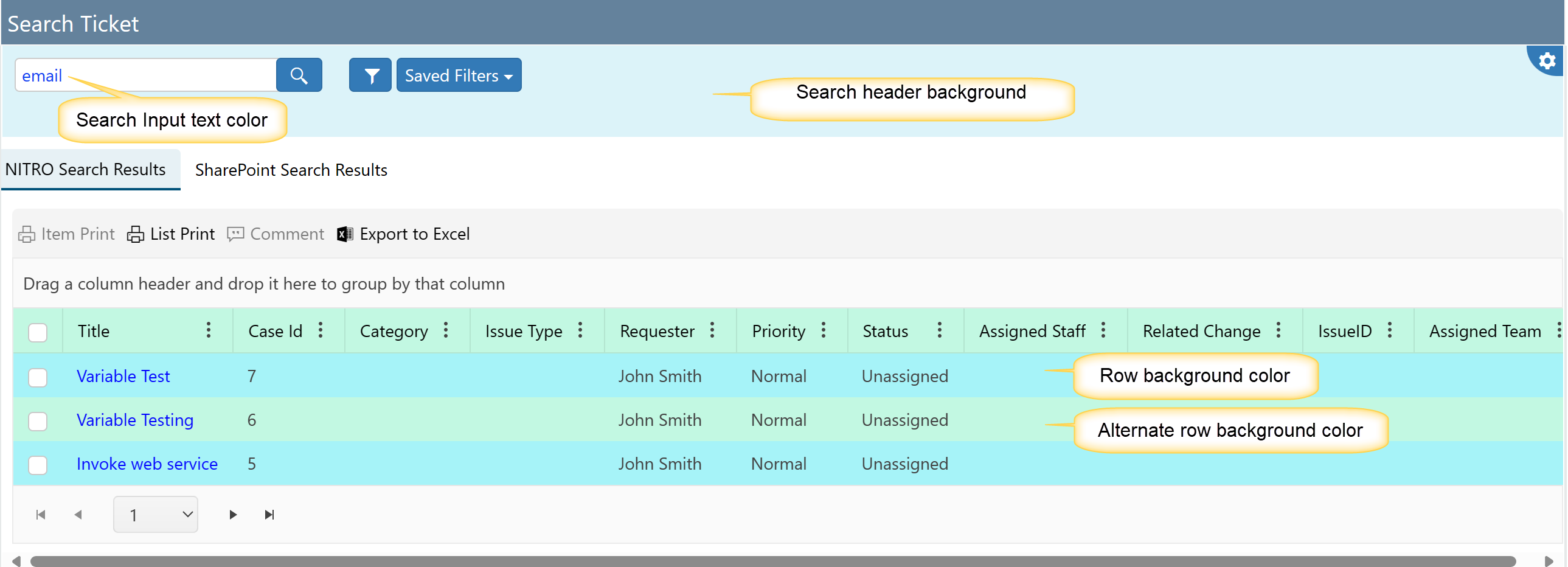
Sample Theme:
 |
Sample Output:
Extended Settings JSON:
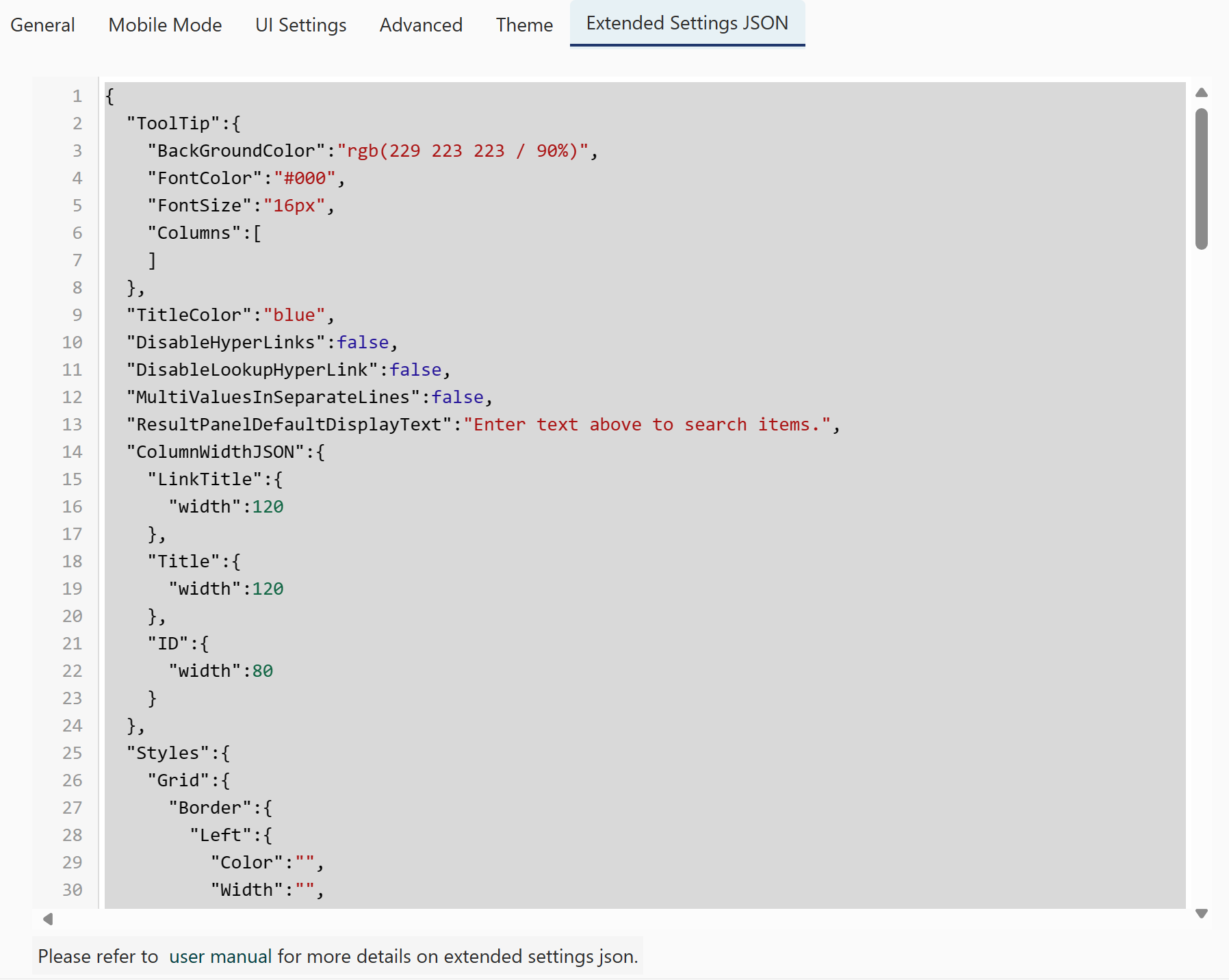
TitleColor: set color value for Title here.
DisableHyperLink: to disable hyperlink in crow canyon list search, set this property value to 'true'.
DisableLookupHyperLink: to disable lookup columns hyperlink in crow canyon list search, set this property value to 'true'. MultiValuesInSeparateLines: If there are columns in list that have multiple values, then set 'true' in this setting to show multiple values in separate lines. Column Width JSON: Allows you to define the width of each column in the view using pixels.
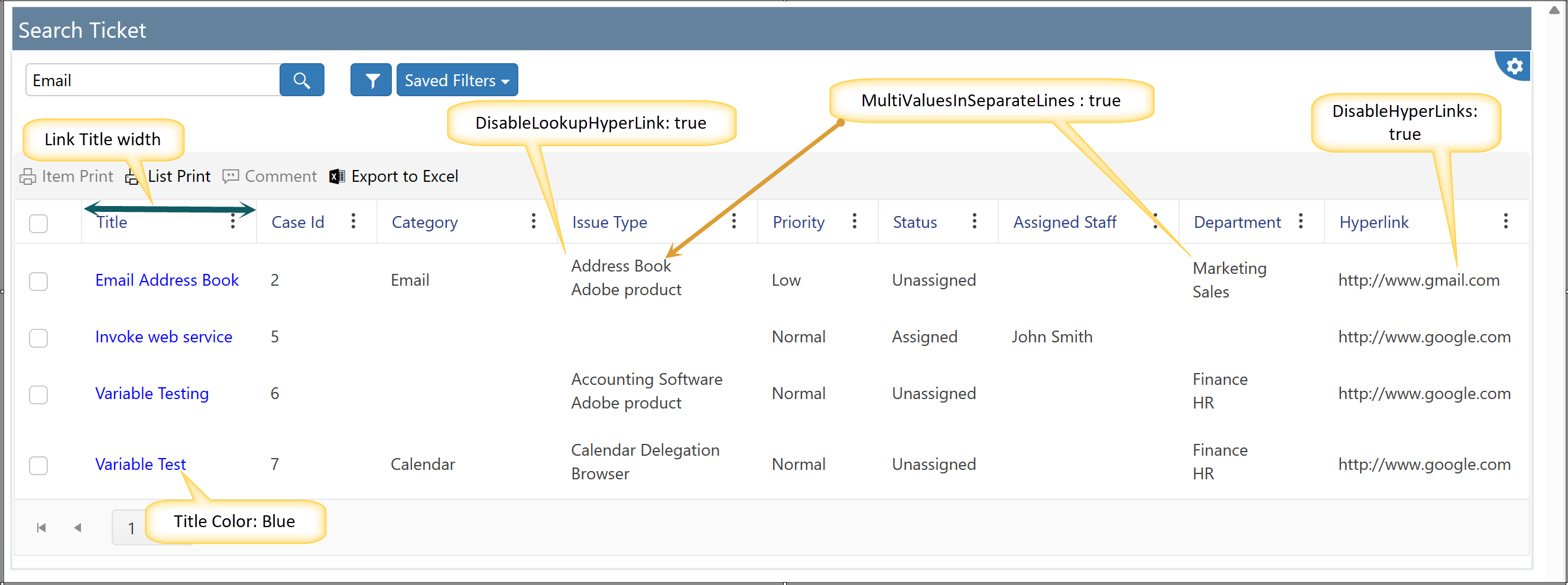
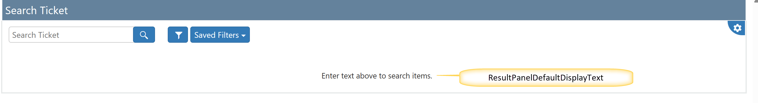
ResultPanelDefaultDisplayText: provide text here to doisplay in result panel.
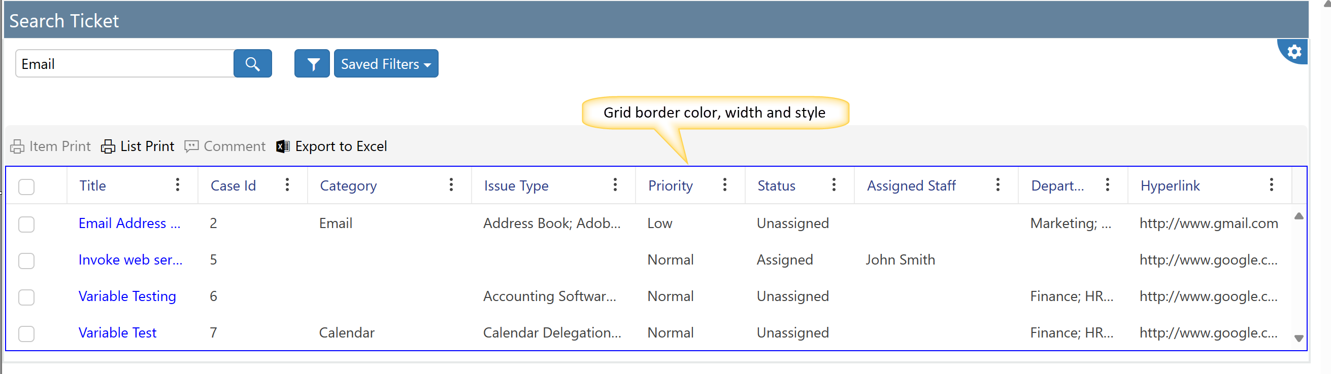
Grid border Color, width and style
We can set the grid border color, width and style using ‘Extended Settings’. Sample settings used are :
"Color":"Blue",
"Width":"6",
"Style":"Solid"
Sample Output:
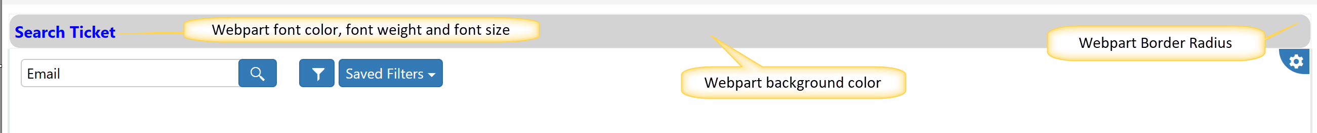
Webpart Header font size, font weight, border radius, background color and font color
We can set the webpart header font size, font weight, border radius, background color and font color using ‘Extended Settings’. Sample settings used are :
"FontSize":"16px",
"FontWeight":"Bold",
"BackgroundColor":"LightGrey",
"Color":"Blue",
"BorderRadius":"10px"
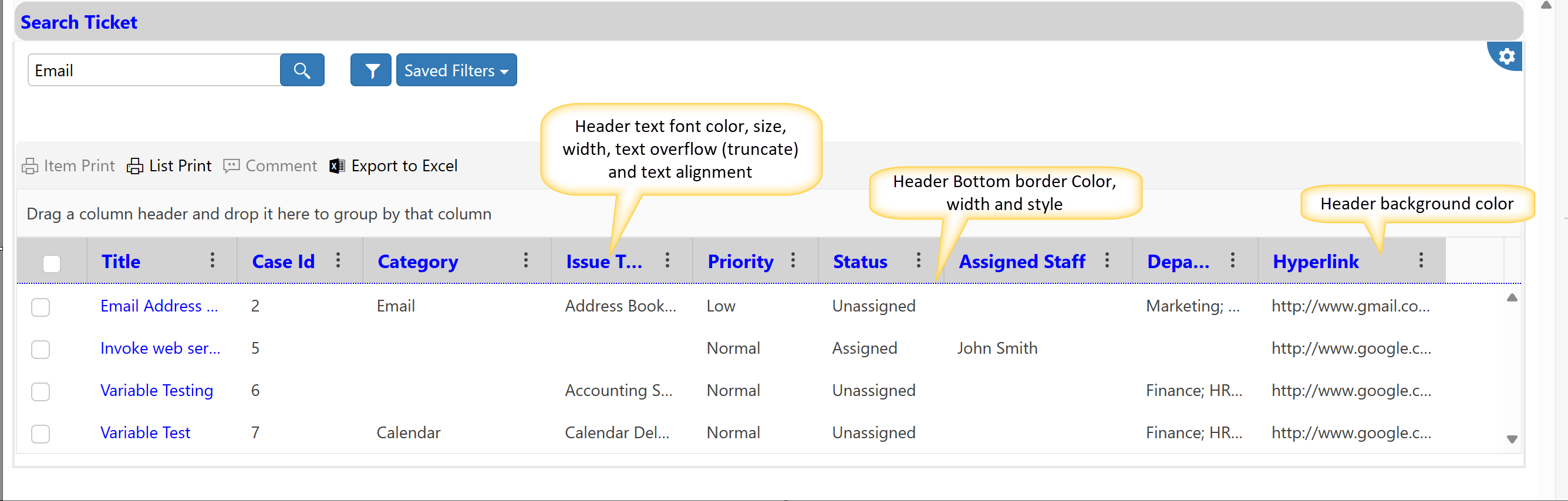
Header border (Color, width, style), text overflow, font size, font weight, vertical padding, background color, text color, text align
We can set the header border, text overflow, background color, font size, font weight, font color, vertical padding using ‘Extended Settings’. Sample settings used are :
For Bottom Border: "Color":"Blue",
"Width":"10",
"Style":"Dotted"
"TextOverflow":"Truncate", // supports value 'Truncate' and 'Wrap'
"FontSize":"20px",
"FontWeight":"Bold",
"ColumnWidthScale":1,
"VerticalPadding":"20",
"BackgroundColor":"LightGrey",
"Color":"Blue",
"TextAlign":""
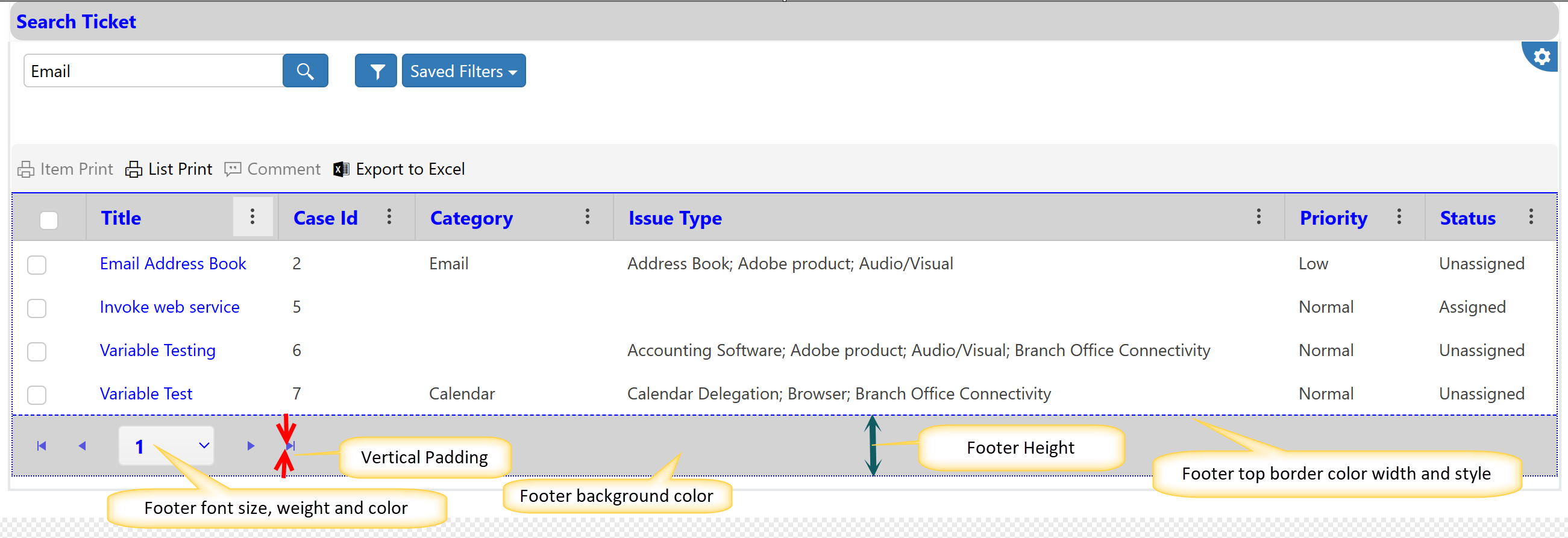
Footer border, font size, font weight, vertical padding, background color, text color
We can set the footer border, height, background color, font size, font weight, font color, vertical padding using ‘Extended Settings’. Sample settings used are :
Border "Top":{
"Color":"Blue",
"Width":"10",
"Style":"Dashed"
}
"Height":"40",
"VerticalPadding":"10",
"FontSize":"16px",
"FontWeight":"Bold",
"BackgroundColor":"LightGrey",
"Color":"Blue"
Sample output for footer extended settings
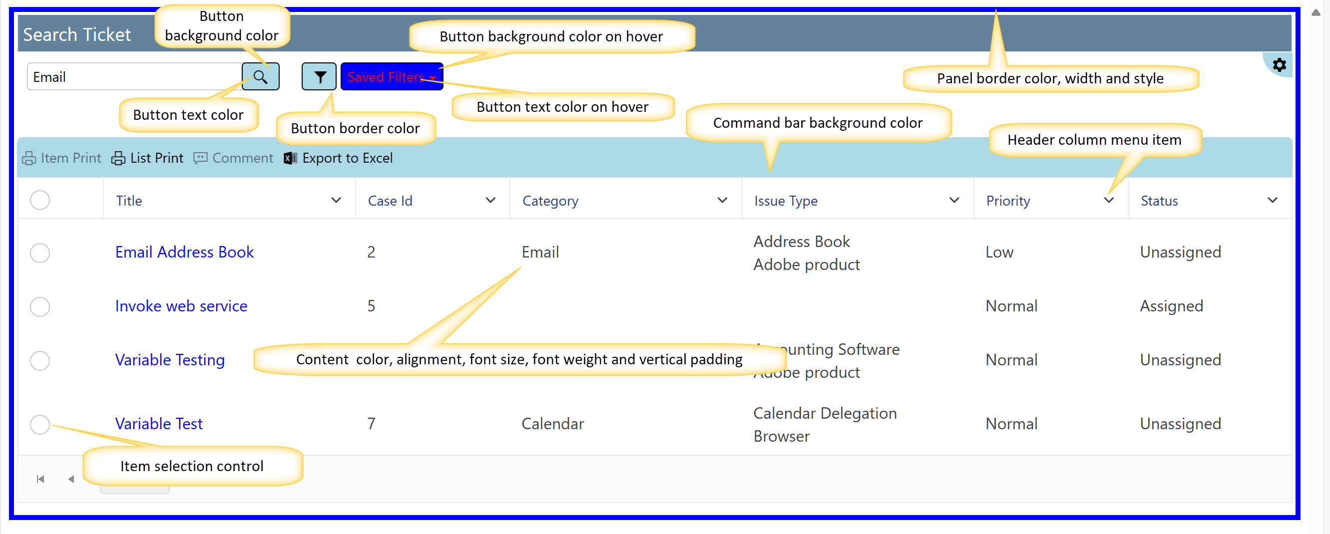
Command Bar Background color
Specify command bar background color. Sample settings used are :
"BackgroundColor":"LightBlue"
Content font size, font weight, text alignment and vertical padding
We can set the content font size, font weight, vertical padding using ‘Extended Settings’. Sample settings used are :
"FontSize":"16px",
"FontWeight":"Normal",
"TextAlign":"Left",
"VerticalPadding":"10px",
Buttons Background Color, Background hover color, Hover Color, Color and Border Color
We can set these using ‘Extended Settings’. Sample settings used are :
"BackgroundColor":"LightBlue",
"HoverBackgroundColor":"Blue",
"HoverColor":"Red",
"Color":"Black",
"BorderColor":"Black"
Panel border color, width and style:
we can set panel border color , width and style in extended settings. Sample settings are:
Border (Top, Bottom, Left and Right): "Color":"Blue",
"Width":"5px",
"Style":"Solid"
ItemSelectionControl: here you can set this property value to 'Radio' or 'Checkbox' as per requirement.
HeaderColumnMenuIcon: here set the value to 'Arrow' if you want to shown header column menu icon as arrow else it will show three dots.
Sample output for above settings: