Overview
The Crow Canyon "Charts, Dashboards, and Reports" app generates custom reports using data from the SharePoint Lists. Reports displays progress of list data graphically based on fields configured.
The App consists of the Report Manager, where the reports are configured, and the Report Center, which is a page in the SharePoint application that shows the reports that were configured in the Report Manager.
Key Features
•Supplies the graphs, charts and tables you need to fully analyze the business process and system performance.
•Allows to select two fields from a list to generate reports
•Uses various operators to generate reports – Sum, Count, Max, Min and Avg
•Allows to create both Table and Chart as a Report
•Enables to add any number of reports in Wiki Page/Web part Pages
•Allows to create custom themes to provide borders, padding and spacing to Tables and also colors for charts
Manage Reports:
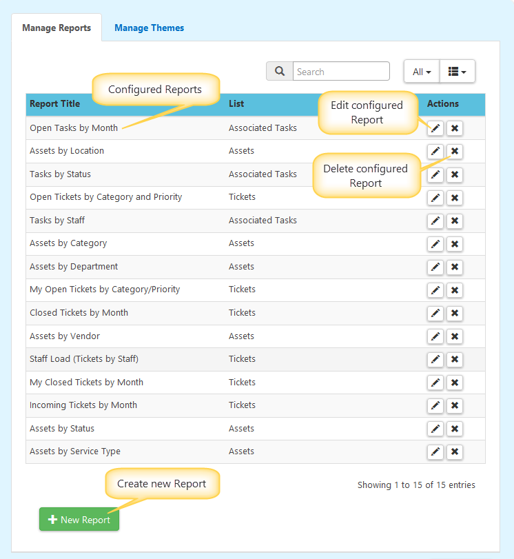
Create New Report:
Click on “New Report” button to create a new report.
Configure Report as shown below
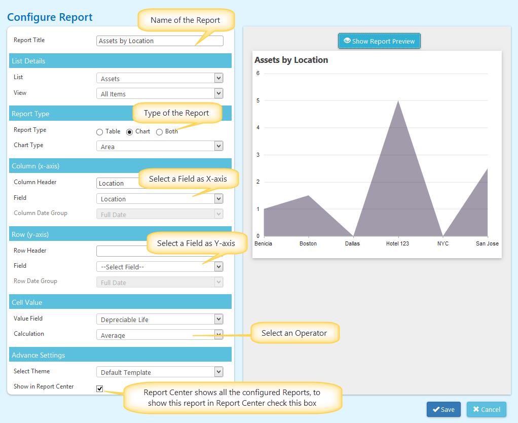
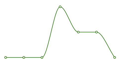
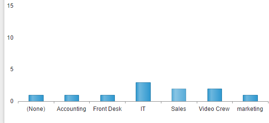
Different Chart Types:
•Line
•Column
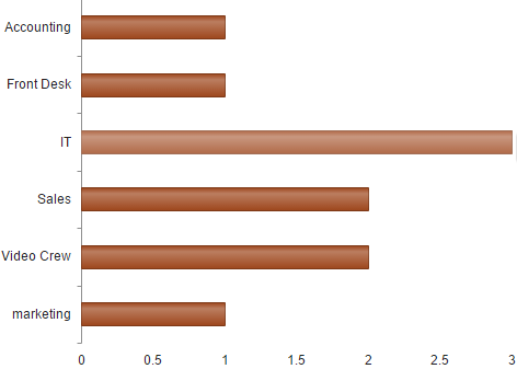
•Bar
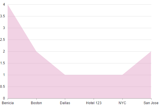
•Area
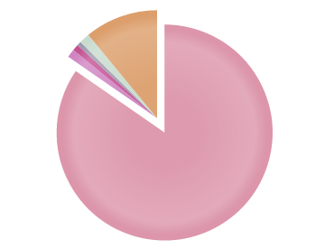
•Pie
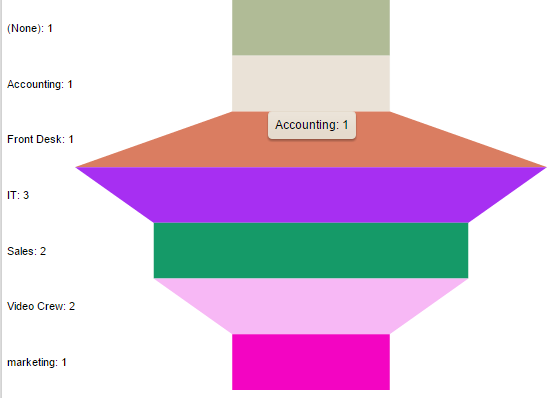
•Funnel
Manage Themes:
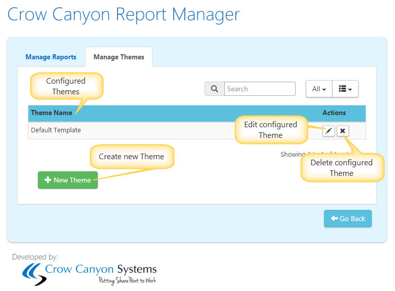
Create New Theme
‘Crow Canyon Report Manager App’ allow you to create custom themes to provide borders, padding and spacing to tables and also to define custom colors for charts.
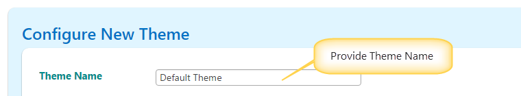
Configure Theme settings as shown below
Table Appearance:
Table apprearance in Reports can be configured by providing Border, Padding along with Header font colors in the ‘Table Appearance’ Section as shown below
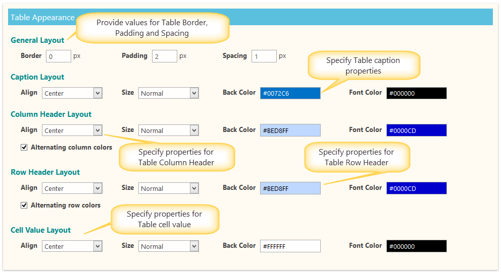
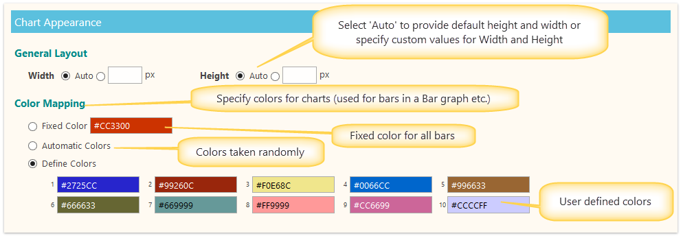
Chart Appearance:
Chart appearance can be handled in the ‘Chart Appearance’ section as shown below
Click on this Link to see “How to Add Report to a page”