The NITRO Lookup Column differs in two significant ways from the standard SharePoint lookup column:
1. It can be used for an Advanced Lookup -- This will show a drop list on the form that lists items in another list, either in the same site, same Site Collection, or from another site within the tenant/farm. This feature has the options to include a Search box to help locate the required item in the other list; to allow creation of a new entry in the other list; and to pull in data from the other list (column data from the item in the other list) to populate columns on the current form (Auto-fill). Another option is to delay loading of the drop list values to improve form load time.
2. It can be used for a Cascaded Lookup (any number of levels) -- this allows the selection in a parent drop-down list to determine what is in a child drop-down list, such as Country/Region, Account/Contact, Category/Issue Type. More levels can be implemented such as Country/State/City or Category/Type/Issue, etc.
Setting up NITRO Lookup Columns
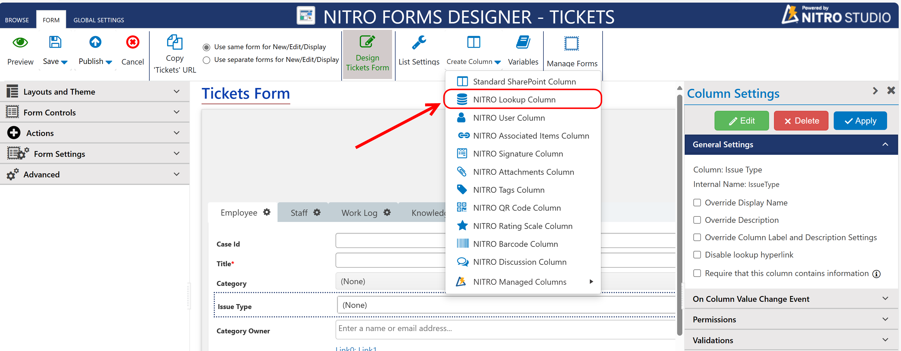
To create a new custom Lookup column, go to the Create Column button in the ribbon, and select NITRO Lookup Column from the dropdown:
This will bring you to the following screen:
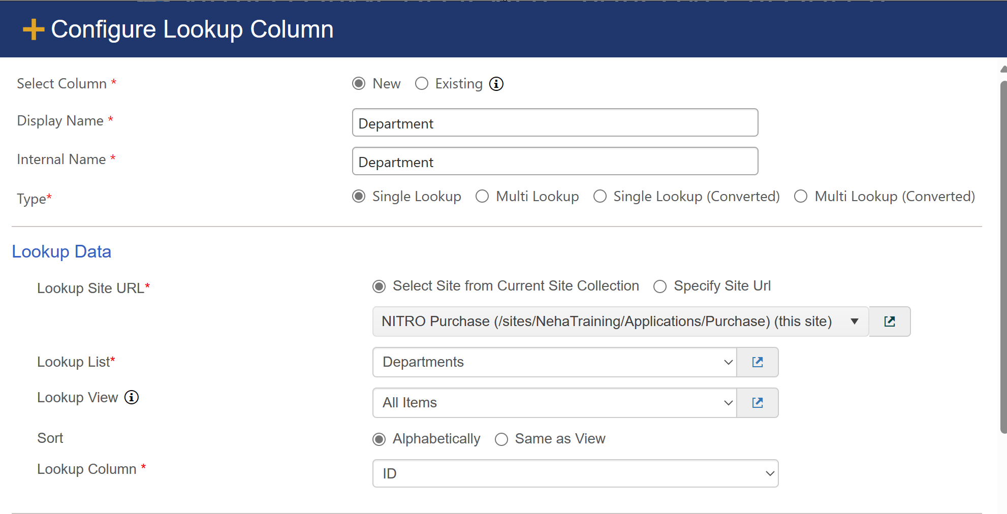
1.Choose whether you want to create a new Lookup column or use an Existing lookup column. If you are converting an Existing column, the options at the top change slightly:
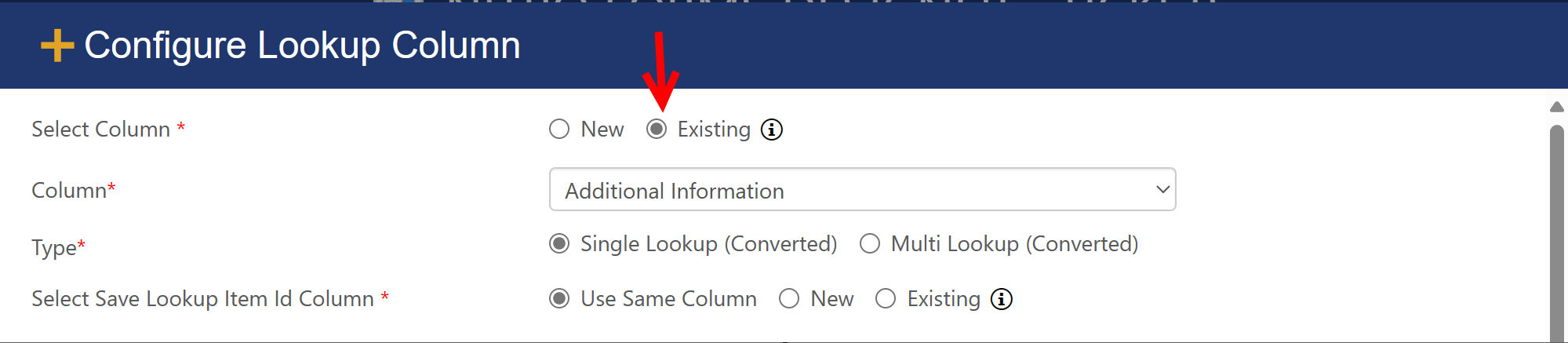
The Column drop-down now gives you an option to select any current standard SharePoint lookup column, Single Line of Text Column, or Multiple Lines of Text Column.
2.On the other hand, if you create a New column, you can determine the Display Name and Internal Name of the column. Crow Canyon recommends using an Internal Name with no spaces. In our example above, we're creating a new lookup column called "Department" in our "Purchase Requests" program. "Purchase Requests" is the current list and "Departments" is the other list. “Department” is the column we're creating from the Purchase Requests list that will show the Departments in a drop-down list.
| Note: |
i.The other list can be in the same site, same Site Collection, or a different site in the tenant/farm where end users have at least "Read" access.
| i. Auto populating internal name from display name if internal name is empty when tabbing out from title of setting in new column creation. |
3.Select the type of lookup that you want to have. A Single Lookup allows you to select one item from the lookup list. Multi Lookup allows you to select multiple items to be shown on the parent item. Multi Lookup presents a few different options, as shown below.
•NITRO form Lookup Column supports NITRO Lookup Single (Converted) and NITRO Lookup Multi (Converted). SharePoint has a list view threshold of 12 lookup type columns (this includes lookups, user columns and metadata columns). No SharePoint view can have more than 12 of these columns in it. If more than 12 lookup type columns are needed in a view, these converted columns help to solve this problem. In a NITRO form these columns look and behave the same as a lookup, but in SharePoint list views these columns are actually just text columns.
Because the column is actually text, rather than a lookup, there are several limitations to Converted Lookups. Therefore they should only be used if the need exists for more than 12 Lookup type columns in a single view. The limitations of converted columns are as follows:
•Cannot be used to build relationships in an Associated Item Column
•Cannot be used as a "Run For > Lookup" relationship in any Custom Action or Workflow update or create new item actions.
•Cannot be used as a "Get Items From" lookup in a Query Action.
•Will not show the other columns in the lookup list when viewed in column mappings (ie; Lookup::Related Column).
Normal Lookup columns store the ID of the item looked up to but only display the value looked up to on forms and list views. For example a normal lookup to the Category "Email" would look like this programmatically; 12;#Email with 12 being the ID of the Email item on the list. Converted lookups also need the ID to be stored and do so in the same syntax; ID;#FieldValue. The difference is that this value shows this way (ID:#FieldValue) in List views for a Converted Lookup if the Same Column is used for the ID value. For Single Lookup (Converted) it is possible to store the ID in different column. We can use 'New' or 'Existing' option in settings. However, Multi Lookup (Converted) doesn’t have option to store ID in a different column because of multiple entries.
4. As noted in Step 1, the list can be from the current Site Collection or can be from a different site collection in your tenant. If you want to choose from a different Site Collection, choose the Specify Site URL option, and then copy and paste the Site Collection URL to get the selection of lists from that site.
Note:
i.Users who are filling out this form should have at least Read access to the list referenced in this step. Otherwise, the form will throw an error that the user doesn't have permission to access the form.
5. Select your view of the other list. This allows you to show a filtered view that will show only the items in the other list that are part of that view. In the example above, we could list all Departments using the "All Items" view or list only a subset of the Departments, such as "Active Departments" if we have a view on the Departments list that filters in that manner.
a.All Items: This allows you to show all items.
b.Other views could be a filtered list that would only show items that meet that view's filter criteria.
6. Lookup Column is the column on the Departments list that will be shown on the Purchase Request form and is a required field. Most often, "Title" will work fine, but you may want to chose a different column in some cases.
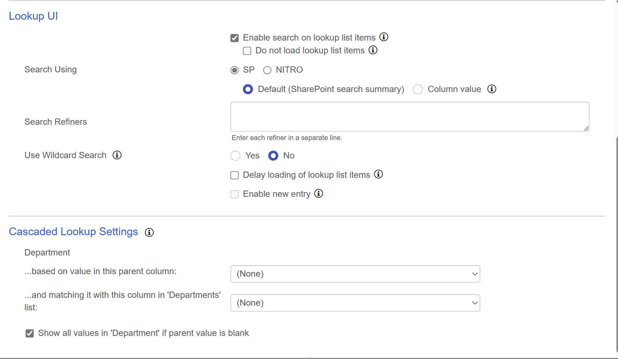
| 7. Several options: |
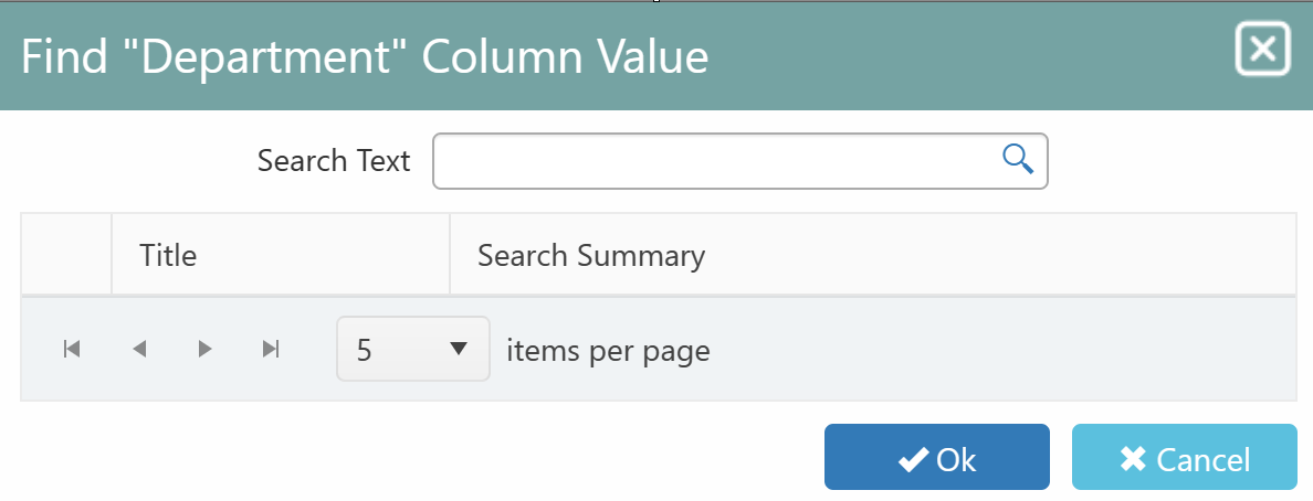
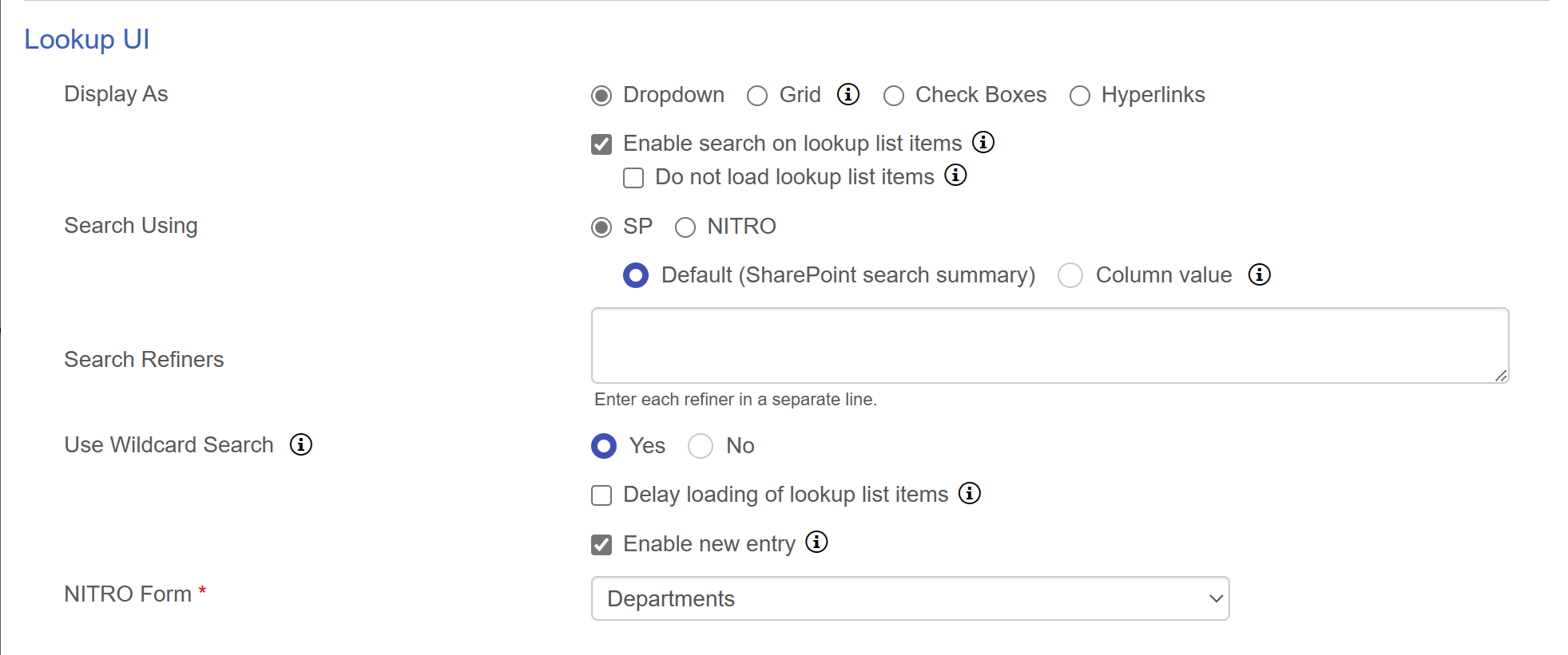
| a. Enable or disable "Search", which puts a search box next to drop list so that you can search for the item you want in the other list. |
| Do not load lookup list items: Lookup column dropdown is not enabled. Use search to find and select the lookup item. This helps to load forms faster for lookup lists having large number of items. |
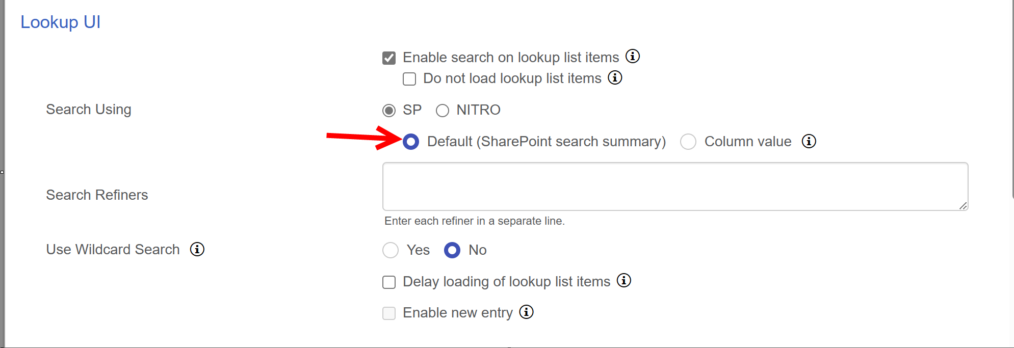
It supports two types of search
1.SharePoint Search:
Two type of SharePOint search are there
Default:
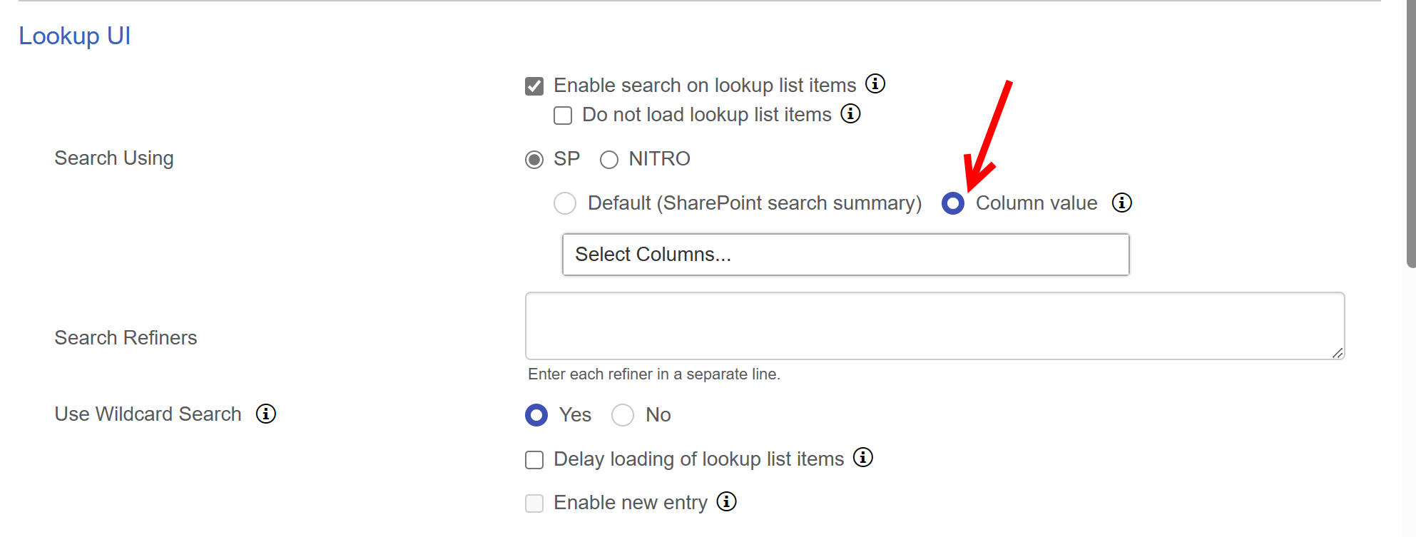
Column value: It shows a box, where you can select upto 3 columns to show search result.
Search Refiners: refiners allow users to narrow down search results by specific categories, providing a more focused and controlled search experience. user can define each refiner in a separate line.
Use Wildcard Search: SharePoint Search works with “OR” operator and supports wildcard search.
Wildcard Setting enabled – If this setting is enabled then it will split the entire sentence delimited by ‘space’, and build the search query
by adding wildcard (*) for each word with length greater than 3. Wildcard will be added to the right side of the word.
Wildcard Setting not enabled - If Wildcard setting is not enabled then it will search for the exact match of the search string.
2.NITRO Search:
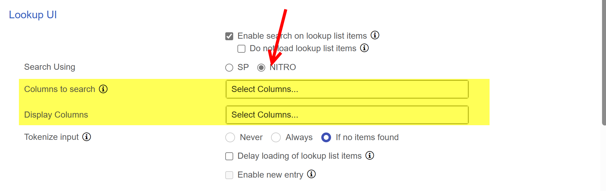
below two columns will be visible after selecting 'NITRO' search
Columns to search: entered text will be searched in specified columns. If list have large number of items, specify the indexed columns. Leave blank to search all columns.
Display Columns: select columns that you want to show in search result.
NITRO search Supports Tokenize feature. In tokenize search, it splits multi word input and run query for each word. Tokenize search works with “And” operator.
For example:
Search String: “Email Working”
NITRO search will fetch all the items that contains words “Email” and “Working”
‘Tokenize’ feature supports 3 settings
•Never: This search will fetch the items matching with the exact substring of the text provided in the Search Box.
•Always: This Search will fetch all the items containing all the substring provided in the “Search Box” with ‘And’ operator. If exact match is not found, it will split the multi-word and run query for each word. Thereafter the result of each word is combined to find the match with the ‘multi-word’ provided in the search box.
•If no items found: This first searches for the exact substring of the text provided in the search box. If exact match is not found, it will split the multi-word and run query for each word. Thereafter the result of each word is combined to find the ‘exact’ match with the ‘multi-word’ provided in the search box.
Example of ‘Never’, ‘Always’ and ‘If no items found’
item 1 text - "if email not working then"
item 2 text - "if email working not then"
search string - "email not working"
Never – will return “if email not working then”
Always - will return both items "if email not working then","if email working not then"
If no items Found - will return "if email not working then" as exact match found.
| b. Choose whether to load lookup list items initially or not. The advantage of choosing not to load lookup list items is that it optimizes load speed for the form. c. "Enable New Entry" puts a plus sign next to the drop list so that a new item in the other list can be created. Note: this feture will be accessible only if NITRO |
| form is configured for lookup list. |
 |
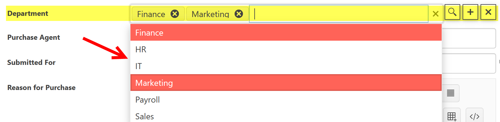
Department lookup box with Search (magnifying glass) and New Entry (+ sign):

Search box comes up when the Search option is clicked. This will search the other list ("Departments" list in our example).
8. Cascaded Lookup Settings -- this section allows you to filter the options in the current lookup column based on the selection in another lookup column on the list. To learn more about how to set this up, see the Setting up Cascading Lookups section.
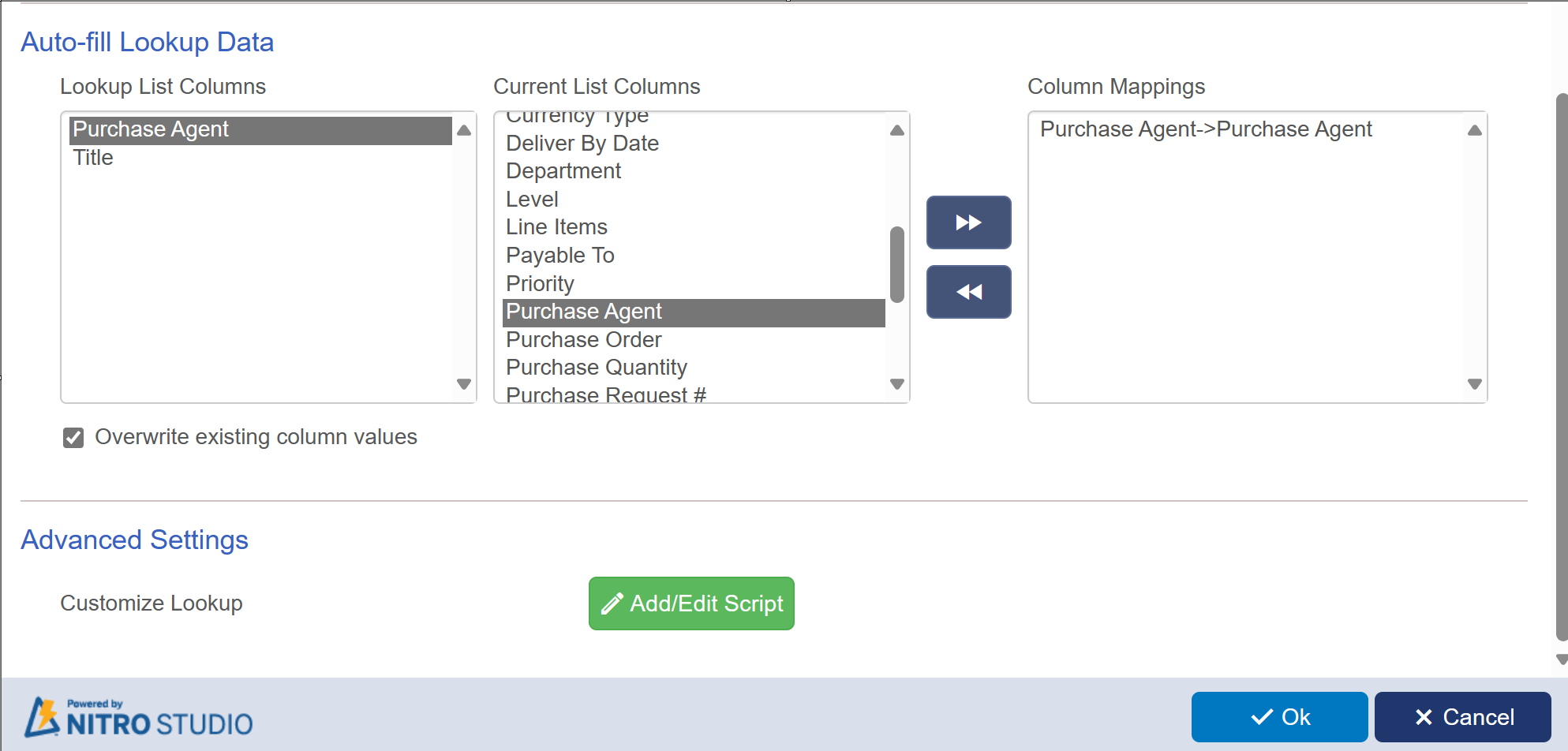
9. Auto-fill Lookup Data. In this section you can map columns in the other list to columns in the current list. In the example above, we could map data about the selected Department (e.g, Location, Department Manager, etc) to auto-fill columns on the form.
10. Advanced Settings - You can add custom JavaScript to the Lookup settings to modify what it does directly through code.
Once you hit “Ok” on the Configure Lookup Column you can Publish the form and the Lookup will be ready to go.
Multi Lookup options
When you are choosing a Multi Lookup, the Lookup UI options change (step 6 above). Instead of only a Dropdown, you now have the option of configuring the lookup
as dropdown, Grid, Check Boxes, or Hyperlinks. For all of these options, the recommendation is to have some way to pre-filter the data. Otherwise, the column will show all items from the lookup list on your form. If you have a large number of lookup items, the form may not look the way you want it to. To pre-filter the
data, you can use the view from step 4 above or you can use the Cascading Lookup feature (recommended).
Each UI option for multi lookup is described below.
Dropdown:
Settings:
This will show lookup list items in dropdown as shown below:
Grid
Settings:
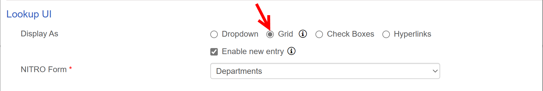
This gives you the option to show the lookup list as a Grid on the form. You can select and associate multiple items from the lookup list to the parent item. This also gives you the option to see more columns from the lookup list. Whichever view you choose in step 4 above will be the one shown on the form. In this example we're showing department from Departments list.
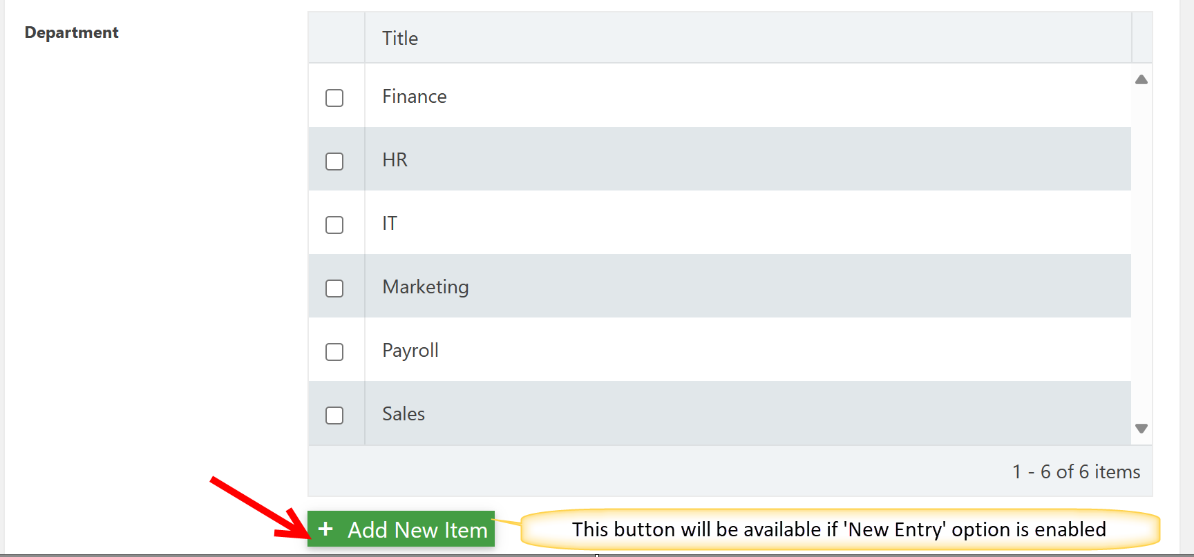
Check Boxes
Settings:
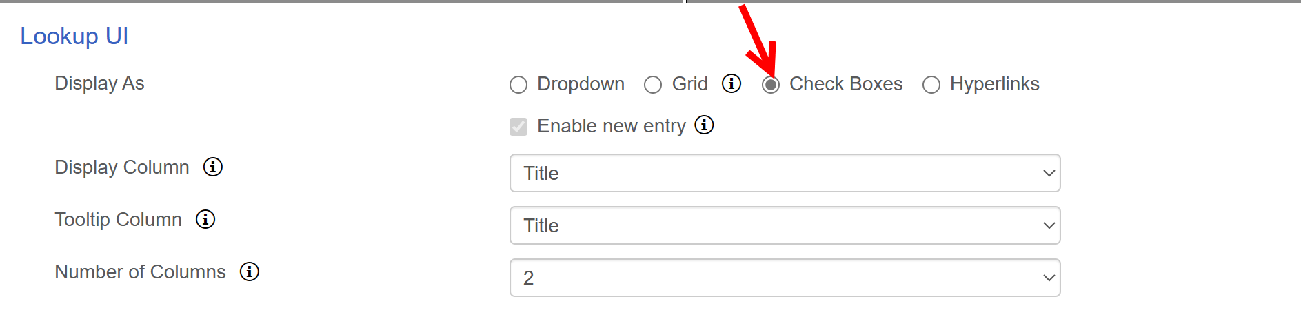
Check boxes give you a look and feel like the mutliselect choice field in SharePoint. There are options for a hover over tooltip in addition to the Display Column. The Display Column chosen here will override the Lookup Column choice from step 5 above. You can also display the options in multiple columns on the form, like so:

Hyperlinks
Settings:
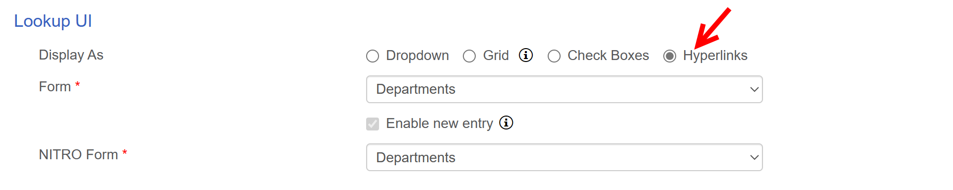
The drop down choice here is for the form you want to show when the hyperlink is clicked. Here is how the hyperlinks are displayed on the form:
