This section consists is several groups of settings. These settings apply to all of the pages in the site.
General Settings
The General Settings section consists of several options for hiding or showing elements of the standard SharePoint page. Here are the elements as shown on a regular SharePoint page:
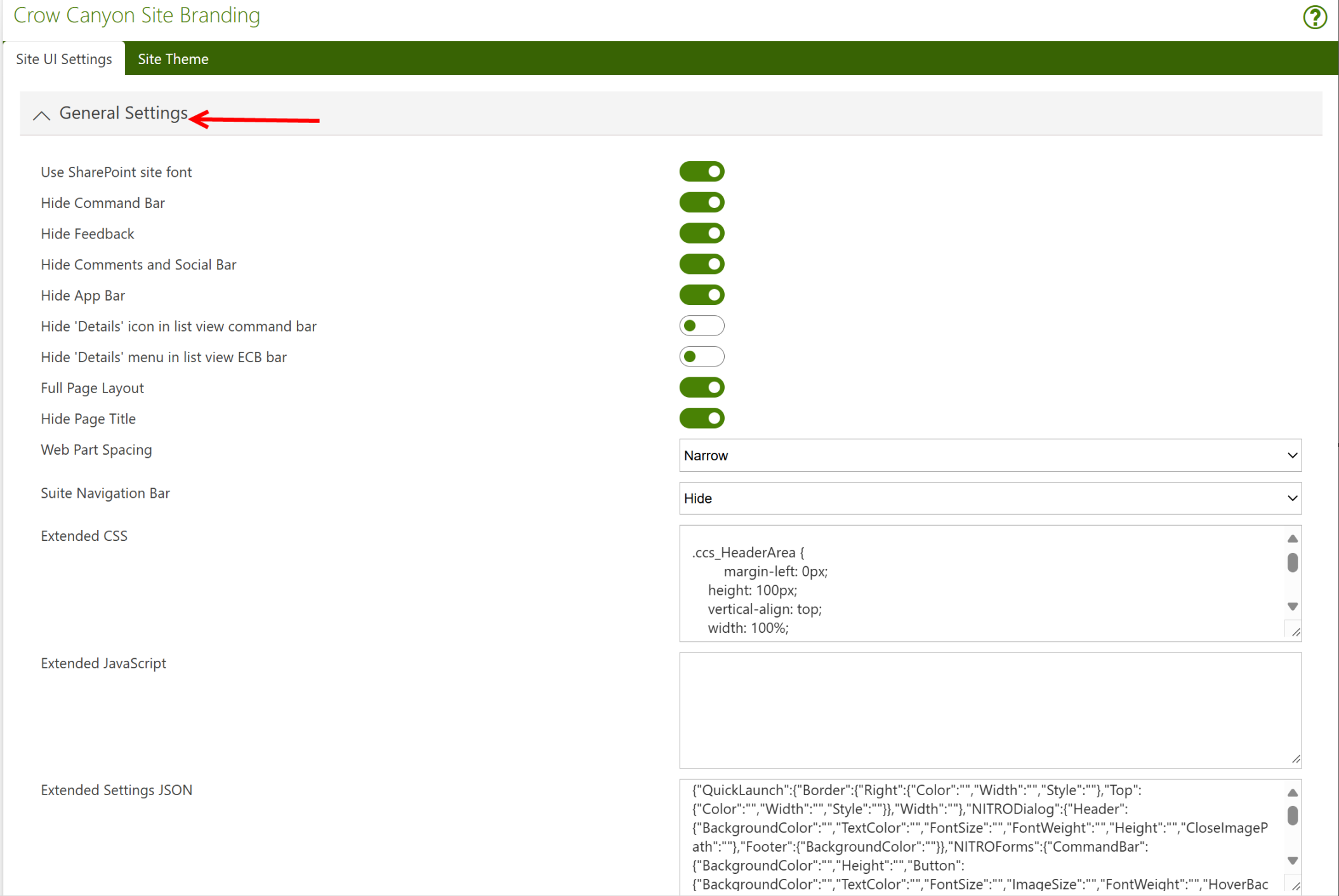
Use SharePoint Site Font
This setting allows you to maintain visual consistency by using the default SharePoint site font across all pages. If enabled, it ensures that your custom branding integrates seamlessly with SharePoint's design language.
2. Hide Command Bar
This option hides the SharePoint command bar (which contains actions like "New," "Edit," "Delete") from view. Useful if you want to simplify the interface or prevent users from accessing certain actions directly from the UI.
3. Hide Feedback
This setting hides the feedback button or functionality, which is typically used to provide user feedback about the page or application. Disabling this can clean up the interface if feedback collection is unnecessary.
4. Hide Comments and Social Bar
This option removes the social bar that contains features like "Like" and "Comments." If collaboration or user comments are not required, you can use this setting to declutter the page.
5. Hide App Bar
The app bar provides navigation links to various apps within SharePoint. Hiding it can provide a more streamlined look if navigation is handled elsewhere, such as in custom menus.
6. Hide 'Details' Icon in List View Command Bar
This setting hides the "Details" icon, which provides additional information about list items. Removing this can simplify the user interface when detailed information is unnecessary or handled through other methods.
7. Hide 'Details' Menu in List View ECB Bar
Similar to the command bar, this setting hides the "Details" option from the ECB (Edit Control Block) menu, which appears when you click on the ellipsis next to a list item. This can help prevent users from accessing item details through the ECB.
8. Full Page Layout
Enables a full-page layout, removing unnecessary elements like navigation or sidebars. This option is ideal for dashboards or pages where you want to maximize screen real estate.
9. Hide Page Title
This option hides the title of the page, which is often displayed at the top. Hiding the title can create a cleaner look for pages where the title is either redundant or displayed elsewhere.
10. Web Part Spacing
Adjusts the spacing between web parts on a page. This allows for better control of the layout and visual flow, ensuring web parts don’t appear too cramped or too spaced out.
11. Narrow Suite Navigation Bar
This setting reduces the height of the suite navigation bar at the top of the page, making the navigation area more compact. This can help to maximize screen space for the main content.
12. Hide Extended CSS
This option hides any additional custom CSS that may have been added to style the page or site. By enabling this, you can revert to default styles or temporarily disable extended styling.
13. Custom CSS for Header and Logo Areas
The custom CSS snippets provided here define the size, alignment, and styling of various elements in the header, including the logo, page title, and user-related information (such as username and logout button). These settings are particularly useful for fine-tuning the header appearance on different screen sizes, ensuring the header looks good on both desktop and mobile devices.
14. Extended JavaScript
This section allows for the inclusion of custom JavaScript to extend functionality or customize the behavior of the SharePoint site. JavaScript can be used to dynamically manipulate page elements or add interactive features that aren’t available out of the box.
15. Extended Settings JSON
This field allows for more granular customization of elements within the NITRO system. The JSON configuration controls various elements like the QuickLaunch (side navigation), NITRO dialogs, forms, list views, and command bars. Through this, you can specify custom styles such as border colors, font sizes, button hover effects, and grid configurations, among other details.
Examples of what can be customized using the JSON settings:
•QuickLaunch: Customize the borders and width of the navigation area.
•NITRO Dialog: Modify the background color, text color, and height of the dialog header and footer.
•NITRO Forms: Adjust the appearance of the command bar, including button background color, font size, and hover effects.
•Associated List View: Customize the grid's border and header styles, as well as font size and weight for content in list views.
Header
These settings let you hide or show and manage the Header section of the page:
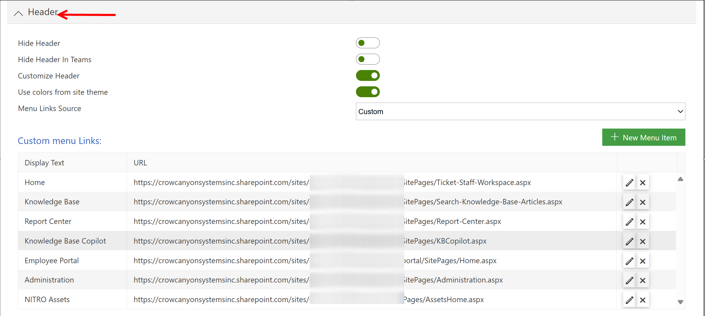
1. Hide Header
This setting allows you to completely hide the header section of the SharePoint page. The header usually contains the logo, page title, and navigation links. If you hide the header, these elements will no longer be visible, which may be useful if you want a cleaner or more minimalist design, or if the page is embedded in another application where the header is redundant.Determines whether to show or hide the Header bar. If shown, the remaining options are described below. If hidden, the remaining options disappear from the settings screen.
2. Hide Header in Teams
When your SharePoint site is integrated into Microsoft Teams, you may want to hide the header specifically within the Teams environment. This option allows you to do that, ensuring a smoother and less cluttered user interface in Teams, as Teams already provides its own navigation and header structure.
3. Customize Header
This setting enables you to fully customize the appearance and structure of the header. Customization options typically include changing the header layout, adding a company logo, adjusting the header size, or displaying additional information (like user details or custom links). You can tailor the header to better fit your organization’s branding or functional requirements.Enabling this setting will make another section pop-up with a variety of settings to use colors from site theme, add custom Menu Links (with support for multi-level links) and custom HTML.
below three options will be visible if Customize header is not enabled.
Header Title Position - The options are to show the Header Tile on the left of the screen or in the Center of the screen.
Hide Promoted Actions - Toggles the visibility of the Promoted Actions.
Top Link Bar Position - Top Link Bar Position refers to the location of the Top Navigation Bar within a site. This is the horizontal menu that typically appears at the top of the page and contains links to important sections or resources within your SharePoint site or Crow Canyon application.
4. Use Colors from Site Theme
This option ensures that the colors used in the header are derived from the overall SharePoint site theme. By using this setting, the header will automatically inherit colors like the background, text, and accent colors from the site’s theme, ensuring consistent branding across the entire site.
5. Menu Links Source
This setting defines the source from which the header navigation menu (or links) is populated. You may choose to pull these links from various sources, such as:
•Custom Links: Define specific links you want to appear in the header manually.
•Navigation Menu: Pull links from the existing SharePoint navigation structure, like the QuickLaunch or top navigation bar. This setting allows flexibility in where the header navigation items come from.
6. Custom Menu Links refers to the ability to manually define and configure the navigation links that appear in the header of your SharePoint site. These links are typically added to provide quick access to important pages or resources within or outside your SharePoint environment.
Here’s an explanation of Custom Menu Links in Crow Canyon Software’s Modern Branding:
1.New Menu Item
This allows you to add a new custom link (or menu item) to your site’s header. Each new menu item can be configured to provide easy access to a specific page or resource. You can customize the display text, URL, and other attributes for each menu item you create.
2. Display Text
This field defines the text that will be shown for the menu item in the header. The display text should be clear and concise, indicating where the link will take users. For example:
•Home: Link to the home or main dashboard.
•Knowledge Base: Link to knowledge base articles or resources.
In the provided example, some display texts include:
•Home
•Knowledge Base
•Report Center
•Knowledge Base Copilot
3. URL
This is the link that users will be directed to when they click the menu item. Each URL must be correctly formatted and can link to either internal SharePoint pages or external websites. In this context, the URLs provided are links to various Crow Canyon or SharePoint pages, like:
•Home URL: https://crowcanyonsystemsinc.sharepoint.com/sites/demo7/NITROHelpDeskV2/SitePages/Ticket-Staff-Workspace.aspx
•Knowledge Base URL: https://crowcanyonsystemsinc.sharepoint.com/sites/demo7/NITROHelpDeskV2/SitePages/Search-Knowledge-Base-Articles.aspx
These URLs point to specific functionalities or sections, allowing users to navigate to key areas such as the staff workspace, knowledge base, report center, or administration pages.
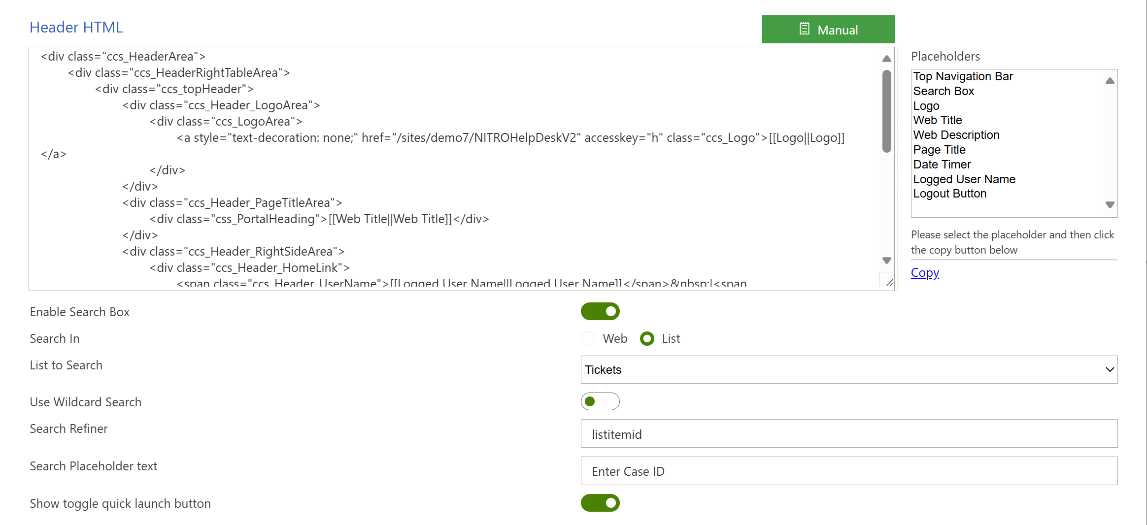
7. Header HTML (Manual Customization)
This allows for the manual customization of the header’s HTML structure. It includes various placeholders and sections that can be customized. The provided HTML is a template for how the header should be displayed, with different areas such as:
•Logo Area: Contains the logo linked to the site’s home page.
•Page Title Area: Displays the site or page title (e.g., "Web Title" placeholder).
•Right Side Area: Shows logged-in user details and logout buttons.
•Menu Area: Displays the top navigation bar.
•Search Box: Includes a search bar for easy access to information.
8. Placeholders
Placeholders are pre-defined areas or variables that can dynamically display specific content in the header. They are replaced with real-time data, such as:
•Top Navigation Bar: Displays the links in the top navigation.
•Search Box: Adds a search box to the header for users to quickly find information.
•Logo: Shows the site logo.
•Web Title: Displays the title of the site or current web page.
•Logged User Name: Shows the name of the currently logged-in user.
•Logout Button: Provides a button to log out of the session.
These placeholders make it easy to manage header content dynamically without hardcoding specific values.
9. Enable Search Box
This setting allows you to include a search box in the header, enabling users to search for information directly from the header. You can configure how the search box operates, including:
•Search In: Choose whether the search applies to the entire web or within a specific list.
•List to Search: If limited to a list, specify which list will be searched (e.g., the Tickets list).
•Use Wildcard Search: Enable users to search using wildcard characters for broader results.
•Search Refiner: Set the criteria (e.g., listitemid) for refining the search results.
10. Search Placeholder Text
This is the placeholder text that appears in the search box when it’s empty, prompting users with guidance on what to search for. For example:
•Enter Case ID: Prompts the user to search for a specific case ID in the system.
11. Show Toggle Quick Launch Button
This option adds a button in the header that allows users to toggle the Quick Launch (the vertical menu usually seen on the left side in SharePoint). Users can show or hide this navigation pane for easier access to more page links.
Example Menu Items from the Configuration:
1.Home: Links to the Ticket Staff Workspace.
2.Knowledge Base: Links to the Knowledge Base Search page.
3.Report Center: Links to a page where users can generate or view reports.
4.Knowledge Base Copilot: Links to a feature where AI assists with knowledge base queries.
5.Employee Portal: Links to a specific employee-focused area or portal.
6.Administration: Links to administrative settings for the system.
7.NITRO Assets: Links to a separate assets management system powered by NITRO.

Application Administration
This section primarily focuses on Crow Canyon's out-of-the-box applications, including the IT Help Desk and Work Order Management systems. Each application features its own Application Administration section, allowing users to configure various elements specific to that program.
In this context, you can control the visibility of the Application Administration link on site pages, specify the URL that leads to the Application Administration area, and define the permission level required for users to access this link.
In Crow Canyon Software’s Modern Branding settings, the Application Administration section helps configure the administrative access and management of specific applications. Here’s an explanation of each heading under Application Administration:
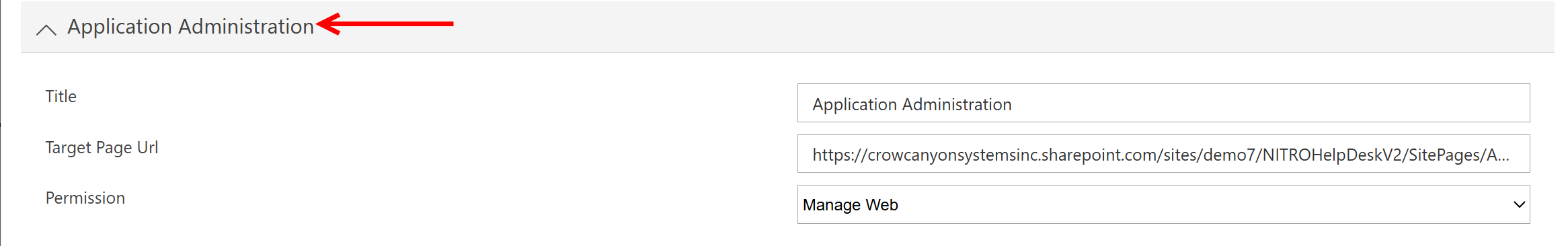
1. Title
•This refers to the name of the section or the heading displayed for the Application Administration feature. In this case, it’s simply titled Application Administration.
•The Title helps users identify the function or purpose of the page, which in this case is to manage administrative settings for the application.
2. Application Administration
•This heading indicates that the content or features under this section are related to the administrative tasks of the application.
•It covers tools or functionalities related to the setup, configuration, and ongoing maintenance of the Crow Canyon applications, such as user permissions, workflows, and integrations.
3. Target Page URL
•The Target Page URL defines the specific web address or SharePoint page where the application’s administration settings can be managed.
•In this case, the URL is https://crowcanyonsystemsinc.sharepoint.com/sites/demo7/NITROHelpDeskV2/SitePages/Administration.aspx. This URL points to the Administration page within the NITRO HelpDesk application in the Crow Canyon system.
•By clicking on this link, authorized users can access the administrative interface for managing the HelpDesk system.
4. Permission
•The Permission heading refers to the type of access control or security level assigned to users who can manage the application. This can involve determining who has the authority to view or edit settings related to the Application Administration.
•Properly setting permissions ensures that only designated administrators can change configurations, protecting the system from unauthorized access or modifications
Translator Widget
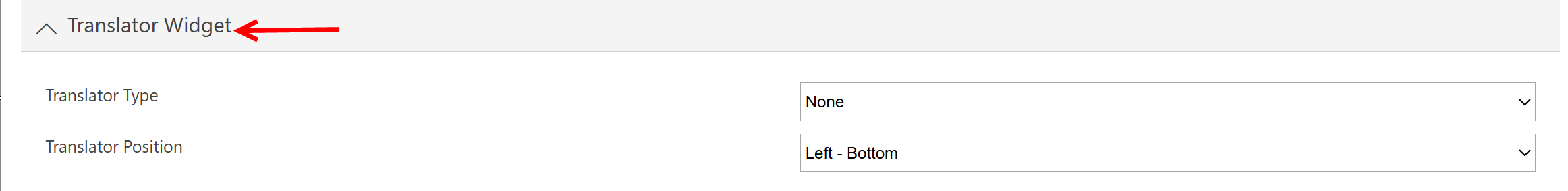
Allows you to show a "widget" on the pages in the site to translate pages into another language. The translation services are provided by Google or Bing. You can then decide where to show the "widget."
NITRO Forms Dialogs
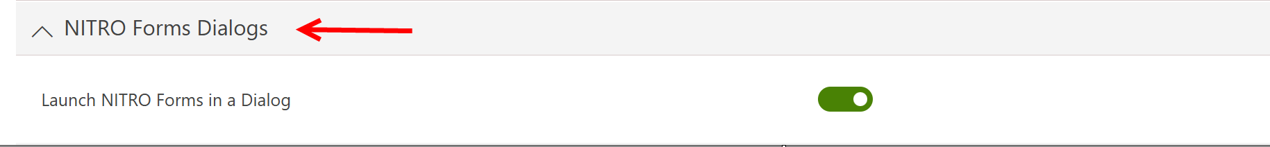
Determines whether to show a list item with a NITRO Form on it in a dialog box overlaying the site, or if the user should be directed to the list item directly.
This option in Crow Canyon Software's NITRO Forms settings refers to the ability to open or launch forms (created through NITRO) in a modal dialog window instead of a new page. Here’s a breakdown of this feature:
1. NITRO Forms Dialogs
•NITRO Forms are custom forms built using Crow Canyon’s NITRO platform. These forms are typically used to collect, display, or update information related to SharePoint lists, workflows, or processes.
•By enabling dialogs for these forms, you allow users to interact with the forms without leaving the current page, providing a more seamless and user-friendly experience.
2. Launch NITRO Forms in a Dialog
•This setting controls whether forms are opened in a dialog box (a pop-up window) rather than navigating to a separate page.
•When this option is enabled, users click a button or link to fill out a form, and the form opens as a modal overlay on the existing page, with the background dimmed or hidden.
Quick Launch
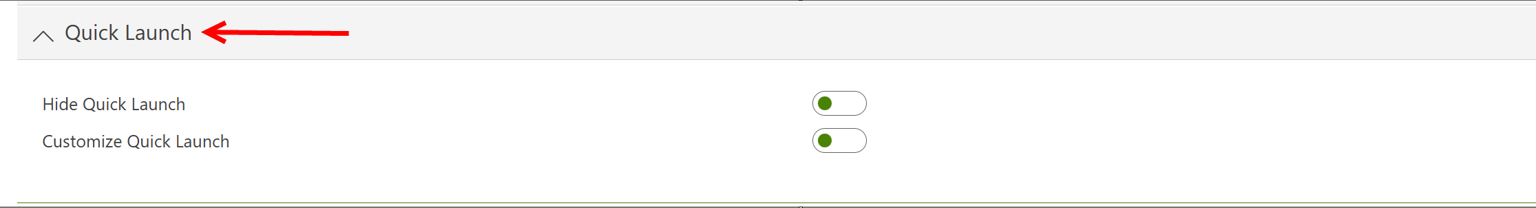
Controls the visibility of the Quick Launch on the left side of the pages. If Hide Quick Launch is disabled and customize Quick Launch is enabled, the following settings become available:
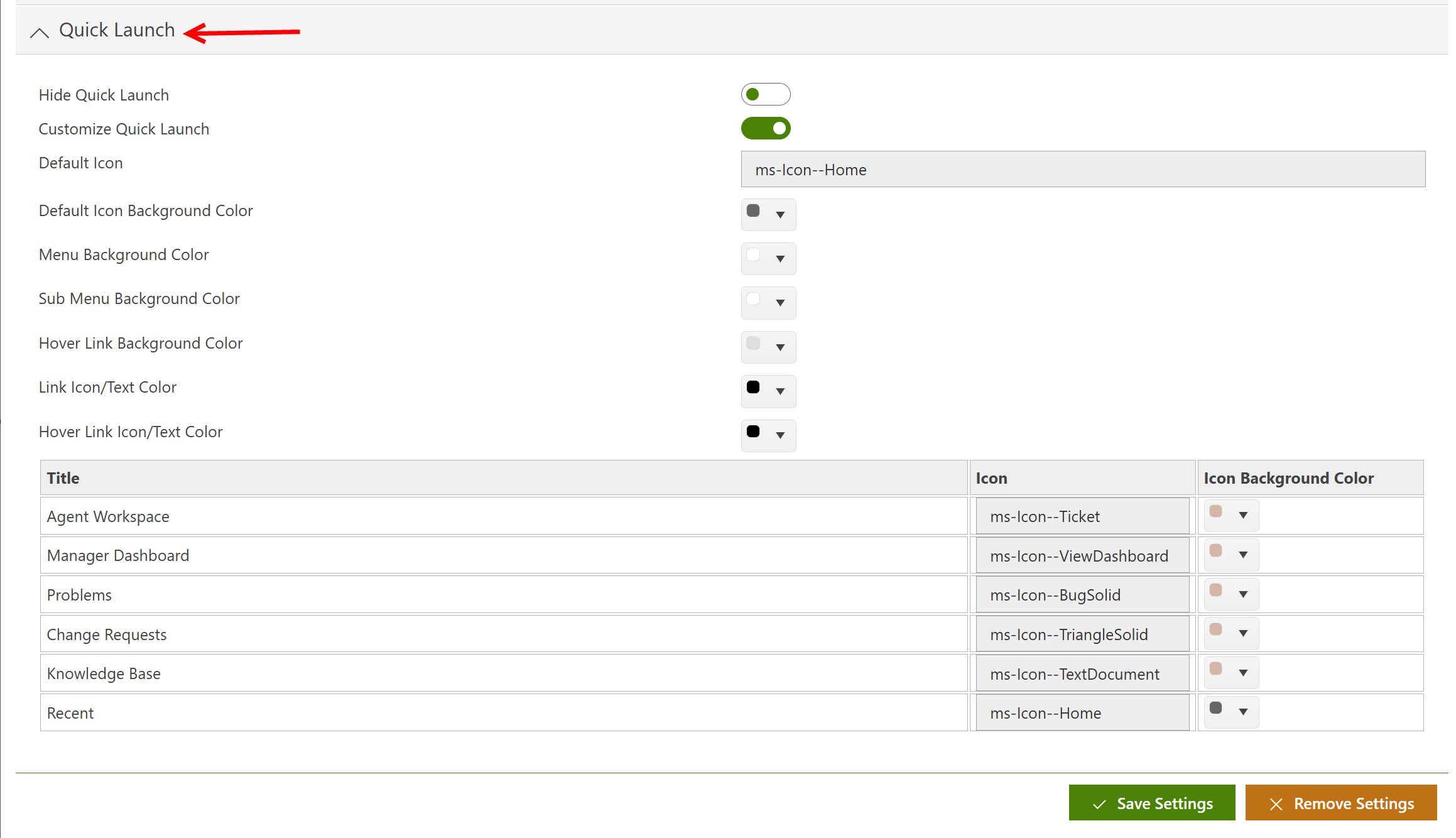
Each link in the Quick Launch has several customizable settings that control the appearance and behavior of the navigation menu on the left-hand side of your site. These settings allow you to style both the top-level and sub-level links, as well as how they react when a user interacts with them. Here's a detailed breakdown of the options:
Menu Background Color
•This setting defines the background color behind all the top-level links in the Quick Launch. It establishes the primary visual theme for the main navigation items.
Sub Menu Background Color
•This color setting applies to the second-level links (or sub-menu items) in the Quick Launch. It helps differentiate between the main navigation and sub-items, making the hierarchy of links clearer.
Hover Link Background Color
•Specifies the background color that appears when the user hovers over a link in the Quick Launch. This provides visual feedback to users, indicating which link they are about to click.
Link Icon/Text Color
•This option determines the color of both the icons and the text displayed on the links. The selected color should contrast with the background to ensure the links are easy to read.
Hover Link Icon/Text Color
•When a user hovers over a link, this setting changes the color of the icon and text, enhancing the hover effect and making it visually distinct from non-hovered items.
Managing Quick Launch Links
•The actual links in the Quick Launch can be managed through your site’s Site Settings under Look and Feel -> Quick Launch. From this page, you can add, remove, or reorder the links, giving you full control over the structure of your site’s navigation.
Custom Icons and Link Click Colors
•You can also assign a unique icon to each Quick Launch link, adding an extra visual cue for users. Additionally, when a link is clicked, you can set it to display a different background color to indicate it has been selected.
•The color palette for these customizations is defined using RGBA values, with the default being rgba(102, 102, 102, 1), which represents a medium gray tone with full opacity.
With these default settings, your Quick Launch transforms visually and interactively, offering users a clear, customizable navigation experience tailored to your site’s branding and design preferences.
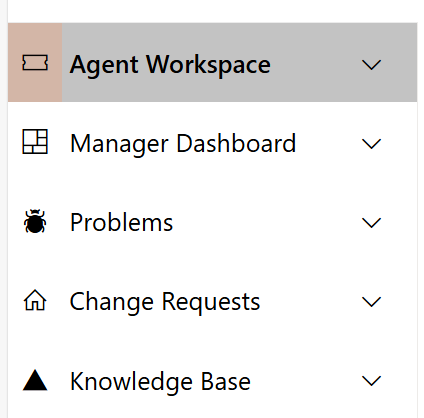
With the above default settings, the Quick Launch goes from looking like this:
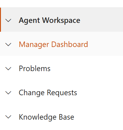
to this: