|
<< Click to Display Table of Contents >> Chart Settings |
  
|
|
<< Click to Display Table of Contents >> Chart Settings |
|
This section will appear when the selection in General Settings is either Chart or Chart and Table.
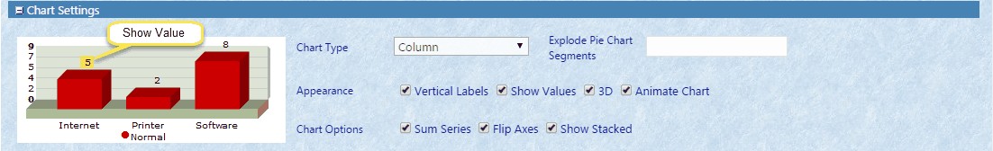
The Chart Types are Line, Column, Bar, Area, Pie, Doughnut, and Funnel.
The Appearance section determines the orientation of labels (vertical when checked, horizontal when unchecked), whether or not to Show Values, whether or not the chart should appear as 3D, or if the chart should be animated (Animate Chart) every time the page is loaded.
The Chart Options are Sum Series, Flip Axes, or Show Stacked. Some charts (such as Bar and Column charts) can display multi-dimensional data - e.g. a list of sales by Year and Product. However, a single dimension may be desirable (e.g. Sales by Product). Use the Sum Series option to sum multiple series data into single series. This will be automatically elected for chart types that don't allow multiple series such as a Pie Chart. Flip Axes will change the orientation of the chart to show the Rows as Columns and vice versa. Show Stacked will put all of the values returned on top of each other for one view.
When using pie charts, you can highlight important segments by ‘exploding’ them. Simply type the name of the segment in the Explode Pie Chart Segments box. To explode multiple segments, separate the names with a comma.