Mobile Mode
Crow Canyon List View is a NITRO components that provides enhanced capabilities to view SharePoint list items. It also provides an option to display the NITRO list view in the mobile mode and this article describes the various options present in the same.
To display NITRO list view in a mobile friendly layout, configure the mobile mode settings in list view component as below.
Go to Site Settings à Crow Canyon List View à Edit any existing list view configuration or create new list view configuration.
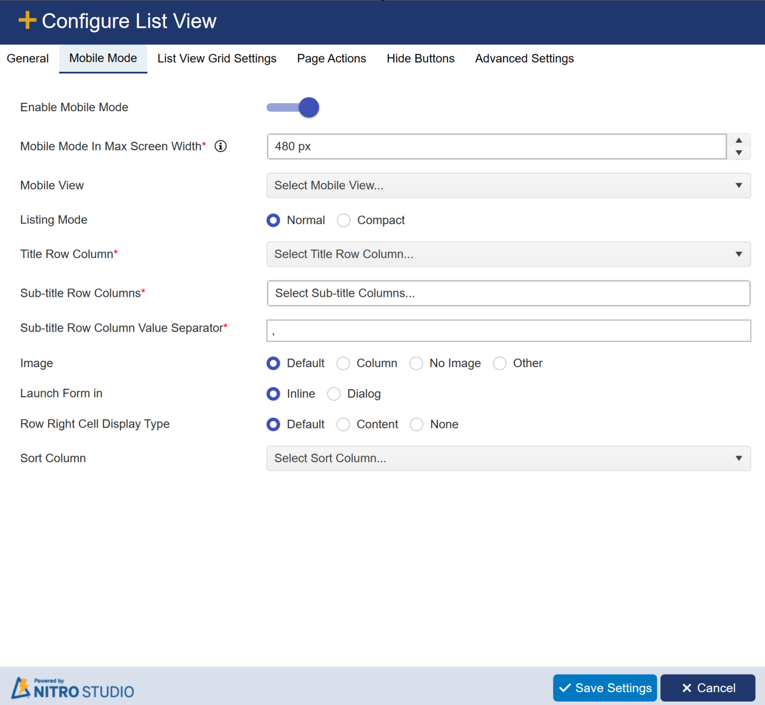
Mobile View: All the list views configured in ‘General’ tab will be shown in this ‘Mobile View’ dropdown. Selected list view items will be shown in the mobile experience.
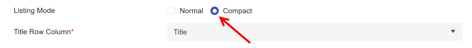
Listing Mode: We can show the items in list view as ‘Normal’ and ‘Compact’ list view mode.
•Normal: When normal mode is selected, ‘Sub-title Row Columns’ and ‘Sub-title Row Column Value Separator’ columns will be visible.
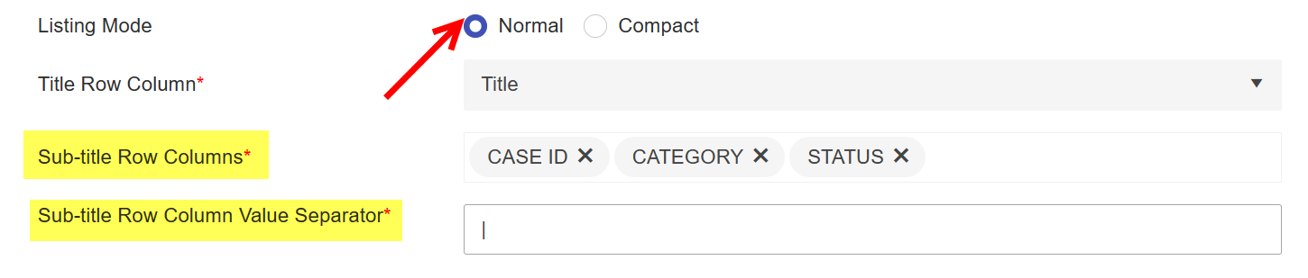
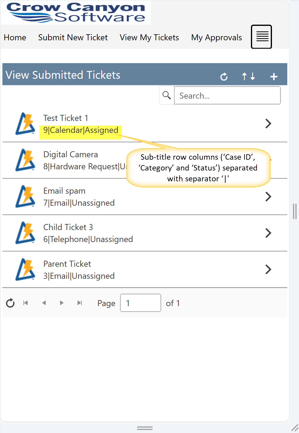
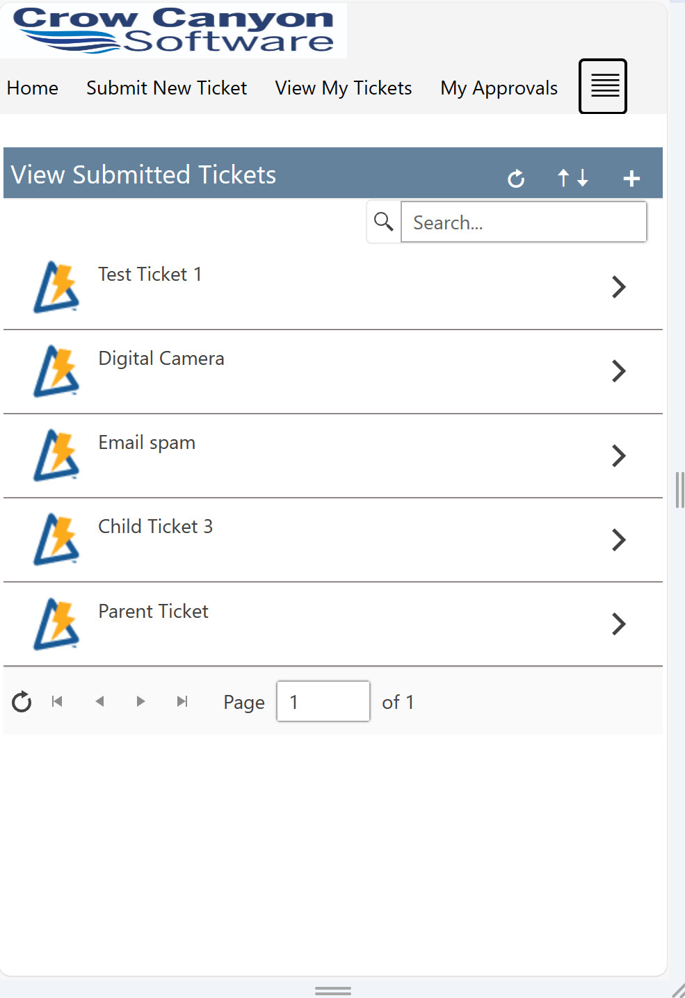
Sample output of normal mode:
•Compact:
When ‘Compact’ mode is selected, then ‘Sub-title Row Columns’ and ‘Sub-title Row Column Value Separator’ options are hidden, and the displayed List view items show only the title of item.
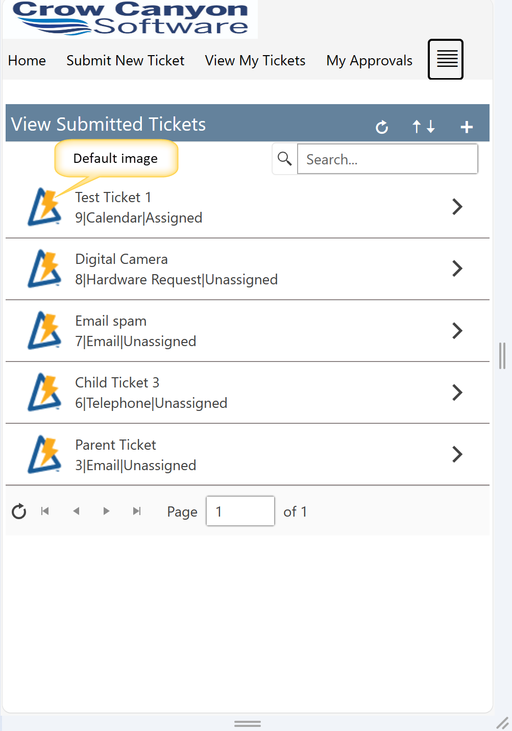
Sample output of compact mode:
Title Row Column: Select the column from dropdown to show the ‘Title’ for Item on the list view in mobile experience.
Sub-title Row Columns: Select the columns to show the other columns information on the item.
Sub-title Row Column Value Separator: Specify separator to be shown between above selected sub-title row columns. Separator can be specified as comma, semicolon, pipe etc.
Image: Image will be shown on the item in list view in mobile experience. Supporting below options in Image configurations:
The options present under this are ‘Default’, ‘No Image’ and ‘Other’.
Default: This is the default option. Selecting this option, will show NITRO image on the item in list view.
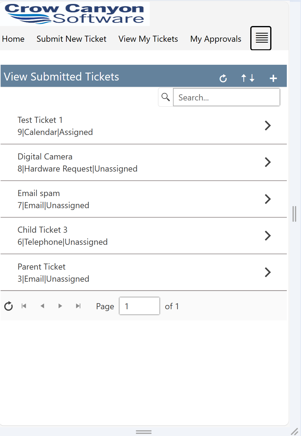
No Image: When ‘No Image’ option is selected, then list view will not show any image adjacent to the displayed list items as shown below:
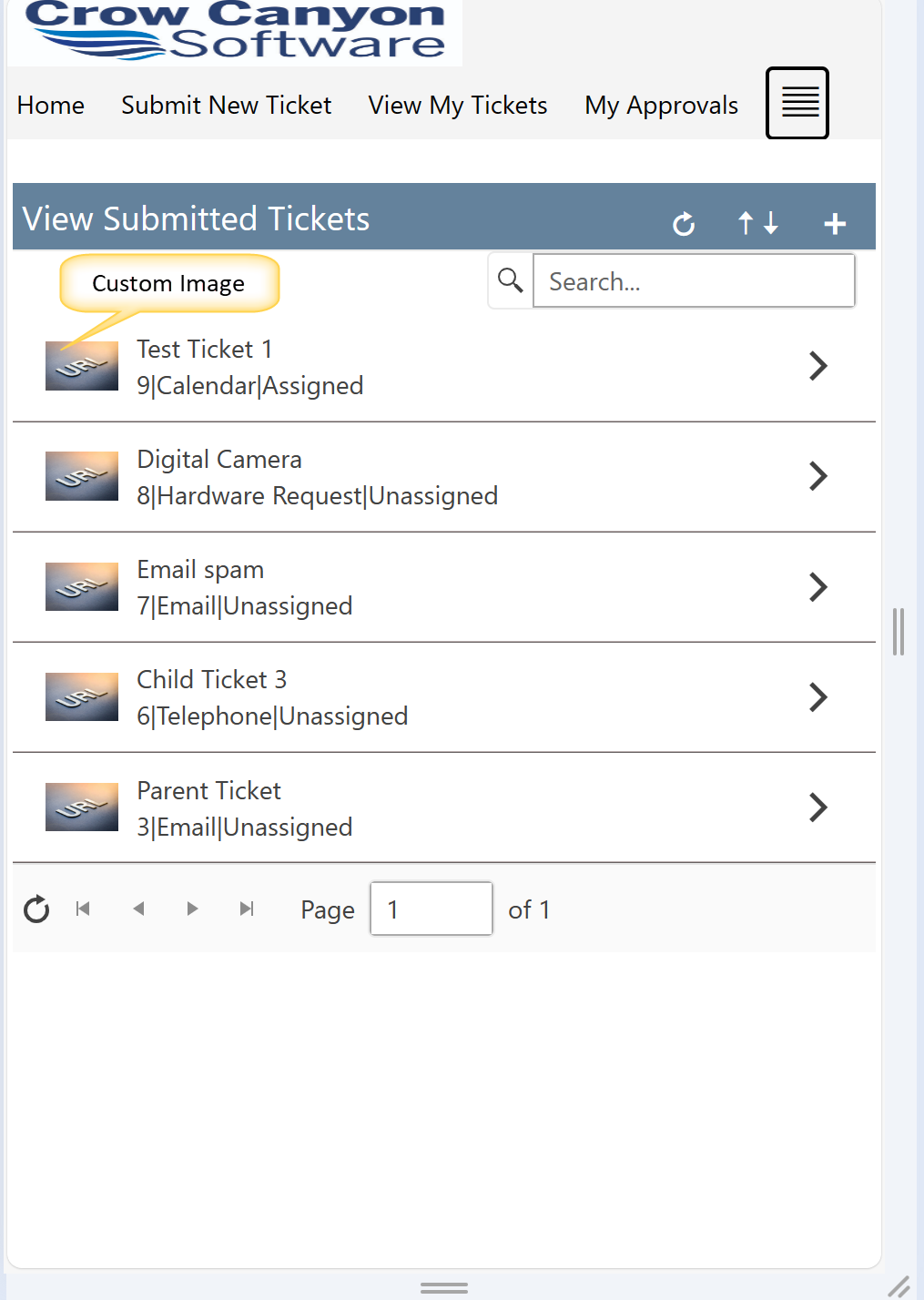
Other: Select this option to specify the URL for custom image. This can be done by uploading an image to the ‘Site Assets’ folder and then using the path of the image to be specified in the ‘Enter Image URL’. Specified image will be shown on the item.
Sample Output of custom image:
Launch Form in: We can open the item form in below ways:
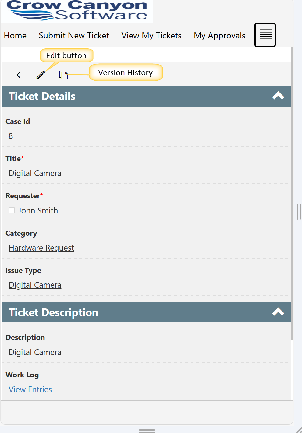
Inline: Select this option to open the item in same webpart.
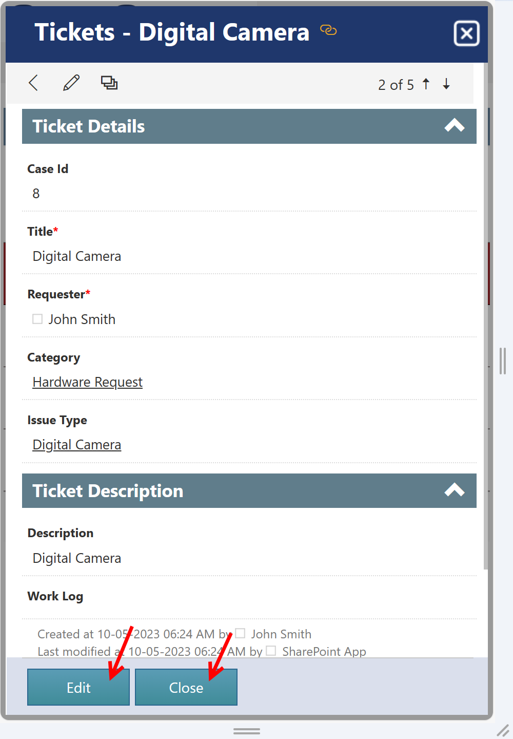
Dialog: Select this option to open the item in dialog mode. In this mode, the dialog window can be closed directly from the displayed item. Also, the ‘Edit’ and ‘Close’ buttons are displayed at the bottom of the opened dialog window as shown below:
It should be remembered that the choice between Inline and Dialog view depends upon the specific requirements and selecting the suitable option ensures a better user experience.
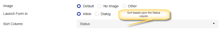
Sort Column:
This option can be used to sort the items displayed in list view in mobile experience.
In this example, we have selected ‘Status’ as the sorting column as shown below: